by Alex Hogrefe | Feb 7, 2015 | Break Down, Project 03 Crossroads Pavilion, Styles / Effects |
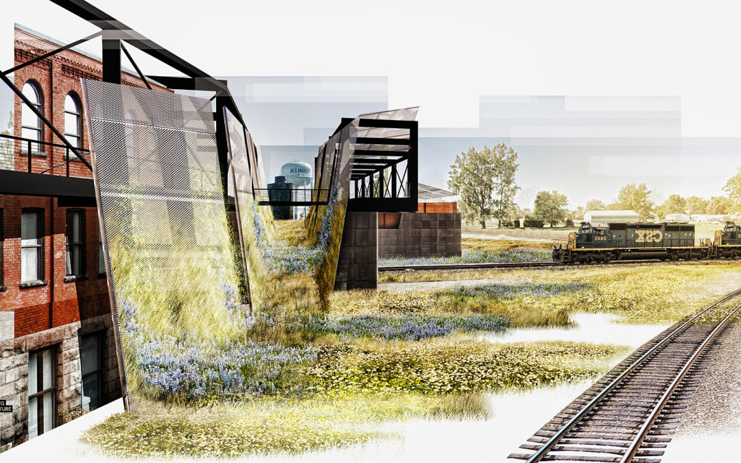
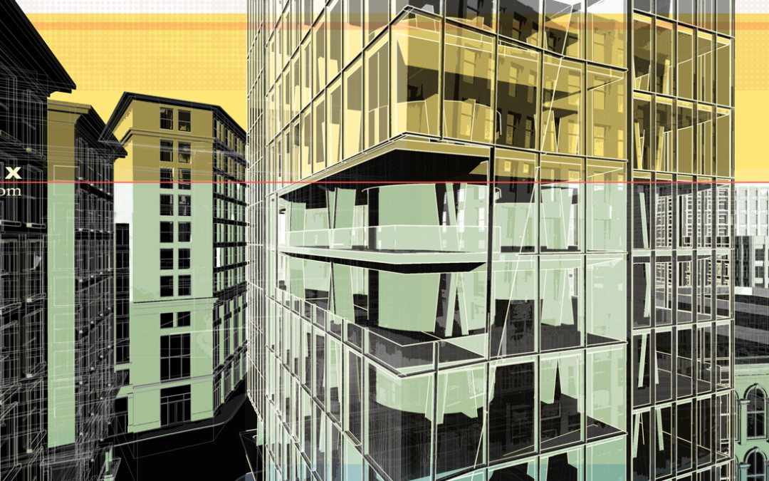
I was in need of some purely right brain thinking so I decided to skip modeling and V-Ray altogether and see what I could turn out with a half baked Sketchup model and some Photoshop. This meant generating a collage style illustration. These types of illustrations are...

by Alex Hogrefe | Nov 26, 2014 | Break Down, Portfolio Vol. 4, Project 02 Cultural Center, Styles / Effects |
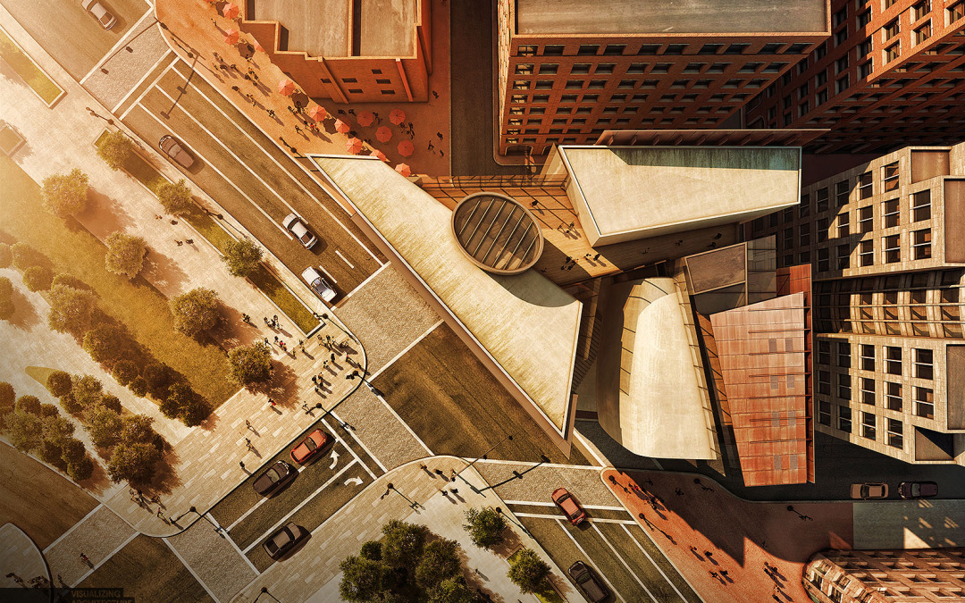
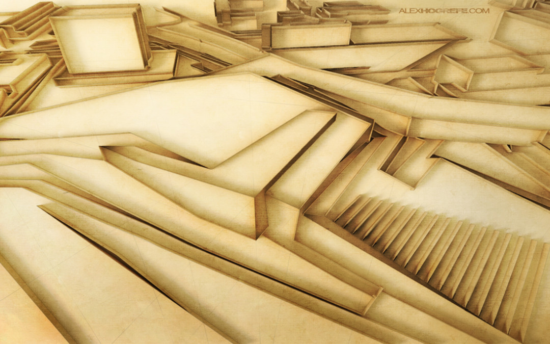
A thought that is often running through my head when working on architectural illustrations is how can I bring more of a human touch to the image. The answer is almost always through texturing in Photoshop. I have spent the last week illustrating an aerial perspective...

by Alex Hogrefe | Aug 3, 2014 | Portfolio Vol. 4, Project 01 Long Wharf, Styles / Effects |
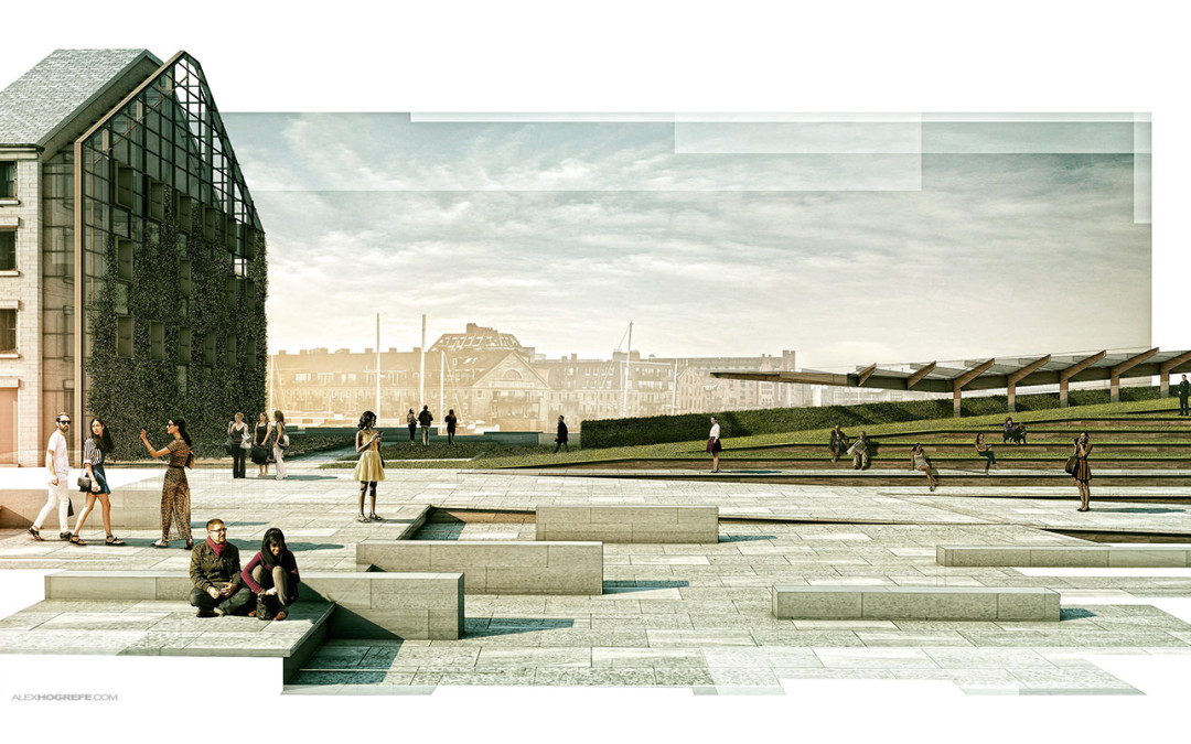
We have used this style a couple of times in the office and I am a big fan of it. It is also really simple to implement. The idea is to apply a mask over a full resolution illustration to break up the edges giving the illustration a collage-like feel. The great thing...

by Alex Hogrefe | Jan 31, 2014 | Styles / Effects |
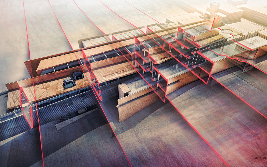
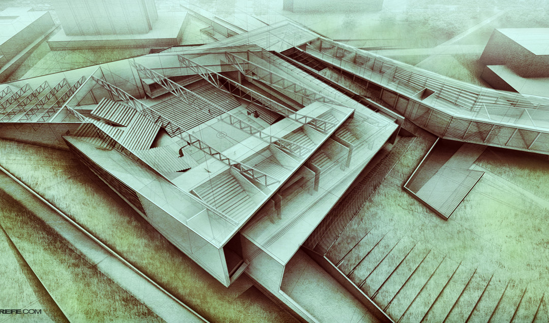
Ever since I rebuilt this model a few months back, I have been wanting to generate an x-ray image of the Cranbrook project. I was having trouble getting the image to read properly because the design doesn’t lend itself well to the x-ray style that I have...

by Alex Hogrefe | Dec 8, 2013 | Break Down, Portfolio Vol. 3, Styles / Effects |
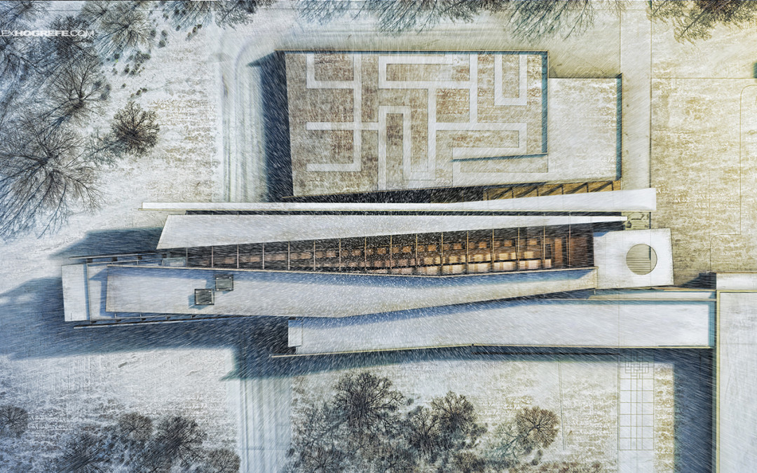
Every year around this time, I have made it a tradition to illustrate a winter scene. With the holidays around the corner, this weekend seemed like a good time to try out some different ideas and techniques related to snow scenes. Sitting down this morning, I...

by Alex Hogrefe | Oct 17, 2013 | Portfolio Vol. 3, Styles / Effects |
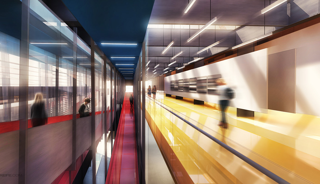
I don’t use blurring techniques that often but every once and a while, I come across an illustration that needs a little extra kick. This was the case with the interior illustration introduced in the last post. The shot was looking down a long and...

by Alex Hogrefe | Oct 7, 2013 | Portfolio Vol. 3, Styles / Effects |
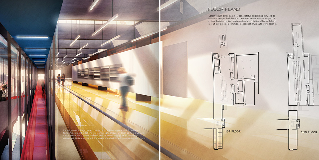
The Cranbrook project spreads are starting to come together. I spent some time composing the section and floor plan spreads which meant moving away from the abstract diagrams and into more traditional architectural drawings. I also developed an interior...

by Alex Hogrefe | Mar 17, 2013 | Styles / Effects |
A few weeks back I posted an x-ray illustration of one of my old projects as sort of a last minute idea. This was the first time I had ever done an “x-ray” illustration and I immediately became excited about the possibilities. I’m really drawn...

by Alex Hogrefe | Feb 18, 2013 | Styles / Effects |
I came across the concept of “quilling” a few weeks back and instantly began thinking how could I translate this digitally to generate a unique architectural illustration for marketing or portfolio purposes. The style had a great look to it and I...

by Alex Hogrefe | Jan 27, 2013 | Styles / Effects |
The past week was a busy one at the office, hence I needed to play catch-up with a lot of non-website related things this weekend. I did find time to put together this illustration of the urban tower model as seen in the past few posts. The urban model lends...
