A few weeks back I posted an x-ray illustration of one of my old projects as sort of a last minute idea. This was the first time I had ever done an “x-ray” illustration and I immediately became excited about the possibilities. I’m really drawn to this style because of the way it reveals scale, tectonics, and the relationship of inside to outside. The thing is, this style is really easy to replicate assuming the 3D model is built correctly. I have a habit of thoroughly grouping parts of my 3D models so that I am able to move large chunks out of the way for easier modeling and editing. Because of the way the model is grouped, I am also able to selectively “peel” away parts of the building facade when it comes to rendering the final design. Below is a break down of the illustration as well as a few tips for combining the images.
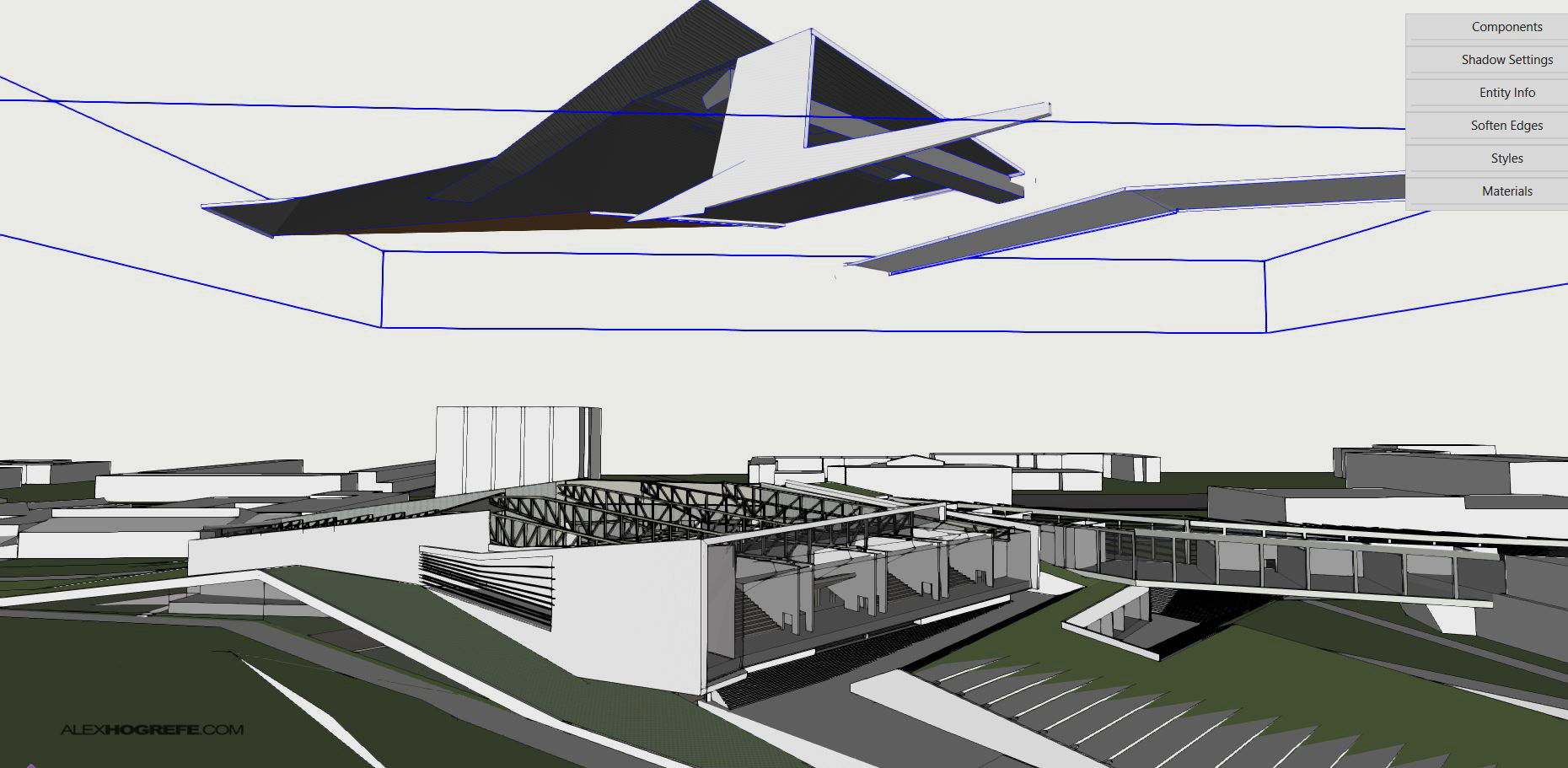
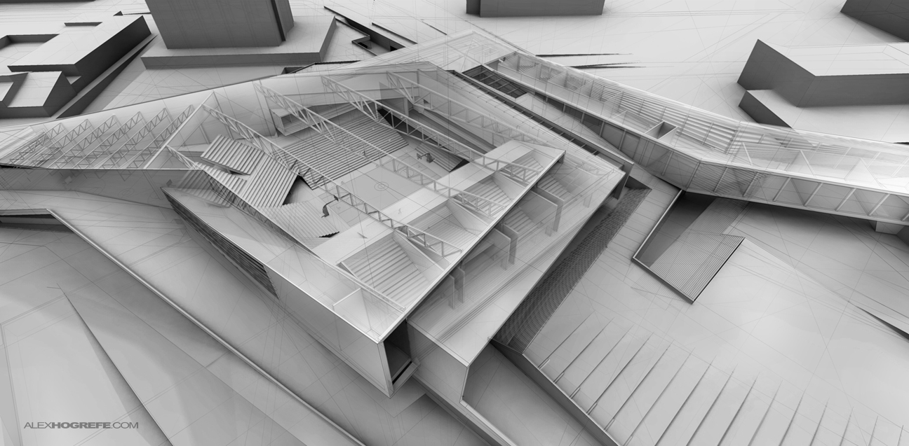
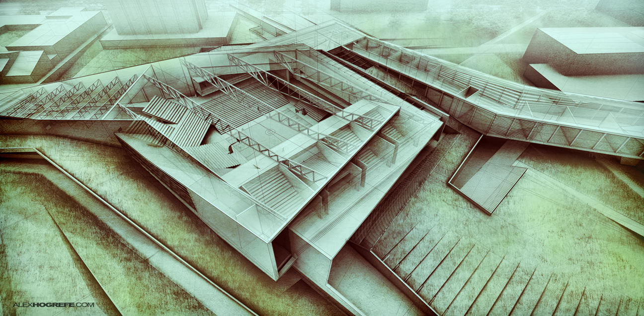
Above, the Sketchup model with the roof being removed.
The first step involves rendering the model multiple times. I did three separate renderings with the first one showing the complete model, the second with the roof off, and the third with some walls removed. I rendered the model without materials because there was already so much geometry being overlayed on top of each other. I was afraid adding materials would start to over complicate things and muddy the reading of the illustration.
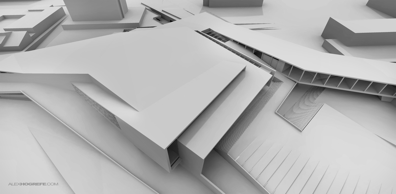
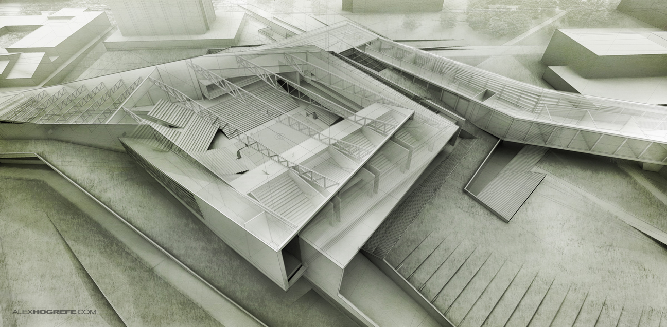
Rendering 1: Model as is (Kerkythea).

Rendering 2: Roof removed (Kerkythea).
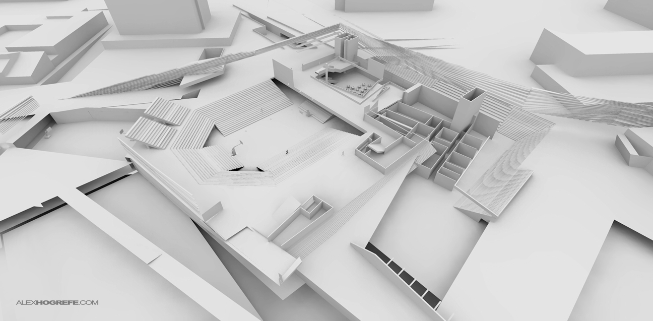
Rendering 3: Walls and some floors removed (Kerkythea).
Ultimately, I didn’t use the 3rd rendering because some of the lower floors were not fully modeled and much of the information was repetitive with the second rendering.
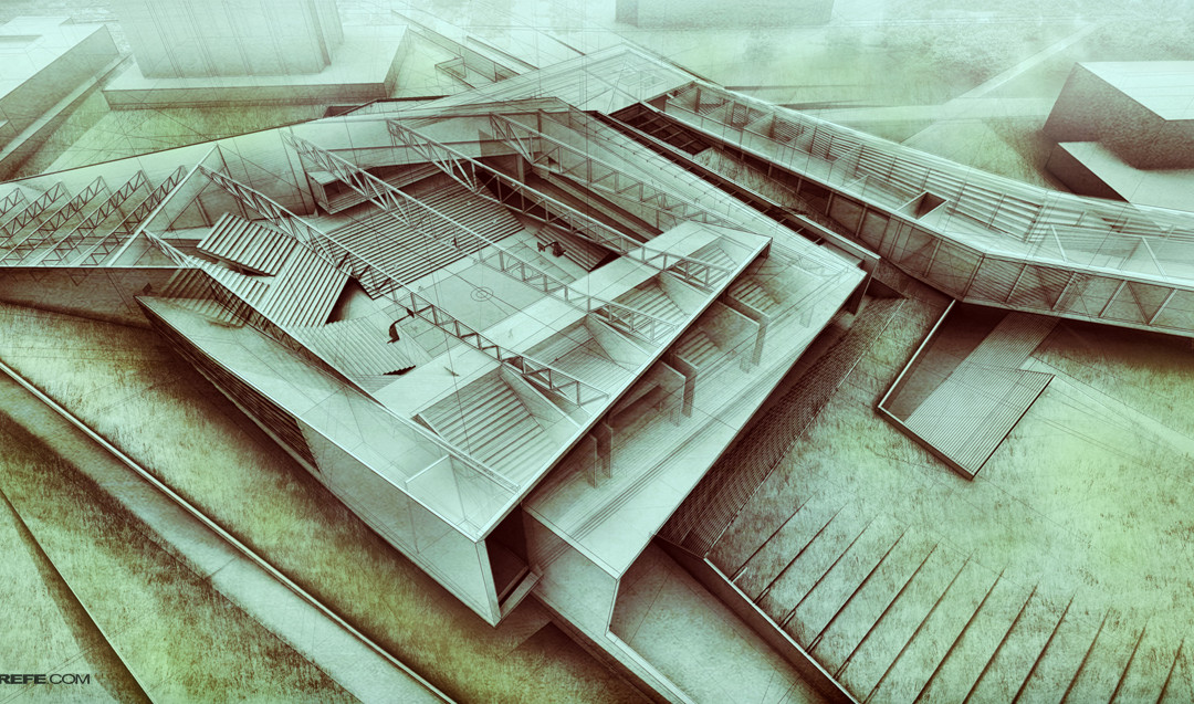
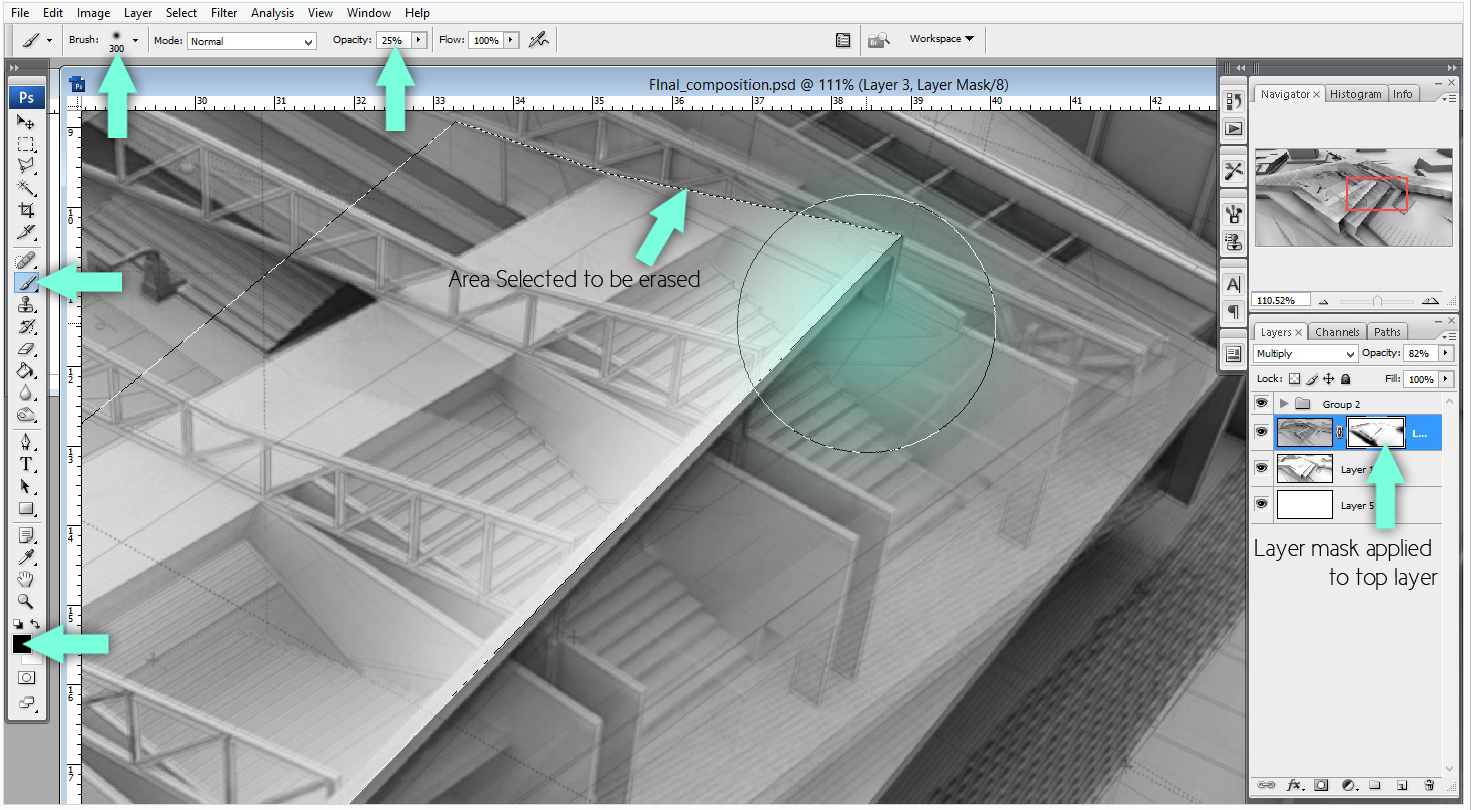
With all three renderings completed, I began layering them in Photoshop. I started with rendering 1 and used that as the base image. I then took rendering 2 with no roof and moved it above rendering 1 in the layers pallet and set the blend mode to “Multiply”. I added a layer mask to rendering 2 and began selectively erasing areas that I didn’t want showing through.
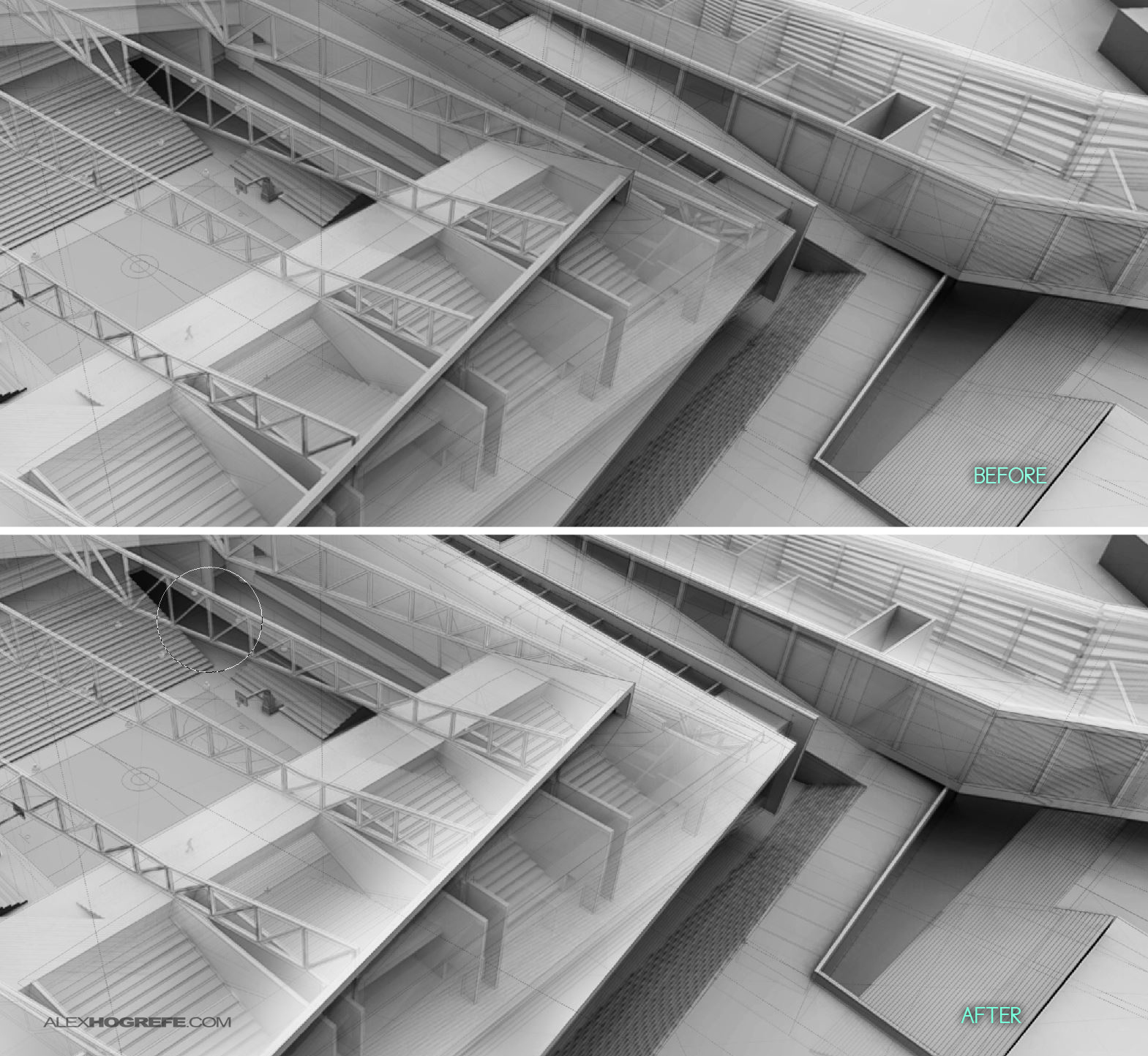
It’s important to maintain the clarity of the exterior form. Throughout post processing, I’m constantly pulling back and looking at the whole image to make sure the exterior form still reads well and isn’t getting lost within the interior layers. One way to manage this relationship is by focusing on the corners and edges of the exterior. With the layer mask still active, I selected the areas I wanted to define, and began erasing parts of the interior (rendering 2 layer).
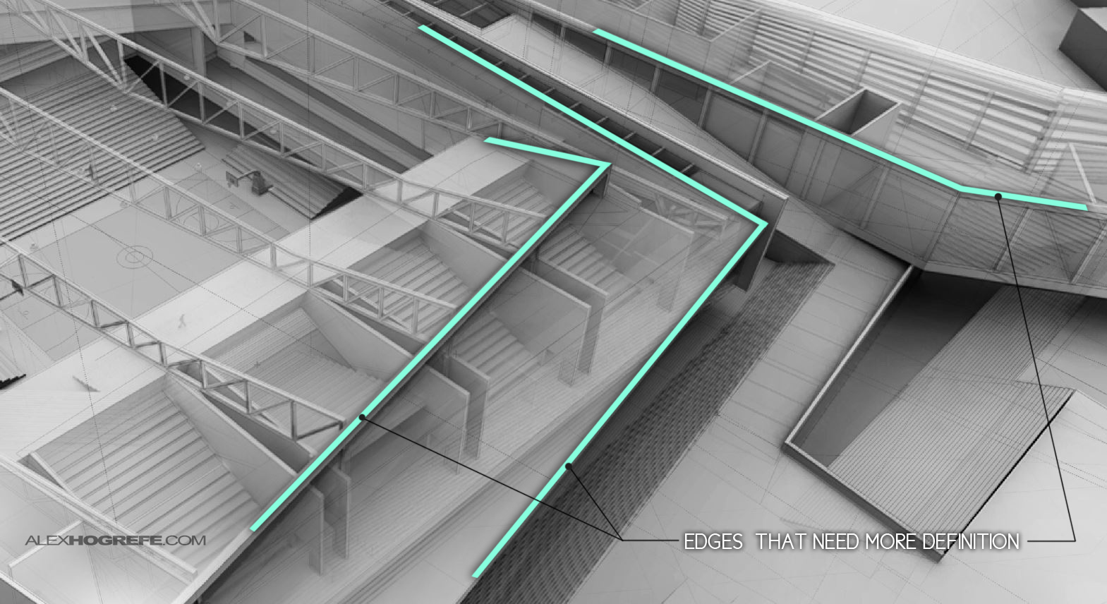
By giving the exterior corners and edges of the design more definition, the dual reading of exterior and interior is much easier to understand.
The last few steps involve me spending time adding textures and background elements to liven up the surrounding site. I tend to default to minimal materials when the complexity of an image such as this is so extreme. More materials in my opinion would make it more difficult to understand the forms. Instead, I focus more on texture to differentiate between built form, hardscape and landscape.
Finally, I tweaked the color/ levels and gave the image an HDR effect.


Very handy technique to show interiors…
Have you tried this on something with multiple levels?
Would the effect be as nice as this or would it get cluttered if you try to add more layers?
I think i'll make a model and try that out…
Thanks for the tutorial 🙂
Wow – you have just given so many great ideas on how to use the section tool in revit in new and fascinating ways, thanks.
you are just simply awesome thank you! FYI I would like to have your babies <3
may you share the texture you use?
work is awesome…no words
you are master of Ps 😉
@Aalekh,
You could probably pull off a multiple level illustration with a view more to the side. The more there are multiple levels overlaying one another, the more confusing it will be to understand. A view from the side would minimize that.
@George,
The grass was just a small patch cloned multiple times. It isn't really a texture. Then I added a minimal grunge texture on top. There are hundreds of free grunge textures if you do a google search.
Amazing. I like very much.
What visopt you use to create model render? Could you share with us? 😀
Thank you
Looking great! just wondering what program you used to render de 3d image? Did you used sketchup -> export 2d graphic?
very nice concept and render using override materials and merge with overlapping volume with lines…
Really. This method is very effective demonstration. We can have a good perception of the building.
thanx a lot alex… yours work always inspire me to improve my render and photoshop skills… your tutotials and blogs helps a lot….i've recently learn't modeling in rhino… but i couldn't import my rhino model to sketch up… can you pls tell me how i can import my rhino model to sketchup 7???
thanx 🙂
Nice..!!
3D Yantram Architectural Animation Studio
I just graduated and frankly, your website was one of the most influential sources during my education. Thank you Alex.
I seldom if ever comment to thank someone. Your site has been a revelation to me and I have enjoyed everything you have put up. Very clear explanations of your process and you do great work. I will be checking in regularly to see what’s to come.
hey alex, i wanted to know how to clay render on vray instead of kerkythea?
Mind blowingly good. I am in awe of your talent.