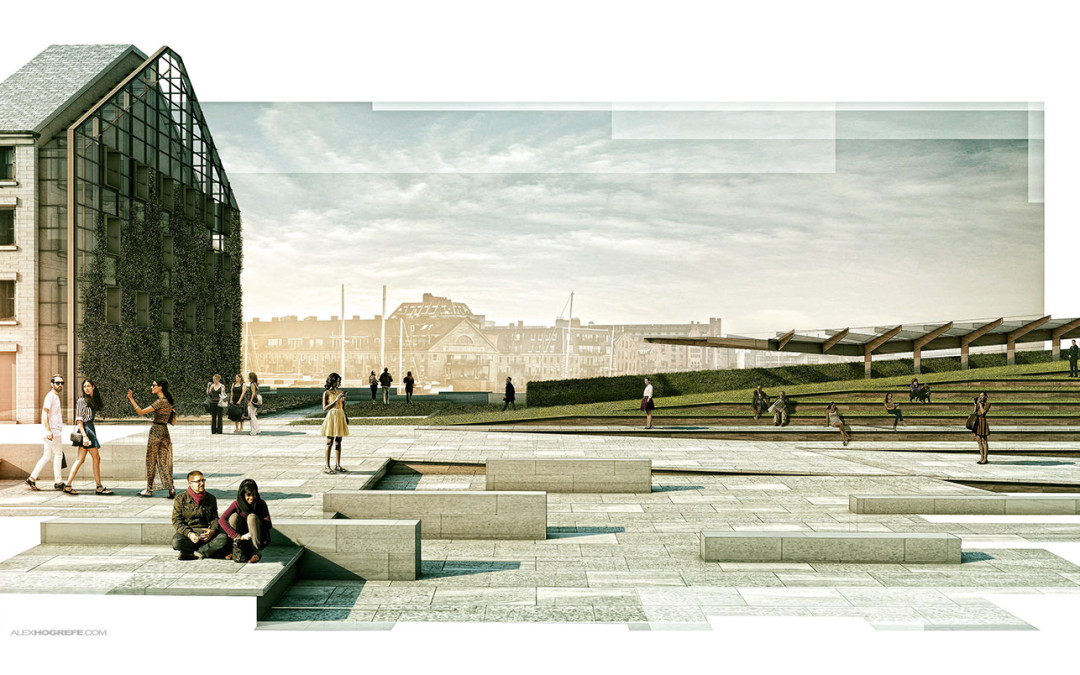
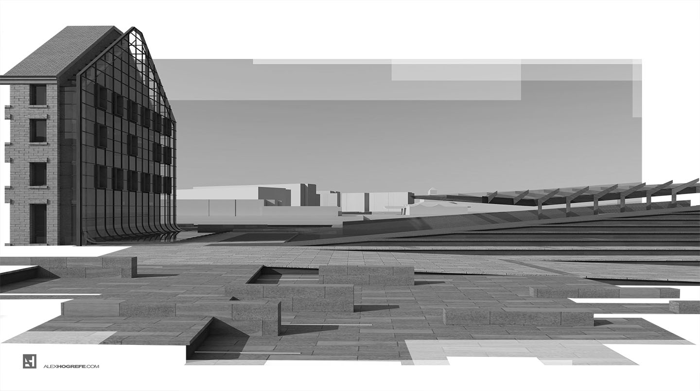
We have used this style a couple of times in the office and I am a big fan of it. It is also really simple to implement. The idea is to apply a mask over a full resolution illustration to break up the edges giving the illustration a collage-like feel. The great thing about this technique is that while you are getting a less formal collage style, the image still has all of its information, detail, and resolution where it counts.
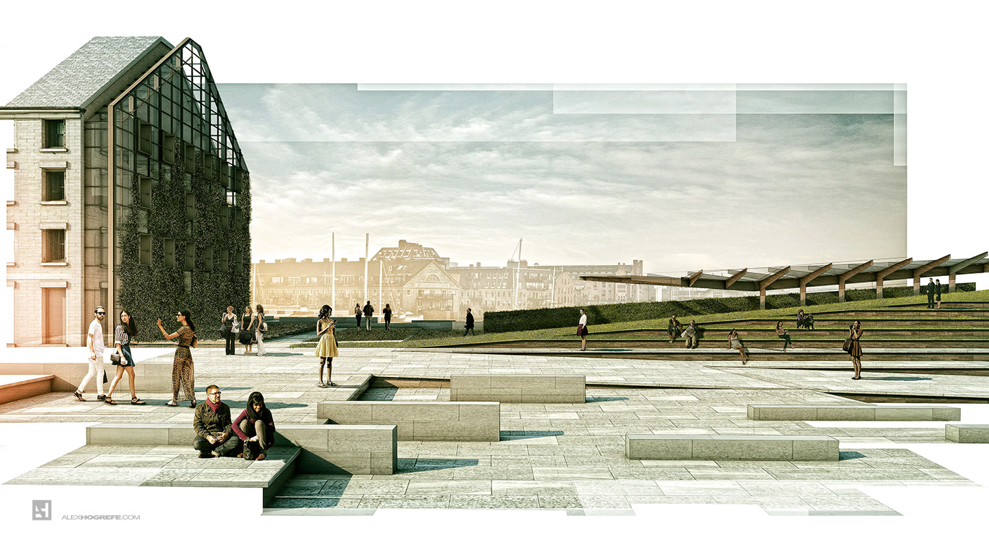
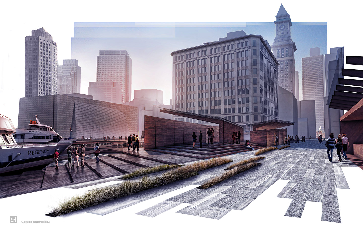
I have chosen two new views of my wharf design to show how it works. The mask is best applied at the very end which means a full illustration edge to edge is still necessary. This also means if the mask isn’t working, it is no big deal and can be removed without any harm to the illustration.
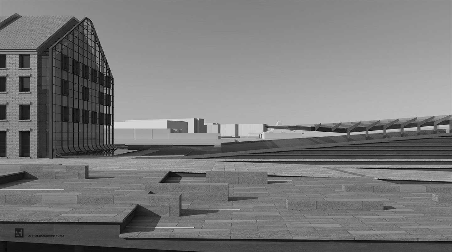
Below is the full frame base rendering before masking (desaturated to better show the masking).
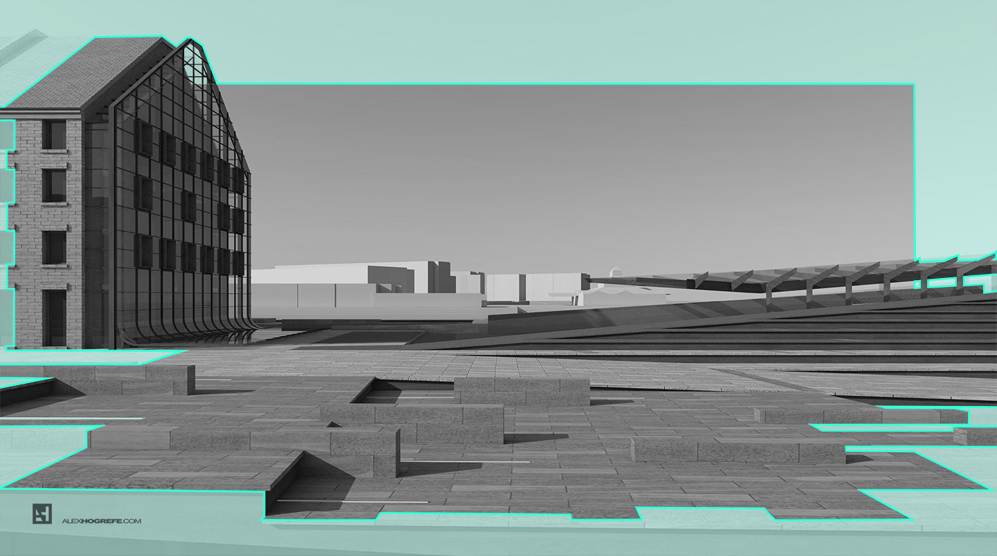
The blue represents what I masked off. The mask was made by creating a new layer and moving it to the top of the other layers. I then selected the “Polygonal Tool” and began selecting areas that I wanted to mask. Once the selection was made, I filled in the selection with a white paint. I went through many of iterations testing out what areas should be masked and what works best compositionally. I experimented with softening the edges or lowering the opacity, however, I ultimately preferred the crisp edges and the sharp contrast between the white and rendered areas.
It is a simple move, but one that completely changes the tone of the image.
The final illustrations were rendered with V-Ray at a resolution of 4500px X 2500px. I then tweaked colors, textures, and added people in Photoshop. Finally, I jumped into my Topaz Labs PS plugin to punch up the detail.


Hi Alex….Lovely lovely post ! This is absolutely beautiful. Was wondering about the texturing ! DO you texture with vray textures or do you texture in sketchup with 3rd party textures and render the sketchup textures in vray i.s.o retexturing in vray ? Thanx
this is really cool. I wanted to ask where and when this kind of presentation may work better? I mean, would you puplish it in your portfolio or present it for a client?
Nice work. The composition is superb. One thing I noticed- In the wharf collage 2 image the slatted material does not fade to the vanishing point.
Great post Alex! You're the best… thanks a lot!
creative solution, thanks for the architectural rendering tip; awesome as usual!
Hi Alex.
what I wanted to ask you that why did U need to render the scene by vray.
The two illustrations in this post could have easily been done with the same effect entirely on Photoshop from a jpeg export.
Any special reasons for that..?
@Jaco
I textured using many different methods. Many are applied in Sketchup and then edited with bump maps and reflections in Kerkythea and Vray. I also texture a lot in Photoshop
@Malak
We used this for a client that asked for something a little more "fun" and less formal. I would also use this in my own portfolio but only at the right time in the right place. In this case, this method works with the composition of the images. However, there are many situations where this method should be avoided due to the tone of the image or composition
@Sufyan,
Yes this method could be done with just a jpeg export. You do not "need" to render the 3d model like I did. However, it was just my personal preference to render the model to get more of a realistic end result.
Hey alex,
Your work are awesome as always! I visit your blog at least 2 times a day!
thank you for your work.
i wanted to ask you if you will post a " Vray sketchup Tutorial " in the future. You know, the basic stuff, to understand how to improve my render…'cause your render are just wonderfull!
thank you again and keep up your incredible work!
These are great Alex, some of the texturing is really really good, nice job. I’ve yet to take the plunge with Vray. I’d be interested to hear what you think the pros and cons are with it, versus Kthea. Do you find it as user friendly? (Sorry if you already answered this for someone else!!)
Blake
I like the way you deal with the tiles!
Hi Alex,
Have been following your posts over the years, noticed that you started to use VRay, may I ask why? Is kerkythea not sufficient for the output? I couldn't really afford VRay, but it seems the most popular one.
Great tutorial!
And glad to see the new site!
Hi Alex! Great Renders! I learned heaps with your web page! Just wondering what effect with Topaz did you use and how did you make that pencil sketch effect? Thanks
Hi alex,
Can you guide us through the steps taken in the plugin phase of developing this render?
It would be really helpful
Hi Alex, I’m an architecture student and great fan of your work. How do you design the typography of your spreads? And which font have you used in this example? Cheers from Brazil.
Hi Alex, Great Renders, can you guide us through the steps taken in the plugin phase of developing this render?
I am grateful to have opened this discussion. This question is quite interesting to me. Finally the answer was found