by Alex Hogrefe | Jan 4, 2015 | Portfolio Vol. 4, Project 02 Cultural Center, Uncategorized |
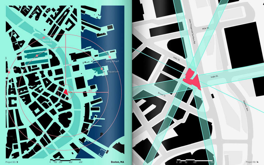
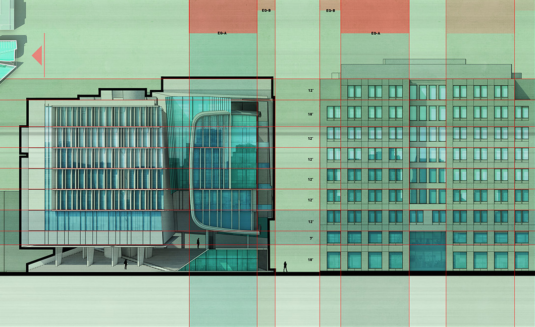
It has now been several months of working on this latest project from which lots of imagery has been created. I’m ready to start compiling all of this information into portfolio spreads similar to what I did for the wharf project. Anyone that reads this...

by ahogrefe | Dec 14, 2014 | Break Down, Portfolio Vol. 4, Project 02 Cultural Center, Uncategorized |
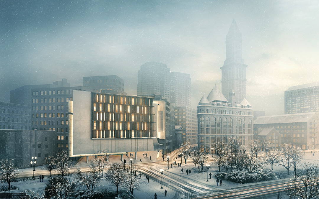
For this winter special #4, it was all about the lighting and atmosphere. Going into this, I knew the illustration was going to be heavily post processed so I spent little time preparing the 3d model and just kicked out a quick V-ray base rendering...

by Alex Hogrefe | Nov 26, 2014 | Break Down, Portfolio Vol. 4, Project 02 Cultural Center, Styles / Effects |
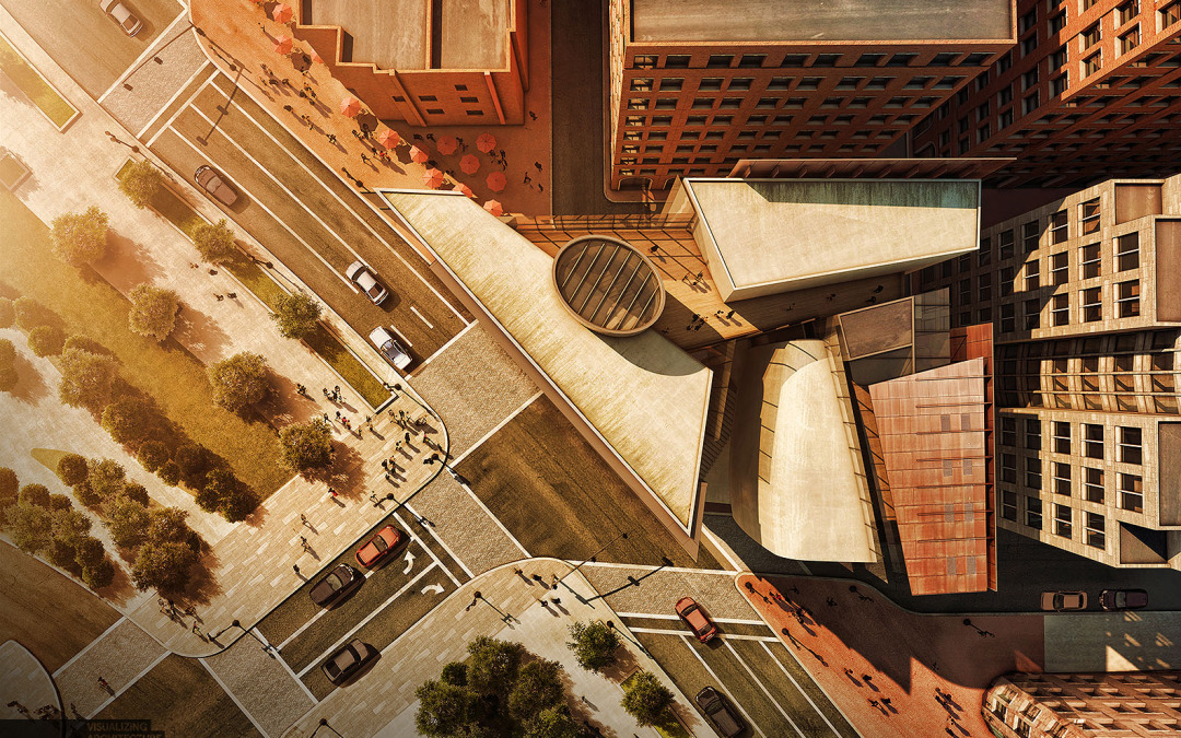
A thought that is often running through my head when working on architectural illustrations is how can I bring more of a human touch to the image. The answer is almost always through texturing in Photoshop. I have spent the last week illustrating an aerial perspective...

by Alex Hogrefe | Nov 9, 2014 | Break Down, Fundamentals, Portfolio Vol. 4, Project 02 Cultural Center |
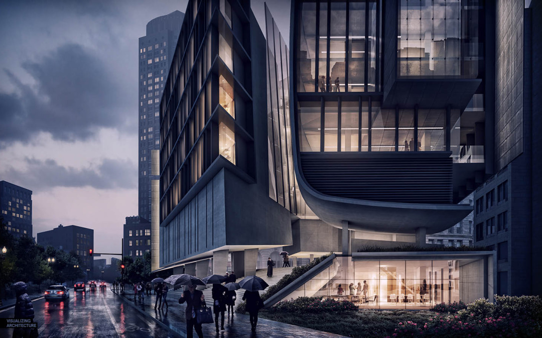
One of the very first tutorials I created for this site described a workflow that generated a night scene only using Photoshop. That tutorial used a very simple base image exported right out of Sketchup. The workflow is easy to implement and is especially...

by Alex Hogrefe | Oct 12, 2014 | Over Time, Portfolio Vol. 4, Project 02 Cultural Center, Uncategorized |
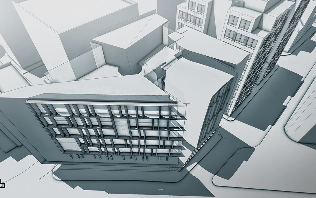
As the 3d model progresses, I find myself spending a lot of time defining and organizing the way different elements are grouped in the model. I posted a video a while back showing a time lapse of the construction of one of my models. I rarely use layers but instead...

by Alex Hogrefe | Sep 30, 2014 | Portfolio Vol. 4, Project 02 Cultural Center, Uncategorized |
These past two weeks have been crazy and if any of you follow my Facebook page, you know what I am talking about. However, with all of the change, I figured it would also be a good time to start a new project as well. The wharf design was a fun project to...

by Alex Hogrefe | Aug 17, 2014 | Portfolio Vol. 4, Project 01 Long Wharf |
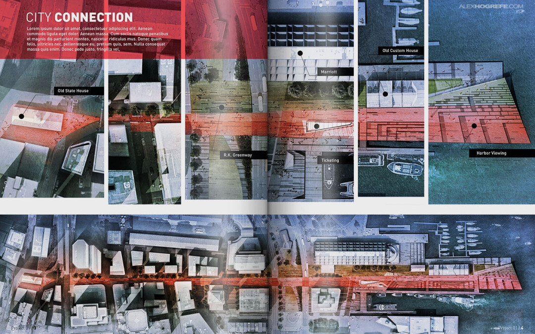
Over the past several months, I have developed many illustrations for my conceptual wharf design. I wanted to start thinking about how these illustrations would be organized into a portfolio layout. One of my favorite parts of arch viz is page layout. Last year, I put...

by Alex Hogrefe | Aug 3, 2014 | Portfolio Vol. 4, Project 01 Long Wharf, Styles / Effects |
We have used this style a couple of times in the office and I am a big fan of it. It is also really simple to implement. The idea is to apply a mask over a full resolution illustration to break up the edges giving the illustration a collage-like feel. The great thing...

by Alex Hogrefe | Jul 13, 2014 | Break Down, Portfolio Vol. 4, Project 01 Long Wharf |
This was a fun image to work on and the breakdown is relatively straight forward. The big poetic moves such as fog and coloring come towards the end which is typically the case with images like this. There was a lot of prep in Photoshop such as refining...

by Alex Hogrefe | Jul 6, 2014 | Break Down, Portfolio Vol. 4, Project 01 Long Wharf |
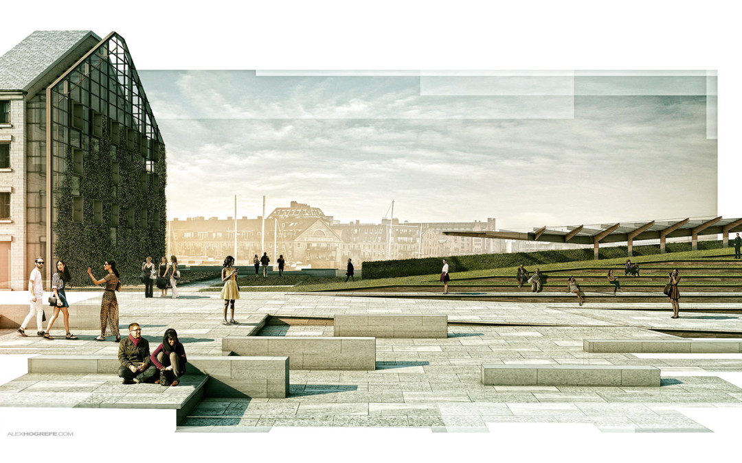
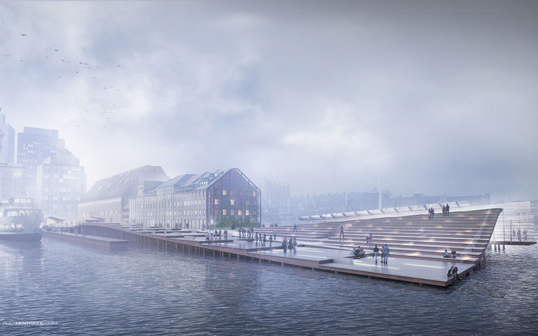
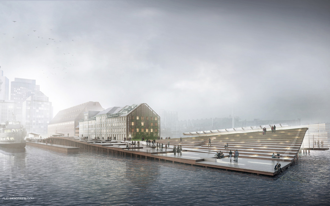
Modeler: Sketchup Renderer: V-Ray Post Processing: Photoshop Final Output Size: 4500 px x 2520 px The Boston Long Wharf perspective illustrations are underway. This first illustration is one of the more important ones because it is describing the entire design...
