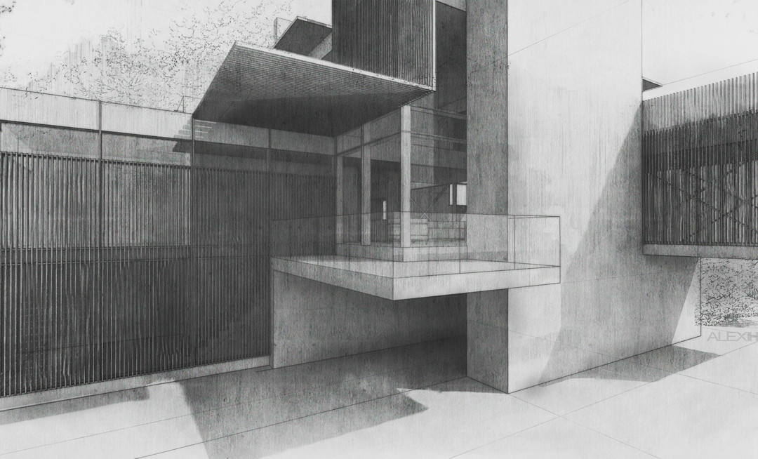
by Alex Hogrefe | Jan 20, 2013 | Styles / Effects |
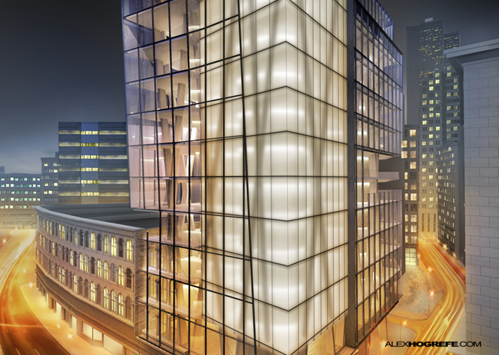
I have been using this technique to create frosted glass for as long as I can remember. The workflow is incredibly simple. Most rendering programs can generate frosted glass, but the setup can often be tricky. In the case of Kerkythea, these settings...

by Alex Hogrefe | Oct 14, 2012 | Portfolio Vol. 3, Styles / Effects |
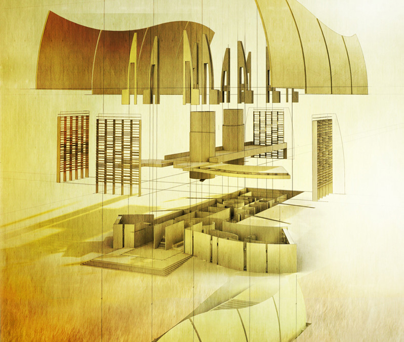
I have always been intrigued by exploded axonometric illustrations. They add a kinetic aspect to what is typically very stagnate fixed objects. Even more though, I like how a successful exploded axon depends on a clear understanding of all...

by Alex Hogrefe | Sep 9, 2012 | Styles / Effects |
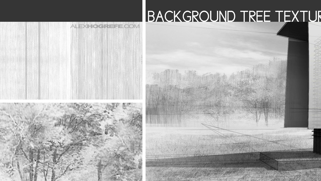
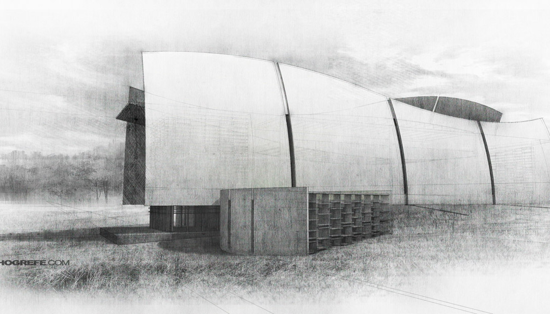
I wanted to go into more depth about how I created the sketch look. Images like these depend almost entirely on the textures you use. I spend a lot of my time scavenging images online as well as creating my own to get the exact style that I am looking for....

by Alex Hogrefe | Sep 2, 2012 | Break Down, Styles / Effects |
I spent the weekend modeling up an old studio project that I designed my sophmore year in undergrad. It’s something I have been wanting to do for a while since the original project was done by hand i.e. no computer. I was able to scan and scale my old hand drawn...

by Alex Hogrefe | Aug 19, 2012 | Styles / Effects |
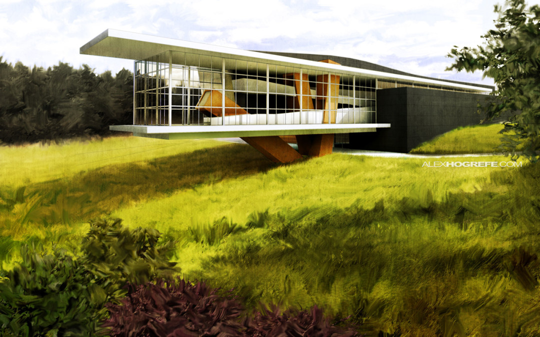
Every so often, I come across situations where I want to loosen up my illustrations and give them a more gestural quality. Growing up, I painted a lot and I have always experimented with ways to carry over the brush stroke into my digital architectural illustrations...

by Alex Hogrefe | Jul 29, 2012 | Portfolio Vol. 3, Styles / Effects |
I have been experimenting with some old-school plan oblique illustrations. This was one of the first 3-dimensional views I learned to draft by hand in school. What is great about these types of illustrations is that they can be used as scaled measured drawings...

by Alex Hogrefe | Jul 11, 2012 | Styles / Effects |
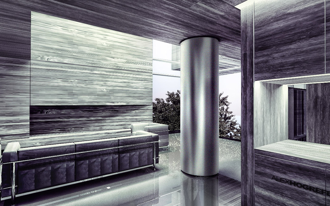
Every so often, there comes a time when I need to illustrate a brushed stainless steel finish like the column in the above image. In my experience, adjusting the “shininess” settings in any rendering program to get that brushed look dramatically...

by Alex Hogrefe | Jun 17, 2012 | Break Down, Styles / Effects |
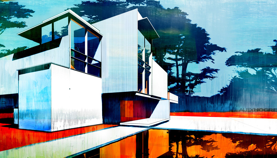
Every once and a while, there comes a time to produce an illustration that is a little more abstract in style. Such cases in the past included situations where the design wasn’t developed to the point that a full blown rendering could be produced, or where I...

by Alex Hogrefe | Apr 1, 2012 | Styles / Effects |
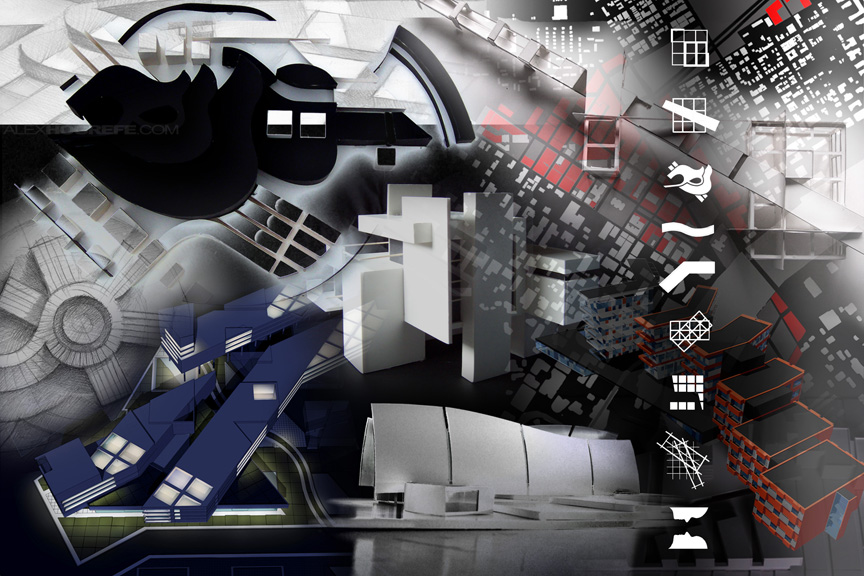
A student in Chicago emailed me a while back asking how I created the back cover of my undergraduate portfolio. The image was a collage of all of my projects Photoshopped together into a single composition. As time consuming as it may look, I probably only...

by Alex Hogrefe | Mar 4, 2012 | Styles / Effects |
I used to draw a lot when I was younger and all but stopped sometime in college. I’m not sure why, but I always find myself trying to recreate hand drawings through Photoshop. I’ve noticed that the workflow that I use to recreate drawings follows a...
