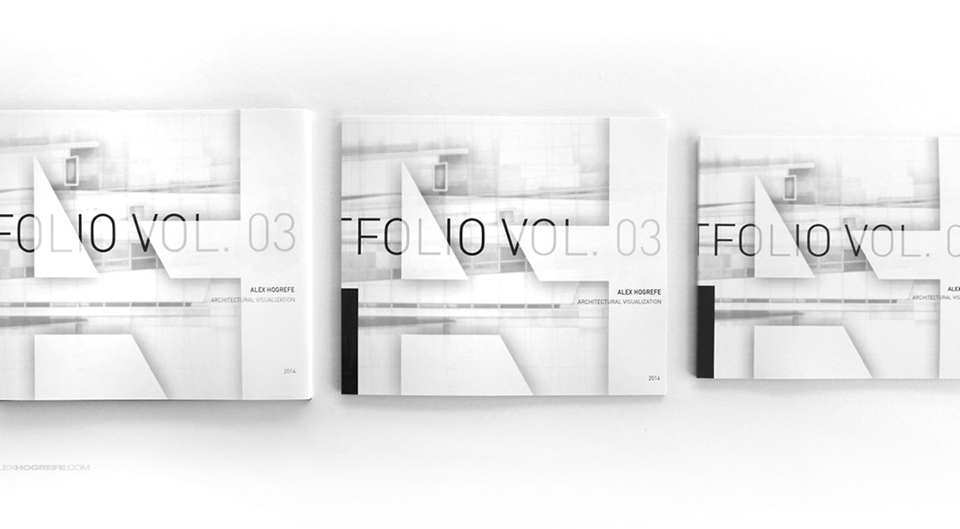
by Alex Hogrefe | Jan 5, 2014 | Portfolio Vol. 3 |
I have been really excited to do this post because it has been a long time since I have printed a portfolio and I have always been curious to see the quality that print-on-demand companies could produce. As much as I enjoy to work digitally, nothing beats...

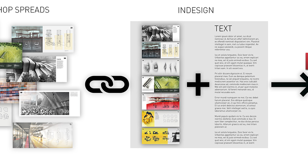
by Alex Hogrefe | Dec 30, 2013 | Portfolio Vol. 3 |
I have talked about portfolio setup in the past but not specifically the workflow. I don’t hide the fact that I prefer to build my layouts in Photoshop. It’s what I’m most comfortable with but also what gives me the most flexibility to blend images into...

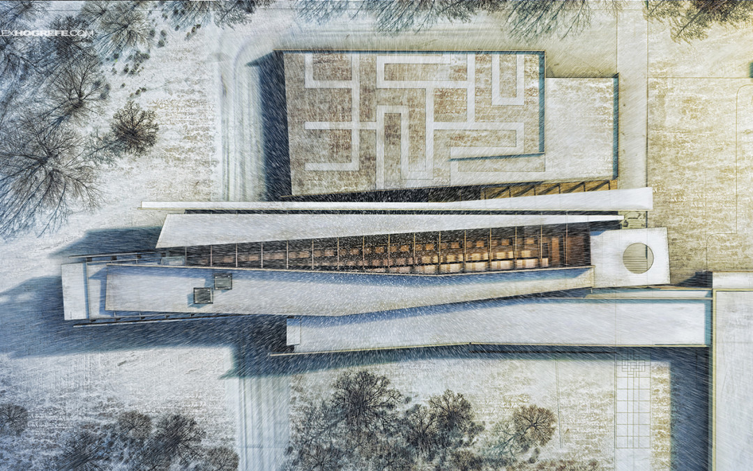
by Alex Hogrefe | Dec 8, 2013 | Break Down, Portfolio Vol. 3, Styles / Effects |
Every year around this time, I have made it a tradition to illustrate a winter scene. With the holidays around the corner, this weekend seemed like a good time to try out some different ideas and techniques related to snow scenes. Sitting down this morning, I...

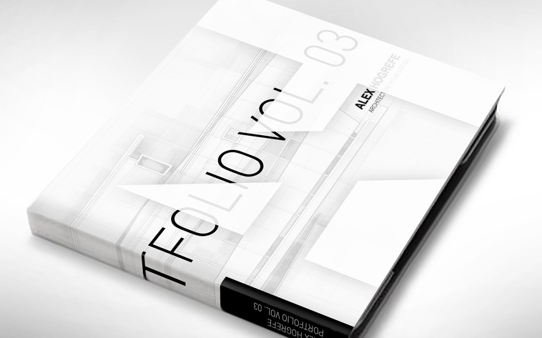
by Alex Hogrefe | Nov 24, 2013 | Portfolio Vol. 3 |
All weekend has been spent working on the cover design for the Project Portfolio Upgrade and it is turning out to be extremely challenging. There is a lot of pressure that rides on the cover. It’s the first thing the audience sees. It’s the...

by Alex Hogrefe | Nov 10, 2013 | Break Down, Portfolio Vol. 3 |
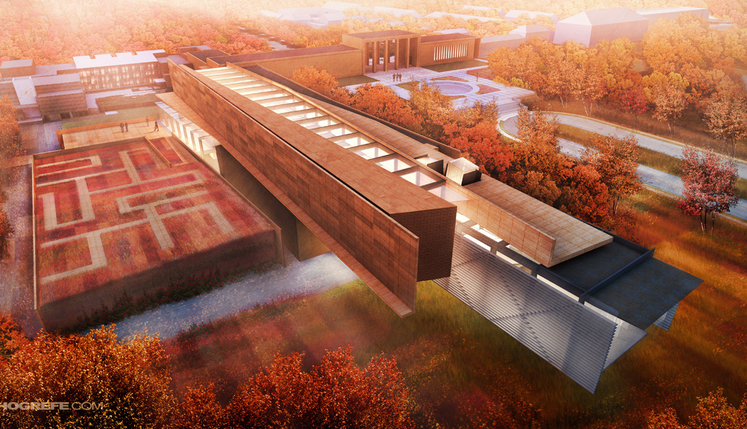
I have taken several trips up to Maine over the past month and experienced some beautiful landscapes with stunning fall foliage. This has inspired the latest illustration for my Cranbrook project. Autumn scenes are not that much different from your standard...

by Alex Hogrefe | Oct 17, 2013 | Portfolio Vol. 3, Styles / Effects |
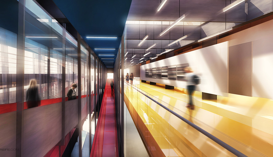
I don’t use blurring techniques that often but every once and a while, I come across an illustration that needs a little extra kick. This was the case with the interior illustration introduced in the last post. The shot was looking down a long and...

by Alex Hogrefe | Oct 7, 2013 | Portfolio Vol. 3, Styles / Effects |
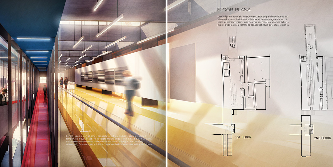
The Cranbrook project spreads are starting to come together. I spent some time composing the section and floor plan spreads which meant moving away from the abstract diagrams and into more traditional architectural drawings. I also developed an interior...

by Alex Hogrefe | Sep 24, 2013 | Break Down, Portfolio Vol. 3 |
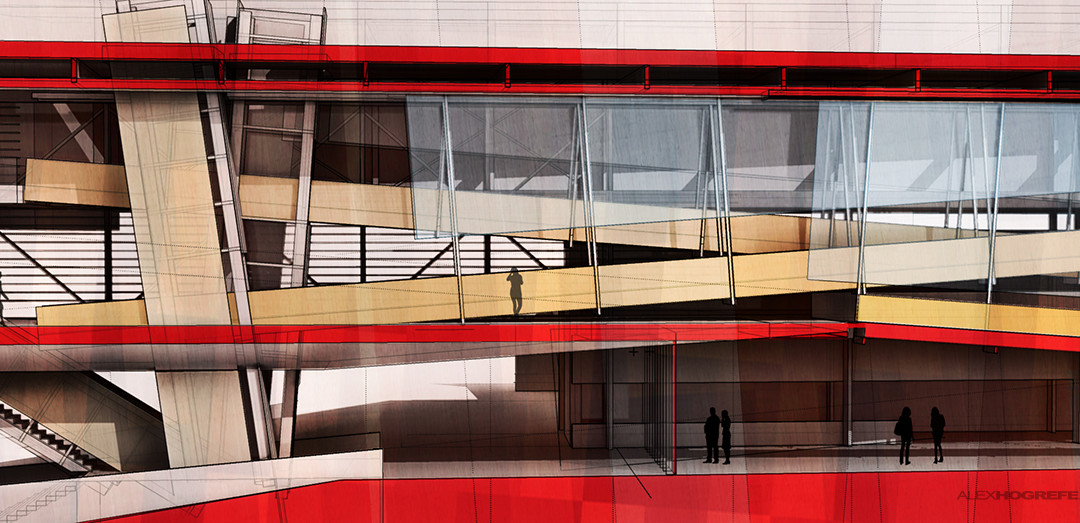
When I originally designed this project back in undergrad, I put a lot of time into the design of the section. It’s an important illustration and I therefore wanted to move away from the abstract illustrations described in the previous posts and...

by Alex Hogrefe | Sep 8, 2013 | Portfolio Vol. 3 |
This week, I put together some diagrams that build off of the language of the first illustration created last week. As mentioned in the last post, the intro page illustration was designed to be a “teaser” for the pages to follow and get the...

by Alex Hogrefe | Aug 26, 2013 | Portfolio Vol. 3 |
The summer is coming to a close and I am making a final push to wrap up “Project Portfolio Upgrade”. I have spent the last two weeks developing a new 3D model for one of my old projects from undergraduate school. Some of you may recognize the design as...
