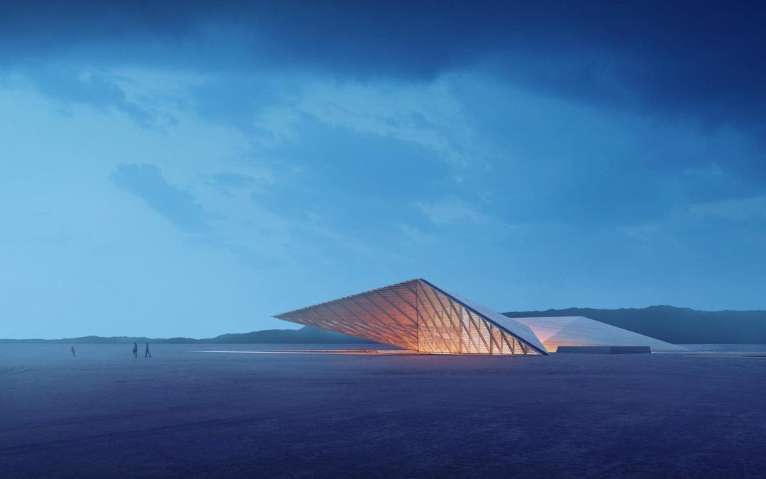
by Alex Hogrefe | Mar 25, 2018 | Break Down, Over Time, Portfolio Vol. 5, Project 07 Desert Villa |
Part 2 of this tutorial will break down the Photoshop side of this illustration. In terms of Photoshop complexity, this image is relatively simple and minimal in layers. However, I think it is a good example of how a compelling image can be generated with just a few...

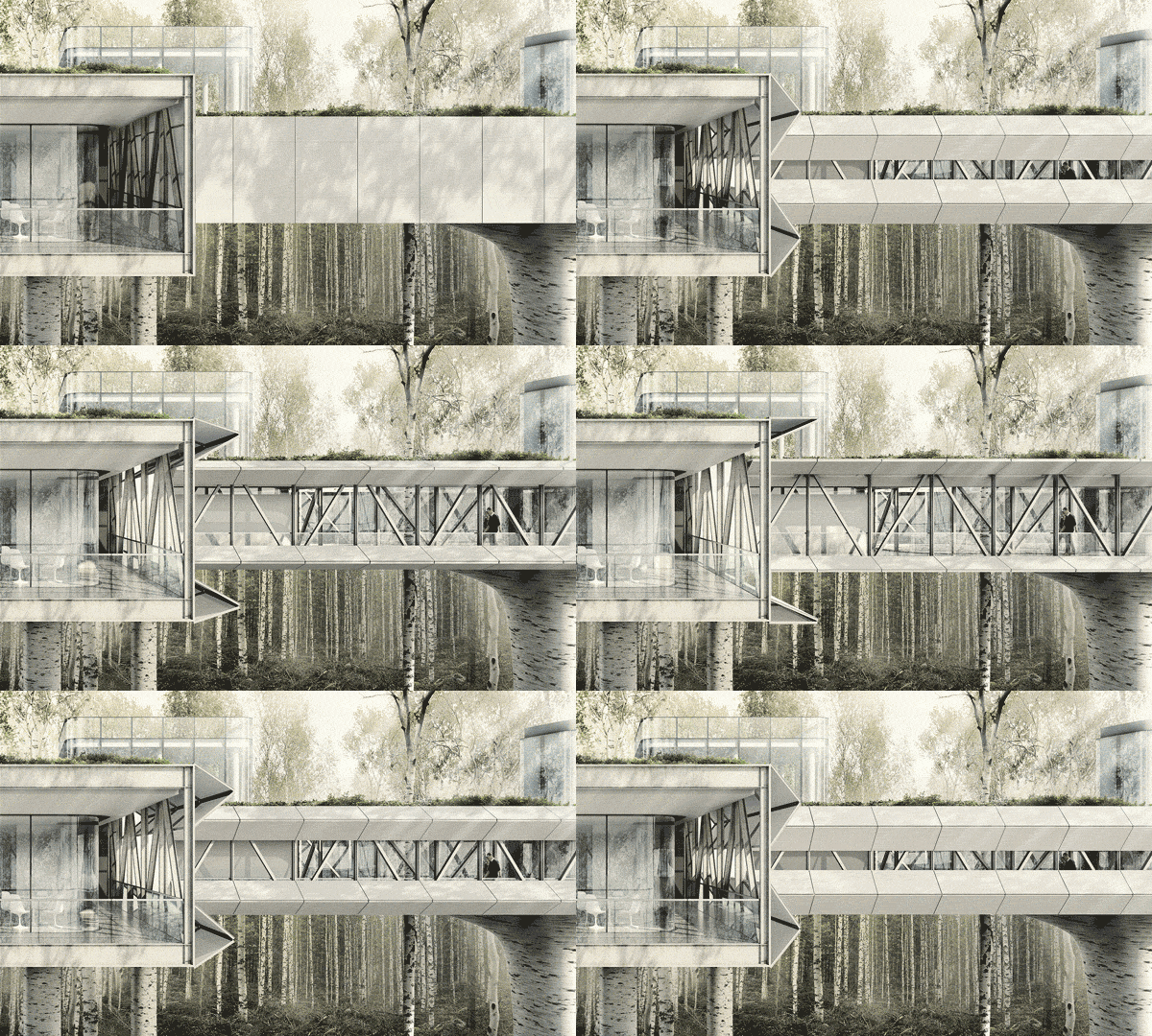
by Alex Hogrefe | Mar 6, 2017 | Over Time, Portfolio Vol. 5, Project 05 Research Lab, Uncategorized |
As old school as they are, GIFs can still be a low tech, highly shareable solution to communicate an architectural idea. In this case, I was having trouble deciding how to illustrate the operable shade system of my research lab design. Enter the GIF. The obvious...

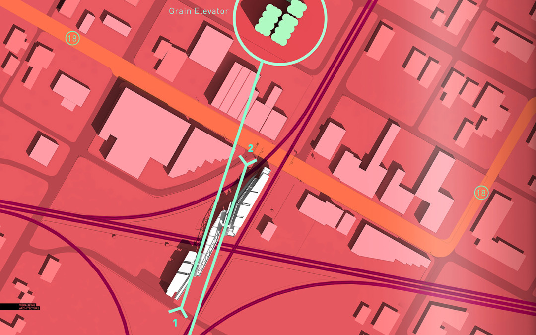
by Alex Hogrefe | Jun 29, 2015 | Over Time, Portfolio Vol. 4, Project 03 Crossroads Pavilion |
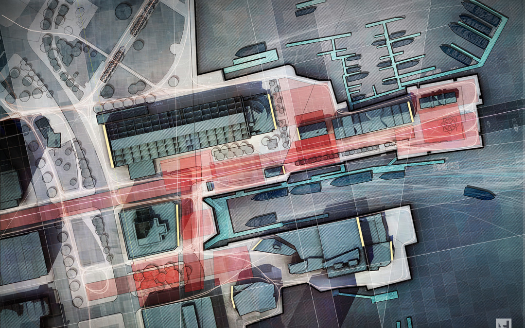
I have been playing around with some diagrams for the recent train pavilion design. The architecture diagrams that I create on this site have ranged quite a bit over the years. Lately, I have been gravitating towards a minimal approach for these types of...

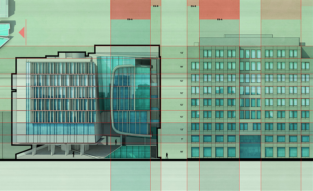
by Alex Hogrefe | Oct 12, 2014 | Over Time, Portfolio Vol. 4, Project 02 Cultural Center, Uncategorized |
As the 3d model progresses, I find myself spending a lot of time defining and organizing the way different elements are grouped in the model. I posted a video a while back showing a time lapse of the construction of one of my models. I rarely use layers but instead...

by Alex Hogrefe | Apr 14, 2014 | Over Time, Portfolio Vol. 4, Project 01 Long Wharf |
This post is also a follow up from many emails asking me to explain the diagonal line hatching used the site analysis diagrams. There are two methods in Photoshop that I know of that can create the diagonal line hatch seen in the image above. Both options use a...

by Alex Hogrefe | Apr 6, 2014 | Over Time, Portfolio Vol. 4, Project 01 Long Wharf |
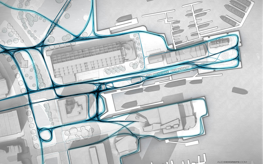
I received a lot of emails asking if I could explain how I created the pedestrian paths diagram in the previous post. To generate the line work, there are many ways this could be done. In the past, I probably would have used the spline tool in CAD. The line...

by Alex Hogrefe | Mar 23, 2014 | Over Time, Portfolio Vol. 4, Project 01 Long Wharf |
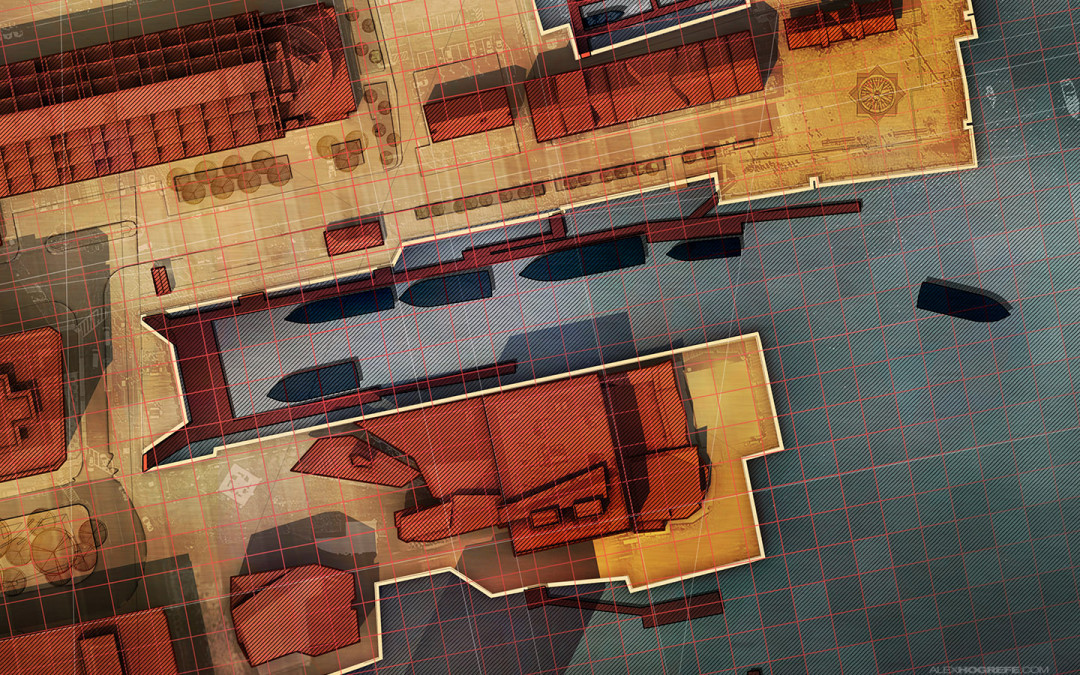
I have been experimenting with some site diagrams of the existing conditions of Long Wharf in Boston. I am mostly interested in introducing texture and depth to diagrams that are typically presented in a more simplified manner using solid colors...

by Alex Hogrefe | Jun 23, 2013 | Over Time, Portfolio Vol. 3 |
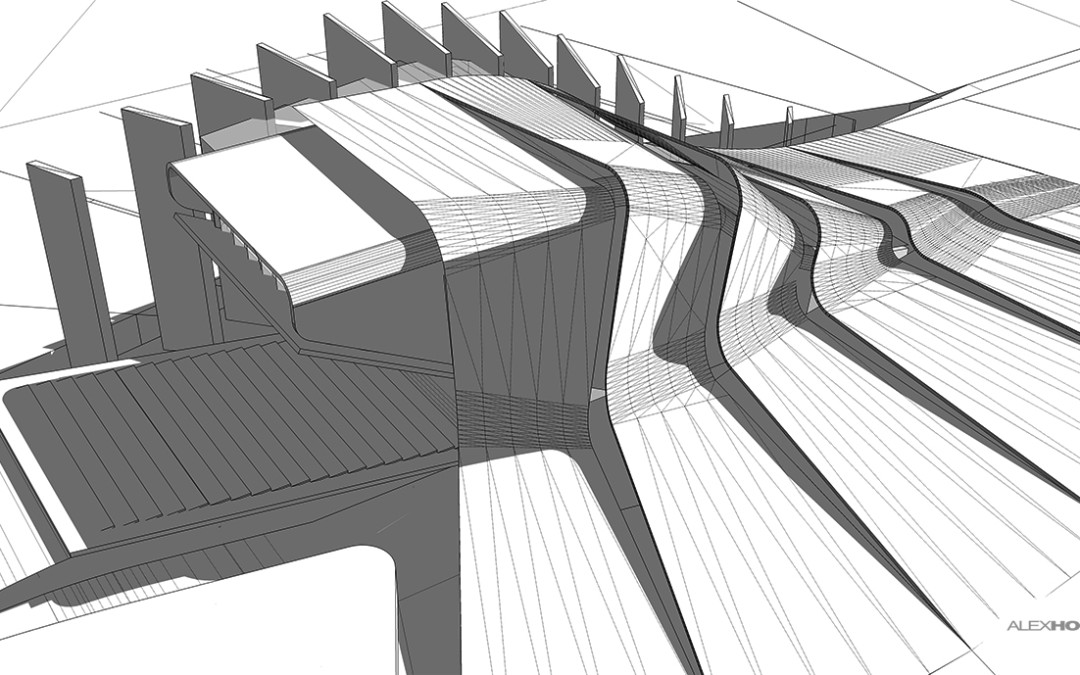
I received a lot of comments asking for an explanation of how I made the model and more specifically the curved geometry. Sketchup by itself is not well suited for “organic” modeling. You need the right plugins to get the “rhino-esk” functionality....

by Alex Hogrefe | Jan 2, 2013 | Over Time |
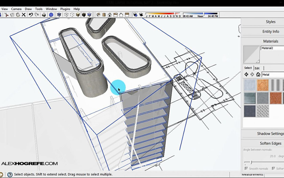
I thought it would be interesting to put together a timelapse video showing the basics on how I built the urban tower seen in the past few posts. A couple of things to note about this video is that I didn’t spend a lot of the time with the finer details...

by Alex Hogrefe | May 28, 2012 | Over Time |
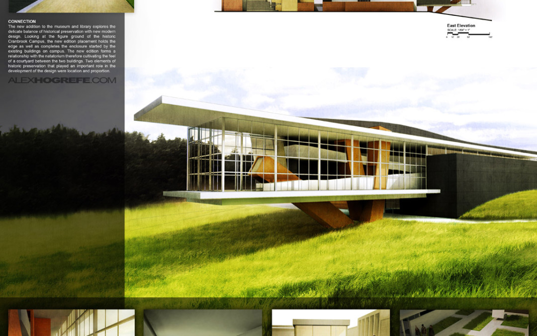
This post is continuing off of the 4 boards discussed last week. To get up to speed on what I have already done so far, read this first. For the most part, I kept the overall layout of the original presentation, however, I have been tweaking certain elements...
