by Alex Hogrefe | Jun 10, 2020 | Break Down, Final Moves, Portfolio Vol. 6, Project 10 Prairie Office, Uncategorized |
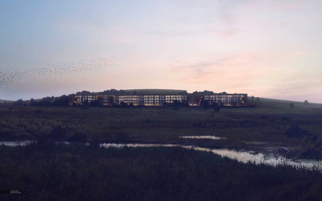
I don’t often discuss in detail how I tone images because the process ranges so much from image to image. Daytime images use different techniques compared to overcast images or dusky images. On top of that, sometimes I am in the mood to really experiment with color...

by Alex Hogrefe | Nov 5, 2012 | Final Moves |
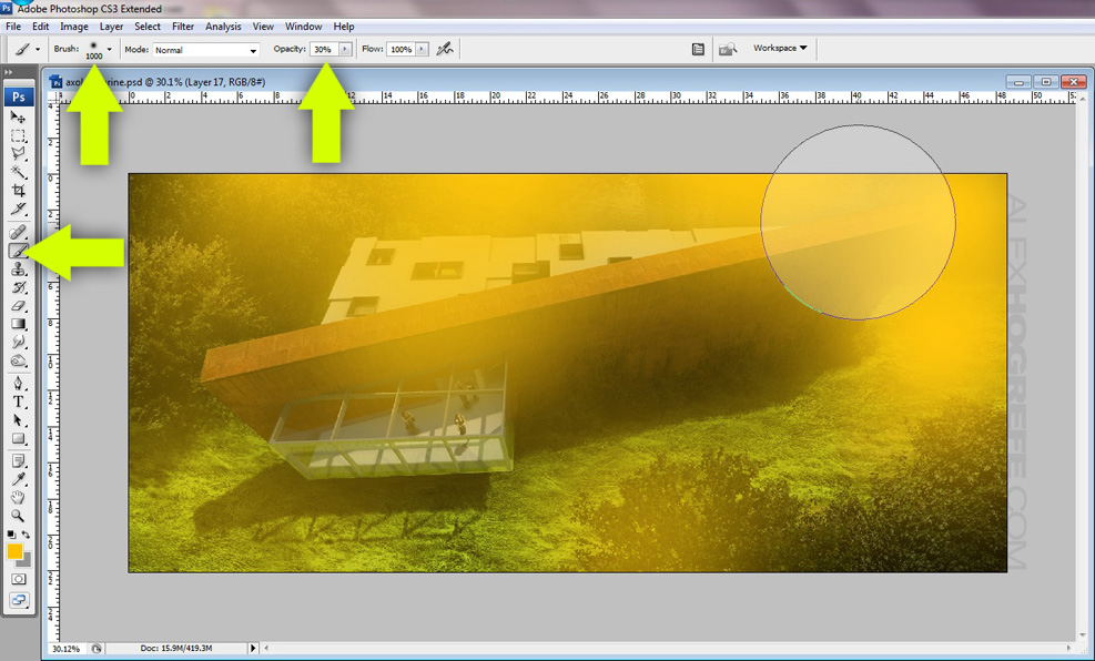
I thought I would pull another move from the Bob Ross play book. He was always great at creating depth in his paintings by saturating and darkening the elements that were closest to the viewer and then lightening the hills and mountains further off in the distance....

by Alex Hogrefe | Nov 29, 2011 | Final Moves |
I posted a landscape video tutorial a few weeks back, however the video did not cover some final post processing steps used for the final look. I received some comments asking for an explanation so I thought I would put something together quickly. The steps are...

by Alex Hogrefe | Sep 5, 2011 | Final Moves |
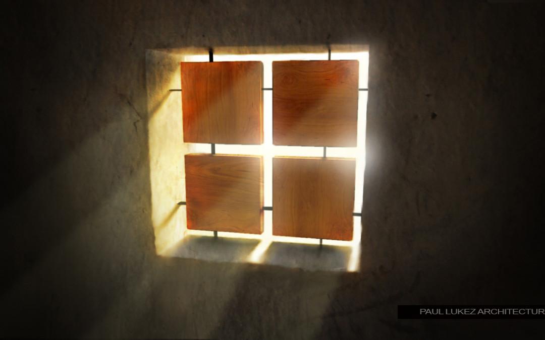
I received a lot of feedback and emails from people after posting the “Honduras Illustration part 2” asking for a tutorial on adding light rays. I put together this video explaining how this was done. You will will realize that there’s not...

by Alex Hogrefe | Aug 27, 2011 | Final Moves |
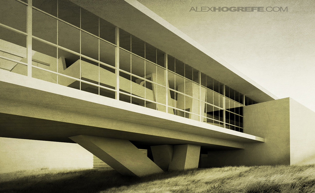
As I get more into photography, I find more and more things that overlap into architecture illustrations. One thing that I never thought about in school when creating illustrations was the idea of avoiding converging vertical lines. Obviously, this isn’t...

by Alex Hogrefe | May 8, 2011 | Final Moves |
As with many of the other tips in this series, this tutorial adds a last minute “kick” to an architectural illustration. What is nice about this process is that the contrast is increased, but at the same time, the sharpness is decreased providing an...

by Alex Hogrefe | May 7, 2011 | Final Moves |
Vignetting is something you see a lot in photography, and it works just as well in architecture illustrations. The idea is simple, the edges of the illustration are darkened to “frame” the image and draw attention to the center. If there is a lot going on in...

by Alex Hogrefe | May 7, 2011 | Final Moves |
This tutorial looks at some grunge and sketch overlays to add a little artistic styling to an architecture image and break away from the “fresh from the rendering engine” look that too many architecture presentations have. Sometimes, illustrations need a little...

by Alex Hogrefe | May 7, 2011 | Final Moves |
Layer blend modes in Photoshop are something that I use for every rendering I do. I often will add a color overlay to change the mood of the illustration and provide cohesiveness to the different elements of the illustration. This process is quick and the...

by Alex Hogrefe | May 7, 2011 | Final Moves |
Adjusting the levels is similar to adjusting the contrast, but gives you more control. More importantly, it adds depth to an image and punches up the color just a bit. The process takes seconds, and is something I do at the beginning and end of post processing....
