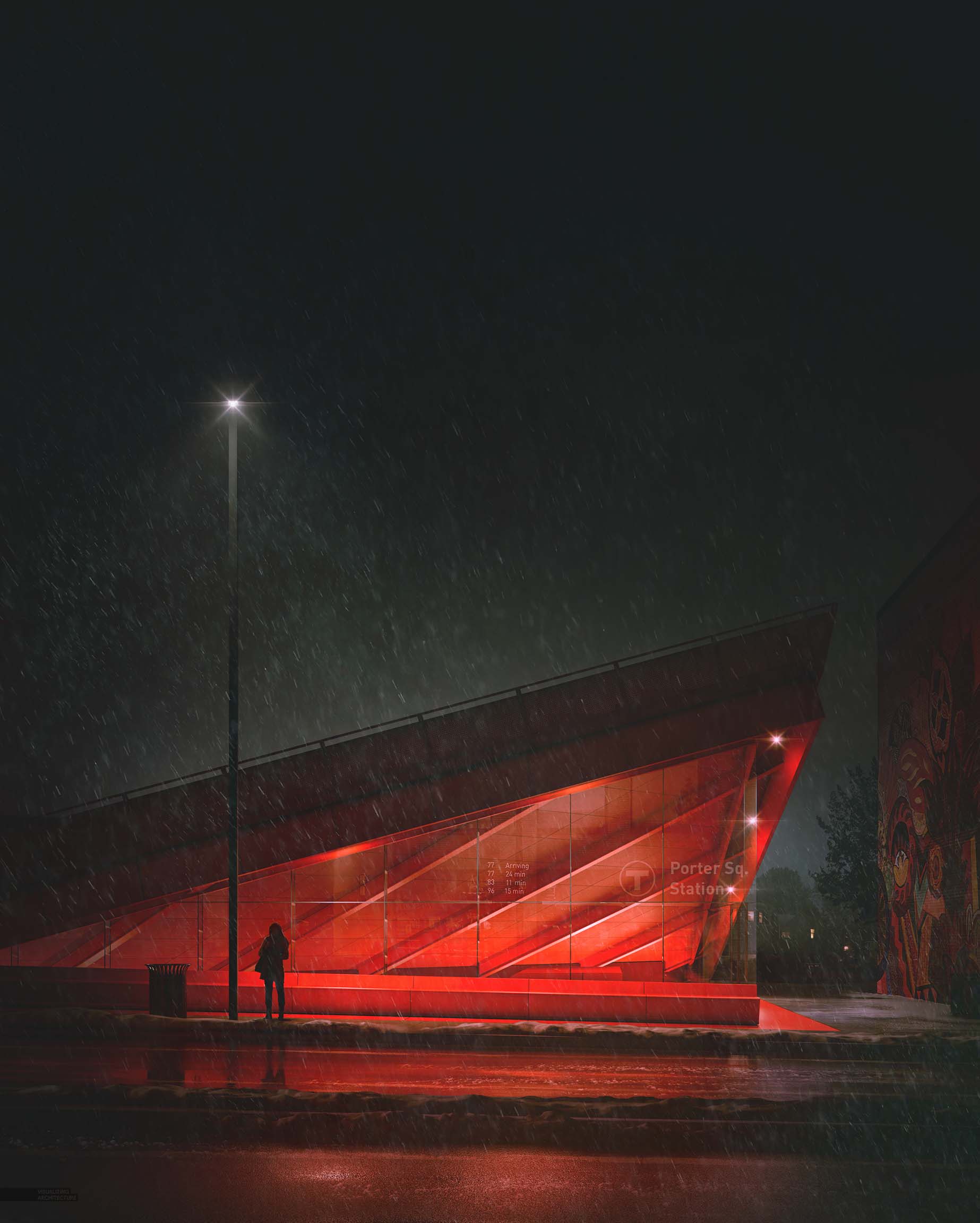
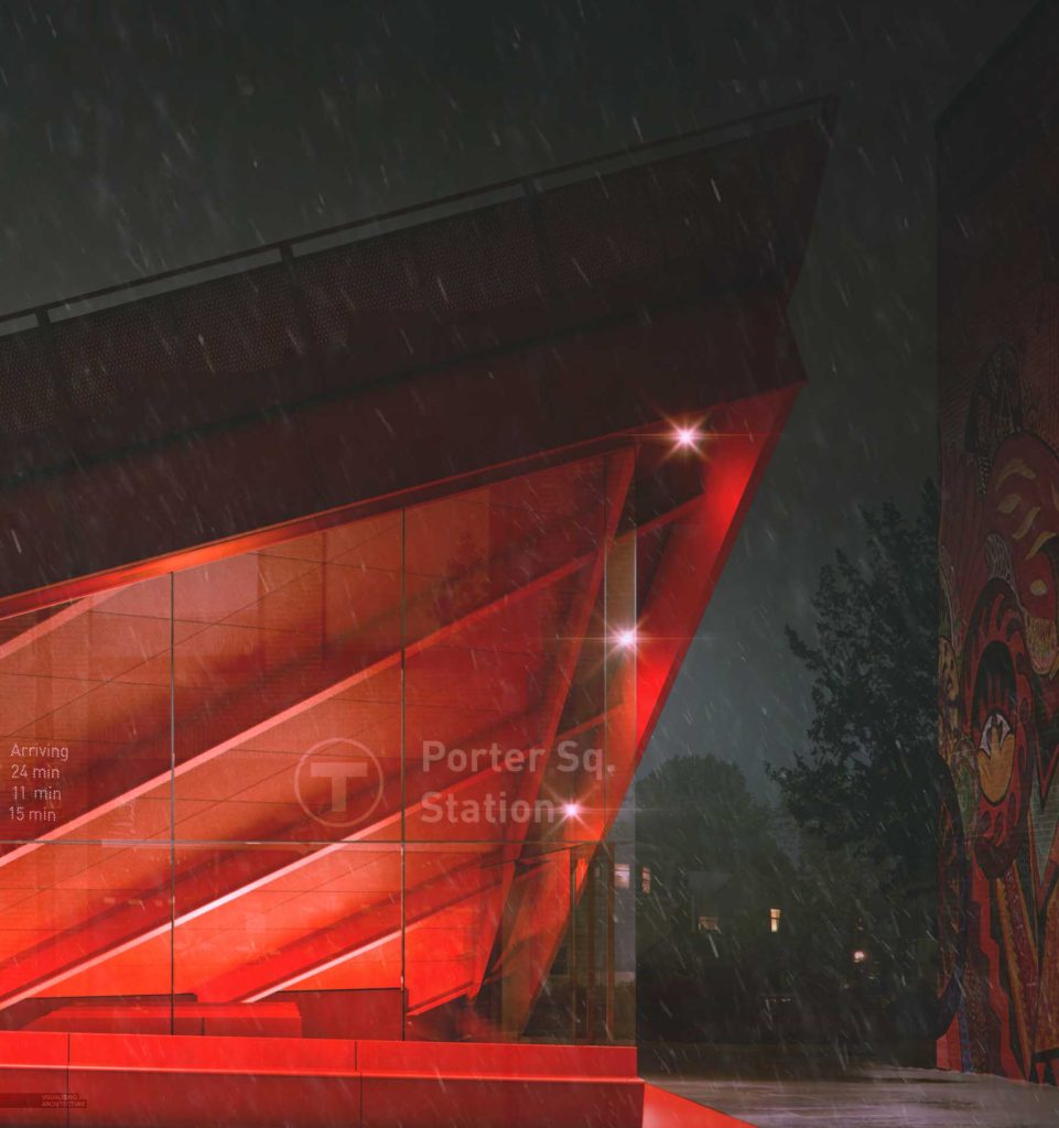
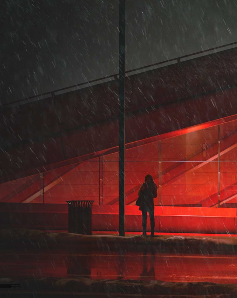
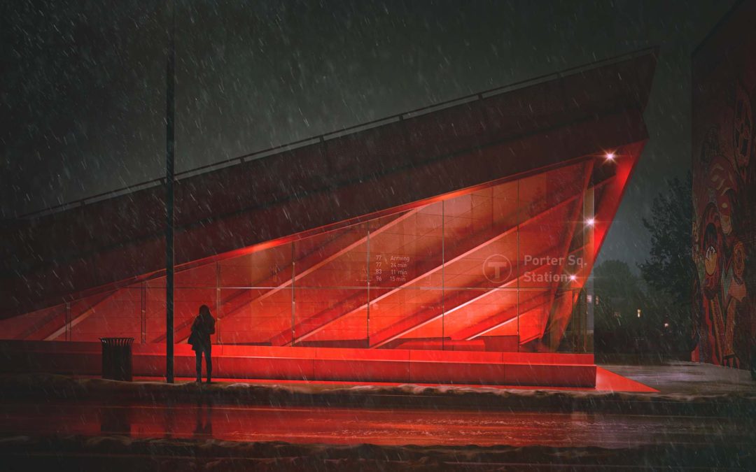
I was able to squeeze in another winter special illustration before the holidays roll around. For this year, I took things really dark and played up the red tones of the Porter Square Station design. The bus stop view is something that I have been planning in my head for a while. I wasn’t thinking it would be a winter scene initially, but because of the timing, I decided to add in snow and turn it into this year’s winter special. The core parts of the image came together quickly because I recycled the 3d scene and lighting from my Night Image Rendering a few months back, and then modeled in the extra detail around the bus stop. Most of my time was spent experimenting with different color grading options. At one point, the image contained lots of blue tones, but it started feeling too much like my other night scene. Then it shifted to greens, and then several other color combinations. In the end, I took things really dark and destarturated much of the shadows leaving the reds to really pop.

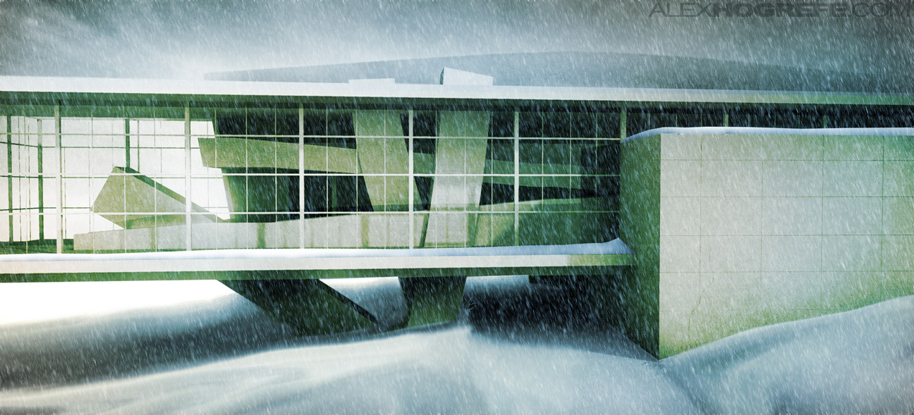
To see all of my past winter special images visit some of the links below:
Winter Special #7

Winter Special #6
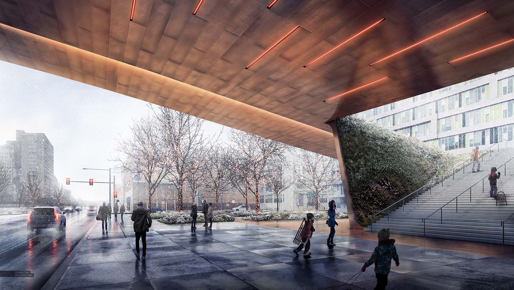
Winter Special #5
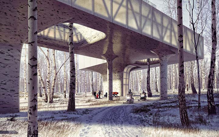
Winter Special #4
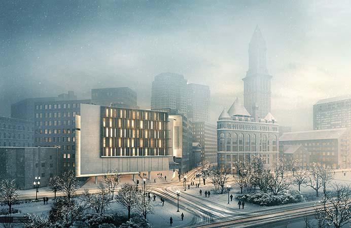
Winter Special #3
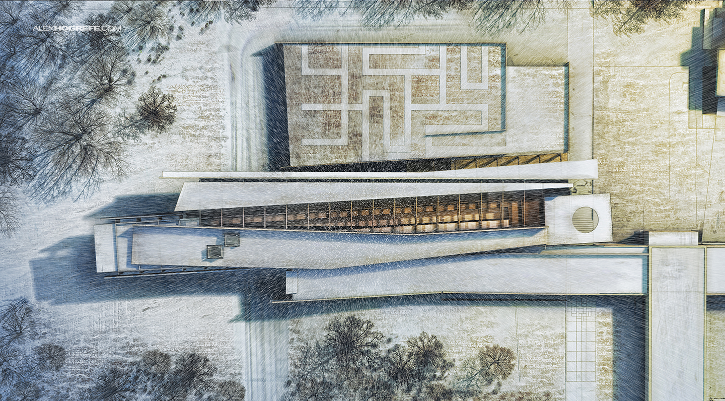
Winter Special #2
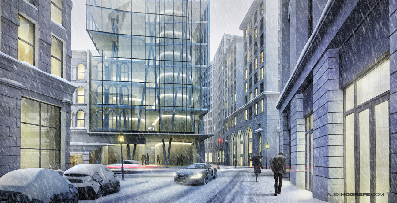
Winter Special #1


Such a amazing blog for the winter special
I love the images but isn’t the image crooked? I mean the horizontal not horizontal?
@Odair, The street out front has a slight slope to it. Just trying to keep it accurate!
Your blog is really interesting and inspiration to many. I’ll be looking forward to more of your posts.
I have been following your site from the last 5 years. I really appreciate all your work. do post something on twin-motion also!
Thanks for sharing the good information wits us
thanks so much
Thank you so much for this wonderful Post. This is an awesome post thank you for sharing this interesting post…
Nice! thank you so much! Thank you for sharing. Your blog posts are more interesting and informative. I think there are many people like and visit it regularly, including me.