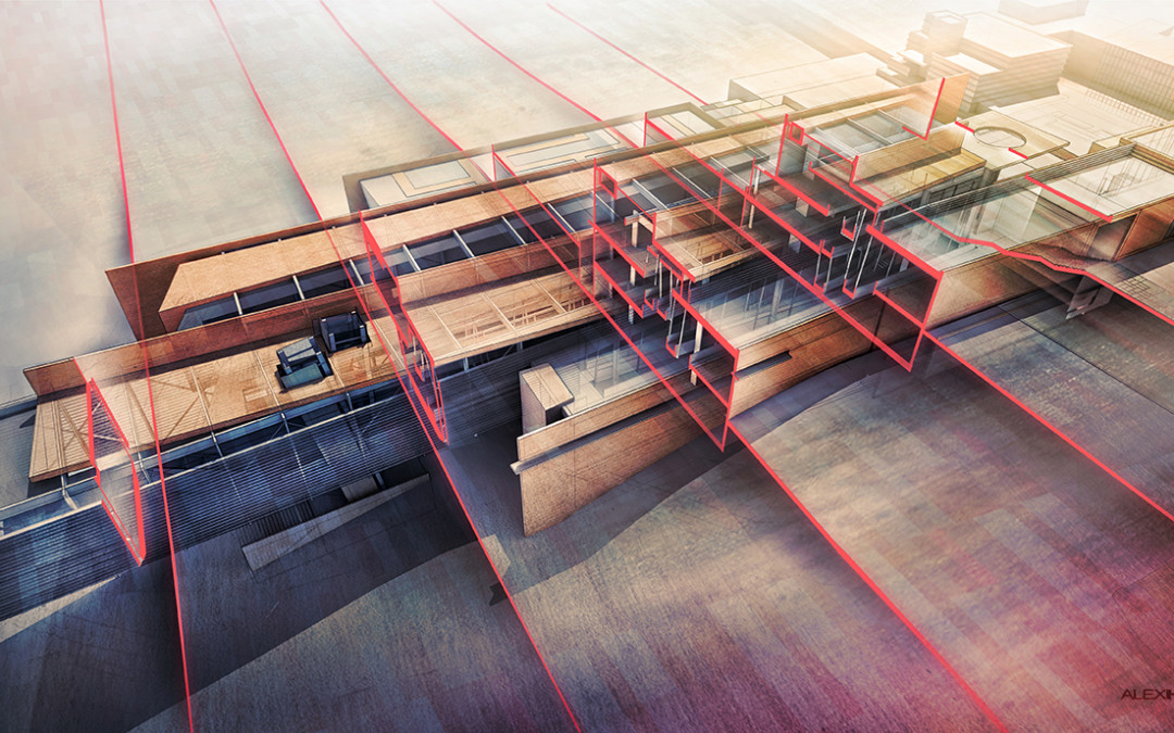
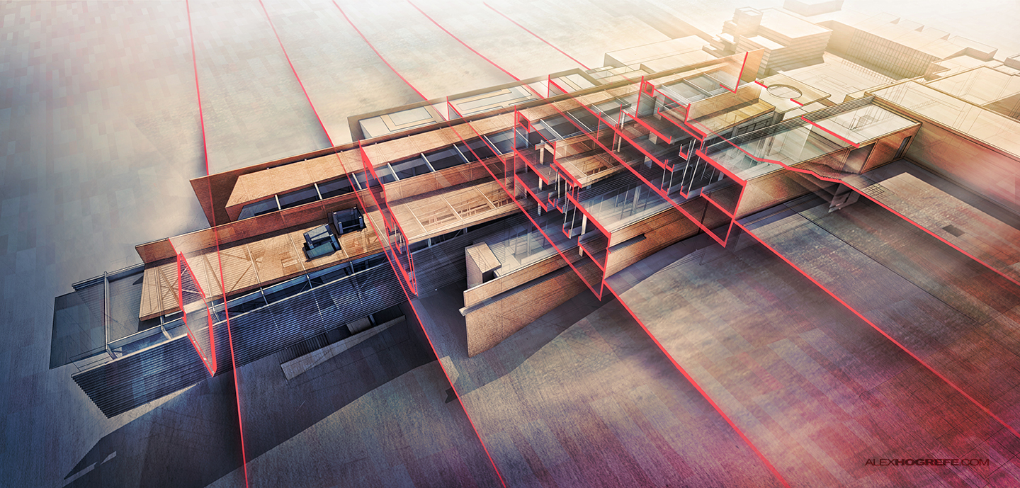
Ever since I rebuilt this model a few months back, I have been wanting to generate an x-ray image of the Cranbrook project. I was having trouble getting the image to read properly because the design doesn’t lend itself well to the x-ray style that I have shown in the past. The problem was the complexity of the structure in relation to the building form and ramping system. There was so much geometry competing for attention that the spatial understanding was getting lost. I then explored cutting several transverse sections along the length of the building to combine them into one perspective view. I wanted to see if I could create an image that could achieve a dual reading of the overall form combined with a clear reading of each individual section. This allows for a clear understanding of what is happening inside at specific moments throughout the design while also explaining the relationship of the outside form with the interior spaces.
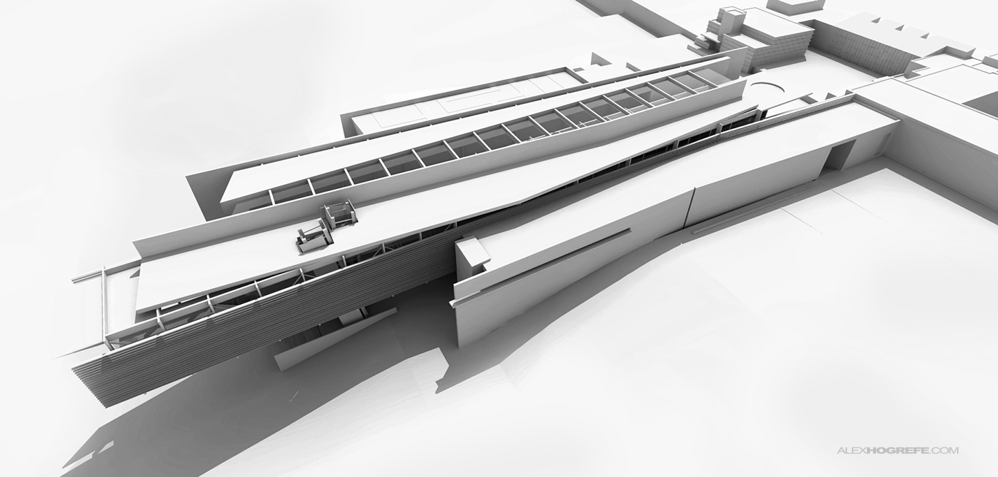
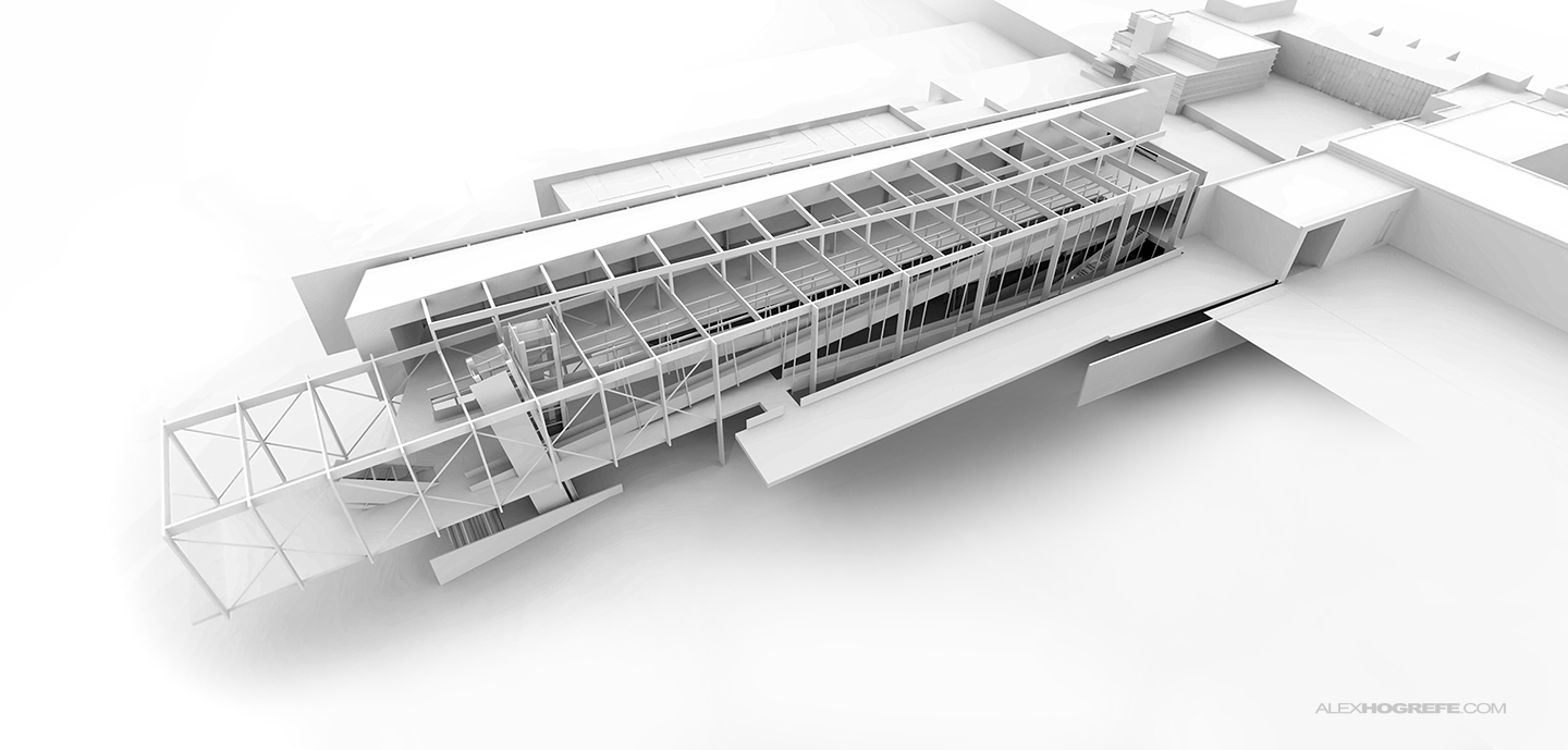
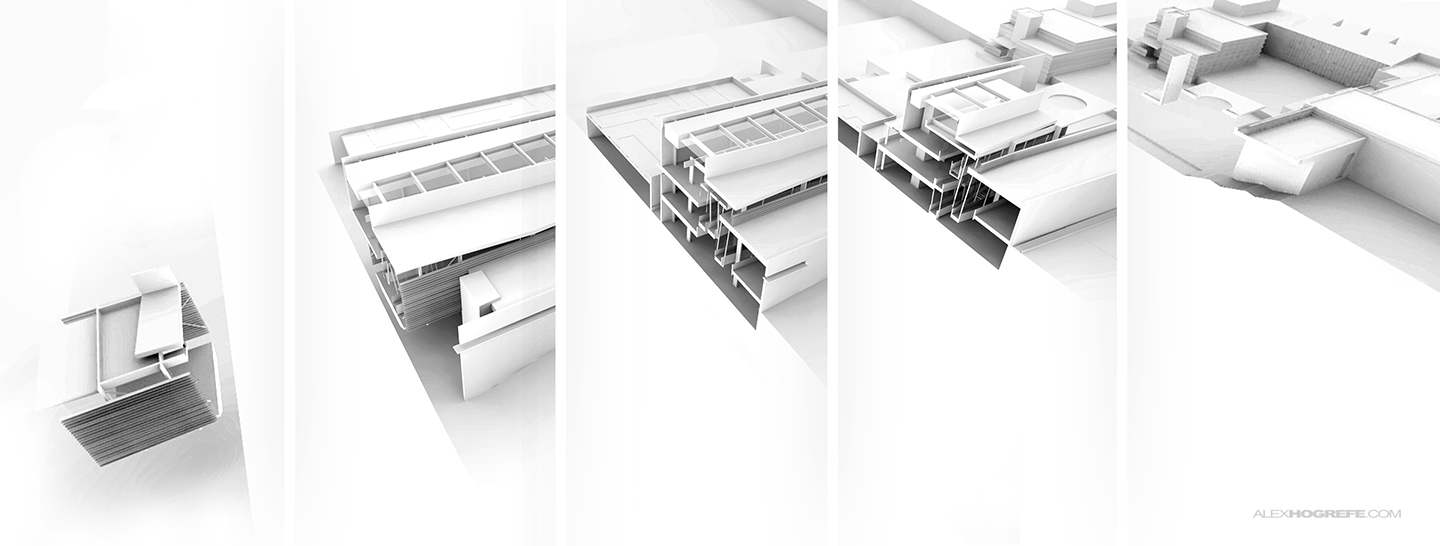
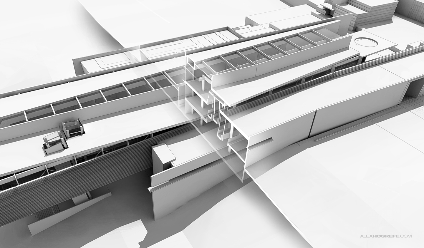
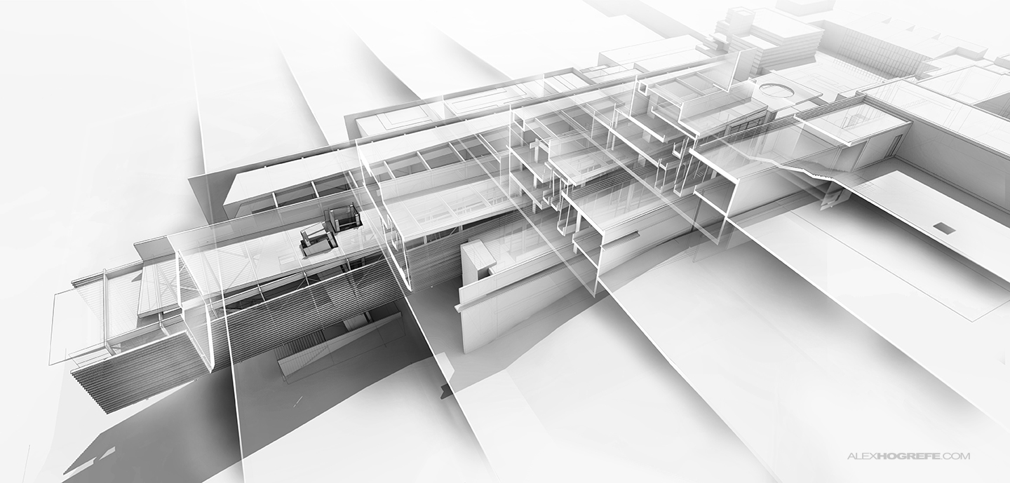
This illustration is made up of seven different renderings shown below. The first rendering acts as the base for the Photoshop file showing the entire exterior envelope of the design. The second rendering peels away part of the envelope revealing the structure behind. I then generated five section cuts using the ZORRO 2 plugin. To maintain certain control of the textures and color, I rendered everything as a clay model and then applied all of the textures and colors in Photoshop. You can revisit the clay model rendering tutorial HERE.
Above, a clay model rendering of the exterior envelope using Kerkythea.
Above, a clay model rendering of the structure with parts of the envelope peeled away.
Above, five rendered section cuts using the Zorro 2 plugin to generate the cuts and using Kerkythea to render them.
With all seven renderings, I began piecing them together. I took each section slice and removed anything that was about 20 ft. away from the cut. I then used layer masks to blend the section into the large exterior building rendering.
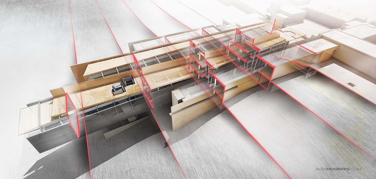
Once the clay model renderings were blended together, I began layering in color. I took my time with this step, slowly adding textures to the ground and walls. I knew I wanted a lot of color in this image, but I wanted it to have depth. This meant using several color overlays to achieve lots of subtle changes in tones throughout the image.
I probably used 15 different color overlays to create the final look. I was also splotchy with where I added the color. You can see in the final image that the blues are stronger in the shadows, the yellows are stronger in the light areas, and the reds are stronger in the transitional areas. Some Vignetting, light, and fog provided depth to the image and encourages more eye movement around the illustration.
Since this type of illustration requires seven different renderings, the setup takes a little longer than normal. However, once in Photoshop, piecing everything together goes relatively quick. I still think there is more room to clarify the reading of the image. The building envelope gets lost among the sections in a few areas. Ultimately, I decided that the sections should be hierarchically stronger which meant sacrificing the clarity of the building form. There may be a better way to pull this off which I will continue to explore in the future.


Hi Alex, I'm Architecture Student from Colombia. I like your job. I'm follow your page from six months ago. i would like to ask you, do you install kerkythea in your mac and how do you do that? and how do you do the terrain at sketchup?
@Carmelo,
Just download Kerkythea and its SketchUp plugin on its official site. They offer a Mac version. You will need XQuartz installed to use Kerkythea.
Amazing, great idea to illustrate seccions.
Thanks for sharing your work and give us the opportunity to learn!
Greetings from Baja!
Thanks for the brilliant blogs so far, and to come alex. Just a quick question regarding Kerkythea clay rendering – How do I minimise or remove the little glowing edges and spots of light that often show up on complex geometry? Ive noticed it still shows up on some of your clay renders but minimally.
All the best
@Trunkers
Using higher rendering presets such as the "0.7 PhotonMap – High + AA 0.3" or even the Fine setting above that in the rendering dialogue box should completely get rid of the glowing edges and spots. It will just mean the rendering will take a little longer.
Thanks for the quick response Alex. Ive set it to PhotonMap – Fine + AA 0.3 and there seems to be little change. Is there anything else you could suggest?
@Trunker,
It could be a few things, but it is hard for me to know without seeing the image. Maybe message me with the image through my facebook website page and I can take a look at it.
I think the image may have worked better in parallel projection, the sections feel a little squashed and out of proportion and don't really give much of an idea of how the space changes throughout the building as you have to mentally adjust for the visual distortion. Maybe arranging the building in a 30 or 45 degree angle pointing to the bottom right and arranging the sections along it so that they don't overlap would be clearer. The idea of overlapping the sections onto an existing rendering is pretty cool though.
Great work I just love the clay rendering of the structure ! pretty sick ! I just created a architecture portfolio blog, yours' inspiring
this image is conceptually, spatially, and graphically stunning. amazing work. keep them coming.
this is great work and i realized some clients increased their demands of this style.
The techniques are quite familiar – but how would you describe/compare the time you need for these kind of images versus typical exterior visuals.
here i see much greater time in modeling and rendering/setup etc. while photoshop might be equal or slightly more.
would you say for such image you need twice or thrice the time to complete?
Just the more complex modelling for interiors seem to have a big influence.
I'm just interestet and would like to know.
Hi Alex,
Just wanting to know, with your new Mac, are you still using Kerkythea? Ive just bought myself a mac too and Kerythea wont install?!
Thanks for all he help
Natasha (South Africa)
@Jens,
Honestly, these types of images take less time because the amount of Photoshop is less than a "photo-realistic" image. There is much less perfection needed (also less trees, people, etc). Also, there are more renderings needed, but they are clay renderings which render much faster than highly textured images. It does require a slightly more resolved 3d model though.
@Natasha,
I did get Kerkythea to work on the MAC side but you need to install an "X-11" application which can be downloaded for free. I however am running on windows via Bootcamp for most of my visualization stuff now.
Hi, Alex. I really like this ghosted sectional perspective. So clear and so attractive. I have a question about the red section cut line. How did you do that? On Photoshop? or ?
Thank you very much
@Tom,
The red painted section was created in Photoshop using the polygonal tool and brush tool.
后期太大神了
Hi Alex, Great stuff! quick question: Do you cut every “piece” image? like, do you remove the background and cut the silhouette of each piece?