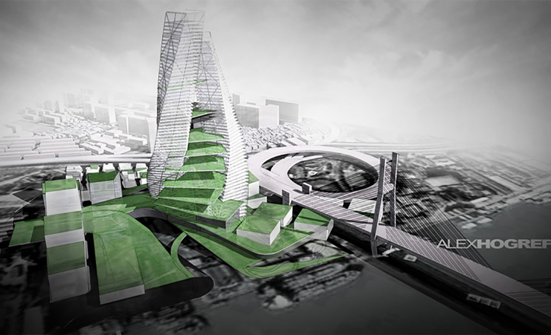
by Alex Hogrefe | May 7, 2011 | Final Moves |
Vignetting is something you see a lot in photography, and it works just as well in architecture illustrations. The idea is simple, the edges of the illustration are darkened to “frame” the image and draw attention to the center. If there is a lot going on in...
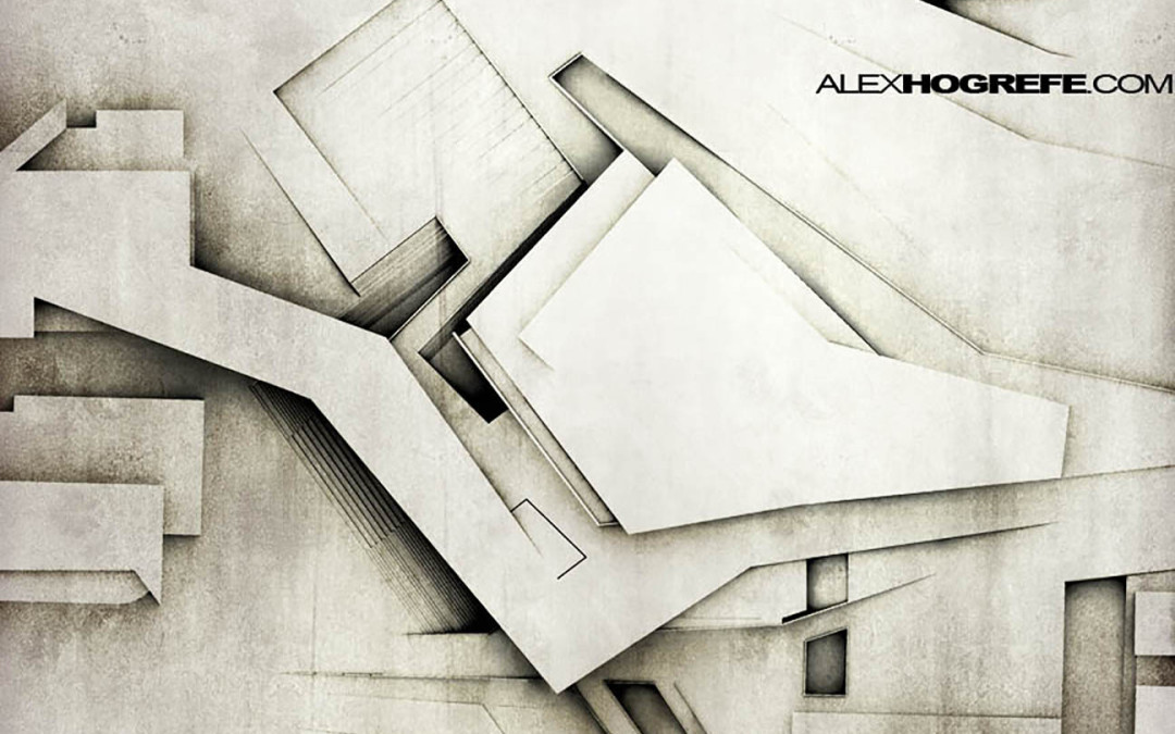
by Alex Hogrefe | May 7, 2011 | Final Moves |
This tutorial looks at some grunge and sketch overlays to add a little artistic styling to an architecture image and break away from the “fresh from the rendering engine” look that too many architecture presentations have. Sometimes, illustrations need a little...
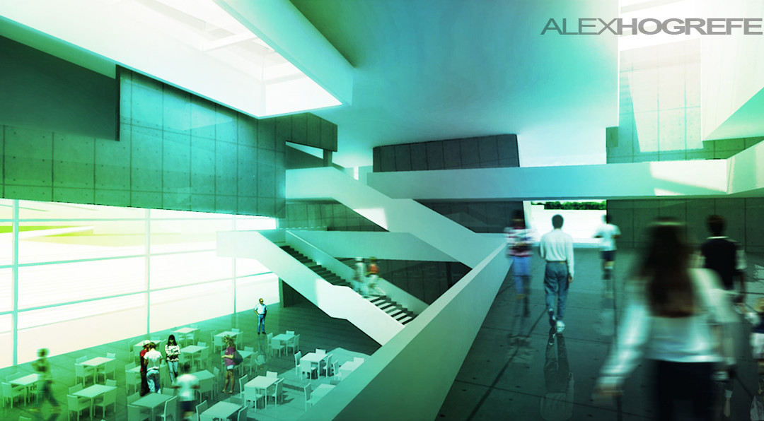
by Alex Hogrefe | May 7, 2011 | Final Moves |
Layer blend modes in Photoshop are something that I use for every rendering I do. I often will add a color overlay to change the mood of the illustration and provide cohesiveness to the different elements of the illustration. This process is quick and the...

by Alex Hogrefe | May 7, 2011 | Final Moves |
Adjusting the levels is similar to adjusting the contrast, but gives you more control. More importantly, it adds depth to an image and punches up the color just a bit. The process takes seconds, and is something I do at the beginning and end of post processing....
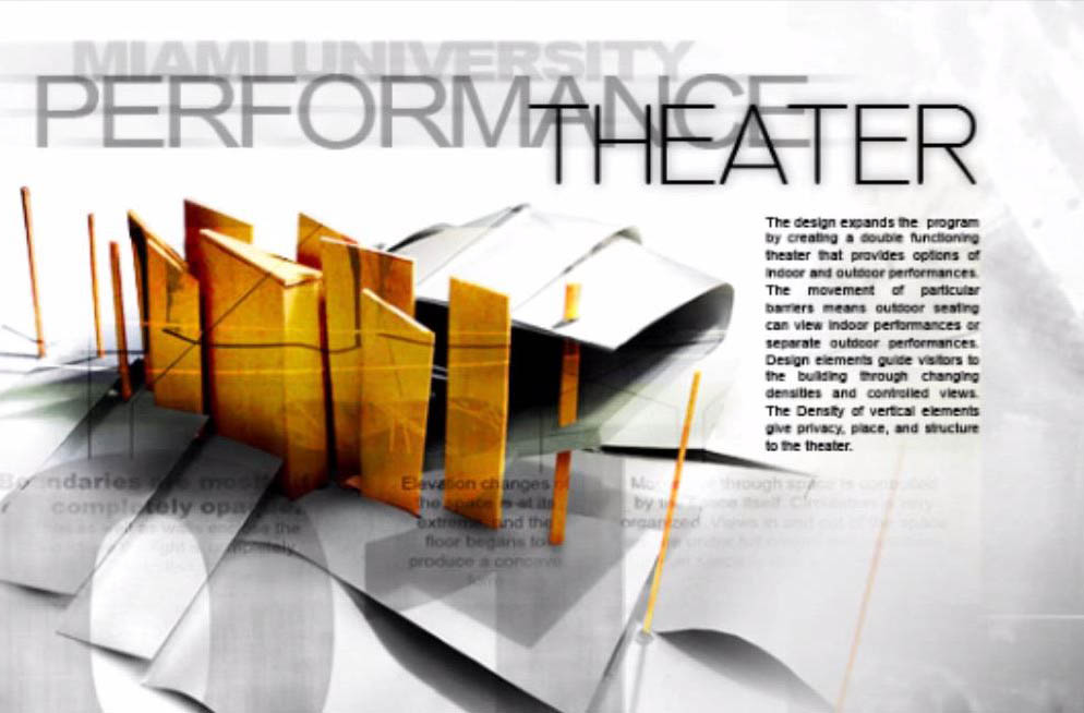
by Alex Hogrefe | Apr 10, 2011 | Portfolio Vol. 2 |
I take text pretty seriously. I think of it as an opportunity to enhance a portfolio page. The odd thing is that I really only use a few different fonts with arial being used about 75% of the time. However with that one font, it seems that text can be...