As the 3d model progresses, I find myself spending a lot of time defining and organizing the way different elements are grouped in the model. I posted a video a while back showing a time lapse of the construction of one of my models. I rarely use layers but instead rely on grouping to organize my models. This allows me to quickly move large sections out of the way to get to tight areas or focus on specific elements. Organizing the model into groups also saves a lot of time when it comes to illustrations. For example, exploded axons and x-ray illustrations are pretty easy images to create when the model is set up properly.
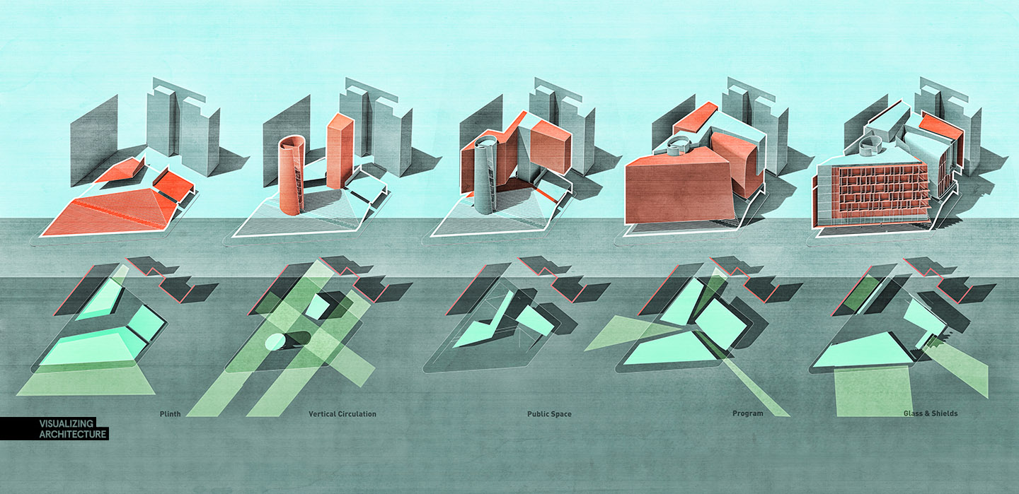
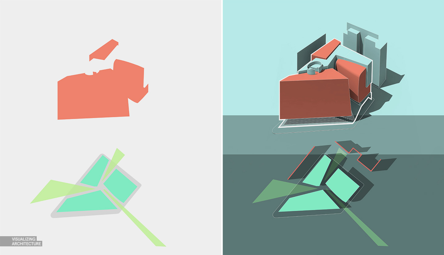
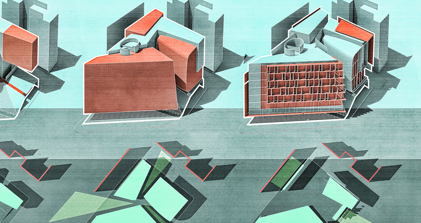
In the case of this model, as I was organizing the elements to help me gain control of all of the geometry, I realized that there was a diagram here. The way the model was grouped was also a way of explaining the project design. Each model I build is organized in different ways depending on the use, material, complexity, etc. In this case, the use is a museum/educational space. I therefore separated the model into the plinth, vertical circulation, public space and circulation, program, curtain wall/glass, and structure which wasn’t used in the diagram.
For diagrams like these, I rarely use textures in the model. I am trying to convey a specific set of ideas which materials can sometime confuse or dilute. In the illustrations above, I rendered everything as a clay model, which can easily be done with material overrides. For V-ray, this option is found in the “Global switches” tab and then checking the “Override Materials” box. As different as the above illustrations look, the workflows are nearly identical. I’ll give a quick break down below.
1. Background
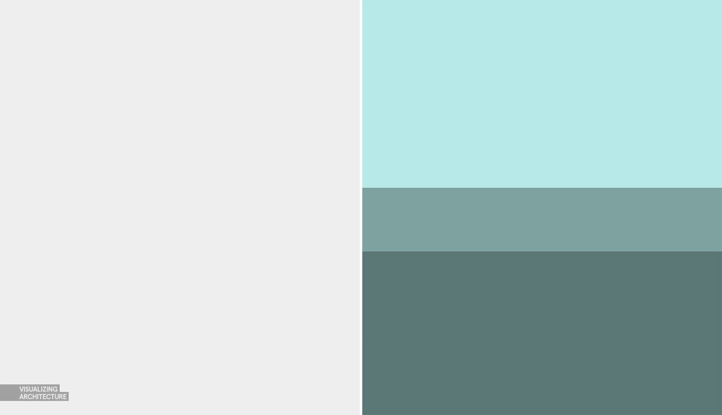
The tone of these diagrams is set by the background color. I often start with a color scheme that will inform how I will make decisions as the illustration progresses. I probably tweaked these colors 20 times before I settled on the green and blue tones. Even though I knew the initial colors would change, I still wanted to start with a darkened background because that gives me the opportunity to highlight elements and use white line work.
2. Clay Renderings
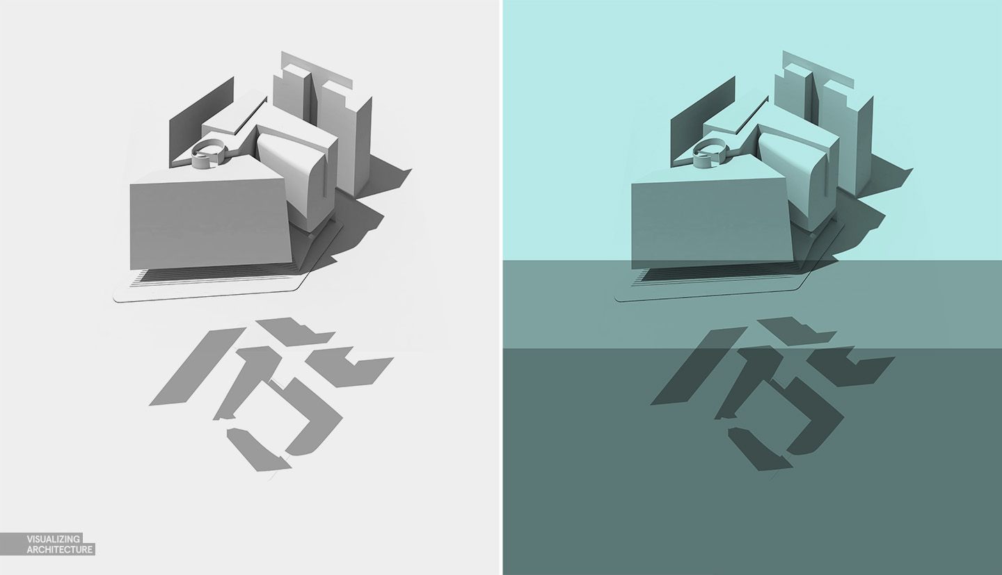
Clay renderings are one of the most useful types of renderings you can do because they are so versatile and quick. Even at high resolutions, they only take about 10 or 15 minutes to render because no material properties such as bump maps and reflections need be calculated. I have a tutorial describing how to rendering clay models in Kerkythea HERE. Other rendering programs such as V-ray provide material override options to quickly replace every material in the model with a simple matte grey. Once the clay model was rendered, I brought it into Photoshop and set the layer blend mode to “Multiply” to set it into the colored background.
3. Line work
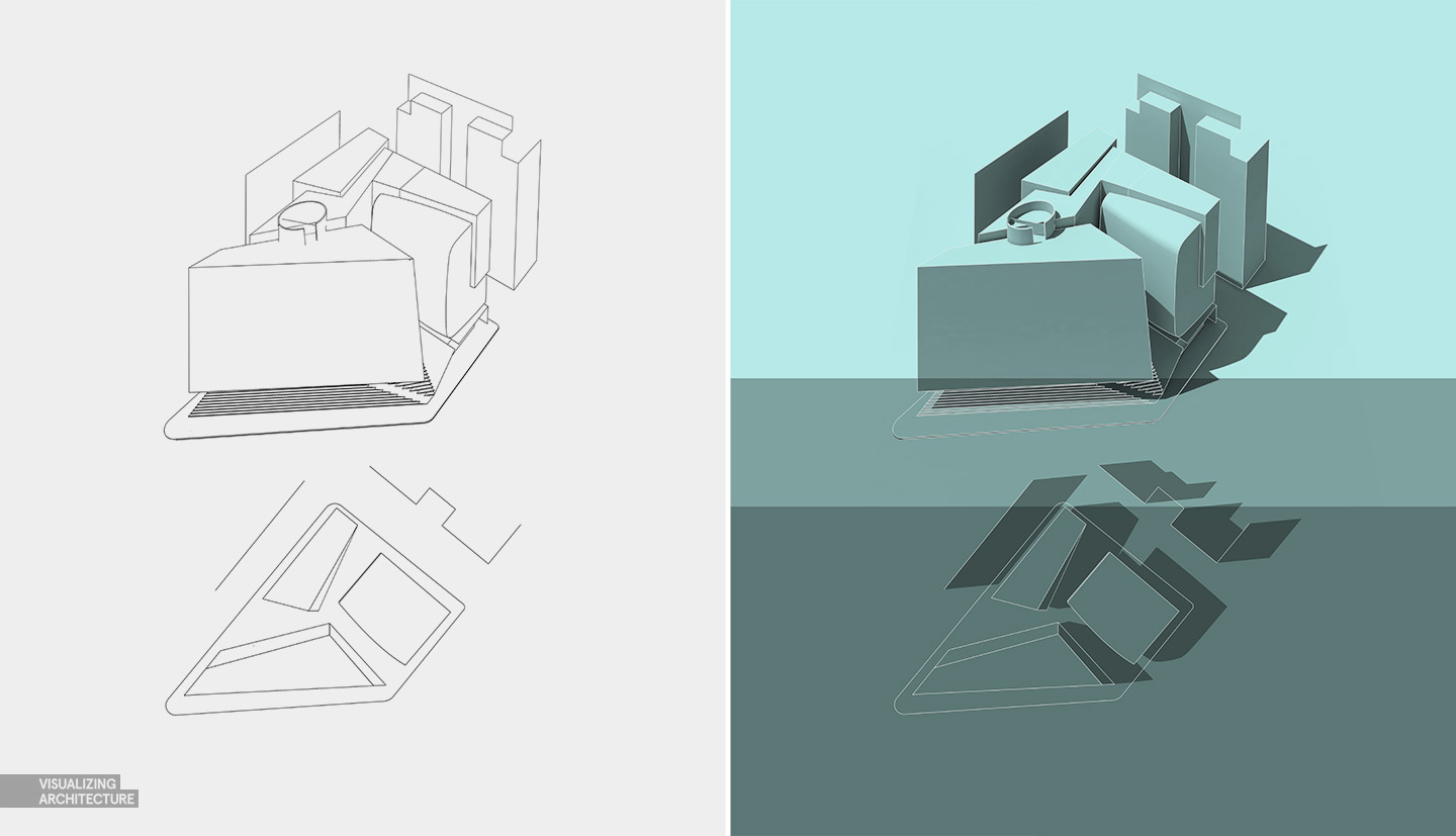
Line work is needed to clarify the forms and simplify the reading of the diagram. Here, I exported line work from my Sketchup model and brought it into Photoshop. I “Inverted” the colors so that the line work was white and the background was black. I then set the layer blend mode to “Screen” to remove the black background and keep the white line work.
4. Profile Lines
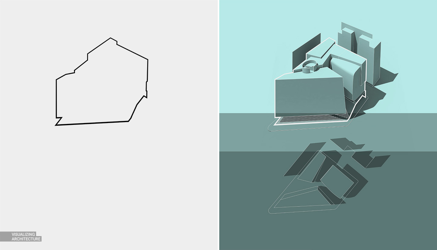
I am a big fan of thick profile lines. I think they do a good job of highlighting important information without drawing too much attention. Here, I use them to define the project boundaries. Since I only needed a few profile lines, I manually created them using the paint brush. By holding shift between clicks, Photoshop will draw a straight line between two points. The profile could also be created using the pen tool seen in THIS TUTORIAL, or by jumping into Illustrator.
5. Color
Color was introduced to setup a hierarchy of information. I wanted the viewers eye to start with the axons at the top so I intentionally used a strong color like red. I then introduced a second bold cyan color below that would draw the eye down after viewing the red elements. It’s also important to note that though there are a lot of different colors going on in these diagrams, they are of a similar family. Most have a green or blue tint with only a third accent color such as red brought in to highlight specific elements. Too many colors will start to compete against one another and the hierarchy will start to get muddy.
The color was added using the polygonal tool to make selections. I then used the paint bucket tool to fill in the selections. Finally, I moved the new color layer below the clay model rendering layer that was set to multiply which allows me to see both the color and shading.
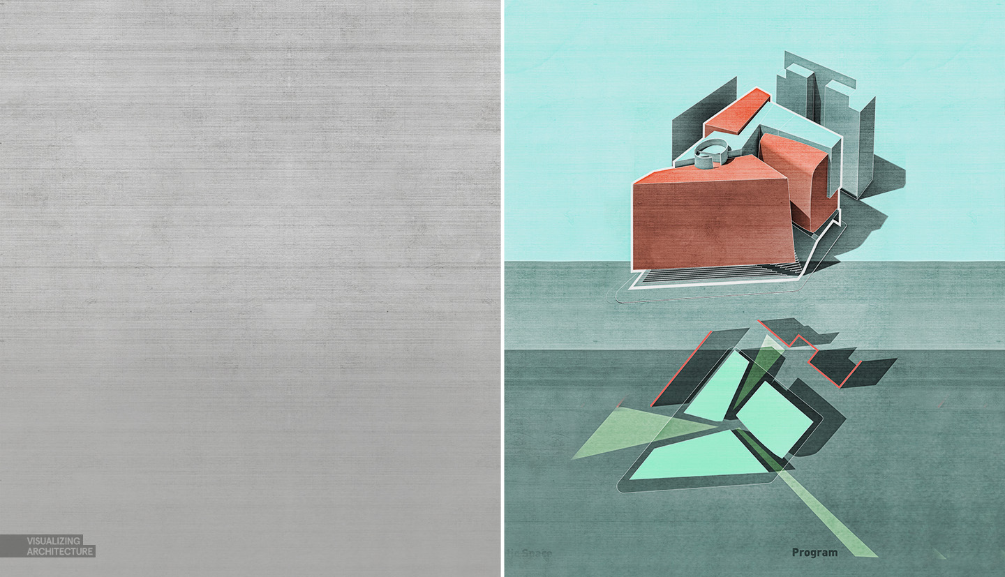
6. Grunge Texture
For many, the process could stop at the last step and the diagram would read fine. However, as mentioned above, I like texture which removes some of the perfection that is generated by computers. I therefore brought in some grunge textures and overlaid them on top. This adds some roughness and a human touch. A tutorial can be found HERE.
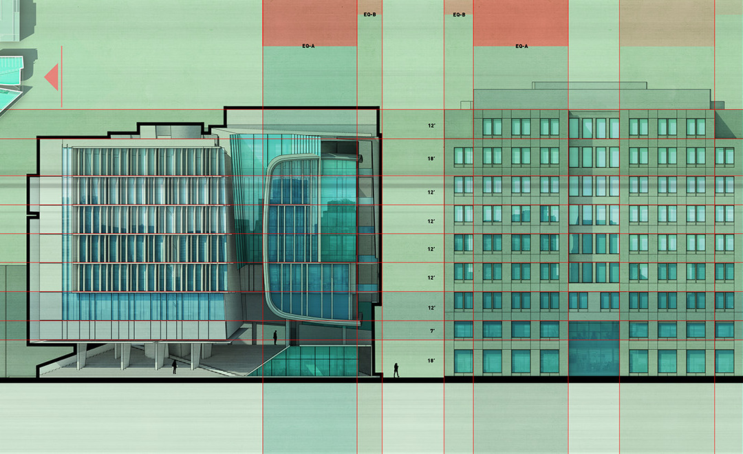
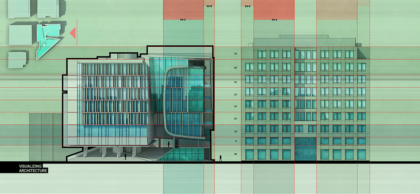
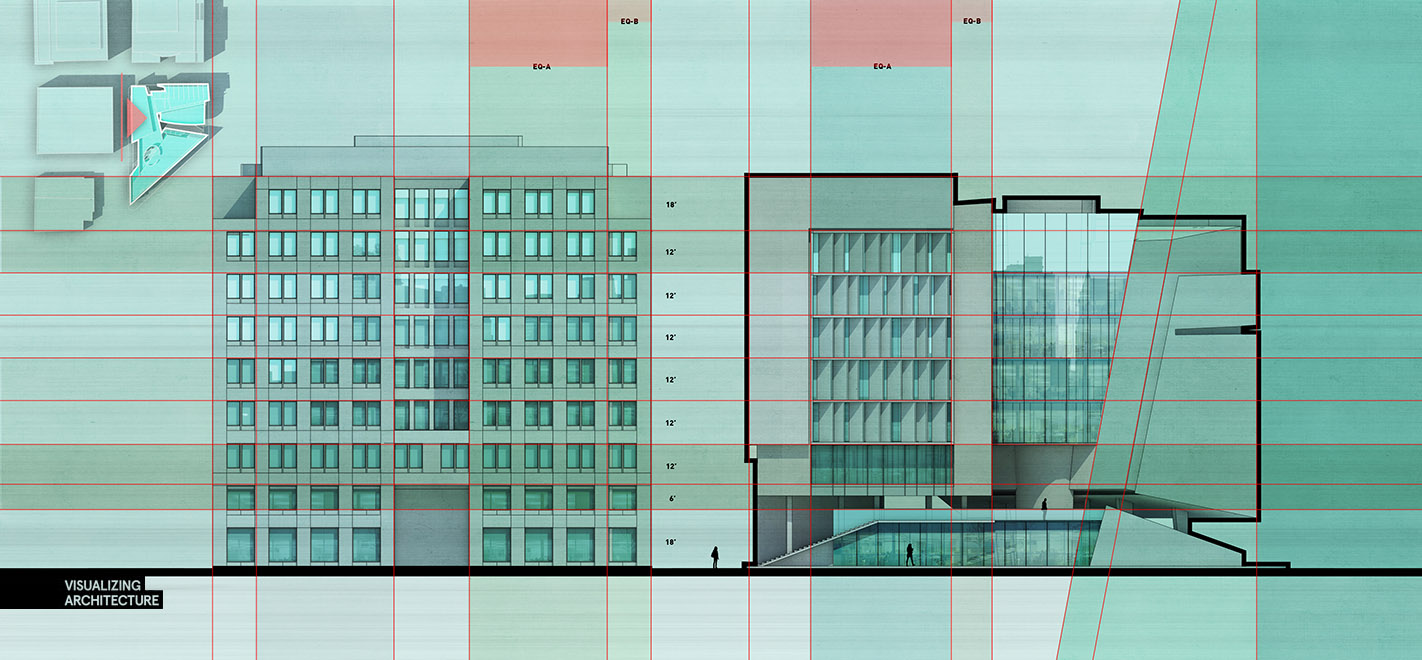
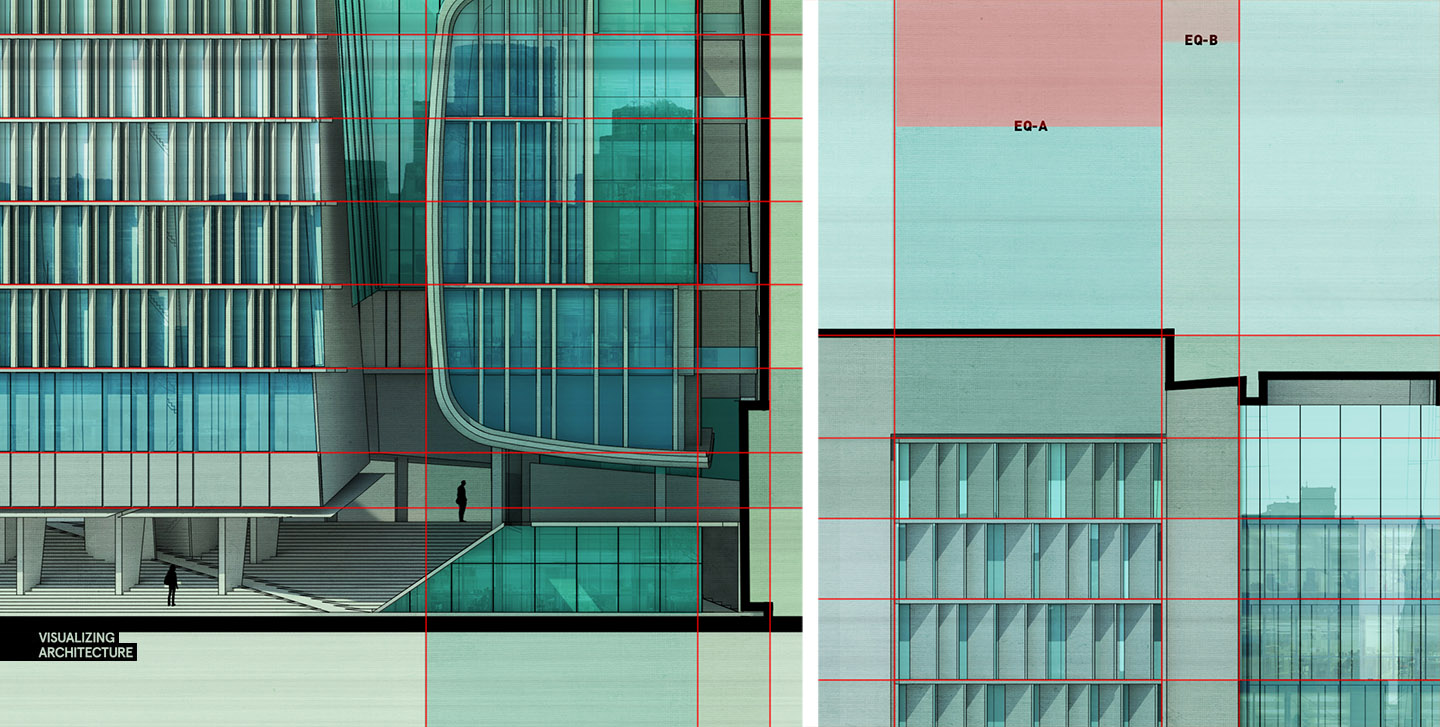
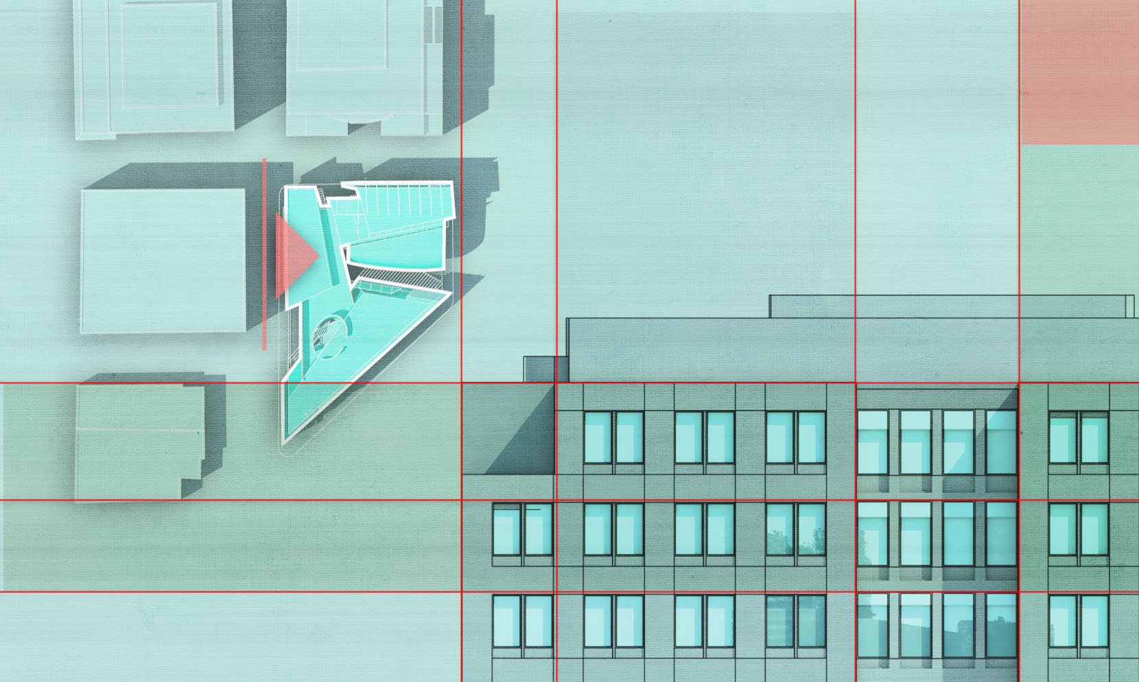
The elevations use essentially the exact same workflow. I started with a clay model rendering and then inserted in some line work and color. This workflow is about as simple as it gets and is fast. However, the success lives and dies with the control of the hierarchy. Too much material, too much geometry, or too much color will hurt not help the reading of your diagrams.


Hogrefe addiction fed, I drift away for another two weeks until my next hit…
Amazing! Thanks for the tips!
what a sweet presentation language
Hi Alex, you always get perfect linework results from sketchup.
For me, I am modelling and rendering (vray) in 3ds max.
Do you know some techniques for linework? I tried some toonshaders but I am not really happy with it. Thanks for your great work and sharing!
Hai Harry ,
I just wrote a reply inorder to help you out with the issue , you can just save your files in .3ds format and your can import them into sketchup and follow up with your linework techniques , sketchup supports .3ds format .
hope this helps.
Regards,
Sha.
Excellent work Alex my congratulations, an tx so much for share your knowlege
Long time fan of your work AH, really effective, clear diagrams. Not so sure about all of the background texturing and colourings, maybe it’s just me but it feels abit over processed in taking away from the work in the sections.
Dear Alex Hogrefe, it is really an interesting building diagram which easily to be understand but may I know what are EQ-A and EQ-B as well what does colour represent for? It is hardly for me to understand of you using different colour to representing something. Perhaps you could provide some info about it, so we know the reason behind all this lighten and darker colour. Thank you.
amazing
OH how us mere mortals strive for this level of perfection,Thanks Alex for the inspiration.
Excellente Work , My congratulations
http://designanddecoration.ma/
Thank you! This is amazing. Thanks a lot for sharing this awesome tutorial. keep it up 🙂 🙂
This text is well written.