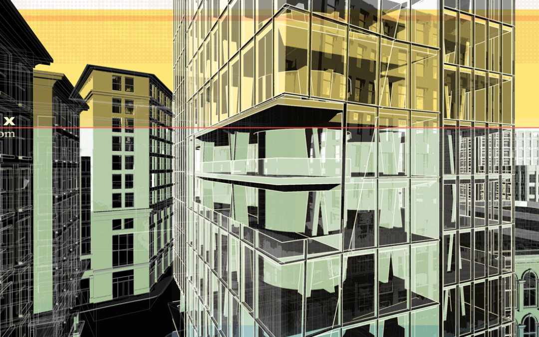
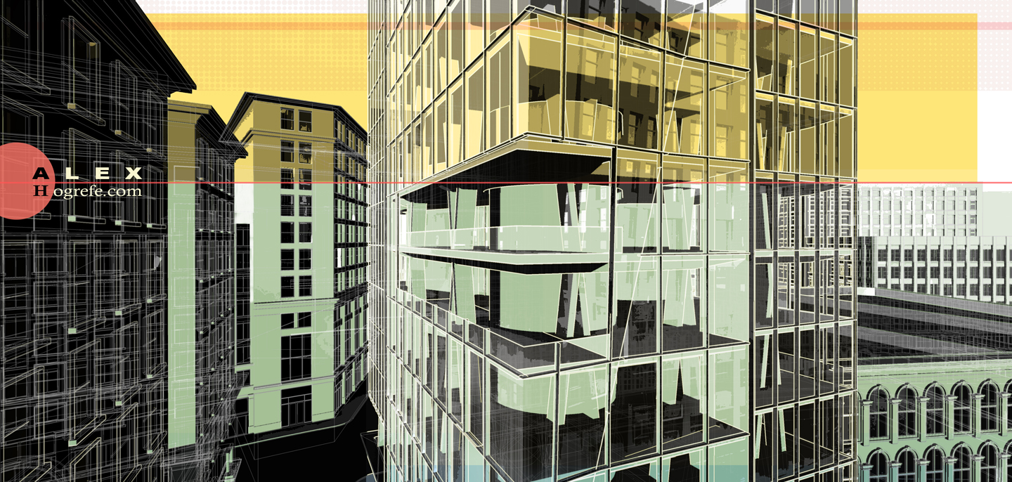
The past week was a busy one at the office, hence I needed to play catch-up with a lot of non-website related things this weekend. I did find time to put together this illustration of the urban tower model as seen in the past few posts. The urban model lends itself well to this style of illustrations because of the amount of line work I have to work with which allows me to be more selective with where I add and remove detail. I also like the relationship between the large tower glass facade and the gridded punched openings of the surrounding buildings.
To get a better sense of how this illustration was put together, take a look at past posts such as these: ABSTRACTING DEAD RENDERINGS , ABSTRACT ILLUSTRATIONS PART 2 , and PLAN OBLIQUE ILLUSTRATION .
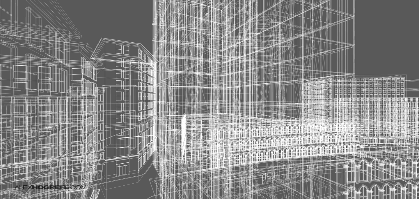
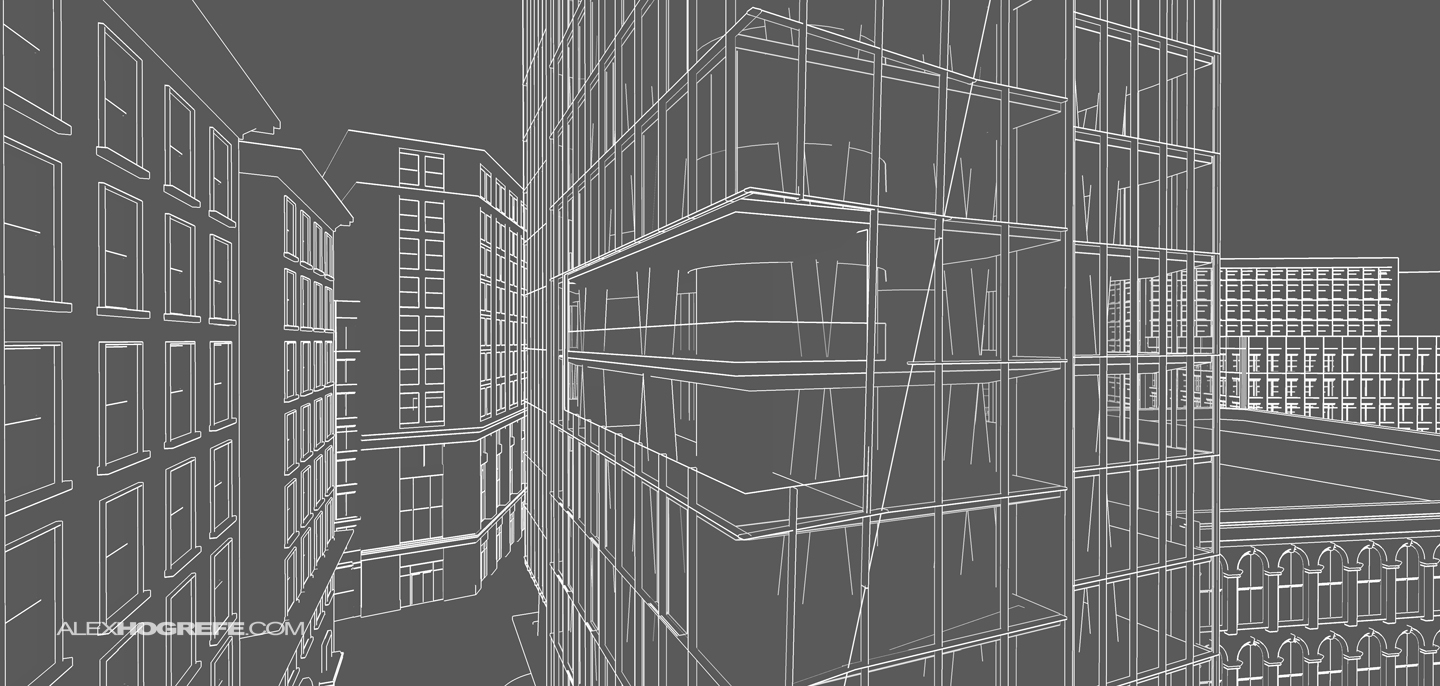
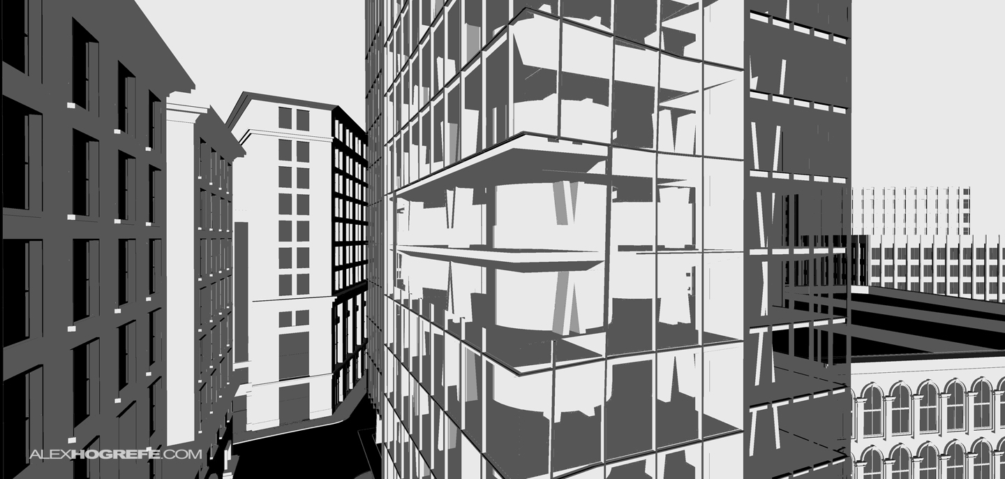
Below are a few of the images that I used to compose the final illustration:
Above: Sketchup wireframe inverted
Above: Model Profile Lines inverted
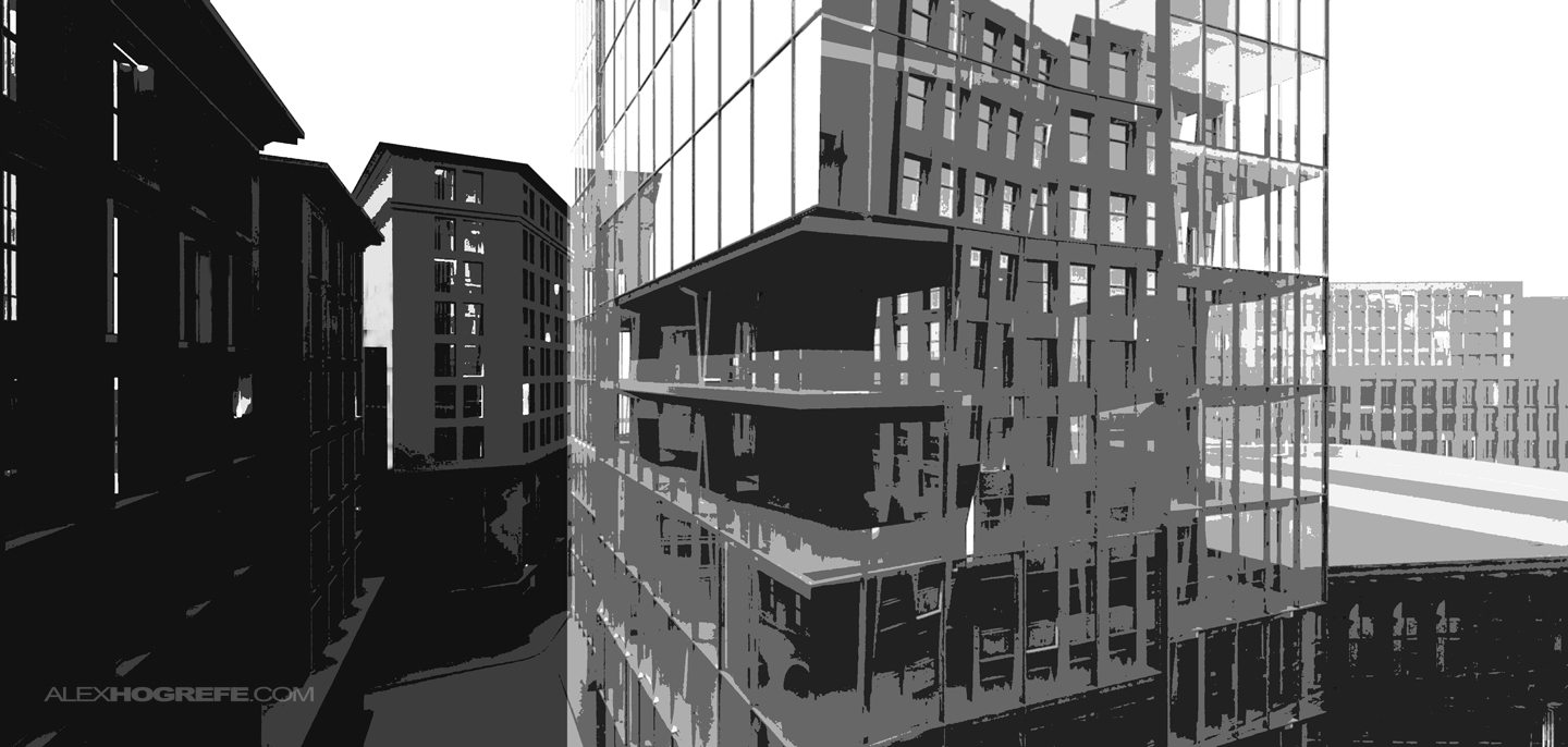
Above: Exported Sketchup color image with the Photoshop “posterize” adjustment set to 3 levels
Above: Rendering with the Photoshop “posterize” adjustment set to 5 levels
The final composition with color overlays added.


This is great.. Kepp up the good work
You have crazy mad skillz! Thanks for the continued inspiration. Your stuff is great and you break it down to make it so 'doable'. Cheers!
This is very good!!! your skills are PERFECT….
would you please explain more about " Rendering with the Photoshop "posterize" adjustment set to 5 levels"
whatever i do i just cant get the effect like you did!!!!
it doesnt give me the stains at all…!!it just alters the contrast!!!!
Thanks…
It's so… hipster. I love it !
@Enrique,
Under "Image>Adjustments>Posterize", there should be a slider where you can adjust the levels. Setting the level to 3 will give you less detail then setting the levels to say 6.