Life has been busy lately. However, I have managed to squeeze in a little time to create two new spreads. I have moved to a different project in the portfolio and I wanted to change up the style a little. Much of this portfolio so far has been very graphically intense meaning I rendered or post processed every image on the page. It’s very hard for me to accept any “white space”. This way of thinking comes from the fact that I am trying to fit as much information into as few pages as possible. The problem then becomes how to manage the hierarchy and avoid having the graphics all compete against one another.
One way to solve this is by taking the “less is more” route. Thinking minimally is outside my comfort zone but at the same time I find minimalist graphic design beautiful and refreshing. The difficulty comes from having to choose what to present and what not to present. If there is white space left on the page, I instantly start thinking what can I fit in there. For some reason, I have this fear that if there isn’t a lot on the page then it may appear like not much effort or time was put into the design. On the other hand, presenting minimal graphics successfully could show a certain comfort in the design and clearly drive home the concept.
With that said, I also wanted to explore putting some spreads together that didn’t require any rendering time and minimal Photoshop time. This site has many tutorials that look at abstract illustrations (such as this and this) yet there is very little on using these types of illustrations in portfolios or presentation boards. More than anything, I wanted to see if I could get these pages to be as informative and expressive as some of my other project pages.
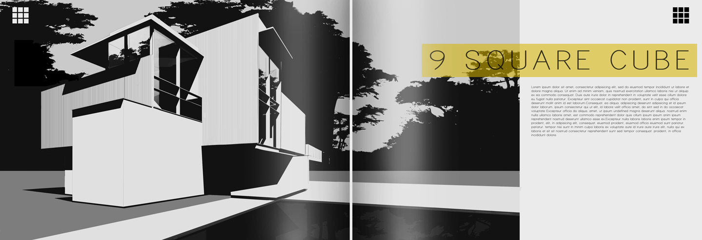
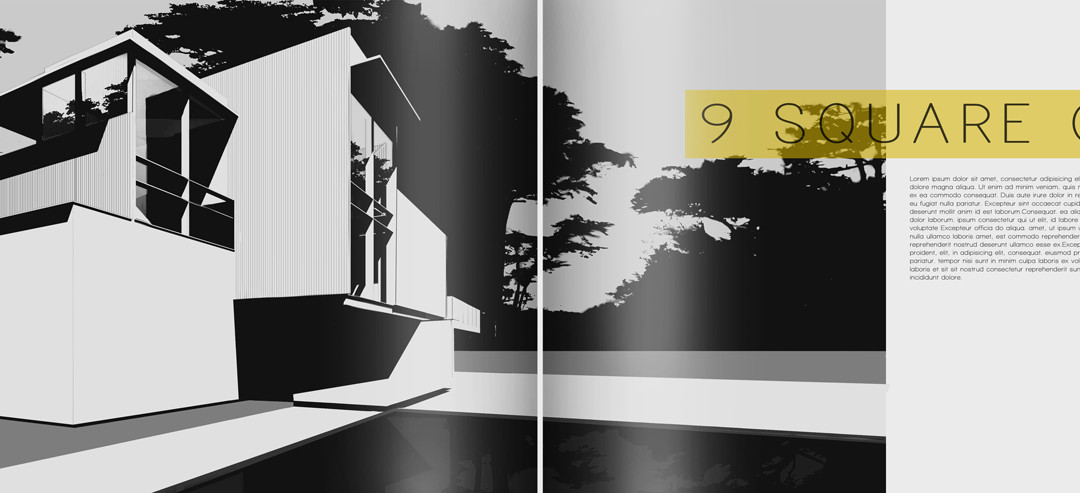
With the introductory page, I started out with a bold image. You may recognize this image since it was pulled from this post, with the colors desaturated. The only color comes from the highlighted text which also spills over into the next spread. The graphic itself has nice lines and draws the viewer in without giving away too much.
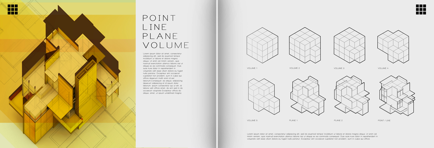
The most important part of this project was how the form was developed. This meant giving up a lot of space for simple line drawings and not over thinking how to graphically explain this idea. These first few pages have set the tone for the rest of the project pages and the goal is not to stray too far off course. It’s a good exercise to get myself to think differently about page layout and I’m interested to see what comes out of it.


i'm the first one to comment, hehe!! alex you're doing great things thanx!
Hey Alex…Wonderful post as always…was wondering about the diagrams on the right side…How did you get the outlines thicker than the inner lines? Is that a sketchup line setting ?
Hey Alex…Wonderful post as always…was wondering about the diagrams on the right side…How did you get the outlines thicker than the inner lines? Is that a sketchup line setting ?
Alex, i have been following your blog since 2011 and thanks to your tutorials I have learned so much . Your works have helped me throughout my final year at arch school and continue to do so. Thank you very much. I cannot seem to find tutorials that are as informative as yours, especially for kerkythea rendering techniques and settings. By chance do you have any tips in that department? Would definitely appreciate it. regards
embrace the white space! It's great to see you 1. aware of your graphic comfort zone and 2. challenging it!
I completely identify with what you mean when you talk about minimalism not telling the full story of the work or development. Having the ability to strip down the graphic presentation of the work and let it stand in stark minimalism demonstrates huge confidence in the design! It's great to see you challenging this struggle that we all face, and having the conversation. The work is beautiful, and I really appreciate the rhythm you create opening with the black and white rendering and reintroducing the B&W in the diagrams on the next spread…
I look forward to whats next 🙂
What font are you using for the title of the image on top?
@Jamal,
I am using a font called "Print Clearly" which can be downloaded through dafont.
Wonderful Alex !!! As Usual !! 🙂
congrats on being named a 2013 KROB judge!
Thanks TIm, Im excited and honored.
Is there a place where we can see the full portfolio? I'm interested to see what your intro / table of contents spreads looked like.
@Caitlin,
As of now, the only way you can see the entire portfolio is by getting the printed copy. I do have many of the pages revealed above in the posts though even some of those have been edited for the final printing. They at least give you an idea of the graphic styles used.
Always cool Alex!… Well done!