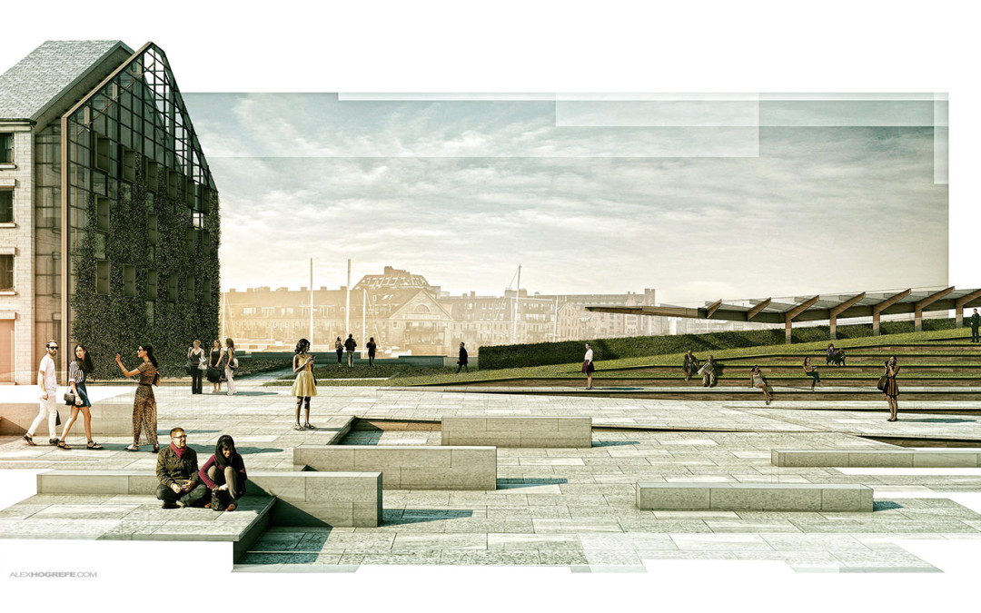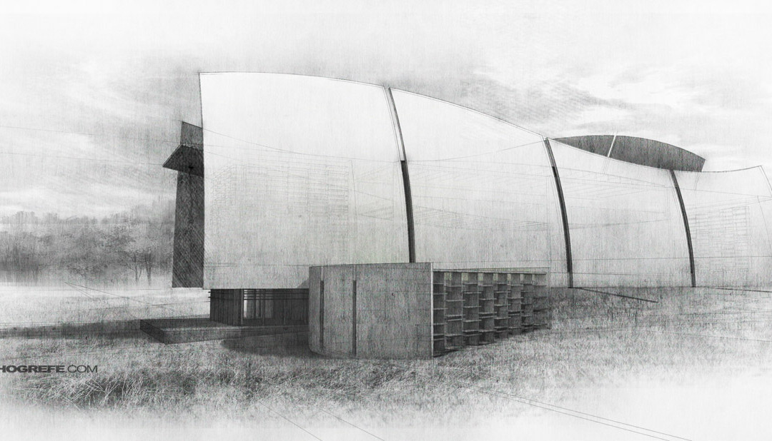
by Alex Hogrefe | Aug 3, 2014 | Portfolio Vol. 4, Project 01 Long Wharf, Styles / Effects |
We have used this style a couple of times in the office and I am a big fan of it. It is also really simple to implement. The idea is to apply a mask over a full resolution illustration to break up the edges giving the illustration a collage-like feel. The great thing...

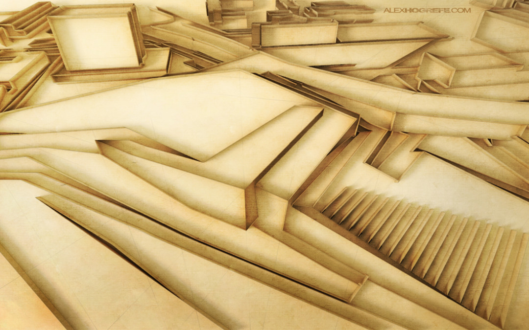
by Alex Hogrefe | Feb 18, 2013 | Styles / Effects |
I came across the concept of “quilling” a few weeks back and instantly began thinking how could I translate this digitally to generate a unique architectural illustration for marketing or portfolio purposes. The style had a great look to it and I...

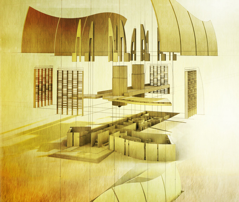
by Alex Hogrefe | Oct 14, 2012 | Portfolio Vol. 3, Styles / Effects |
I have always been intrigued by exploded axonometric illustrations. They add a kinetic aspect to what is typically very stagnate fixed objects. Even more though, I like how a successful exploded axon depends on a clear understanding of all...

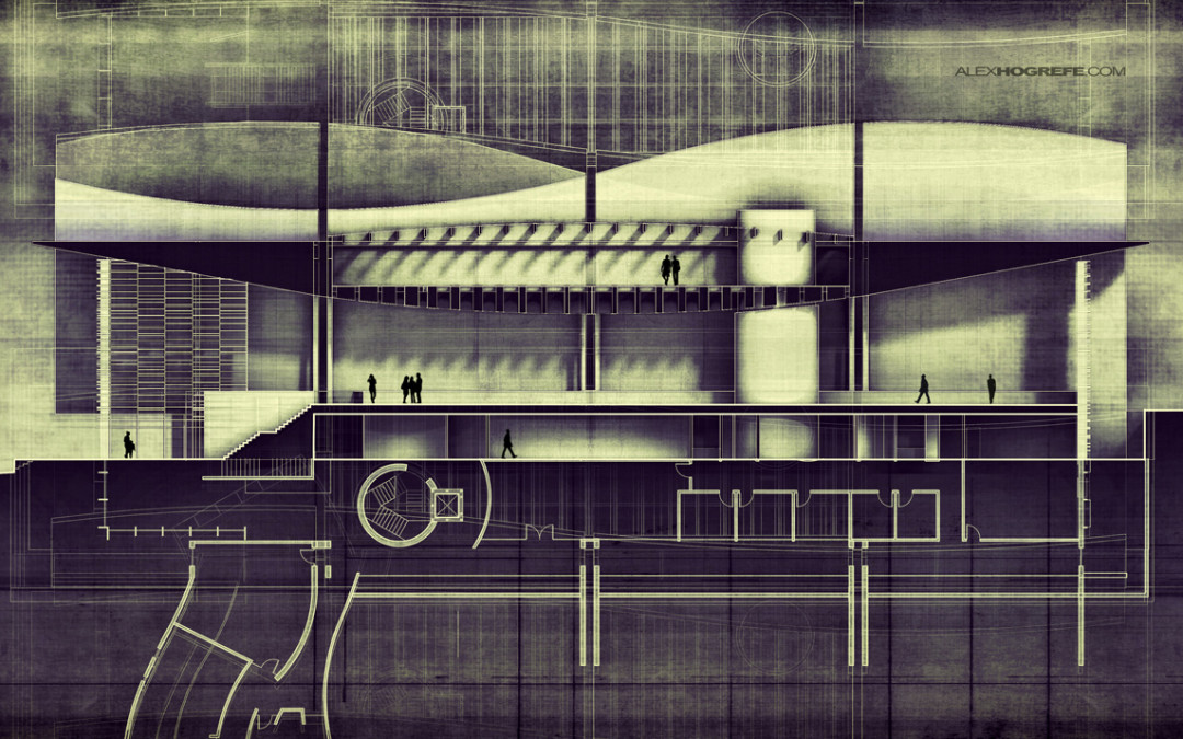
by Alex Hogrefe | Sep 23, 2012 | Break Down |
I randomly decided this weekend that I wanted to go all out on a building section. I have been spending a little of my free time detailing an old studio project just to have some new geometry to illustrate and present on the site. I really liked some of the...

by Alex Hogrefe | Sep 2, 2012 | Break Down, Styles / Effects |
I spent the weekend modeling up an old studio project that I designed my sophmore year in undergrad. It’s something I have been wanting to do for a while since the original project was done by hand i.e. no computer. I was able to scan and scale my old hand drawn...
