by Alex Hogrefe | Oct 16, 2011 | Fundamentals |
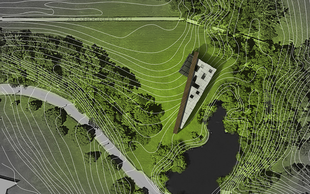
With this tutorial, I wanted to show the workflow that I use to develop a clean looking architectural site plan. This tutorial, like many of my tutorials, doesn’t use a rendering engine, only Sketchup image exports and Photoshop. Although I don’t...

by Alex Hogrefe | Aug 27, 2011 | Final Moves |
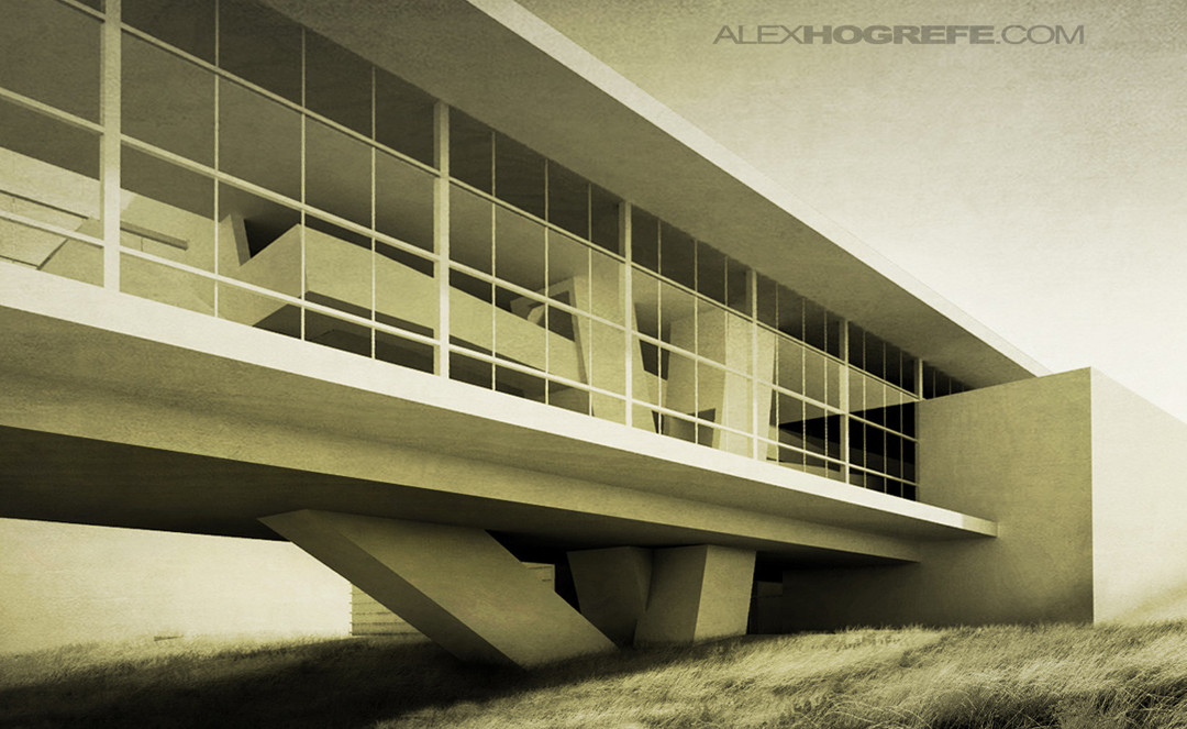
As I get more into photography, I find more and more things that overlap into architecture illustrations. One thing that I never thought about in school when creating illustrations was the idea of avoiding converging vertical lines. Obviously, this isn’t...

by Alex Hogrefe | May 8, 2011 | Final Moves |
As with many of the other tips in this series, this tutorial adds a last minute “kick” to an architectural illustration. What is nice about this process is that the contrast is increased, but at the same time, the sharpness is decreased providing an...

by Alex Hogrefe | May 7, 2011 | Final Moves |
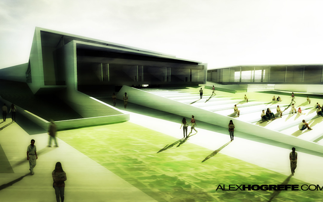
Vignetting is something you see a lot in photography, and it works just as well in architecture illustrations. The idea is simple, the edges of the illustration are darkened to “frame” the image and draw attention to the center. If there is a lot going on in...

by Alex Hogrefe | May 7, 2011 | Final Moves |
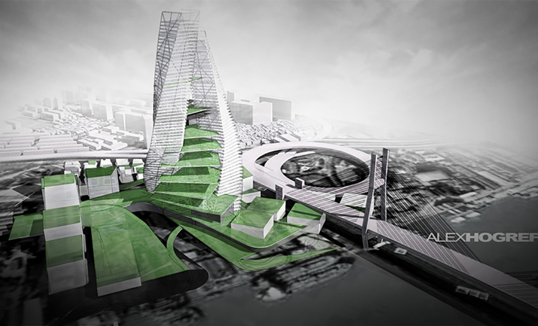
This tutorial looks at some grunge and sketch overlays to add a little artistic styling to an architecture image and break away from the “fresh from the rendering engine” look that too many architecture presentations have. Sometimes, illustrations need a little...
