by Alex Hogrefe | May 6, 2012 | Over Time |
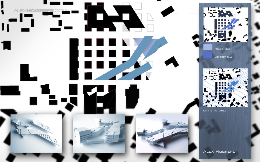
Presentation boards are something I haven’t really talked about on this site and they seem like a good thing to transition into. I was looking through some of my old boards and couldn’t stop noticing really stupid mistakes that I kept making. The below...

by Alex Hogrefe | Apr 15, 2012 | Fundamentals |
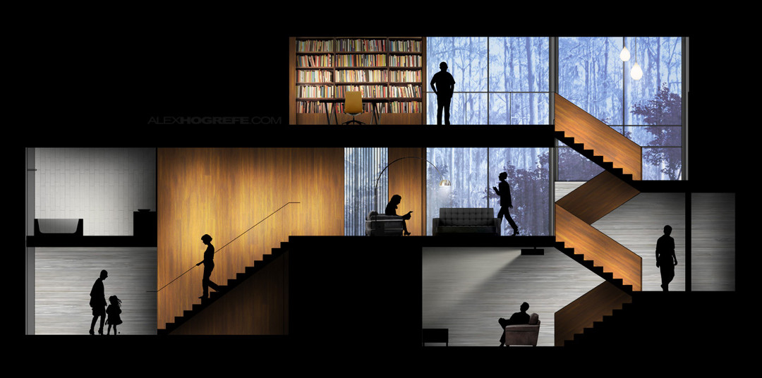
As promised, I put together a video tutorial explaining the workflow that I use to create colored interior elevations using only Photoshop. There was a lot to go over, and I’m surprised I was able to fit it all in one 15 minute video. The steps are not difficult...

by Alex Hogrefe | Apr 1, 2012 | Styles / Effects |
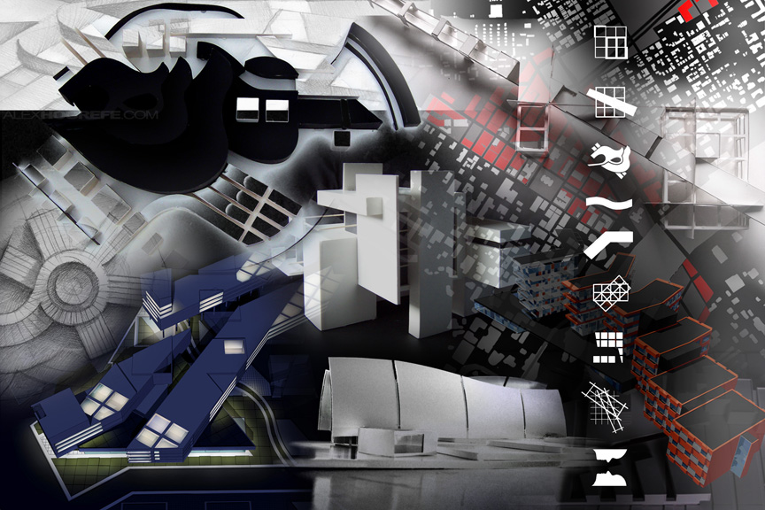
A student in Chicago emailed me a while back asking how I created the back cover of my undergraduate portfolio. The image was a collage of all of my projects Photoshopped together into a single composition. As time consuming as it may look, I probably only...

by Alex Hogrefe | Feb 12, 2012 | Break Down |
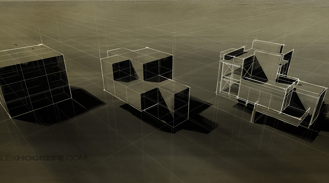
There is something really nice about the simplicity and clarity of an architectural line drawing. A friend of mine was showing me some old school drawings by guys like Bernard Tschum and Lebbeus Woods. It’s amazing how fast drawings like these are being...

by Alex Hogrefe | Jan 1, 2012 | Styles / Effects |
I’m always looking for ways to take renderings that just aren’t working and turn them into something that can be used for portfolios or cover pages. This tutorial is about as simple as it gets in terms of difficulty and speed. In the example below,...
