Presentation boards are something I haven’t really talked about on this site and they seem like a good thing to transition into. I was looking through some of my old boards and couldn’t stop noticing really stupid mistakes that I kept making.
The below presentation was created in 2006, my junior year in undergrad. The design was an urban planning project and we were presenting our massing studies of an area in downtown Toledo, OH. At the time, I had only been using Photoshop for about a year, and this was probably the 3rd project that I had used Photoshop to create my boards with instead of drawing them by hand. With that said, I will use these boards to begin explaining what not to do.
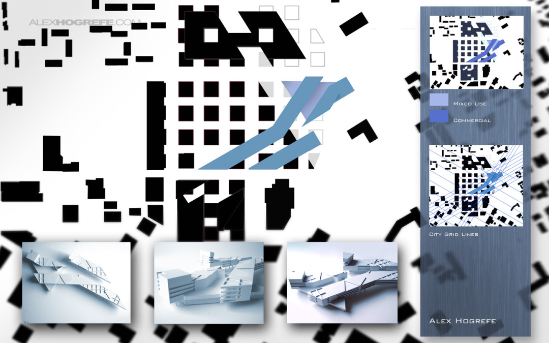
BOARD 1
The first thing that really grinds my gears is that there are hardly any labels or explanations. For some reason, I felt it wasn’t necessary to write much. This is crucial because you won’t always be standing next to your boards to defend the design. Having short explanations give viewers a quick introduction into what you were thinking. It also allows the jurors to understand the parts of the project they are interested in while they are pretending to listen to you talk. I typically like to have a 3 to 4 sentence paragraph on the introduction board summarizing the overall concept and giving viewers a place to start. This board, however, has nothing.
While the large figure ground covering most of the sheet is an important diagram, it should not be the focus of the board. It might have helped to overlay an aerial image or combine multiple diagrams with the figure ground to amp up the message I was trying to get across. In this case, it seems I was more concerned about the composition of the board rather than the information I was trying to convey.
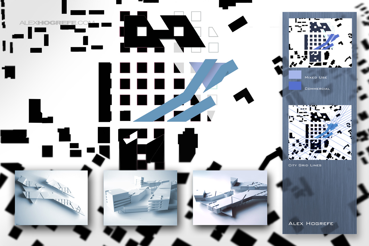
Board 2
The second board isn’t much better. Again, not much information explaining the images. My biggest beef with this board is the waste of space in the gray box on the right side. The images in the box graphically aren’t saying anything. This would be the perfect place for more diagrams or text explanations.
The image at the top left of the board should be removed. It is covering up part of the elevations and is representing a view that already appeared on the first board with the physical models, and will appear again in the next board.
The elevations read extremely flat. I remember spending a lot of time designing the project sectionally, yet I don’t have any drawings showing a section slice through the site. The sections would have provided a much better understanding of the forms and scale of the spaces compared to the elevations that just come off as confusing and hard to read.
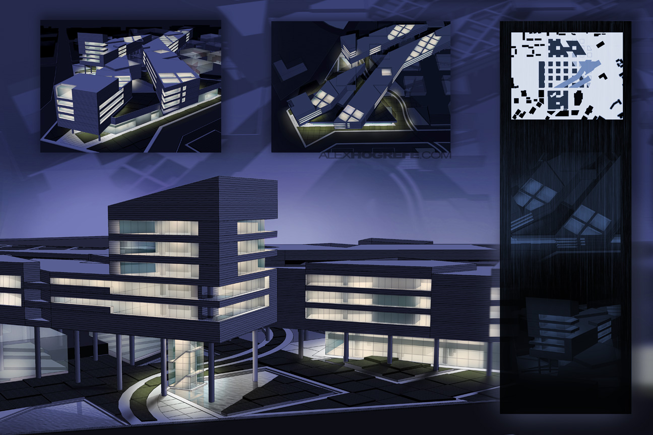
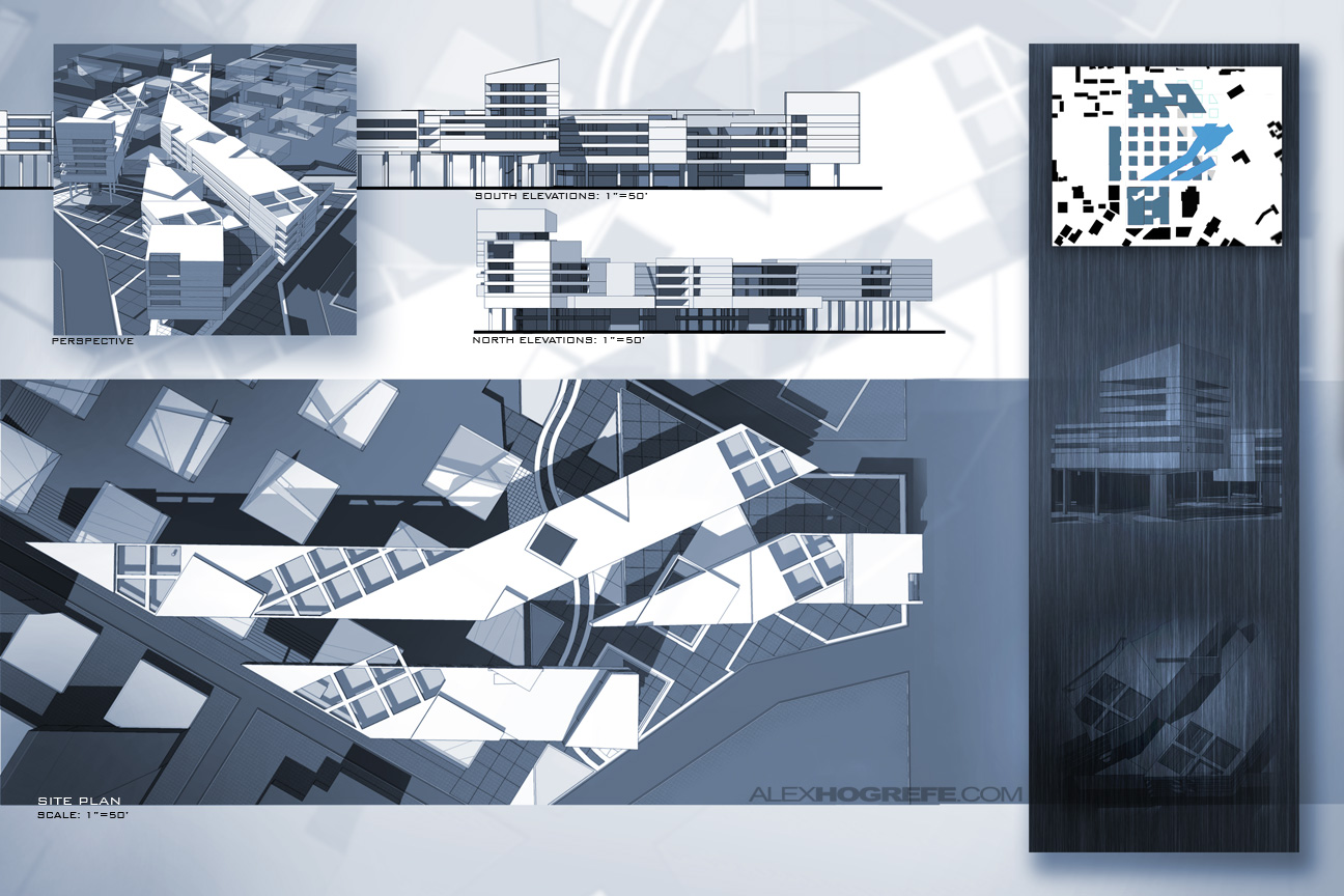
Board 3
I remember getting really excited with how these night illustrations turned out. This was the first time I tried this technique, and it had come together better than I was expecting (See the tutorial on how to create these illustrations HERE). The big problem though is that all the rendered images are at bird’s eye view. Nothing is at eye level describing the experience of actually walking through the site. My thinking at the time was that I thought I could explain the building better with these types of views. But with this approach, I am essentially explaining the design as a sculpture and not as an inhabitable structure. I also show no people in or around the site, making everything feel lifeless. Adding people would have made a big difference in the atmosphere of these illustrations.
The repetition of views in these three boards are horrible. The pics I chose of the physical model are almost identical with the rendered views. While it seems obvious now, at the time, I didn’t think twice about it.
While it is easy to look back at past presentations and pick them apart, it has also made me aware of the decisions I tend to make when I’m under a time crunch and has allowed me to work more efficiently the next time around. This is just one project of many so expect to see more critiques later on.


Hey Alex, I've been following your blog for quite some time now. I feel like the presentation boards are just as important as the process work and models we do when we design. Do you have any opinions bounding boxes? Seeing as that I just finished MY third year, I feel like my boards don't exactly sell my idea well enough when they stand alone.
Again, keep up the good work! I look forward to continue following your stuff!
Alex, excellent explanations on how to improve boards. Do you have any examples of boards you liked or you feel were successful?
@ Edric,
can you explain a little more about what you mean when you say bounding boxes? Thanks for following!
@ Robert,
There were a couple of thesis boards that I was happy with. My approach to my thesis presentation boards where altogether different though. I will talk about those at a later time.
Alex…Useful blog.
Most of the architectural student always underestimate the layout or content of presentation board
and just try to fill up the board with no sense of design.
It is very good that you point out the importance of presentation board and it is always part of the design….it also involves a thinking process to decide what to place on it
As Robert said, I am looking forward to your explanation on the presentation board that you are happy with. Thanks
This is great stuff Alex, yeah there are mistakes or I would rather say content that was overlooked. But remember this is your junior year of undergrad work, personally with that in mind I think they're great. You show the core concepts of design early on in your academic career. That is the basics and the text and getting "to the point" comes later on. As always you're work is extremely impressive.
Just an idea I know everything takes time, but what if you critiqued then did a quick iteration of the same project that would be a good example. I'm sure many techniques regarding layouts will be communicated.
Good stuff man, thanks for taking the time to do these posts
Hey there Alex!
I have just recently become a consistent viewer of your blog, this is a great resource for beginners and advanced users alike! This is a very handy article, some points that I will not soon forget about presentation! Again thanks for the blog posts, and keep up the great work! 🙂
sixthlaw
i was wondering: why do you use photoshop to make posters? indesign is much better at it. seriously, give it a try. it will save you hours of work!
I was also curious about what mark you've got for this project 🙂
It would be very interesting if you opened the original file and corrected it with the feedback you gave yourself in this blogpost. I think we are all curious to see what these posters will look like if you let your magic do the work for 1 hour. 🙂
good luck!
@E-J,
I have used Indesign to compile portfolio pages. Im not sure I agree that it is better at layout for single boards, at least from my experience and for the look that I am going for. Obviously, this is different from person to person though. For compiling many pages such as a portfolio, it is invaluable.
For the project grade, I did very well. I had a physical model and a verbal presentation that supplemented the boards, so you are not seeing everything that I had for the project presentations.
I like your idea about making corrections to the boards. I was planning on posting boards that I was happy with, but this would make more sense. Thank you for the comments!
Hey Alex, I have just recently stumbled upon this page through the word of a good friend. I just wanted to say thank you, not only for the comments you give but also for the videos you openly share.
I am just a beginner in photoshop and honestly am just now getting into sketchup/rhino. I am fairly proficient in Revit and AutoCAD but I lack a serious design gene. I am more of a structural guy but I was just curious if you had any works that show structure as a main design element?
I will be on this blog for years to come and I wish you luck in the field. (Not that it seems you need any).
Thanks David. Im assuming your asking if I have any tutorials that cover that topic?. I cannot think of any off of the top of my head. I have done a few projects in the past with an emphasis on structure but no tutorials specific to that topic.
Hi!
It was really chance to find your site in my free time!:D
I found blog really affective especially about landscape tutorials as Im a landscape architect
There are alot of things for visualization.
so other then this have you got another sites that you find useful for this stuffs?
Hi Alex. Thanks for posting about the presentation boards. You provide many good points, and it is awful thoughtful of you to take the time to do that. I am sure you are tremendously busy, and to share your insights is very thoughtful. Just letting you know that it is appreciated. Personally I have been practicing the hand rendering stuff more these days but I realize that I need to continue to grow in the graphic software as well. The learning experience is made so much better when people are open to sharing ideas and tips. Thanks.
Thanks for these awesome tutorials Alex!
Im a third year archi student from South Africa and my style is very similar to yours. I approach my work in a very artistic way which the lecturers don't always enjoy. Have you also experienced negative feedback on presentation techniques?