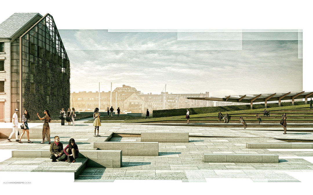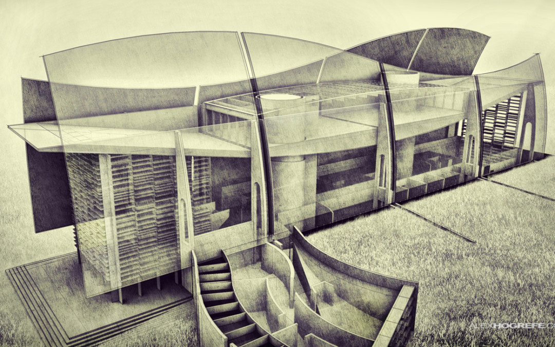
by Alex Hogrefe | Aug 3, 2014 | Portfolio Vol. 4, Project 01 Long Wharf, Styles / Effects |
We have used this style a couple of times in the office and I am a big fan of it. It is also really simple to implement. The idea is to apply a mask over a full resolution illustration to break up the edges giving the illustration a collage-like feel. The great thing...

by Alex Hogrefe | Aug 11, 2013 | Break Down, Portfolio Vol. 3 |
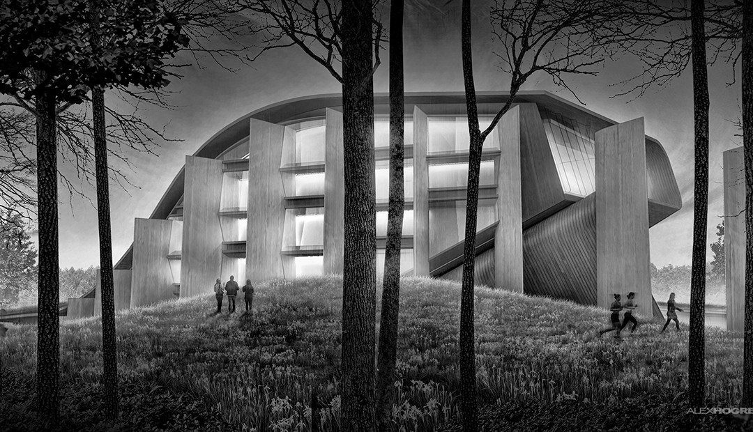
I was able to develop a couple of illustrations this weekend to help illustrate some of the exterior spatial qualities of the theater design. The number of pages for this project are really starting to add up and I don’t want to add...

by Alex Hogrefe | May 25, 2013 | Break Down, Portfolio Vol. 3 |
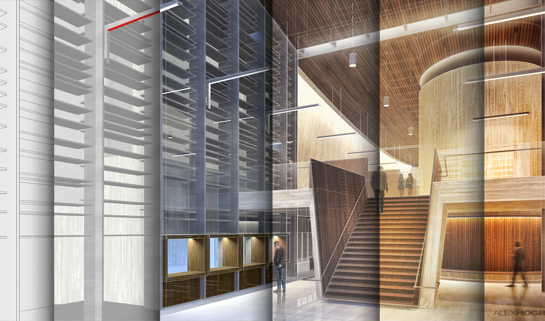
This past post received a lot of feedback from you asking for a more detailed breakdown of the illustrations. The interior illustration in particular got a lot of attention so I am going to start with that one. Since several different parts of the...

by Alex Hogrefe | Apr 22, 2013 | Portfolio Vol. 3 |
So much has happened in the past few weeks and I was amazed that it has been so long since I last posted. The past week in particular has been especially difficult to focus on the site. What I am posting this week is more or less a filler for a more in...

by Alex Hogrefe | Mar 3, 2013 | Uncategorized |
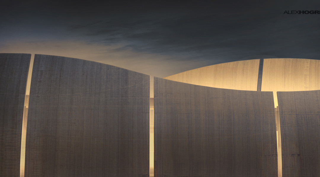
I spent most of the day designing and developing the above model that I didn’t leave much room to do an illustration or even a post. However, this is what several hours got me. I’ve done a few illustrations with this model in the past looking at...
