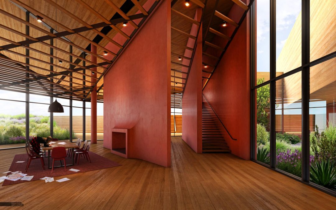
by Alex Hogrefe | Feb 22, 2019 | Portfolio Vol. 5, Project 07 Desert Villa, Uncategorized |
If you haven’t been to my site in a while, I have been taking the past several months to piece together my new Portfolio Volume 05. As I go from project to project, I look to fill in gaps of missing information in the storytelling of the design. In this case, I...

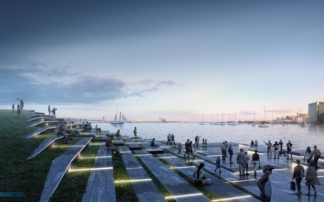
by Alex Hogrefe | Aug 7, 2016 | Break Down, Portfolio Vol. 4, Project 01 Long Wharf, Uncategorized |
One of the final images that my upcoming Portfolio Vol. 4 was lacking was a view of the Boston harbor for my Long Wharf redevelopment project. This view was crucial because it showed how one of the most important parts of the design, the tiered seating, framed the...

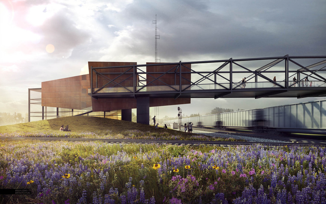
by Alex Hogrefe | Jun 7, 2015 | Fundamentals, Project 03 Crossroads Pavilion |
I can’t believe that I have not written a post about skies yet on this blog. In most cases, a sky can make or break an architecture illustration. It’s also something that I see a lot of people overlook or only spend a few minutes on in their renderings....

by Alex Hogrefe | Sep 5, 2011 | Final Moves |
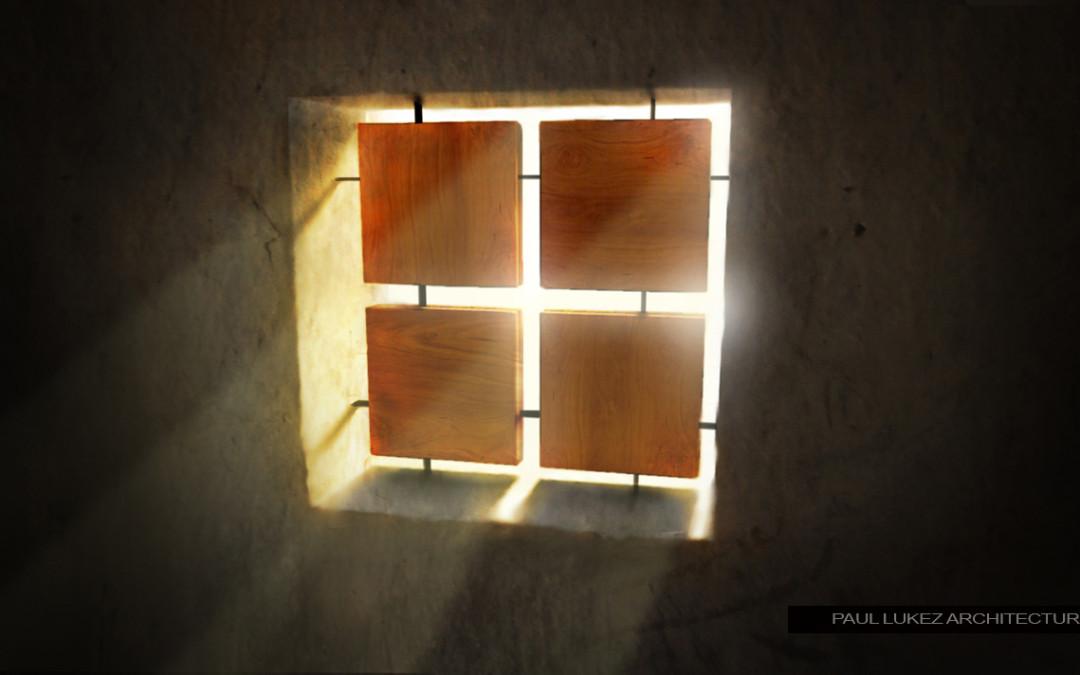
I received a lot of feedback and emails from people after posting the “Honduras Illustration part 2” asking for a tutorial on adding light rays. I put together this video explaining how this was done. You will will realize that there’s not...

by Alex Hogrefe | Aug 21, 2011 | Break Down |
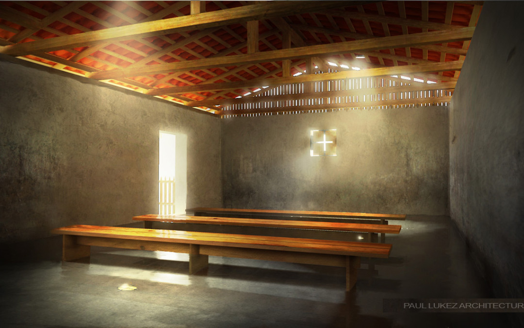
I realized that I never posted these images that I created a while back when I posted the Honduras Church illustrations. In this case, the design is relatively simple composed of 5 elements added to the untouched shell of a house in Honduras. The space is...
