If you haven’t been to my site in a while, I have been taking the past several months to piece together my new Portfolio Volume 05. As I go from project to project, I look to fill in gaps of missing information in the storytelling of the design. In this case, I had previously put together some abstract illustrations of the interiors of my Desert House Project. These illustrations helped me explore some color and texture ideas without getting lost in the details. However, later, I became interested in taking these interior images one step further and developing illustrations with more resolution and clarity.
I don’t create many interior illustrations on this site partly because interiors require well resolved models with lots of detail. I can’t simply rely on Photoshop to fill in information of interiors like I do for exteriors. This usually translates to more time, and since all of the work on this site is done in my free-time, I tend to steer clear of a lot of interior work. However, with the Desert House Project, I felt more resolved and realistic interior images were needed to close out the narrative.
While I didn’t have a lot of time to break down these images, I still wanted to post them here rather then keeping them hidden in the portfolio. I am including images of what the Sketchup model and base renderings looked like so that you can get a sense of how much the 3D model was developed versus how little things were manipulated in Photoshop.
01. Original Abstract Images
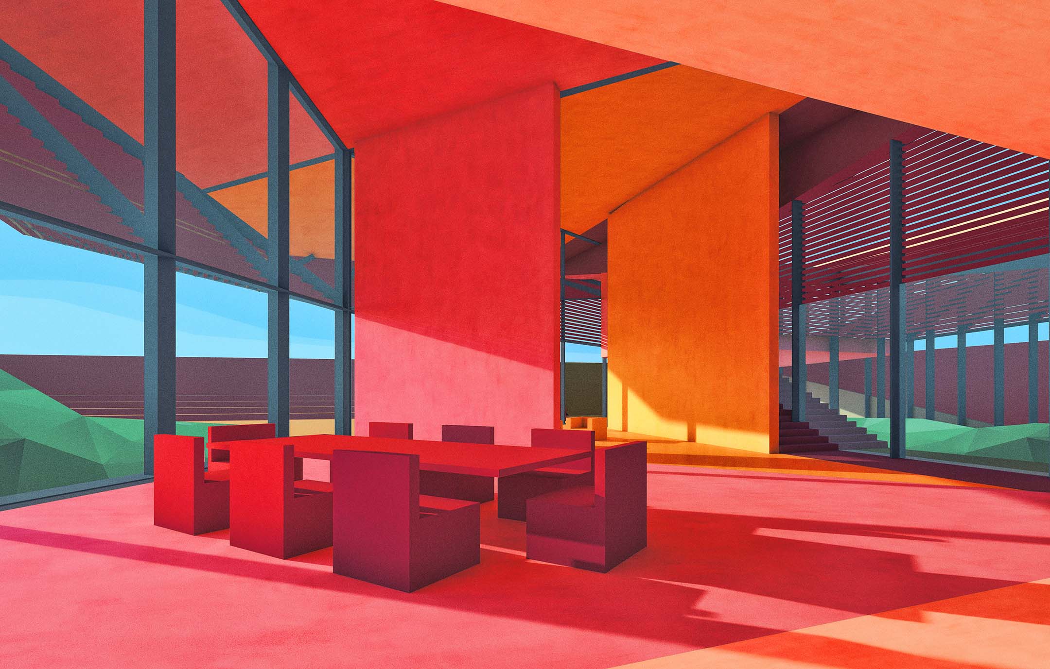
The above illustrations were first created a while back to explore some color and texture ideas as well as get a quick sense of the interior volumes. I still plan to put these illustrations into the portfolio, but I also need something a little more real to better explain the final result. The original post for these abstract images can be found Here.
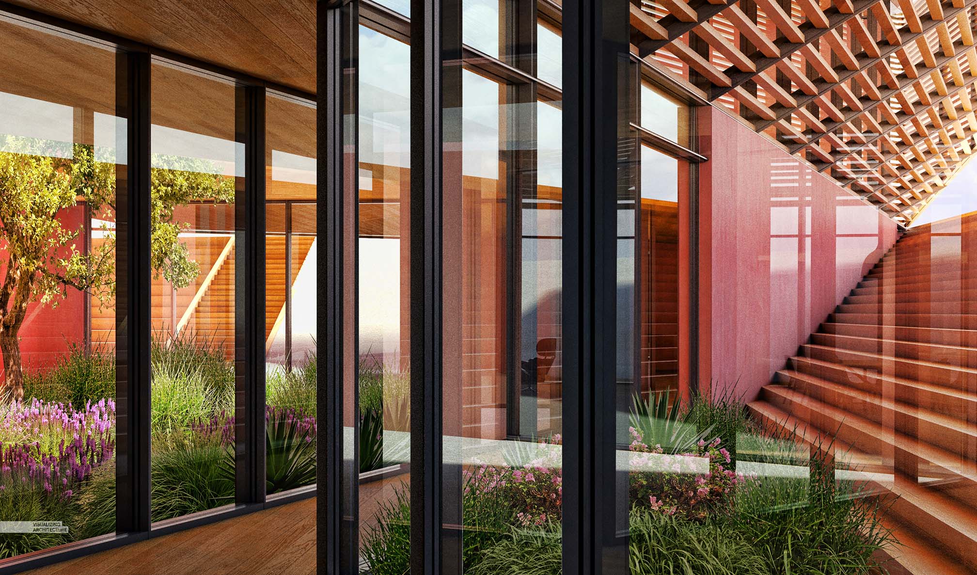
2. Sketchup Model
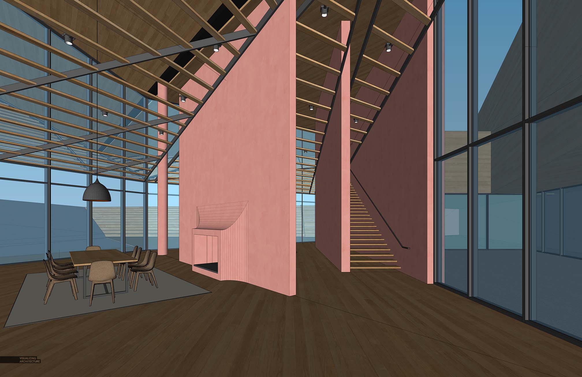
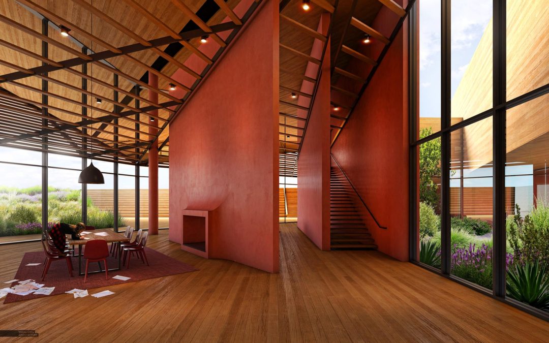
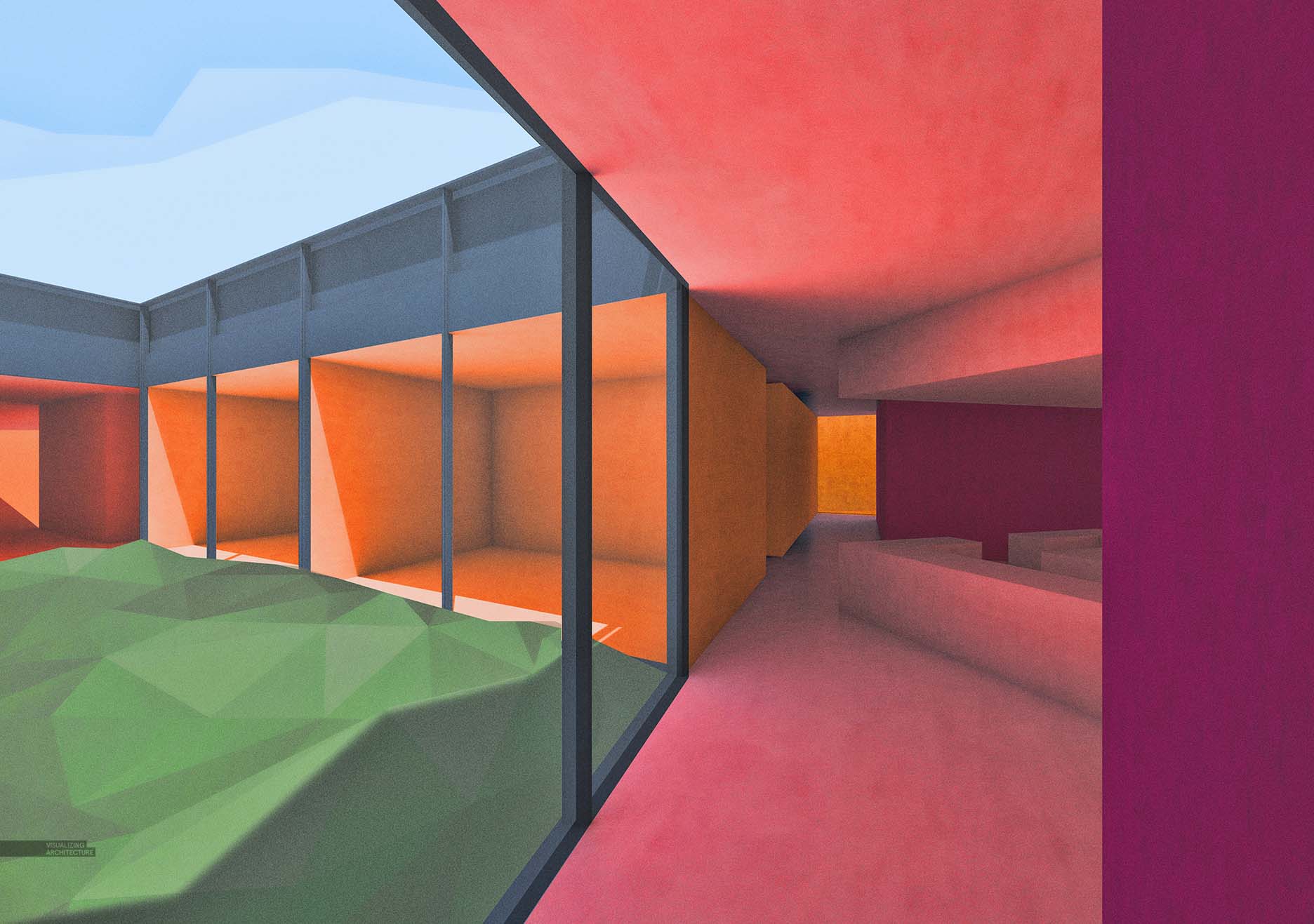
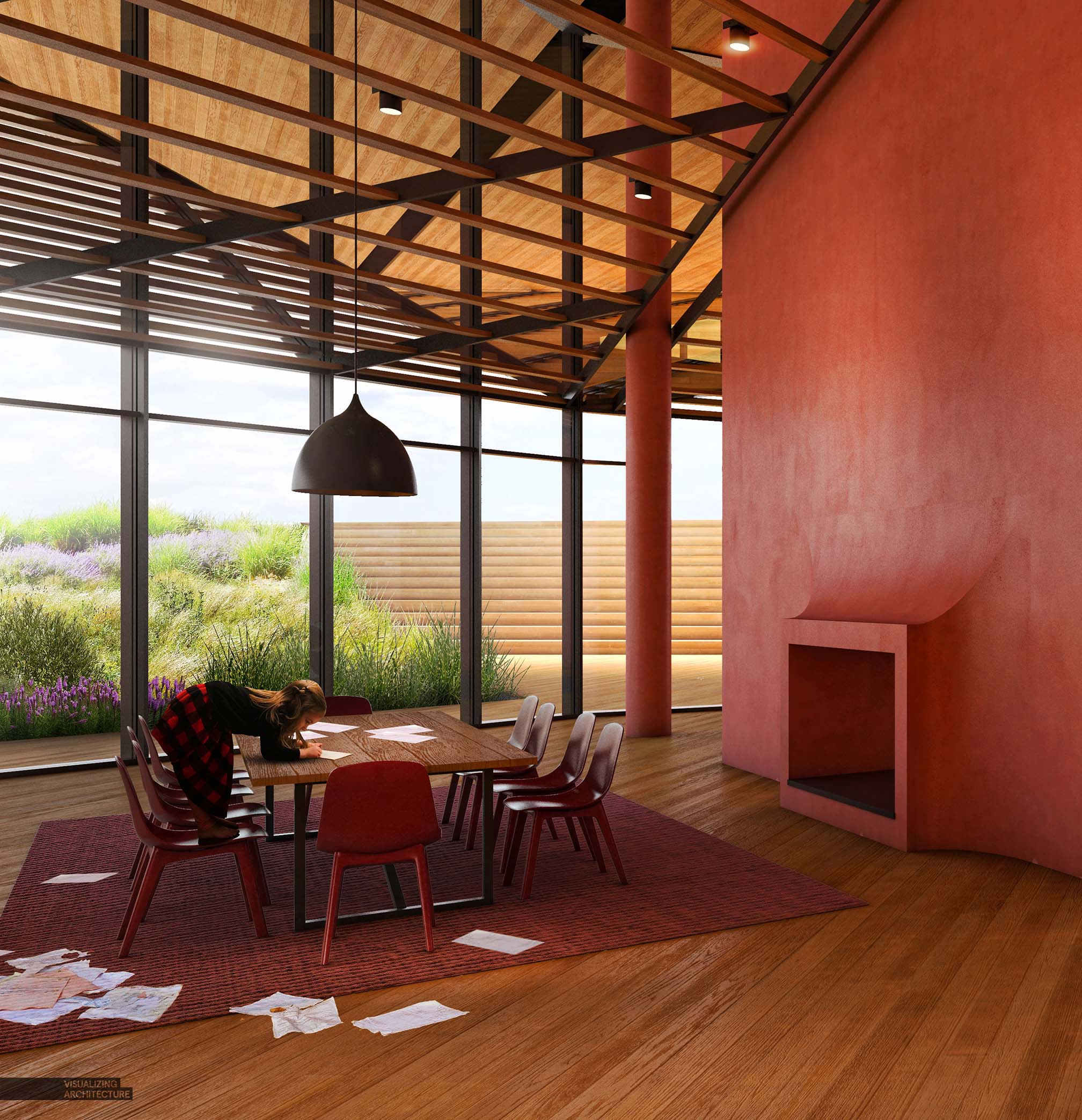
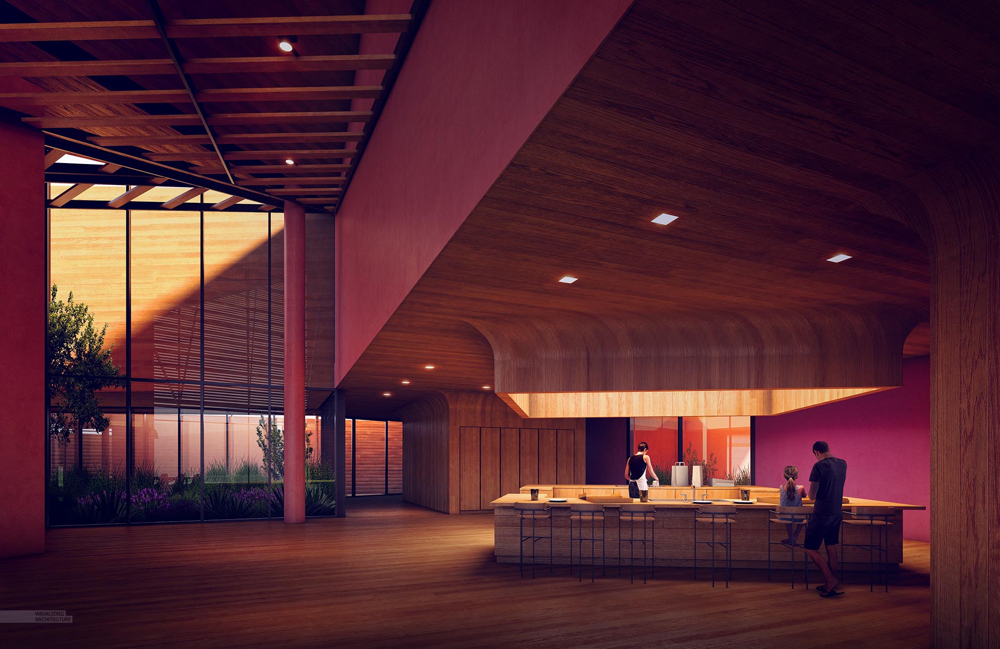
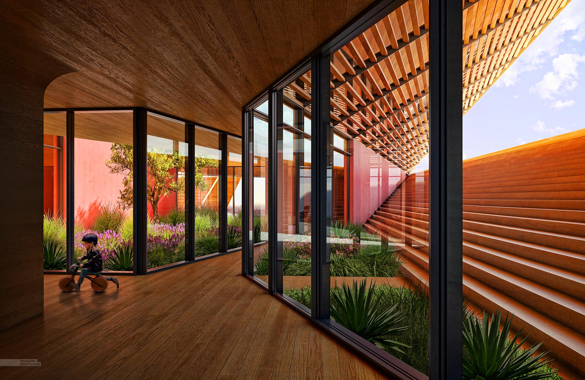
Upon revisiting the interiors, I started with adding more detail such as window mullions, high poly furniture, and better textures. I already had much of the interior built from when I generated exterior images. However, I added a louver system on the inside ceiling to help relate to the exterior louver system and to also help define some of the larger spaces inside. A fireplace and stair were also added in.
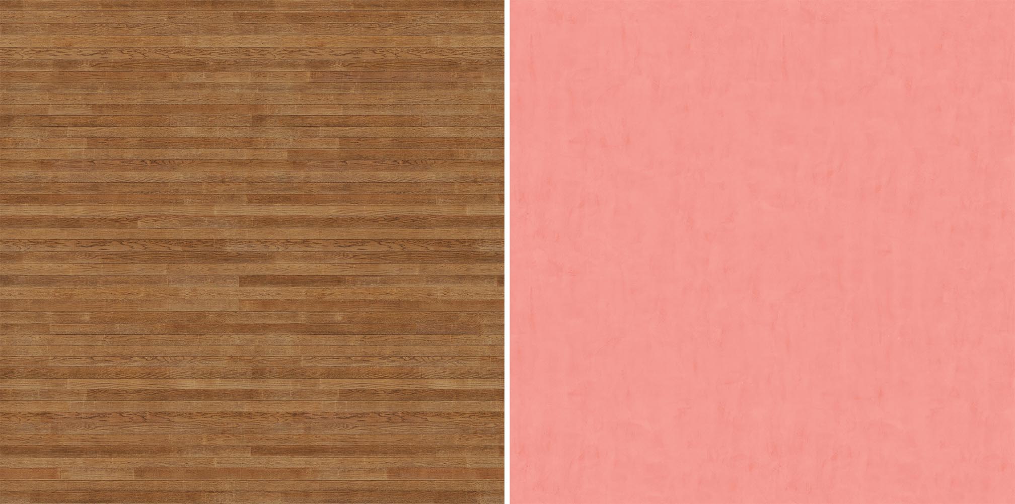
I really don’t like seeing textures repeat aka tiling, so I ended up building two large textures for the wood floors and plaster walls. . Each texture is made up of several smaller textures copied/cloned/overlaid together and setup to be seamless. I also made corresponding bump and reflection maps.
3. V-Ray Base Renderings
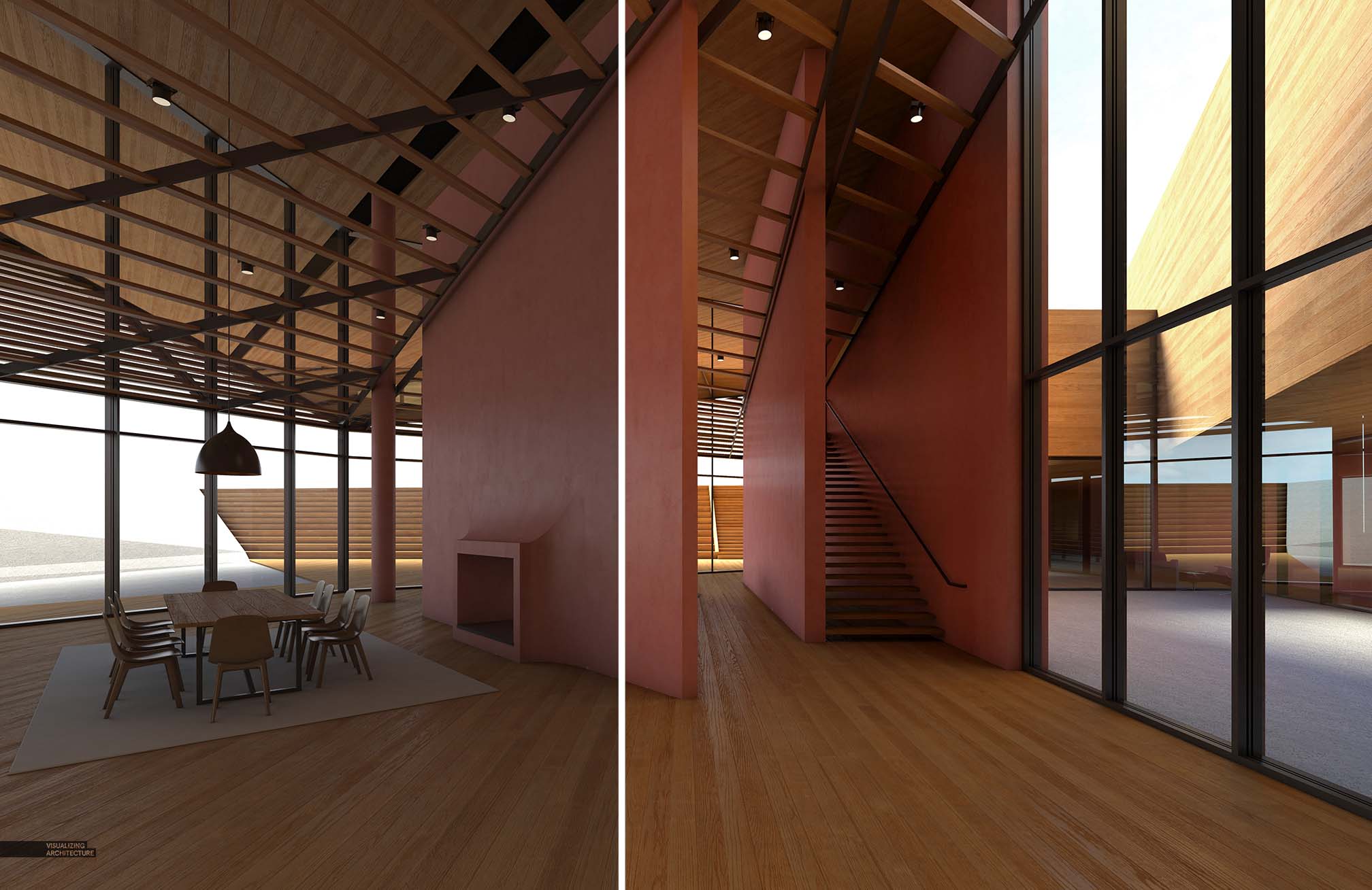
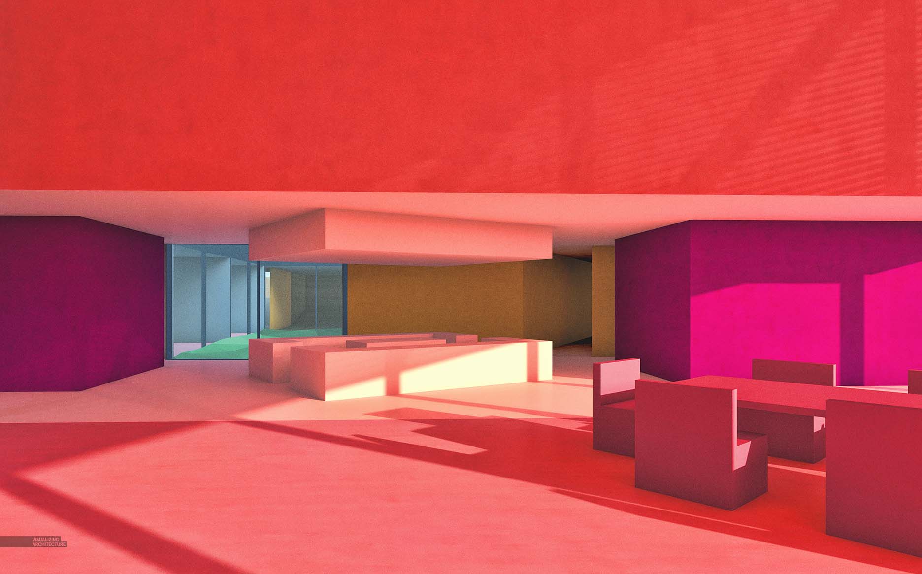
The scenes are largely lit by the sun to highlight the fact that even though the project is recessed into the ground, lots of natural light still gets in. For the kitchen view (seen below) I did add some additional interior lights to create some strong focal points in that view. Above, the image on the left is straight out of V-Ray while the image on the right shows some quick level adjustments I did before starting the Photoshop work.
4. Photoshop
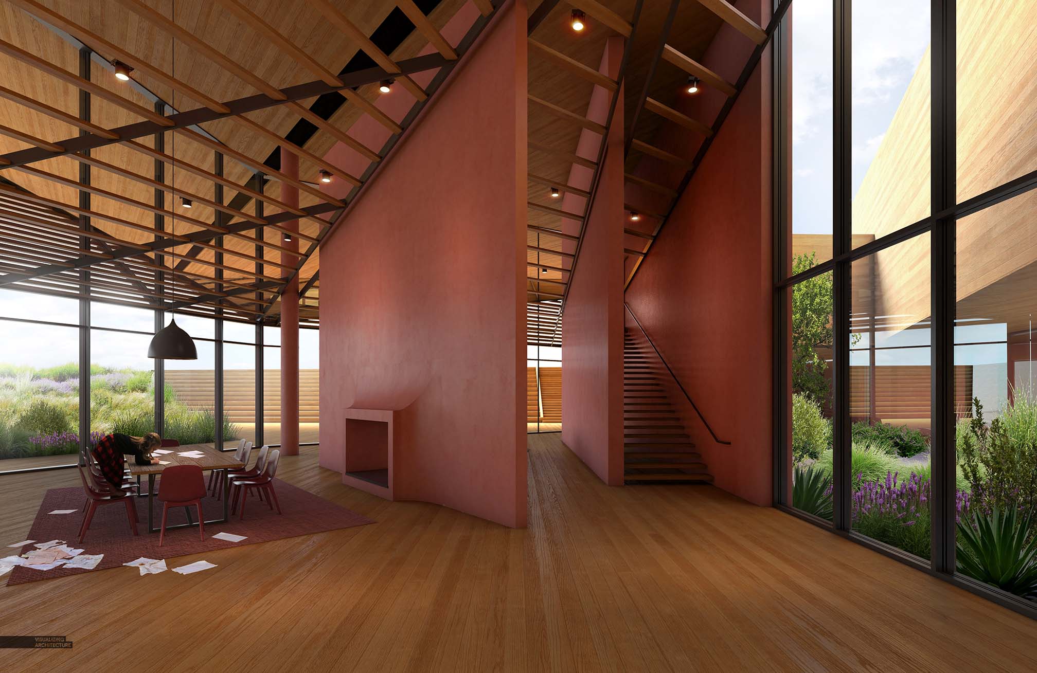
I started with the vegetation in Photoshop because I figured this might help inform what I do with the entourage. I focused on strong highlights and shadow with the vegetation to help dramatize these areas and draw attention as these are key features to the design. The entourage was limited to just a few people in each scene. In this case, I placed just one person off to the side and relatively small in the composition to help play up the grandness of the space.
5. Final Adjustments
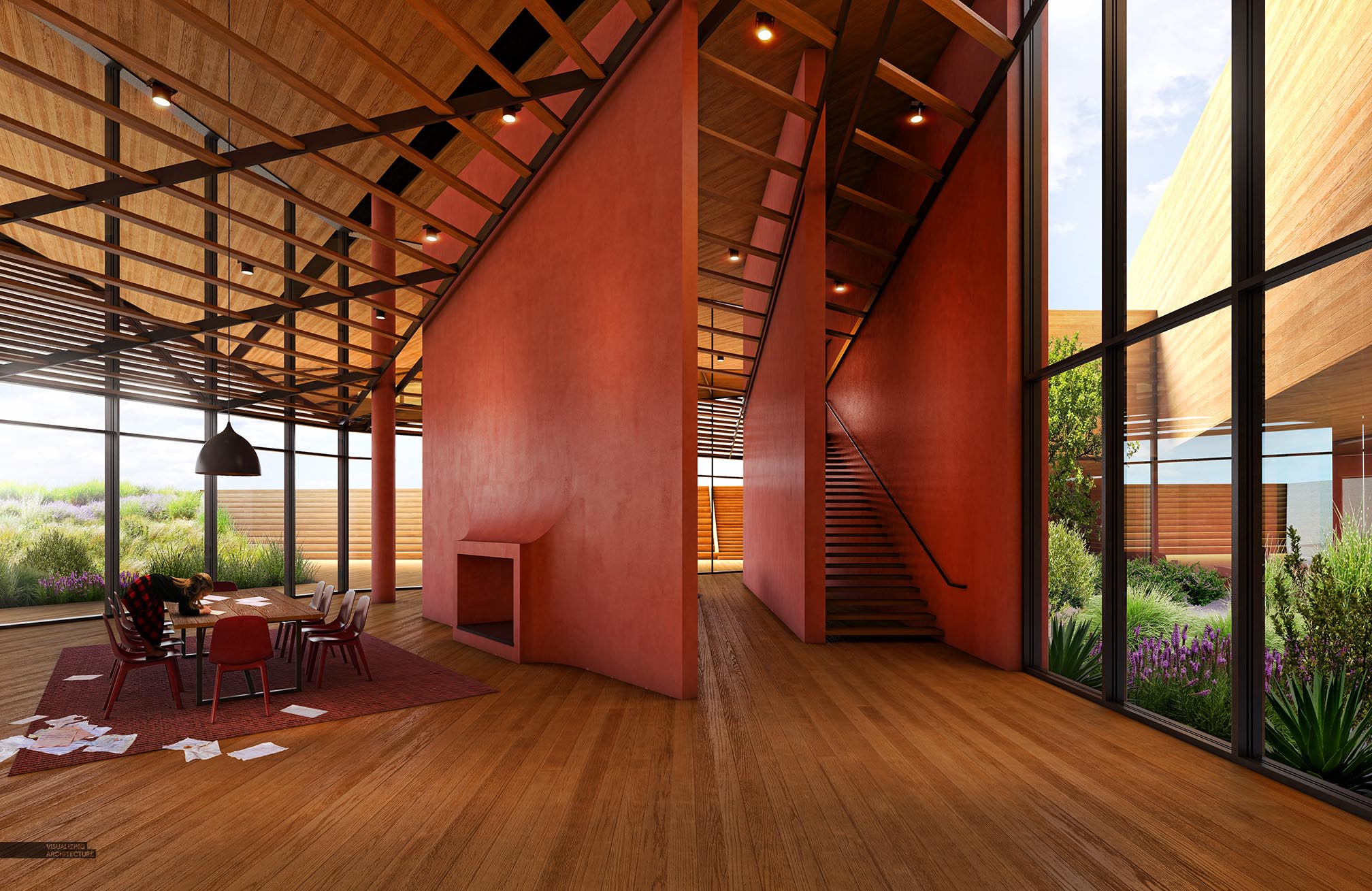
Finally, I didn’t want to lose out on the vibrancy and strong colors that many of the other images of this project have, so I increased the color saturation of these interiors quite a bit. I especially wanted the warm tones of the plaster and wood to pop, so I increased those areas even more. Also, the detail was intensified by running some Topaz Filters at the very end.


It’s a true pleasure to have a look at your work. Thank you for share it.
Long time Fan but never commented before. Thank you for being so diligent on updating and continuing to add content. These are really inspirational and educational. Don’t stop!!
Thanks again.
Hi Alex,
Can you make a post about vray settings please?
incredible truck house, extensive and best place to calm pressure.
Alex, I really appreciate your work and style. I’m curious if you have any good resources on how to build your own textures? Thanks!
These are fantastic, and easily some of my favourites here. Love the tones and compositions.
On a side note the bar one has an indistinguishable Hopperesque feel.
Nighthawks! I thought the same thing when I saw it on instagram.
Diego & Joshua
Hopper or perhaps Jeffrey Smart?
But agree about the painterly feeling. Stunning!
Hi,
I have been using Vray more and more recently, but one thing I always find difficult when rendering is the sizing of materials and how to actually set up the material in the editor. For example, when rendering stone in an ashlar pattern where there are different sizes of elements. As related to your note about the wood pattern, could you provide a tutorial on how you set up your materials in photoshop and Vray?
Your guides have helped so much!
Your work is stunning, it is a inspiration for me.
Alex have admired your work since Miami and have been following your blog to refine ideas it’s been a pleasure keep it up.
I really love your rendering style. Some how you all way manage to reatain a painting quality. Just stunning.
Some of my favorite work yet. Have you thought about making a quick post about your process for making non-tiling materials?
I would love to learn more. I find that I can always get great looking material/bumps, but the tiling completely ruins it for me.
Keep up the inspired work!
Amazing and inspiring work!
Alex –
Would really like to see you do a Lumion/Photoshop workflow!
ATC is a car shipping company providing consumers different methods to transport their vehicle all over the US.
ATC is a car shipping company providing consumers different methods to transport their vehicle all over the US.
Awesome creations Alex! I have a friend who is passionate on this as well and I can say this requires pure talent.
Not my first time commenting here, just wanted to point how nice your vegetation always looks.
Thank you! It was a great help. What I most loved about it was how you presented the information. Brilliant and helpful. Do you want to design your home, office or hotels building or interiors on your own? CADhouzz is the best place for you here you can download free rooms, floors and halls designs in 3D or 2D. We design latest AutoCAD 3D building designs.
Thank you so much for this! I’m an architecture student and this is really inspiring.
Awesome structure. Its really inspiring for all the architect.
Hey Alex, this is an amazing work first of all.
I would like to know what textures did you use for the walls and floor.
Or how did you make them?
Thanks!