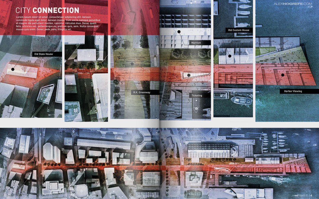
by Alex Hogrefe | Aug 17, 2014 | Portfolio Vol. 4, Project 01 Long Wharf |
Over the past several months, I have developed many illustrations for my conceptual wharf design. I wanted to start thinking about how these illustrations would be organized into a portfolio layout. One of my favorite parts of arch viz is page layout. Last year, I put...

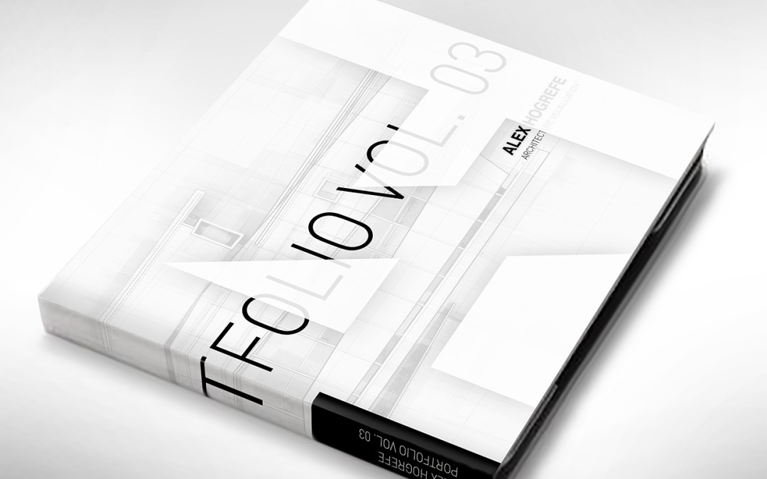
by Alex Hogrefe | Nov 24, 2013 | Portfolio Vol. 3 |
All weekend has been spent working on the cover design for the Project Portfolio Upgrade and it is turning out to be extremely challenging. There is a lot of pressure that rides on the cover. It’s the first thing the audience sees. It’s the...

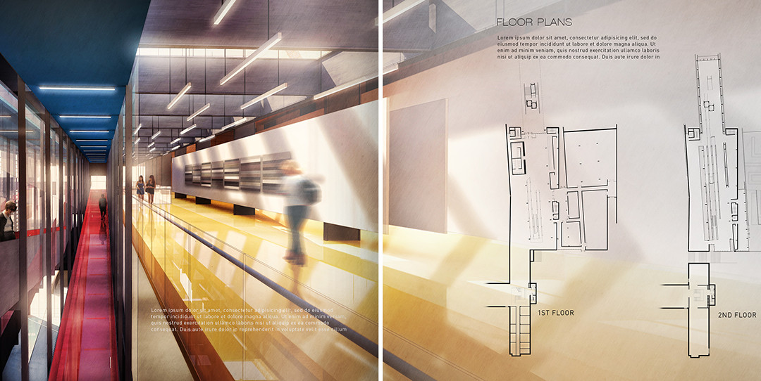
by Alex Hogrefe | Oct 7, 2013 | Portfolio Vol. 3, Styles / Effects |
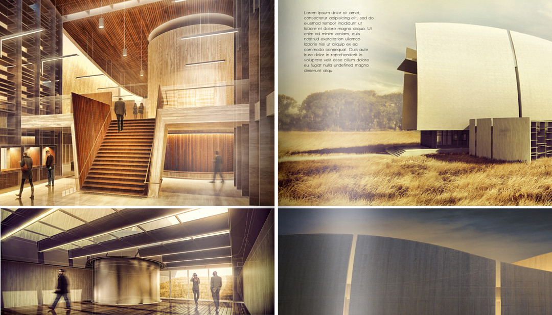
The Cranbrook project spreads are starting to come together. I spent some time composing the section and floor plan spreads which meant moving away from the abstract diagrams and into more traditional architectural drawings. I also developed an interior...

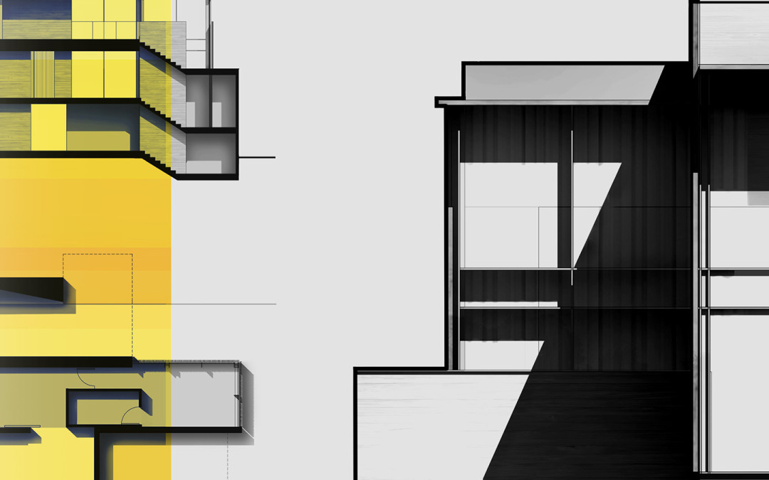
by Alex Hogrefe | Jun 2, 2013 | Portfolio Vol. 3 |
A few weeks ago, I created a post on “going minimal” and this week I am adding two more spreads to the project. I mentioned in the first post how difficult it is for me to leave white space on the page and I think the above two spreads show...

by Alex Hogrefe | Apr 28, 2013 | Portfolio Vol. 3 |
Last week I briefly posted some images that I had developed for the “rendering” spread of this particular project. I didn’t post the spread itself which is shown above. I thought I would spend this week breaking down how I got to this...
