by Alex Hogrefe | Aug 11, 2013 | Break Down, Portfolio Vol. 3 |
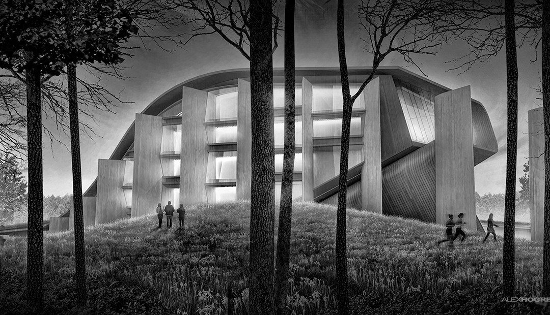
I was able to develop a couple of illustrations this weekend to help illustrate some of the exterior spatial qualities of the theater design. The number of pages for this project are really starting to add up and I don’t want to add...

by Alex Hogrefe | Apr 3, 2013 | Fundamentals, Portfolio Vol. 3 |
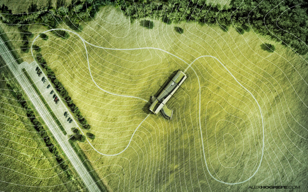
I put some more time into project portfolio upgrade continuing to develop the visitor center pages. The above sheets are a first pass at the layout and will serve as an introduction to the design and concept. Since the relationship to the landscape is...

by Alex Hogrefe | Aug 19, 2012 | Styles / Effects |
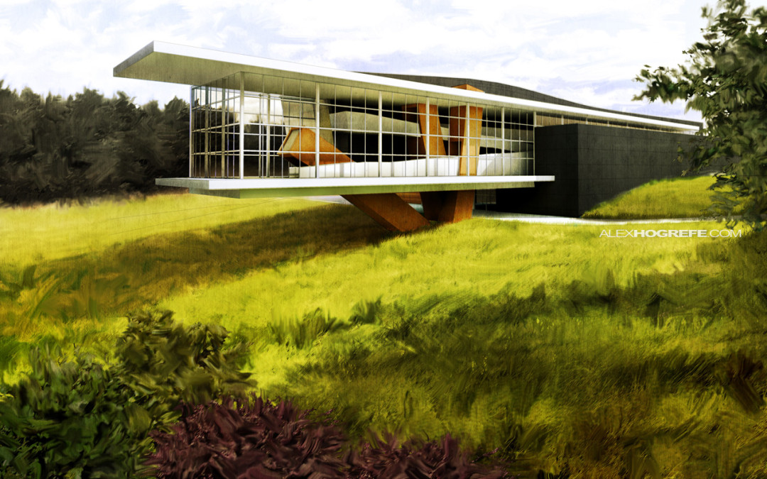
Every so often, I come across situations where I want to loosen up my illustrations and give them a more gestural quality. Growing up, I painted a lot and I have always experimented with ways to carry over the brush stroke into my digital architectural illustrations...

by Alex Hogrefe | Jun 5, 2012 | Uncategorized |
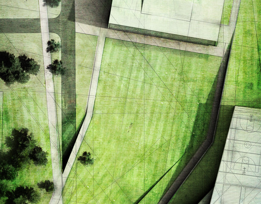
This image is taking a bunch of the different tutorials and posts on this website and mixing them together. Notice the lawn mower stripes in the grass haha. It’s all about the details. ...

by Alex Hogrefe | Dec 18, 2011 | Styles / Effects |
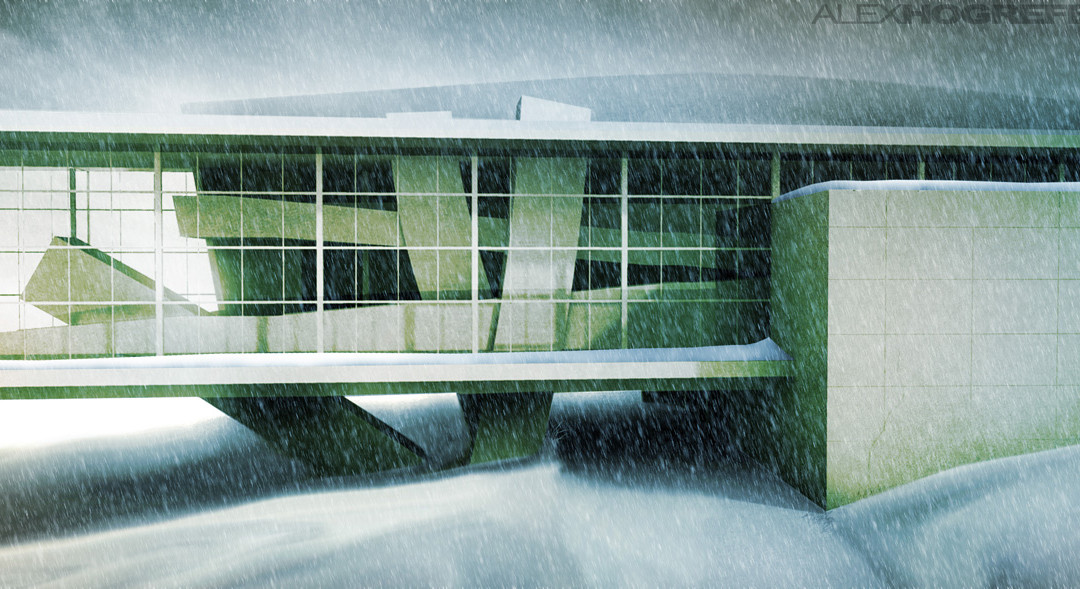
I don’t know if I’m just in the holiday spirit, but I thought I would write a post about winterizing an illustration. In essence, this tutorial takes your typical daytime rendering and turns it into a snowy winter scene, which is easier than you...
