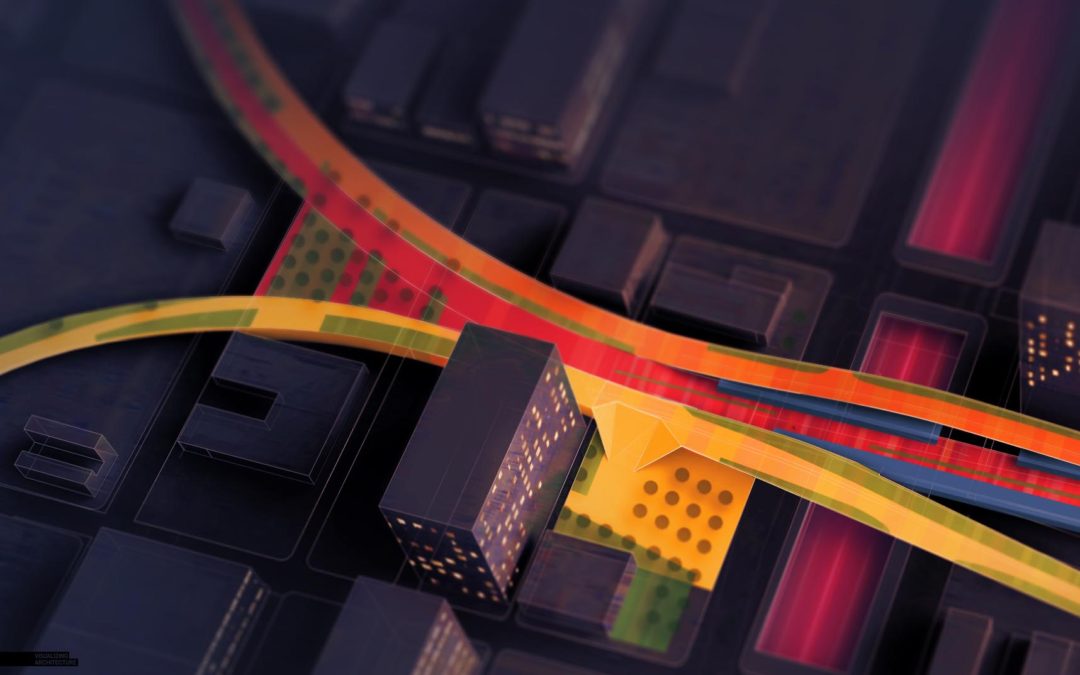
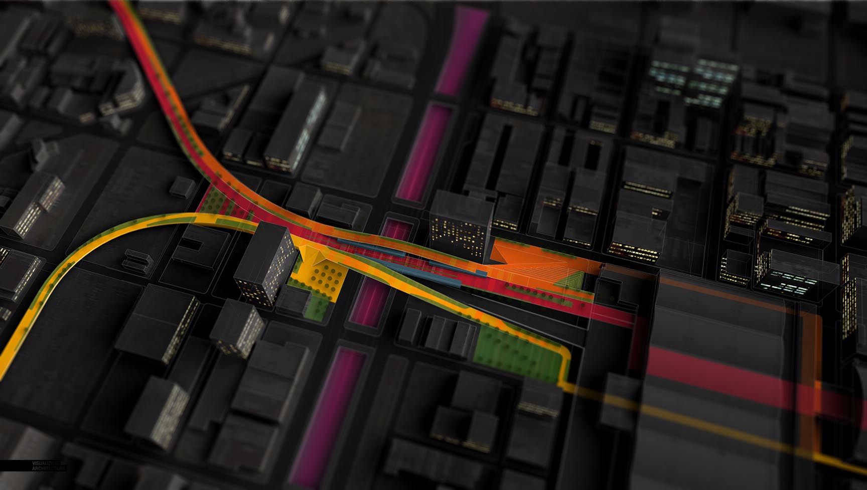
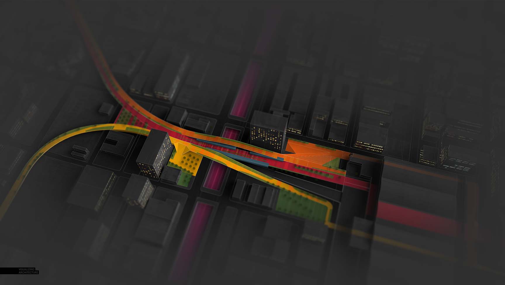
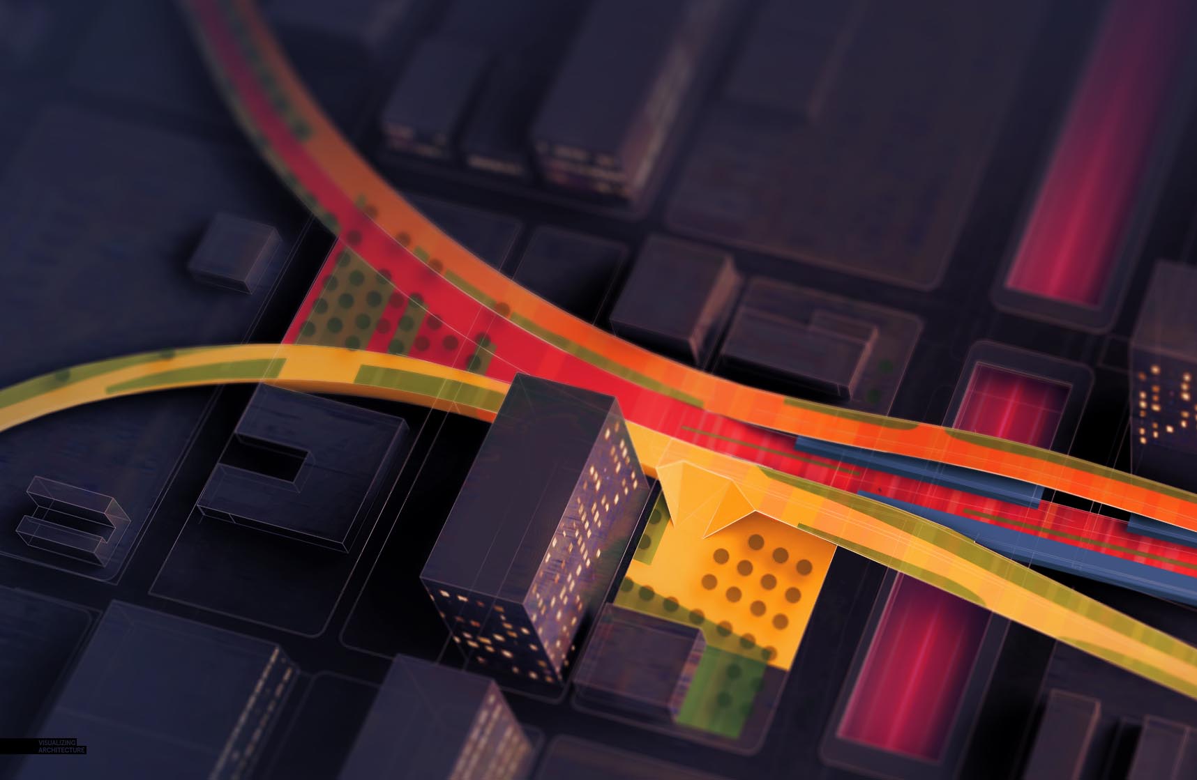
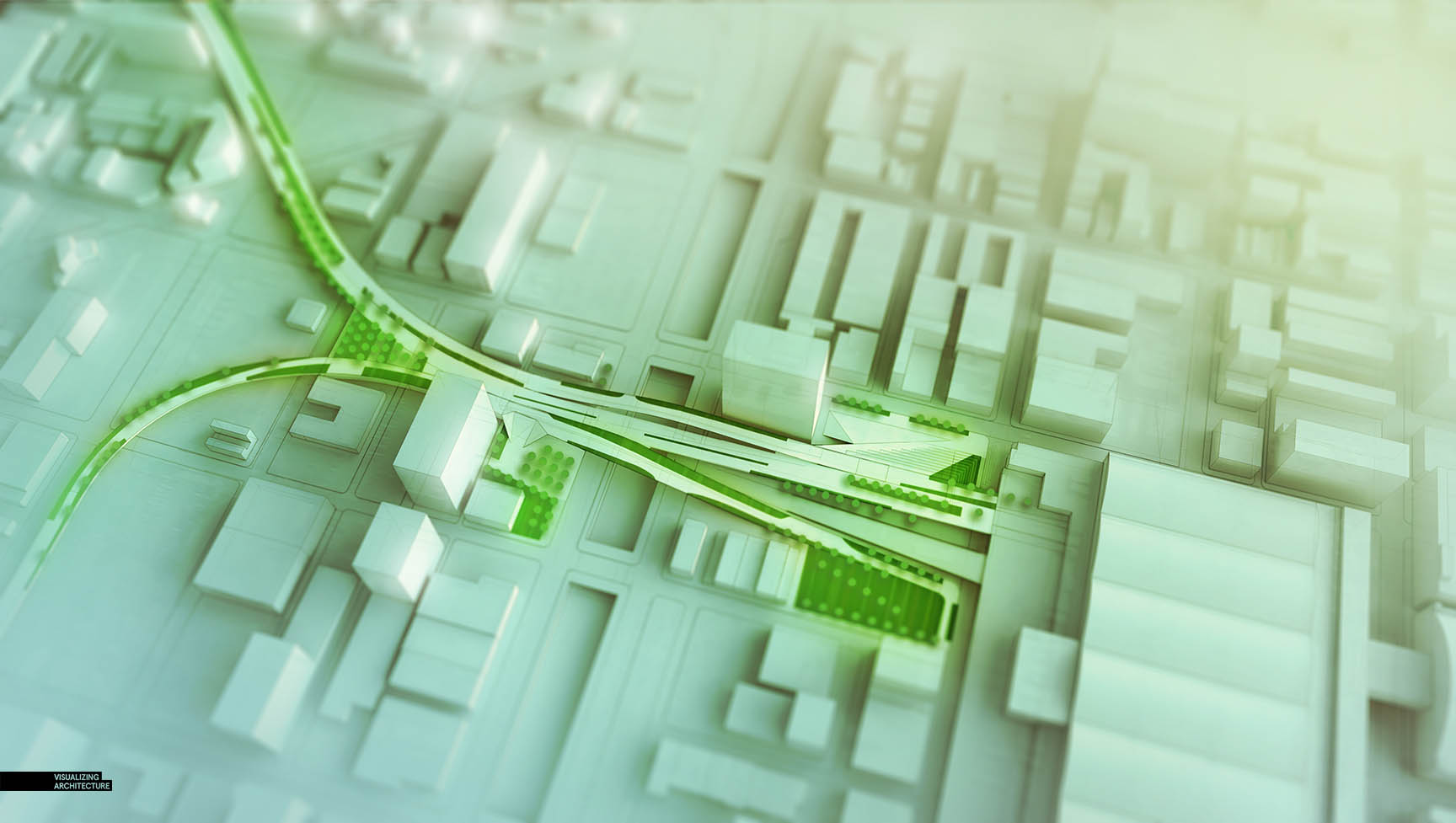
I always look to diagrams to help tease out ideas or to clarify my thoughts as early on in the design process as possible. The diagram being broken down below is working off of a simple model with almost no detail or structural articulation making it easier to update as the design evolves. This illustration is meant to study the big picture concept of the programmatic zones and will help me to think through some of the future design moves. At the same time, I know this will eventually be used in presentation materials, so I introduced some quick atmospheric and graphical effects to add a little emotion and give the image some texture. Items like annotation and information keys will be added later as I get closer to inserting the illustration into the portfolio.
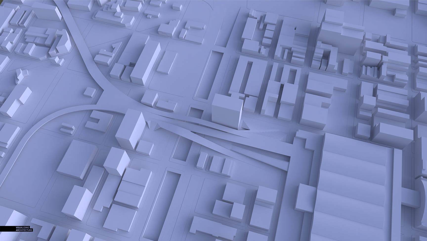
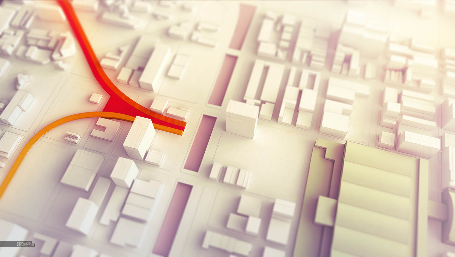
1. Clay Model Base
The 3D model for this diagram is as simple as it gets. The model consists of basic massing with no window and structural articulation to give me light and shadow information. The model was built in Sketchup and rendered in V-Ray.
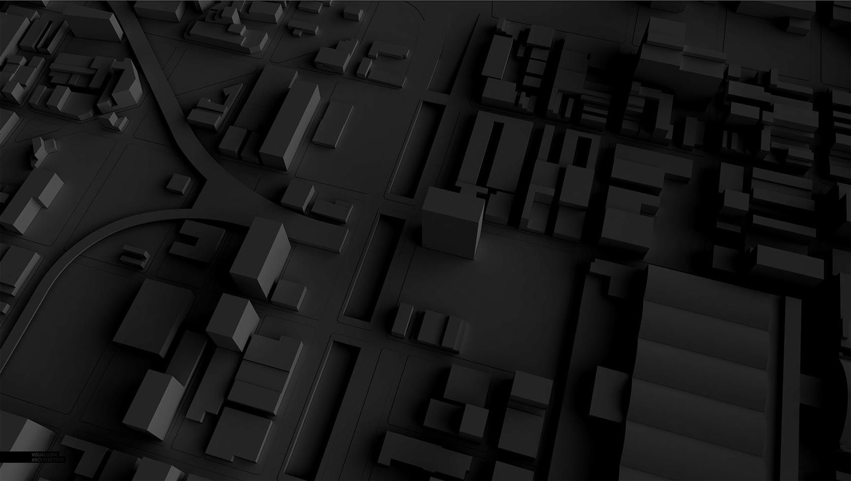
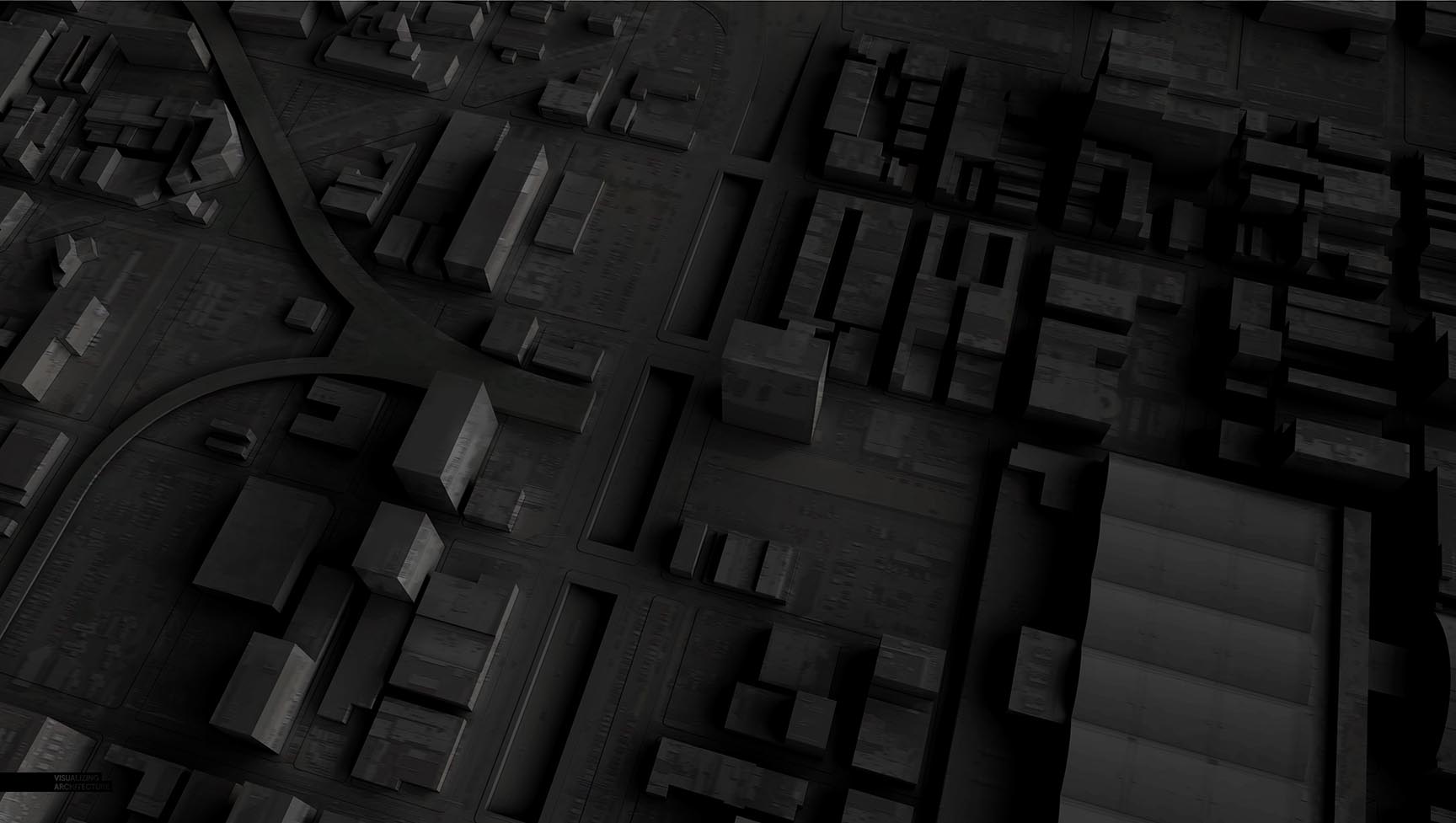
2. Darken
The base rendering was desaturated and darkened by going to “Image>Adjustments>Hue/Saturation” and by adjusting the levels.
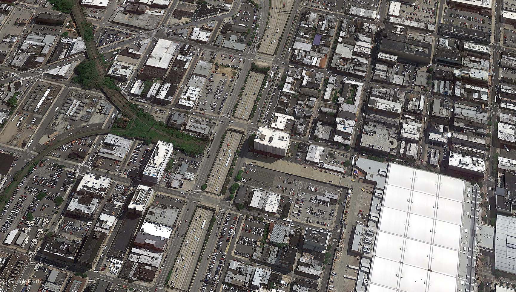
3. Map Overlay
An aerial image was distorted to match the perspective and then the layer blend mode was set to “Overlay” giving the image a subtle texture.
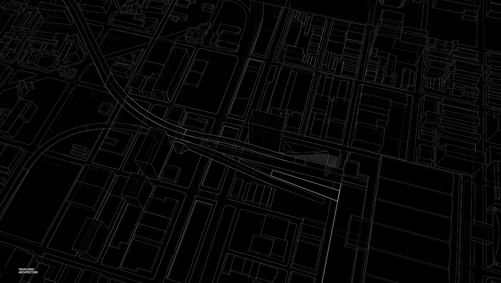
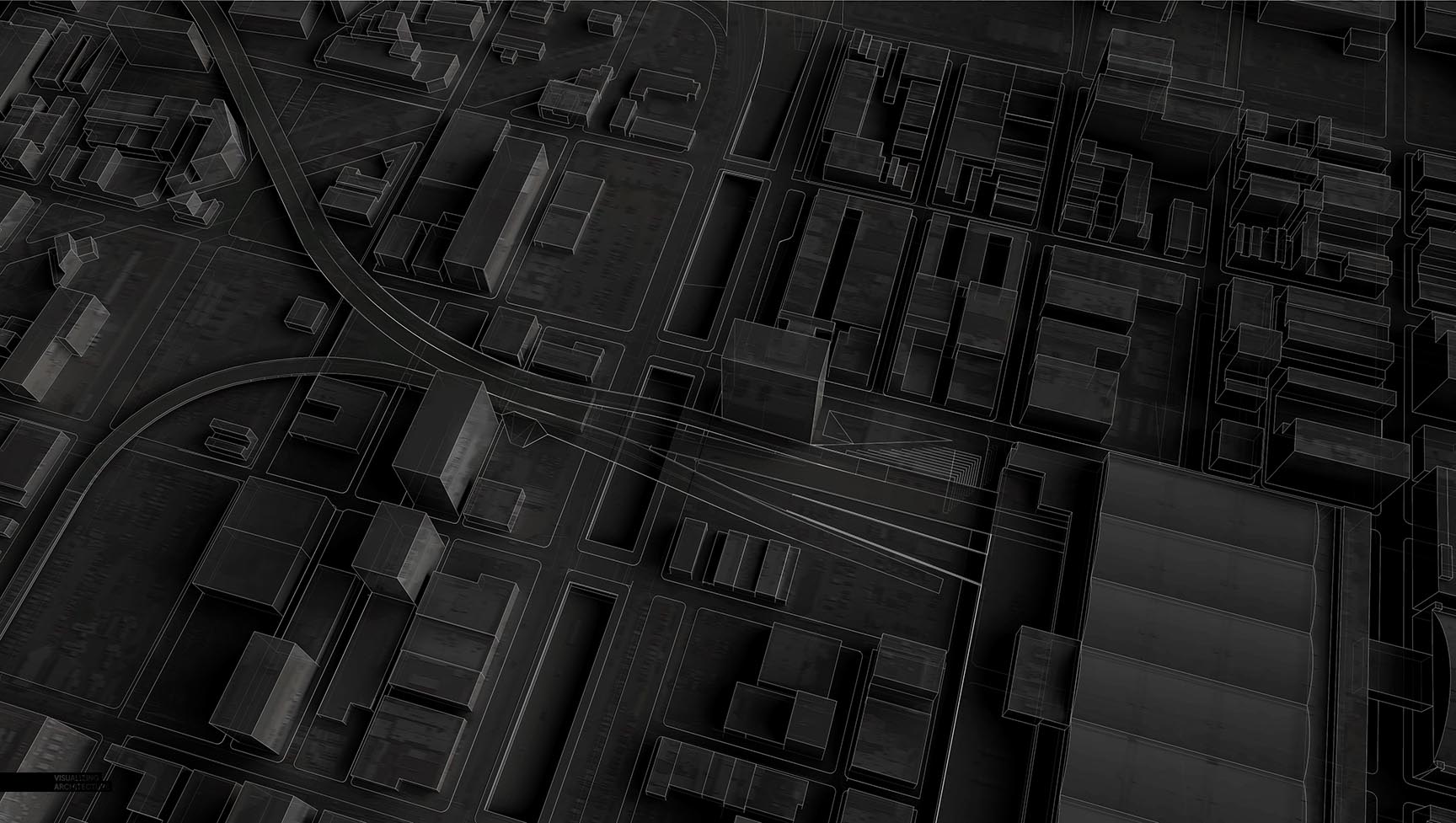
4. Line Work
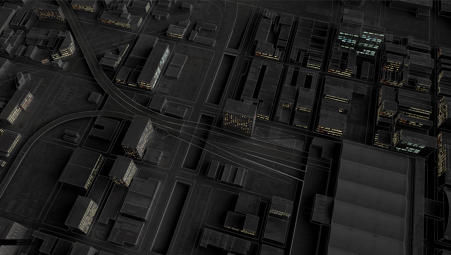
To help define the forms, I exported line work from Sketchup, inverted the colors so that the line work was white on a black background, and set the layer blend mode to “Screen”. For an added effect, I exported the line work from Sketchup with the face style set to “X-Ray”.
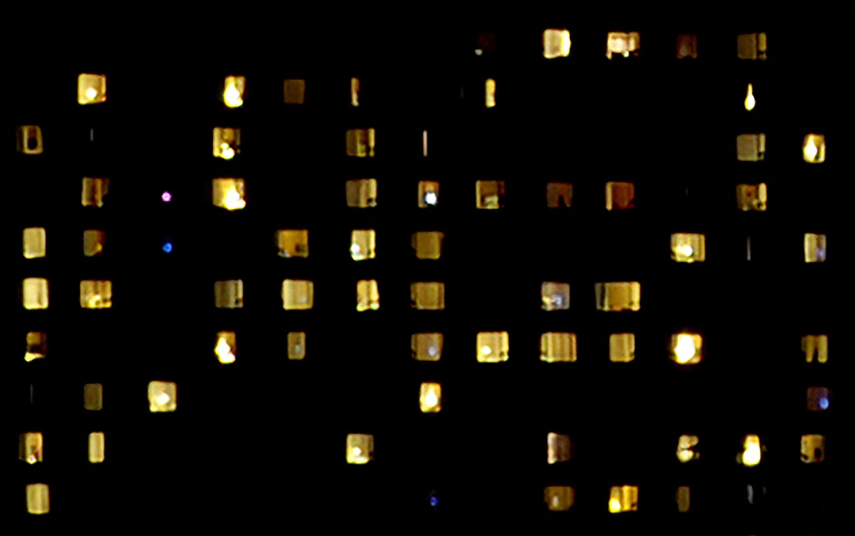
5. Turn on the lights
As a last move to add just a little more texture to the context, I found an image of building lights, and overlayed that texture onto several facades. Using the image above, set the layer blend mode to “Screen” and simply distort the perspective to match that of the contextual massing. Since this is a diagram, I wasn’t concerned about being accurate, therefore allowing me to move fast and only spend a few minutes on this step.
6. Adding Color
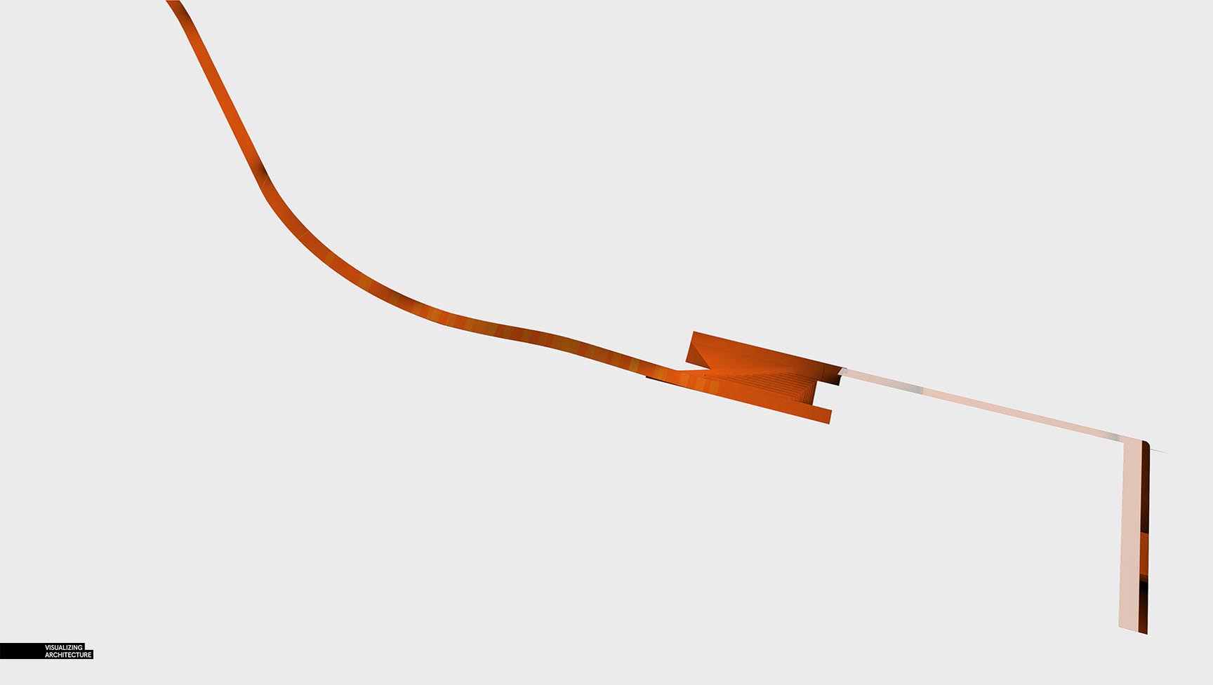
There are many ways that the color could be added through Photoshop. The way that I approached it was by first painting an area with solid color, in this case orange.
Next, I took the clay model rendering and cut that same section out. I would suggest using smart objects and masks, but for now, we will keep this super simple.
I then took the clay model section and set the layer blend mode to “Multiply” on top of the color to give it some shade and shadow.
I repeated these steps for each color which will allow me to make quick edits or experiment with color later on as needed.
Finally, I moved the white line work layer above the new color groups to give each zone a white outline.
7. Lens Blur
I added a simple lens blur to draw attention to the center of the image. A tutorial on this step can be found here.
8. Add Fog
Similar to the lens blur, I painted in some fog to again draw the eye to the center of the image. This also tones down the context and will give me some space to add annotations and descriptions for the diagram.
9. Color Overlay
Finally, the image was looking too desaturated, so some blue and orange color overlays were added. As mentioned earlier, this will be used to study my design and help clarify the concept. Once I get close to the portfolio, I will add some annotations and color keys.
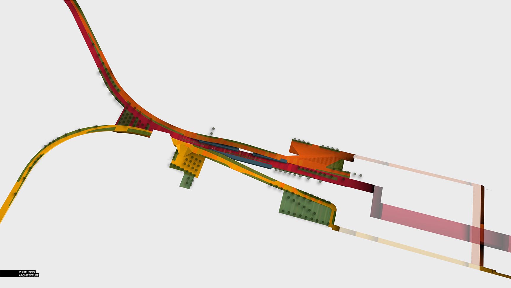
Using the same base renderings and Photoshop moves, I tweaked the colors and atmosphere to generate a base illustration for the existing conditions diagram.
As well as a green spaces diagram.







I’m always being inspired from your works and test out stuff on my portfolio. Thank you very much for an amazing work.
Hi Alex, another one here following your blog for quite some time now. I love the way you approach visualization, more based on common sense and creativity than in render settings so to speak. It is always a pleasure to watch your projects developing in those (again) creative but approachable ways, and it is also obvious you have lots of fun while doing it. 🙂
As for this scene i am a bit curious about the map overlay in step 3, as i´ve worked quite a lot with geo referenced aerial images in my models. Was the camera positioned based on the image available, so both roofs and facades would fit the model? Would you mind to go a bit into more detail in that part?
Thanks for sharing, i am a fan of your work.
Hey Diego. If you click on the second image in the “Map Overlay” section, you will zoom in on it and see that the texture is generally correct, but not precise. I think the intent is just to make the base render more interesting, not necessarily more realistic. It does make the large building on the right more articulated and adds cars to parking areas.
Ok, got the idea!
Thanks Joshua.
great!
You always KISS! Thank’s!!
Great job Alex! Thanks for the inspiration!
Can you please share the vray settings for your clay model?
It looks like a real physical model
Or are you using the same setting that you shared in a previous tutorial?
I don’t think he uses Vray for clay renders, but Kerkythea. He has made a tutorial about clay models already: https://visualizingarchitecture.com/sketchup-to-kerkythea-clay-rendering/
I think the 3D model being as basic as possible has really allowed the colour overlay to shine. I really love this diagram! I think making the colours a little darker during stage 9 will give the model a little more definition.
I agree. The colour really comes to live in this diagram and stage 9’s picture looks really lovely.
You are an inspiration Alex.
As someone who will soon be a registered architect you work sets a benchmark for quality that I still aspire to.
Thank you.
Thank you so much!
Your works are very inspiring!Thank you so much!
This is very useful to us…… thanks for sharing this Articles…https://bit.ly/2sL4gIf
The models change very miraculously through your hands.