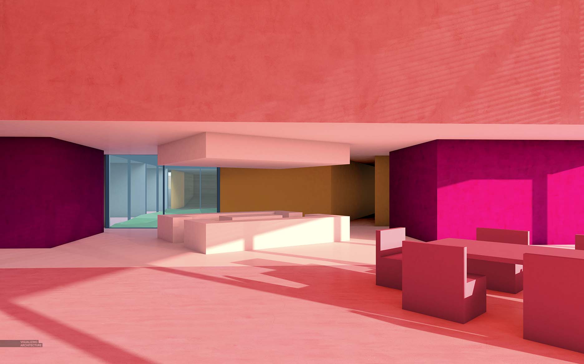
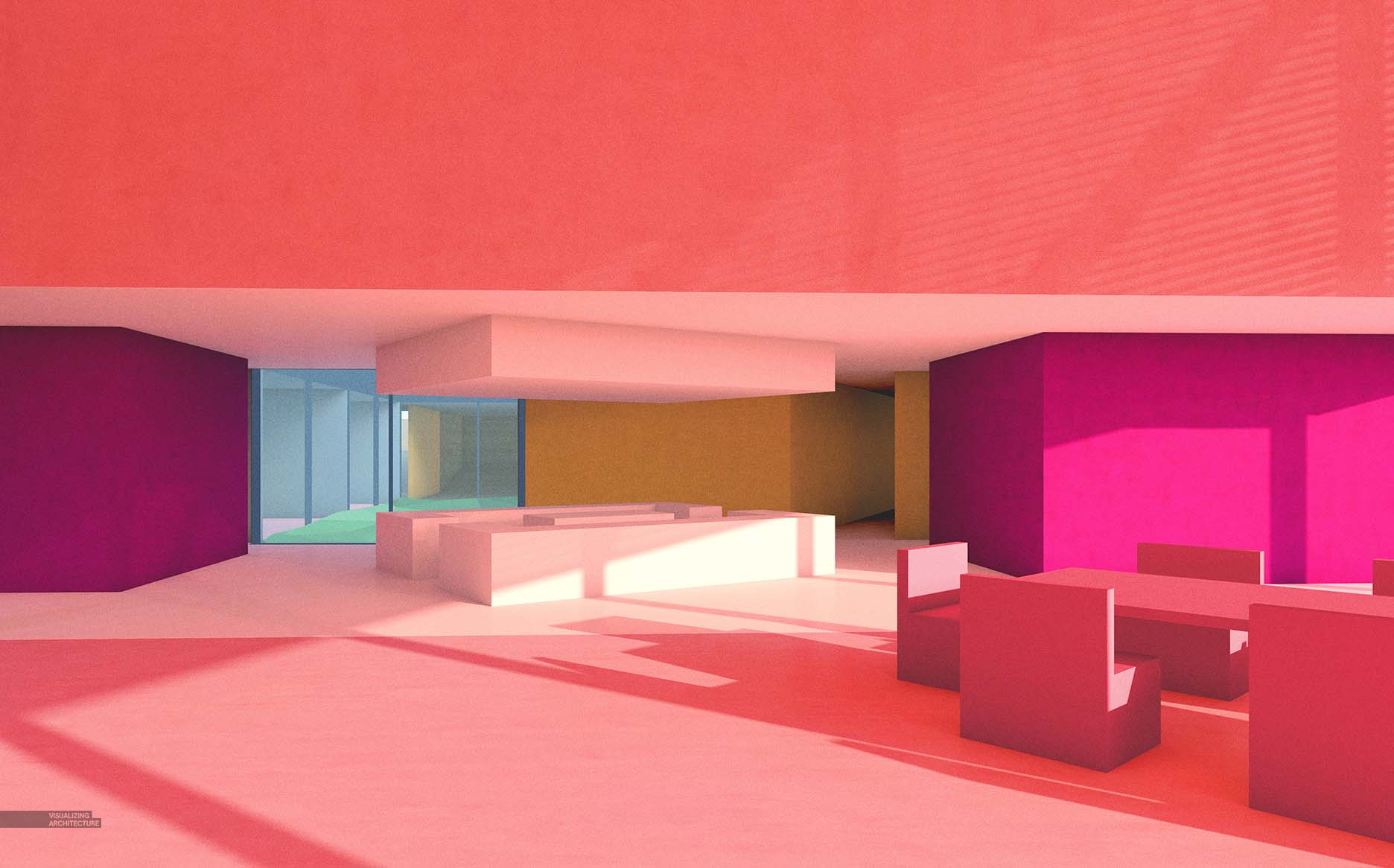
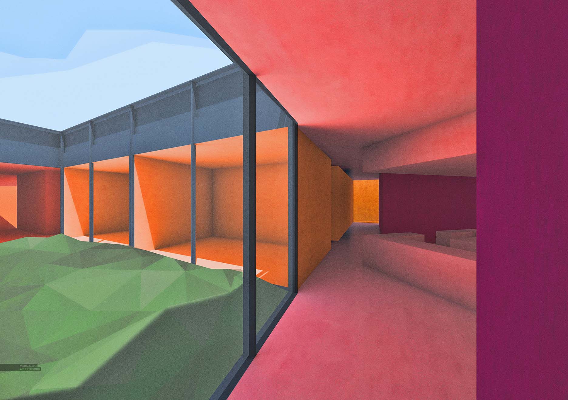
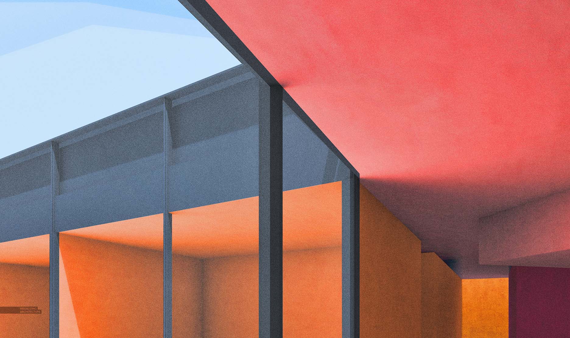
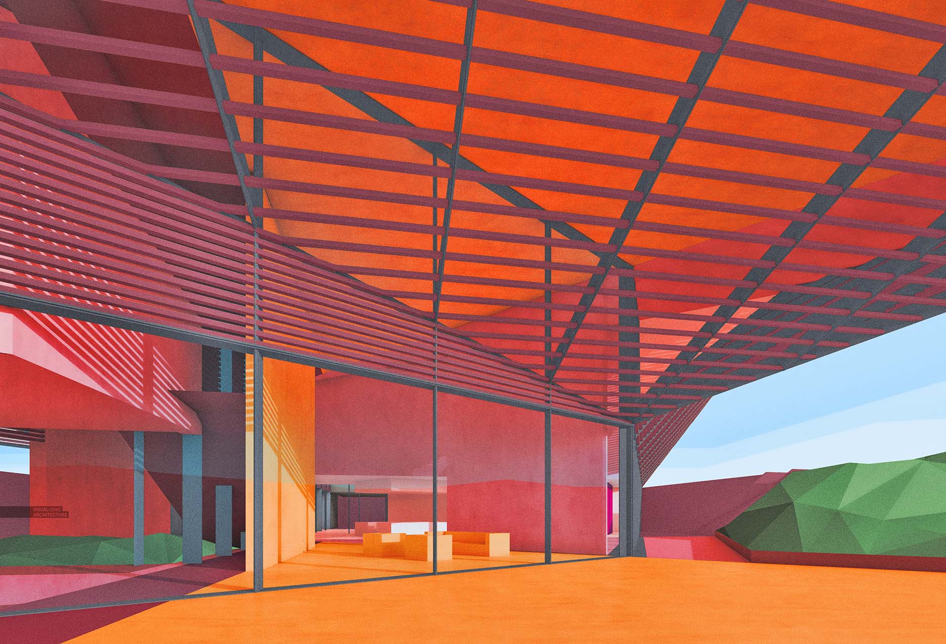
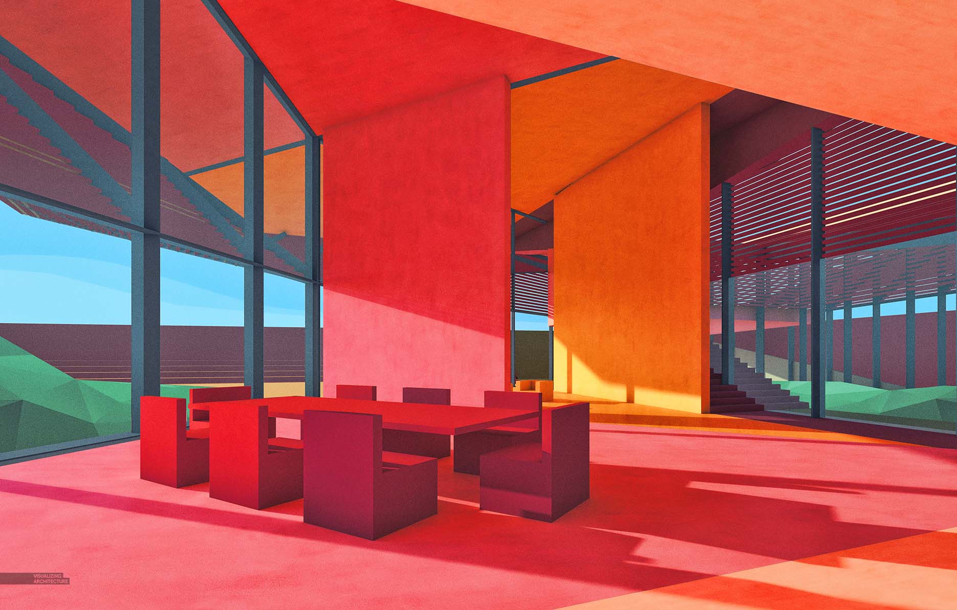
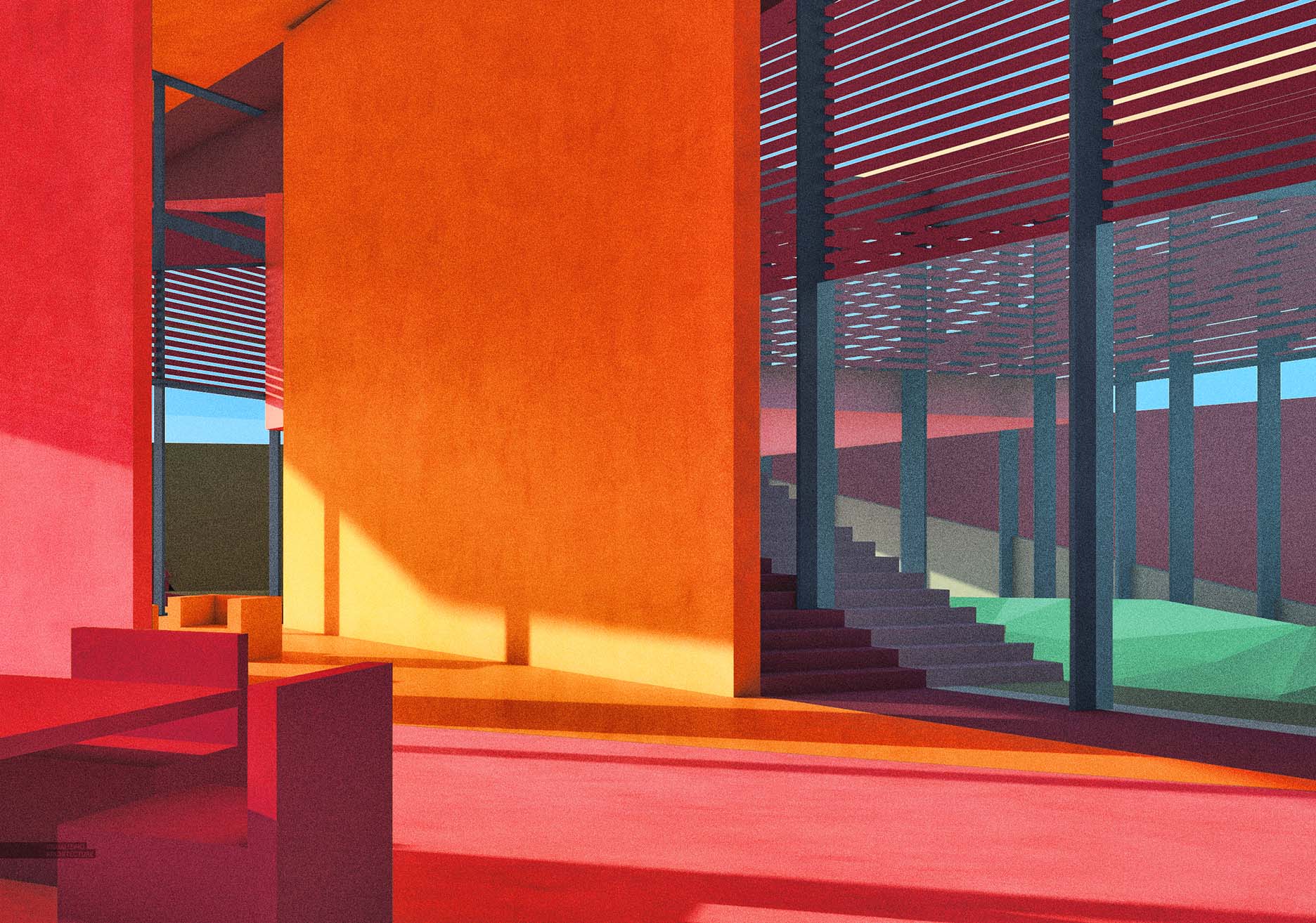
I decided to go abstract with this latest post. With this set of illustrations, I have been studying the interior spaces of the Desert House. I tend to prefer interiors with minimal color and material, so I generated these studies as a way to force me out of that way of thinking. Also, the exterior renderings were a little more serious and detailed, so I wanted to switch things up and have a little fun with these. One thing about minimal images is that inserting just a little texture can really change the reading of the illustration. In this case, just a hint of plaster texture on the walls gives the images a painterly quality. Below is a quick break down of one of the images.
1. V-Ray Base Rendering
For the V-Ray base rendering, I simply applied some colors close to what I was looking for knowing that I would tweak them later in Photoshop.
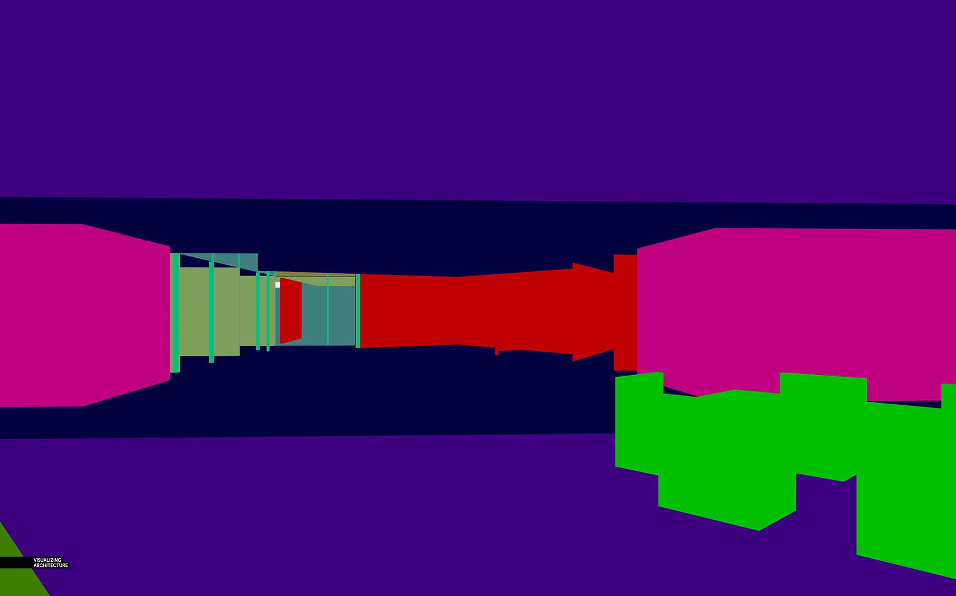
The Material ID that rendered out of V-Ray was crucial for me to make fast selections. Each color represents a zone that will take on a very specific color in Photoshop. I have talked about Material ID in more depth in this POST.
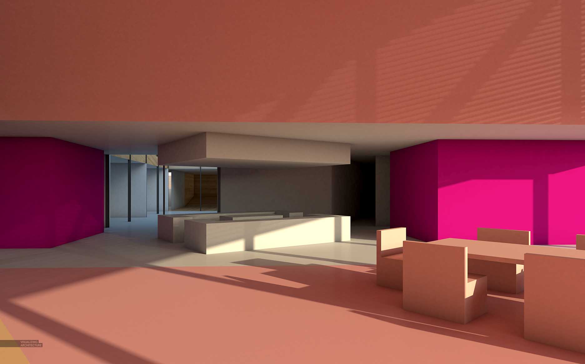
2. Add Color
Next, I took each zone of color and created a mask of that specific area in Photoshop so that I could dial in the color. In the image above, I adjusted the center pink zone to be lighter and more saturated. I wasn’t trying to be realistic so I wasn’t concerned about washing out the shadows a little bit.

Above, the image shows what the illustration looked like once I had all of the colors adjusted in each zone.
3. Texture
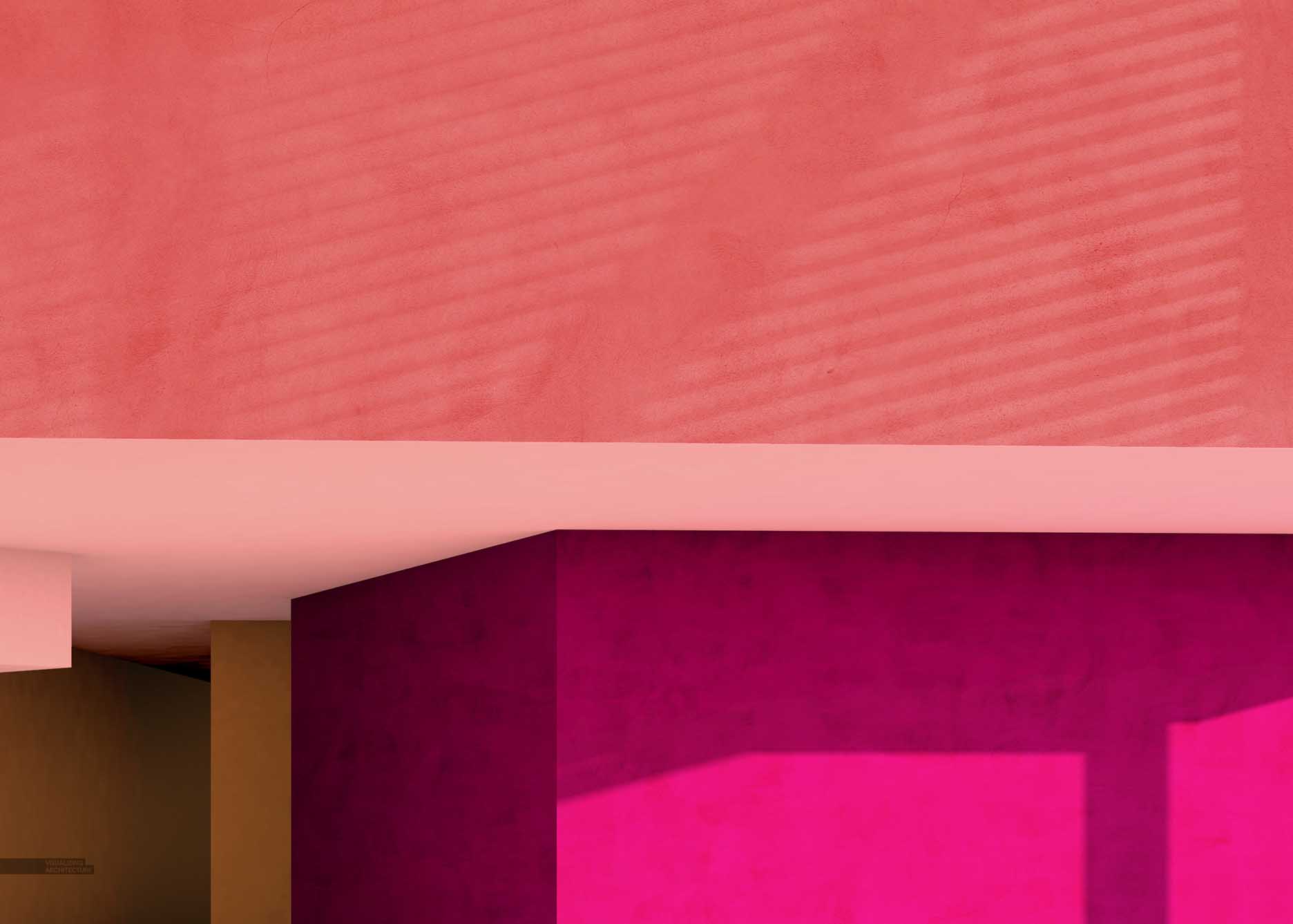
I added a simple plaster texture to all of the walls to break up some of the smoothness of the color gradients. I wanted to do this in Photoshop so that I could dial in how strong the texture was. It is important to note that I still distorted the perspective of the plaster texture to match the wall angles. If it sounds like a lot of work, it isn’t because I was able to use the color zone masks used in the previous step to speed this process up.
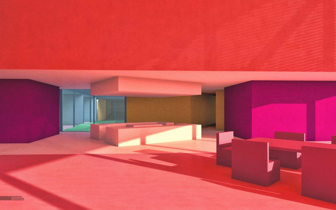
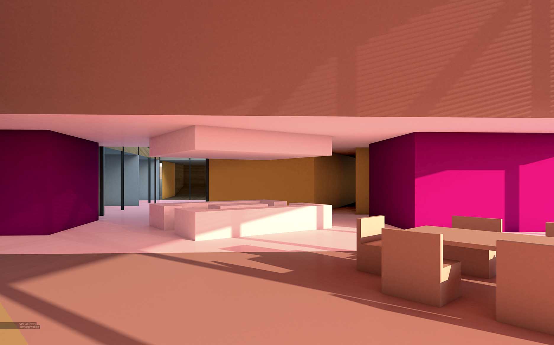
4. Color Adjust and Noise
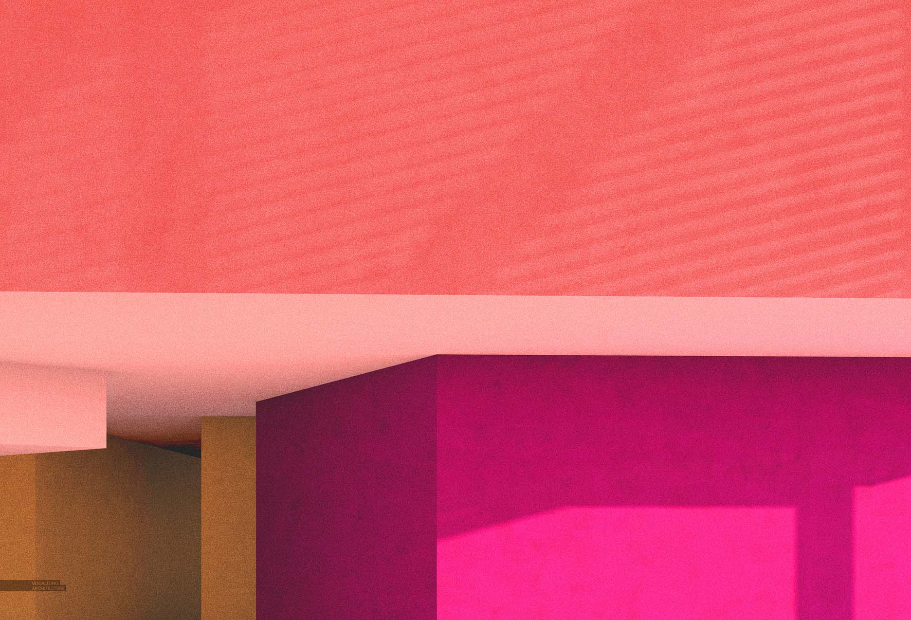
At this point, I began adjusting the overall image. I first lightened the images and increased the saturation. I also added just a hint of noise. I describe how to add noise in step six of this POST.
5. HDR

Finally, I added a slight HDR effect that amplifies the contrast and textures. I used Topaz to generate the HDR effect.
Final Images


Hi Alex,
A cool presentation of interiors. I did a similar presentation using the colors that we get from the Material ID itself and overlaying it on top of RAW GI getting a similar effect. 🙂 Tell me what do you think.
https://www.youtube.com/watch?v=ntcJ2kb4aAo
Hi Alex,
Thank you for this exciting passage. How you generate those low-poly lawns in the final images? Did you build them in SketchUp or add in Photoshop? Thanks again.
Beautiful! I love the colored pencil look these have.
The pictures do a wonderful job of showing off these interiors! The abstract style is fascinating and the final images have a gorgeous texture – almost like crayon. Thanks for sharing.
I think this looks amazing
Beloved writer! Thank you so much for staying there and publishing so perfectly reports. There is someone who value it and say thanks a lot!
In my opinion, not many bloggers have so lots of suggestions to make unique, appealing content. Thanks for doing it and I desire you did not lose the motivation to write the unique ones!
I completely accept with the previous reader. I feel the great enthusiasm and great comments are wonderful foundation to create high excellence content.
I have usually wondered how to put together top quality items and distribute them on the weblog. These days I should state that the job isn’t for me. I allow it for pro writers.
I believe there are many other people who are enthusiastic about them just like me! How much time does indeed it take to complete this post? I have read through other blogs, nonetheless they are cumbersome and confusing. I actually hope you continue to have such quality articles to share with everyone!
Here is a quick problem to consult – how to organise such a ideal article? It shows all attributes what make a great post. There is a catching heading and fascinating articles. Well-done!
I ought to acknowledge that it really is 1 of the most worthwhile content I have actually study. It actually is also professionally created. I am an french instructor so I see what I suggest.
Nice Information!!!
Good articles. Thanks for providing us.Very Helpful us.
Awesome presentation of interiors. Looks amazing
Amazing, great enthusiasm.
Thanks for sharing with us. Its very Helpful….
Hello everyone. You are a basketball enthusiast !!! You want to get involved with an impressive basketball game or simply a game player. Have fun
Thanks for sharing amazing presentation
Thanks for sharing good content of blog .There is a catching heading and fascinating articles.
Your rendering images are looking nice.
I love the 4th final image. I would easily frame it and hang it on my living room or my office.
Great work.
off topic: so many spam comments with escort services in this comment section…
as if somebody that clicks in an escorting service web page by mistake and thinks “humm, now that I’m here, why not make a pause from renderings?”.
Amazing…..! great work…. thanks for sharing this Articles…
http://caddraftingservices.in/
I was very impressed with the desert abstract study, it was quite new to me.
A fabulous presentation of an interior design. It sounds quite impressive.
Appreciate it for your great contribution.
Thanks for sharing very nice interior designs great architectural rendering designs.
Thanks for sharing very nice interior designs great architectural rendering designs.
View more high-end Architectural Visualization in: https://spotworks.com.sg/
Waitress New York Tickets at Brooks Atkinson Theatre