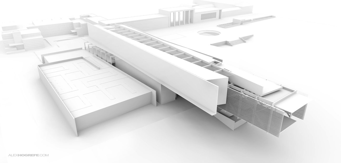
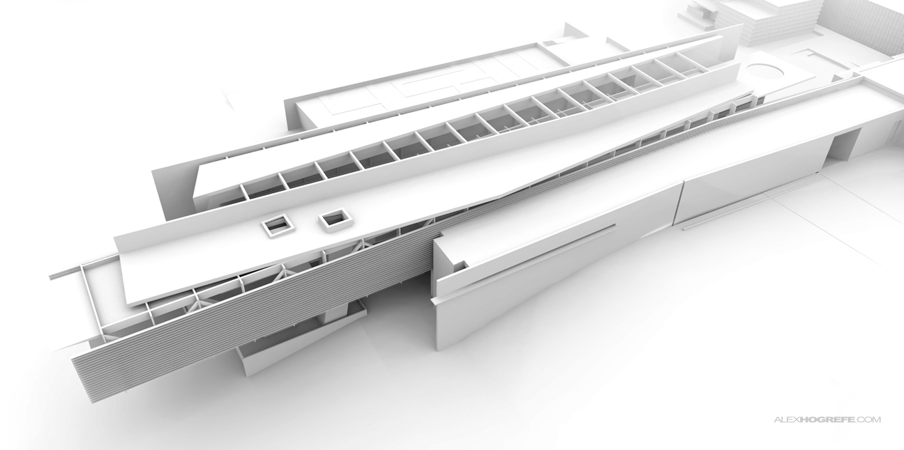
The summer is coming to a close and I am making a final push to wrap up “Project Portfolio Upgrade”. I have spent the last two weeks developing a new 3D model for one of my old projects from undergraduate school. Some of you may recognize the design as it has appeared in many past posts and tutorials. The project was originally developed for a competition by Cranbrook Academy to design an addition to their art museum. It has always been one of my favorite projects and I was excited to revisit it and have a second go at it.
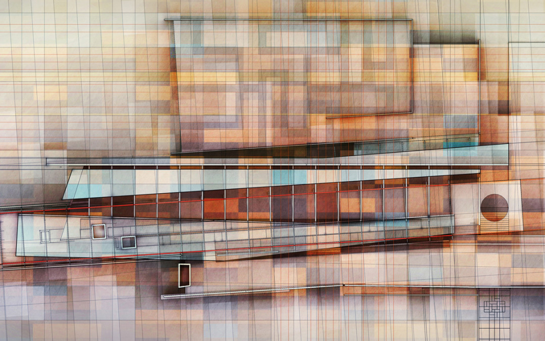
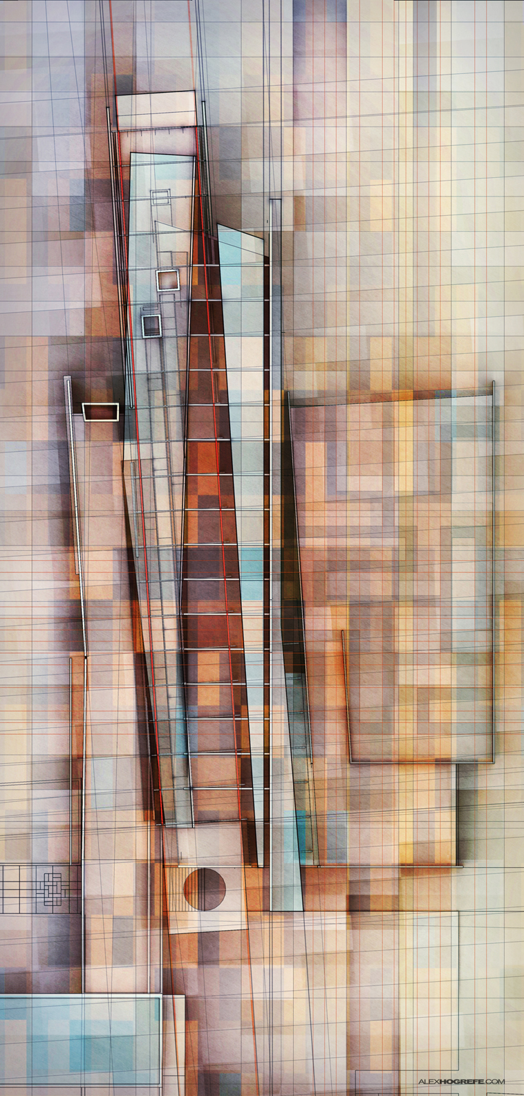
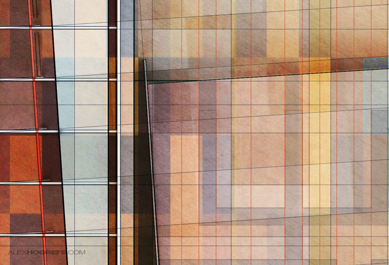
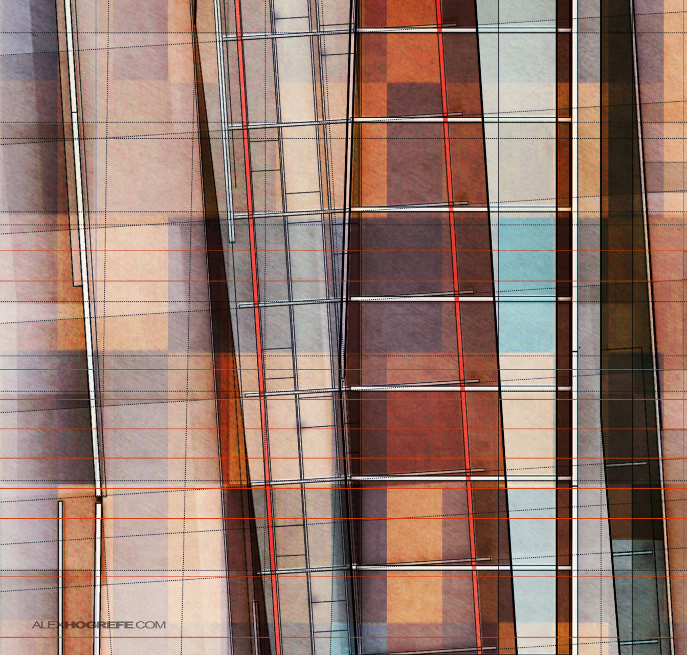
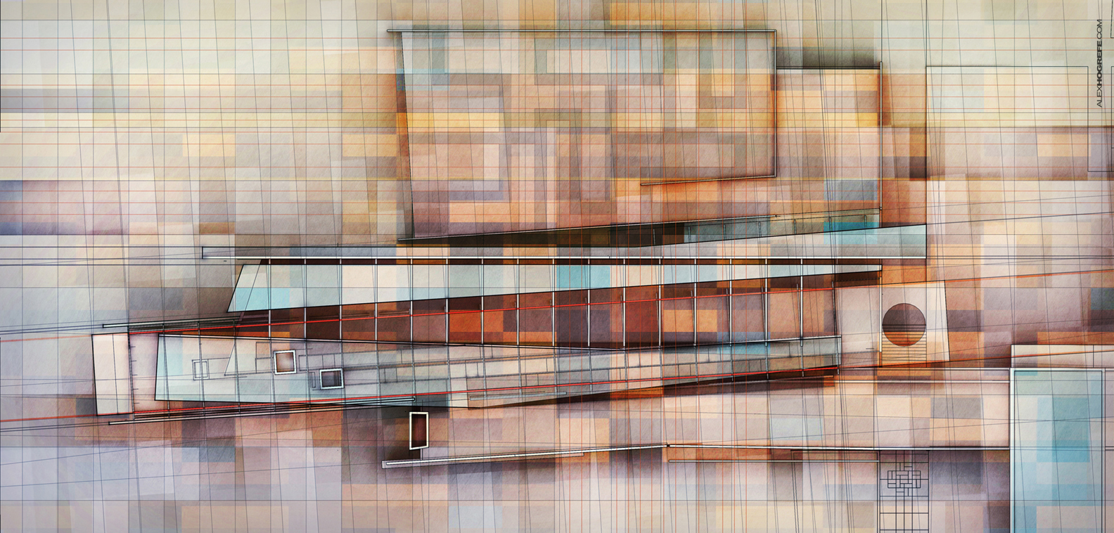
I was in one of those moods to experiment and use more of the right side of my brain. The intro spread to this project seemed like the perfect place to do something a little different. The design has many strong lines that at first glance don’t appear to relate to one another. There is also a grid system that influenced many of the big moves. With all of this complexity, the illustration needed to expose the rules of the design i.e. how the form responded to the grid systems as well as how the forms related to one another. I wasn’t looking for a diagram though. The intro page should be strong graphically but at the same time be abstract, encouraging the viewer to investigate the rest of the project pages.
Above, the new 3D model based on an old project from undergrad.
There was also an opportunity to use this illustration as a study for areas of the design that have not be developed yet like the roof garden and interior details. Breaking away from the 3D model and developing this illustration has spawned a few new ideas that I know I would not have arrived to had I not gone through this exercise. The complexity of an illustration like this really draws me into the project and gets me thinking about things that I just don’t think about when modeling and sketching.
This illustration, like all of the other intro spreads, will set the tone for the rest of the portfolio pages of this project. Be sure to check back over the next few weeks. I plan to churn out a few more spreads and hopefully get out some new tutorials that are long over due.


This looks great… almost like art… very nice as a graphic… but took away from the design, wouldnt you say? maybe a little bit of a play with opacities would make the built stand out from the surrounding…
@Salonee Chadha – Maybe it did a little bit. But I think it's just an illustration for the rest of the project and it's supposed to be that way 🙂
Incredible as usual!!! XO
By the way Alex, could you please make an video tutorial how to make that "nice-clean clay render" with Kerkythea and make good fence material as seen above?
thank you 🙂
nehemia
I like your work very much.could you please share the way you make this work ?
I just wanted to share this web for those who have any trouble choosing matching colors.
https://kuler.adobe.com/create/color-wheel/
it used to be free.. hope it stays like that.
About your post: AWESOME like always
All the way from Argentina, keep rocking!
@Salonee,
I was going for something a little more abstract. I wanted something graphically strong and that would peak the viewers interest drawing them into the rest of the project pages.
@Nehemia
I do have a video tutorial of this. Check out: both these tutorials:
http://www.alexhogrefe.com/clay-rendering-tutorial/
http://www.alexhogrefe.com/quick-tips-adjust-levels/
@Martin, thanks for the comment. I have always come across these sites but never really use them. I need to start looking into them more.
hi Alex….i’m not able to view these video tutorials, is it not available now?
dear Alex
your blog is perfect! could you please teach how to insert cars and their light trails?
thank you 🙂
You have done really a fabulous work. Some important and essential idea i got from your post. Really appreciated your works very much !!
Alex, I'm missing a good old video tutorial …. 😉
Can't wait for it.
Your BLOG is an inexhaustible source of resources and learning!!
You're an inspiration, even to an architect colleague, as I 😉
I'm from Argentina and I was studying in the US last year and one day a friend of mine told me, Do you know Alex Hogrefe ?.. and I said who???.. but when I saw your website I was more than impress and I'm still astonished by the way you express architecture… I learn to used Photoshop thanks to you…
thank you for shearing what you do and to teach us how you do it.. when I went back to Argentina I told all my architect friends about you so you re officially world wide famous…. never stop to do what you do, cause you inspire people, and make us remember the love for designing great architecture, and the way to represent it.
@Alex Hogrefe : thank you for your two links above….that's very helpful 🙂
by the way, same as JOAO PEDRO …" I'm missing a good old video tutorial , Alex …. 😉
Can't wait for it."
Dou you plan about that, Alex? hehe
#Justask
anyway thanks for your great blog!
🙂
You are a spectacular artist and an amazing teacher! Thank you so much for sharing your knowledge and can't wait to see the techniques for this!
@Federico, Nehemia, Pikitila, Soraya, Papiya, and Joao,
Thank you for the kind words! It is much appreciated.
The blending colors are very pleasing to the eyes and very natural. This is art!
you helped soo much! THANK YOU!
This blog is an inspiration. Thanks! http://homeextensioncentre.co.uk
Alex,
Do you have any tutorials showing the way you have achieved this look?
I have a very diagrammatic based project and I think an abstracted version of what you have done here would work extremely well. I'm just curious how you got the overlaid color-grid and textures into the linework of the drawing?
Thank you for all your inspiration! I've learned more from your tutorials than a lot of what we're introduced to at school!
Dear Alex,
I love your site, thank you so much for sharing all the valuable techniques.
I have a simple question. The models in white, above this page, are those rendered in sketchup and using KERKYTHEA to render again in Clay?
Thank you so much again for all the works on this.
I hope sometimes if you could share some very fundamental stuff for noobs like me would be great. Thank you again.
Thanks so much for this great article; this is the kind of thing that keeps me going through the day. Ive been looking around for your article after I heard about them from a friend and was thrilled when I was able to find it after searching for some time. Being a avid blogger, Im happy to see others taking initiative and contributing to the community. I just wanted to comment to show my appreciation for your post as its very encouraging, and many writers do not get the credit they deserve. I am sure Ill be back and will send some of my friends. check this
Handless Millionaire
I have noticed you don’t monetize your website, don’t waste your
traffic, you can earn additional bucks every month because you’ve got high quality content.
If you want to know how to make extra money, search for:
Ercannou’s essential adsense alternative