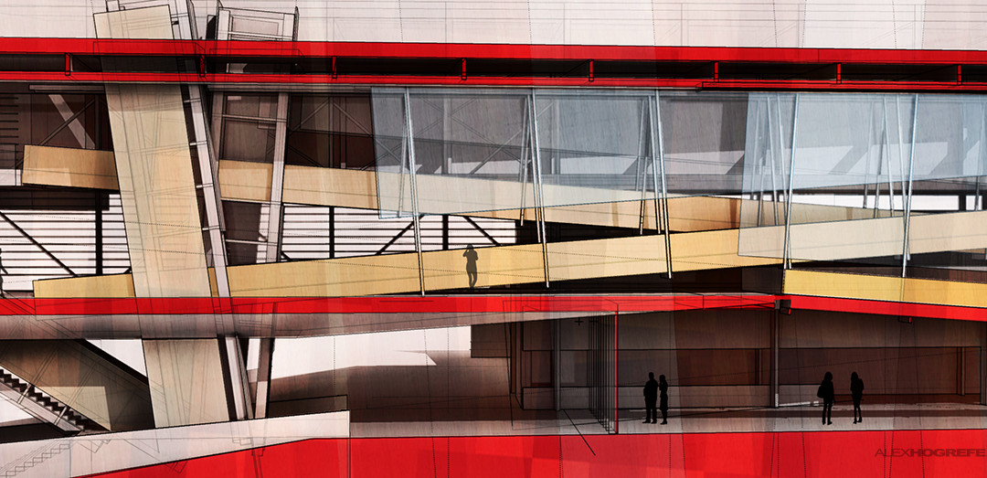
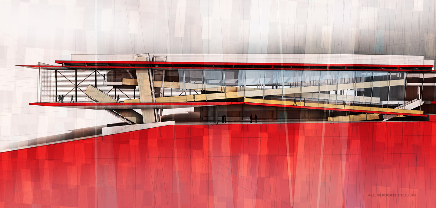
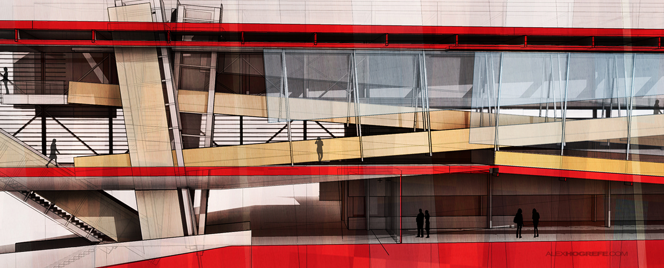
When I originally designed this project back in undergrad, I put a lot of time into the design of the section. It’s an important illustration and I therefore wanted to move away from the abstract illustrations described in the previous posts and move towards a clearer reading of the actual architecture. I didn’t want the move to be too extreme so I kept remnants of the same gridded texture used in the other illustrations. Below I break down the image to show the steps taken to get to this point.
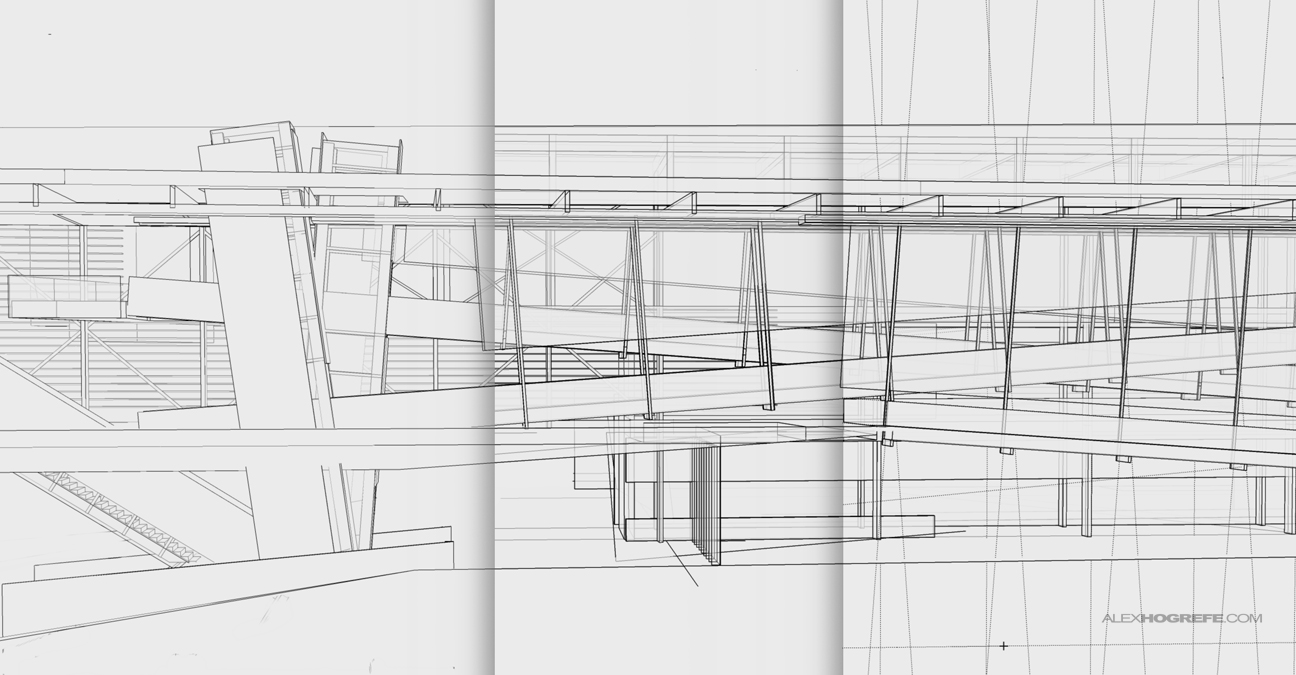
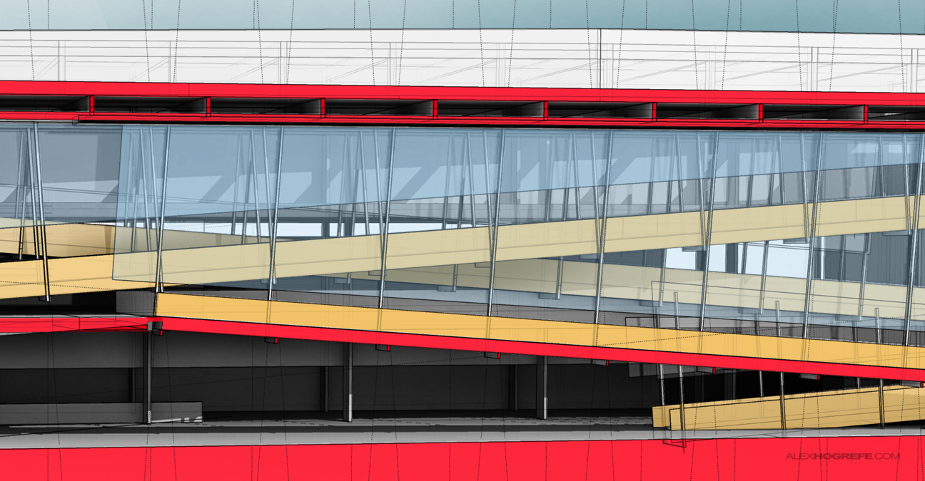
1. Export Line Work
I exported several line work images from Sketchup. I typically export many line work options whether I know I am going to use them or not. It only takes seconds and gives me more options to experiment with once in Photoshop. In this case, I exported images with the face style set to “Hidden Line”, then with “Hidden Line and X-ray”, and an image with only the guides turned on.
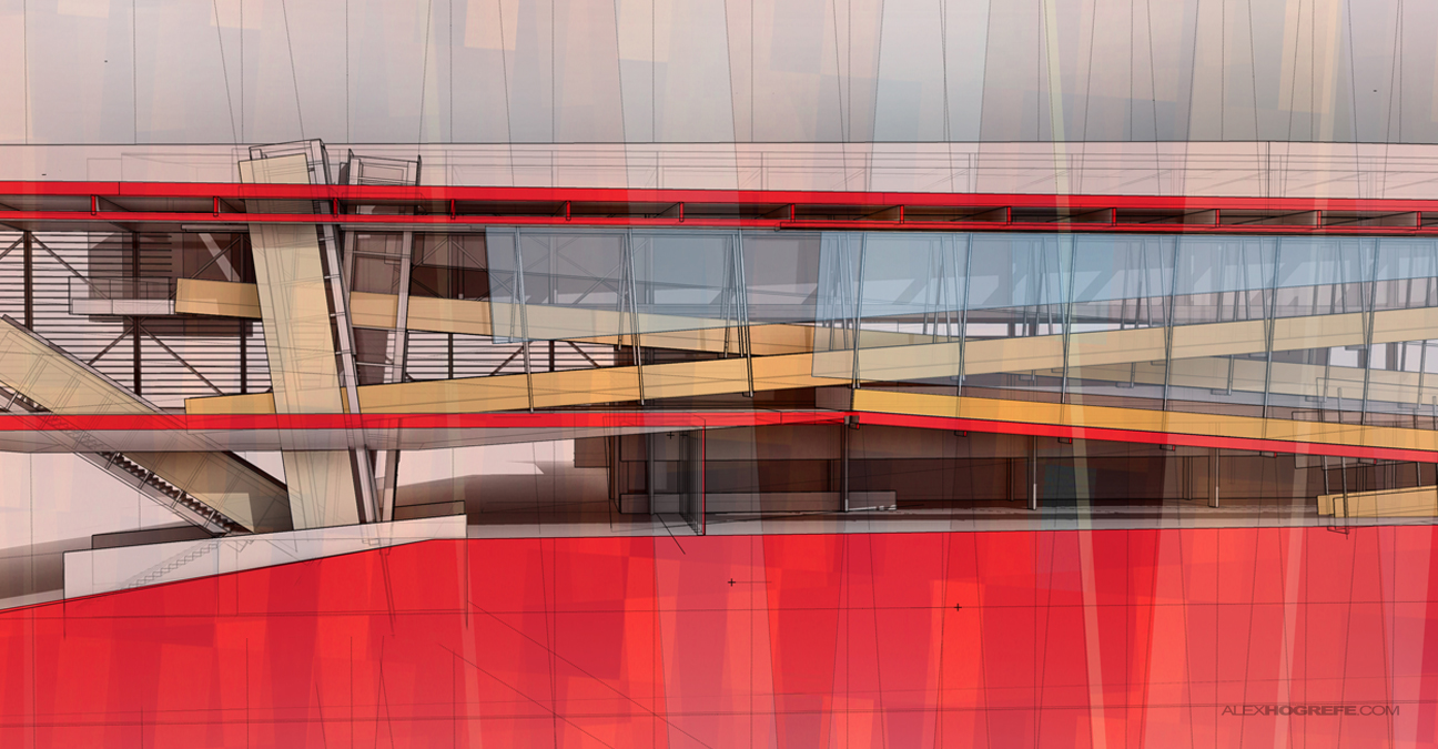
2. Clay Rendering
Next I did a quick clay model rendering of the Sketchup model. I used Kerkythea to render the image below but really any rendering program will suffice just as long as the rendered image aligns with the Sketchup exported line work. I also tweaked the levels and desaturated the rendering to get the image below. See this tutorial on CLAY MODEL RENDERINGS and also this post on ADJUSTING THE LEVELS . I should also say that I used the Zorro Plugin to cut the model which allowed me to render the section.
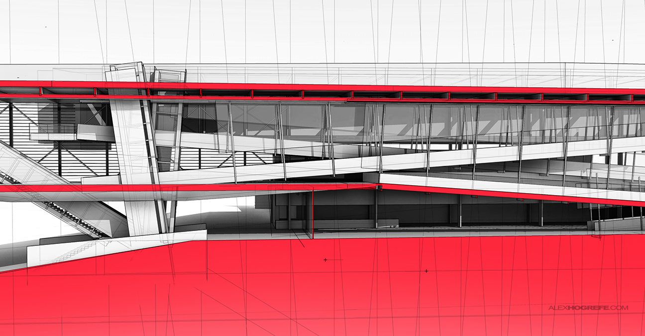
3. Poche the Cut
I wanted the cut geometry to be graphically strong, so I shaded it red. Nothing fancy here. I used the polygonal tool to select the cut areas and used the paint bucket tool to fill the selections with red color. This process is described in more detail in the QUICK SECTIONS tutorial.
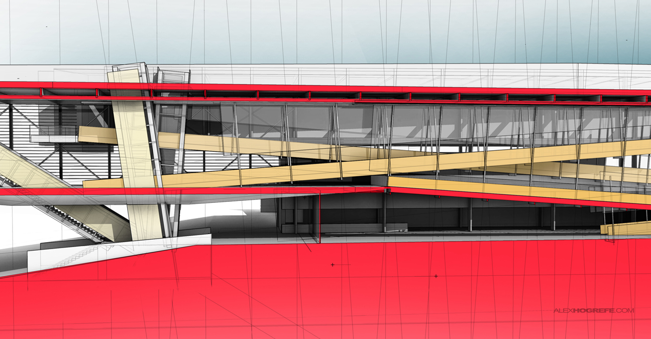
4. Tone
The image at this point is too stark and needs more color. I want the ramps and three structural elements to stand out in the section. An easy way to solve this is to add some warm tone overlays. With this illustration, I’m not concerned with materials. It’s still diagramatic and I plan to have the perspective illustrations later on to provide that information.
5. Interior Depth
The design contains many ramps as well as layers of translucent materials but this is lost in the illustration. To fix this, a light blue paint with low opacity representing the translucent material was added above the ramps. I then copied this layer two more times to give a better perception of depth and layering between the ramps.
6. Texture
In the previous posts, I have been overlaying a graphically strong grid pattern over the illustrations to convey the idea of shifting organizing grids. The concept still follows through to the section, however, I want the texture to be toned down. I took a texture of different colored squares, stretched it to give more directionality, and then scaled it to work with the column spacing of the architecture. I next duplicated the texture and rotated to match the second grid system. Both layers were set to 20% opacity.
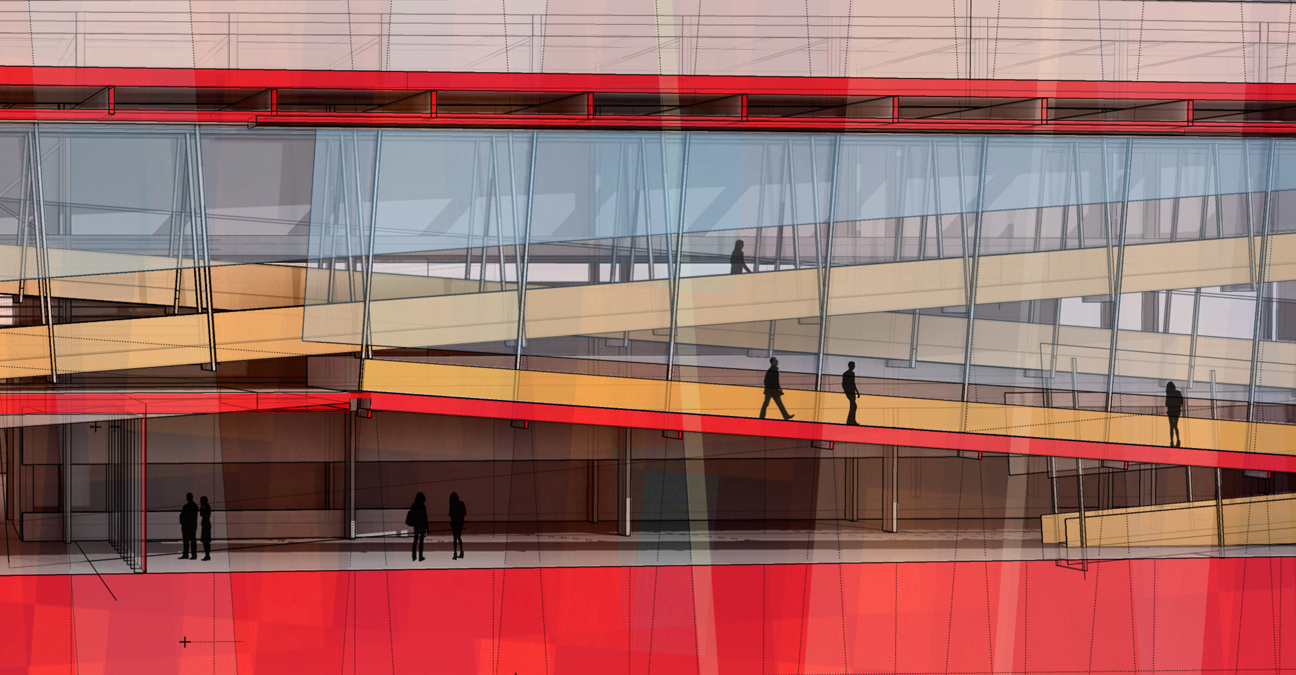
7. People
The section was populated with people to give a sense of scale. A quick way to change the people into silhouettes is to go to “Image>Adjustments>Hue / Saturation”. Then move the “Lightness” slider all the way to the left.
8. Contrast
At this point, I am happy with the illustration. But, the image still reads a little flat for my taste and is lacking hierarchy. More contrast helps to move the eye around the image. To do this, I duplicated the final image layer, desaturated it, and set the layer blend mode to “Overlay” on top of the original layer. This deepens the shadows and brightens the highlights. It’s similar to adjusting the levels or curves, but gives a slightly different look. A similar workflow can be seen in the IMAGE SOFTENING tutorial.
Below, the final image




Hello Alex! Stunning work as always. I have a quick question that's been on my mind for a while. I've tried exporting line work images in the past and find that the lines never look clean enough, meaning they look jagged and… well… Sketchup-y. This is most noticeable when I'm working with lines that are in an angle… I do hope you know what I mean. As a result, I always find it hard to work with them because they never look as crisp and neat as I would like. So my question would be, which format do you export the line work in? If it's in an image format, what resolution do you use to ensure the line work doesn't look jagged? I'd sure appreciate it if you could go into a little more detail on this. Thanks, and again, great work.
I love the second image the most – the linework combined with the clay rendering looks amazing!
@Sandra,
Its a common problem I come across too. I export as a jpeg at about 5000 pixel making sure the anti-aliasing box is checked. Another tip to help get rid of the jagged diagonal line work is to blur the lines a tiny amount once in Photoshop using the Gaussian blur filter. A much bigger workaround would be to export as a CAD file from sketchup. Then open in Illustrator and save your image from there. This would give you the cleanest line work however this takes too much time in my opinion. Hope this helps.
Alex, once again your work is brilliant and inspirational. I really love the last two post you have put up, I even made one of them my desktop wallpaper.
Thank you!!!!!
hi, alex stunning job as always! i'm searching for how to do a conceptual model (figurative). so if anyone knows it, please give me some sources! thak you.
Hey Sandra (and others),
i don't know if it'll help. but the way i export if i want really crisp linedrawings is to:
1. set up the view the way you want
2. Set the style to straight lines 01px and save the sketchup file
3. open Layout and make a new page ( i usually go landscape a3, size doesn't matter)
4. in layout insert the SU file you just saved
5. in layout set the style to Straight lines 01PX (in the menu on the right below sketchup model)
6. set the sketchup model to VECTOR and have it render(should be automatic)
7. export to pdf
and you're done, the pdf will be in vector format so you won't have the ragged lines.
its a few extra steps in the proces but you get really clean and crisp linedrawings.
o yeah this is possible in all versions of SU with layout except for the 2013 version (which i think is a pretty terrible version anyways).
kind regards,
Dean
Alex,
Amazing work as always, I owe you one from my final submission in May for your presentation ideas. I'm sure it's laughable to think I can give you a pointer, but I've never seen you mention this one I figured out.
Have a look at your section view with no edges and faces set to hidden line. All you effectively see is the cut line. Pretty much paint bucket-ready right away.
Cheers to a great blog.
– Nick
This is a really fine rendering that shows what can be conveyed architecturally, that cannot be conveyed with a plain old digital rendering. I enjoy looking through your digital approach, as it shows how the artist has to be fully engaged in the image creation process; it cannot be "outsourced".
Great blog! I check it each week.
I love the way you rendered these sections in Photoshop. Very easy and efficient. Thanks for sharing. =)
Hi
great job Alex,
if I can, i suggest maybe it will be better to add some details, architectural detail to your drawing. Little screw, a balustre, just for to have some scale of object, They will be more "realistic" but still expressive. Nevertheless I like very much your blog, and I come here and there to stole some precius advices. Thank you.
bye.
Lorenzo.
Hello, Alex.
I’m a big fan of ur website and i pay a visit almost everyday.
I really appreciate ur work and ur dedication to architectural tutorials.
The square texture photo above always makes ur work outstanding. Would u plz send it to my email or share it online?
It’s perfect..