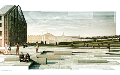
Wharf Design: Spreads
Over the past several months, I have developed many illustrations for my conceptual wharf design. I wanted to start thinking about how these illustrations would be organized into a portfolio layout. One of my favorite parts of arch viz is page layout. Last year, I put...
Breaking Up Edges Using Masks
We have used this style a couple of times in the office and I am a big fan of it. It is also really simple to implement. The idea is to apply a mask over a full resolution illustration to break up the edges giving the illustration a collage-like feel. The great thing...
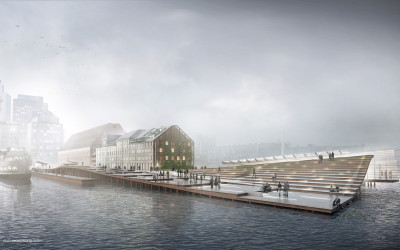
Wharf Design: Foggy Morning Perspective: Part 2
This was a fun image to work on and the breakdown is relatively straight forward. The big poetic moves such as fog and coloring come towards the end which is typically the case with images like this. There was a lot of prep in Photoshop such as refining...
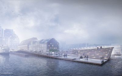
Wharf Design: Foggy Morning Perspective: Part 1
Modeler: Sketchup Renderer: V-Ray Post Processing: Photoshop Final Output Size: 4500 px x 2520 px The Boston Long Wharf perspective illustrations are underway. This first illustration is one of the more important ones because it is describing the entire design...
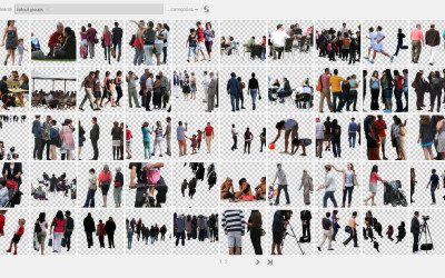
Favorite Architectural Cutout and Texture Resources
Architecture visualization can consume a lot of resources and time if you're not careful. With the tediousness of Photoshop and renderings calculating through the night, spending more that 20 minutes searching Google images for a specific texture or image can...
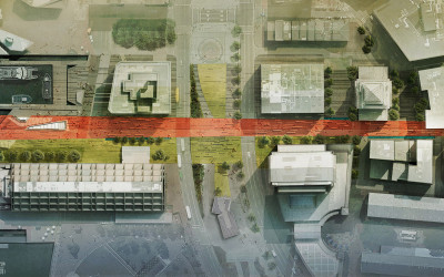
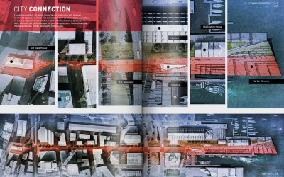
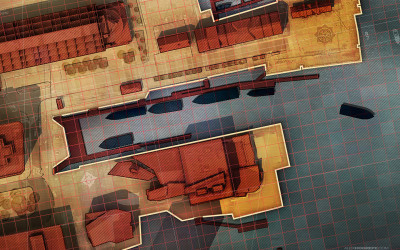
High Res Site Plan
In the previous wharf post, I discussed black and white texture studies that focused on pattern and ground plane elements throughout the wharf. The above image builds off of those studies introducing color and material. Site plans are...
Best Of Tumblr Gallery
It was a little over a year ago that I started a visitor gallery tumblr page in an attempt to generate a another place on the internet for architecture visualization inspiration. It has been exciting to see so many unique styles and methods submitted week after...
Diagrams: Texture Study
The last few posts have been focused on diagramming the existing conditions of the site. In this latest post, I have shifted to studies for the new design. The overall concept and form of the Sketchup model is established, but now I am interested in exploring...
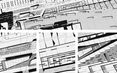
Diagrams: Hatch Patterns
This post is also a follow up from many emails asking me to explain the diagonal line hatching used the site analysis diagrams. There are two methods in Photoshop that I know of that can create the diagonal line hatch seen in the image above. Both options use a...
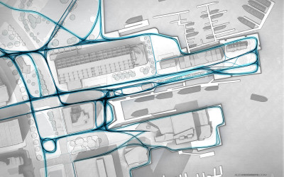
Diagrams: Pedestrian Paths
I received a lot of emails asking if I could explain how I created the pedestrian paths diagram in the previous post. To generate the line work, there are many ways this could be done. In the past, I probably would have used the spline tool in CAD. The line...
Wharf Design: Spreads
Over the past several months, I have developed many illustrations for my conceptual wharf design. I wanted to start thinking about how these illustrations would be organized into a portfolio layout. One of my favorite parts of arch viz is page layout. Last year, I put...
Breaking Up Edges Using Masks
We have used this style a couple of times in the office and I am a big fan of it. It is also really simple to implement. The idea is to apply a mask over a full resolution illustration to break up the edges giving the illustration a collage-like feel. The great thing...
Wharf Design: Foggy Morning Perspective: Part 2
This was a fun image to work on and the breakdown is relatively straight forward. The big poetic moves such as fog and coloring come towards the end which is typically the case with images like this. There was a lot of prep in Photoshop such as refining...
Wharf Design: Foggy Morning Perspective: Part 1
Modeler: Sketchup Renderer: V-Ray Post Processing: Photoshop Final Output Size: 4500 px x 2520 px The Boston Long Wharf perspective illustrations are underway. This first illustration is one of the more important ones because it is describing the entire design...
Favorite Architectural Cutout and Texture Resources
Architecture visualization can consume a lot of resources and time if you're not careful. With the tediousness of Photoshop and renderings calculating through the night, spending more that 20 minutes searching Google images for a specific texture or image can...
High Res Site Plan
In the previous wharf post, I discussed black and white texture studies that focused on pattern and ground plane elements throughout the wharf. The above image builds off of those studies introducing color and material. Site plans are...
Best Of Tumblr Gallery
It was a little over a year ago that I started a visitor gallery tumblr page in an attempt to generate a another place on the internet for architecture visualization inspiration. It has been exciting to see so many unique styles and methods submitted week after...
Diagrams: Texture Study
The last few posts have been focused on diagramming the existing conditions of the site. In this latest post, I have shifted to studies for the new design. The overall concept and form of the Sketchup model is established, but now I am interested in exploring...
Diagrams: Hatch Patterns
This post is also a follow up from many emails asking me to explain the diagonal line hatching used the site analysis diagrams. There are two methods in Photoshop that I know of that can create the diagonal line hatch seen in the image above. Both options use a...
Diagrams: Pedestrian Paths
I received a lot of emails asking if I could explain how I created the pedestrian paths diagram in the previous post. To generate the line work, there are many ways this could be done. In the past, I probably would have used the spline tool in CAD. The line...