by Alex Hogrefe | Sep 12, 2011 | Break Down |
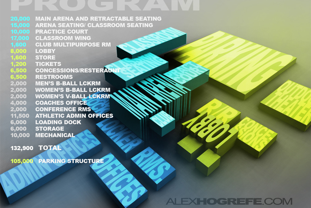
I’ve been putting together some program diagrams for work, and it reminded me of one that I created a year and a half ago in grad school. Experimenting with different arrangements and adjacencies of programmatic needs in Sketchup proved to be an effective...

by Alex Hogrefe | Sep 5, 2011 | Final Moves |
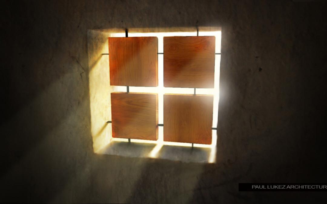
I received a lot of feedback and emails from people after posting the “Honduras Illustration part 2” asking for a tutorial on adding light rays. I put together this video explaining how this was done. You will will realize that there’s not...

by Alex Hogrefe | Aug 27, 2011 | Final Moves |
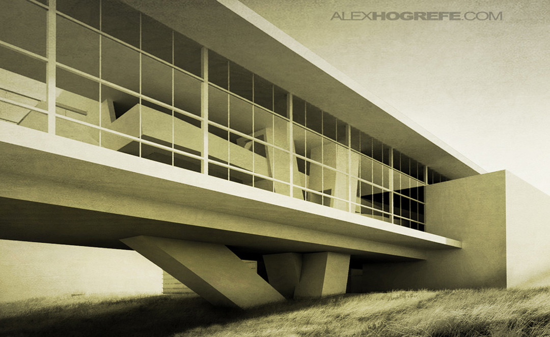
As I get more into photography, I find more and more things that overlap into architecture illustrations. One thing that I never thought about in school when creating illustrations was the idea of avoiding converging vertical lines. Obviously, this isn’t...

by Alex Hogrefe | Aug 21, 2011 | Break Down |
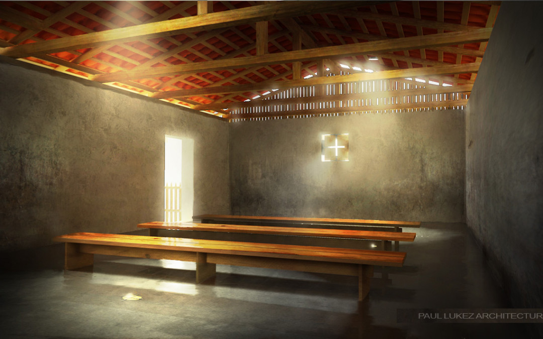
I realized that I never posted these images that I created a while back when I posted the Honduras Church illustrations. In this case, the design is relatively simple composed of 5 elements added to the untouched shell of a house in Honduras. The space is...

by Alex Hogrefe | Aug 14, 2011 | Break Down, Over Time |
As the title implies, this architecture illustration tutorial doesn’t use a rendering engine. I have done a few other tutorials in the past that don’t involve a rendering program, however this tutorial does things a little differently, and in less...
