by Alex Hogrefe | Jun 25, 2017 | Break Down, Portfolio Vol. 5, Project 06 Philly Bridge |
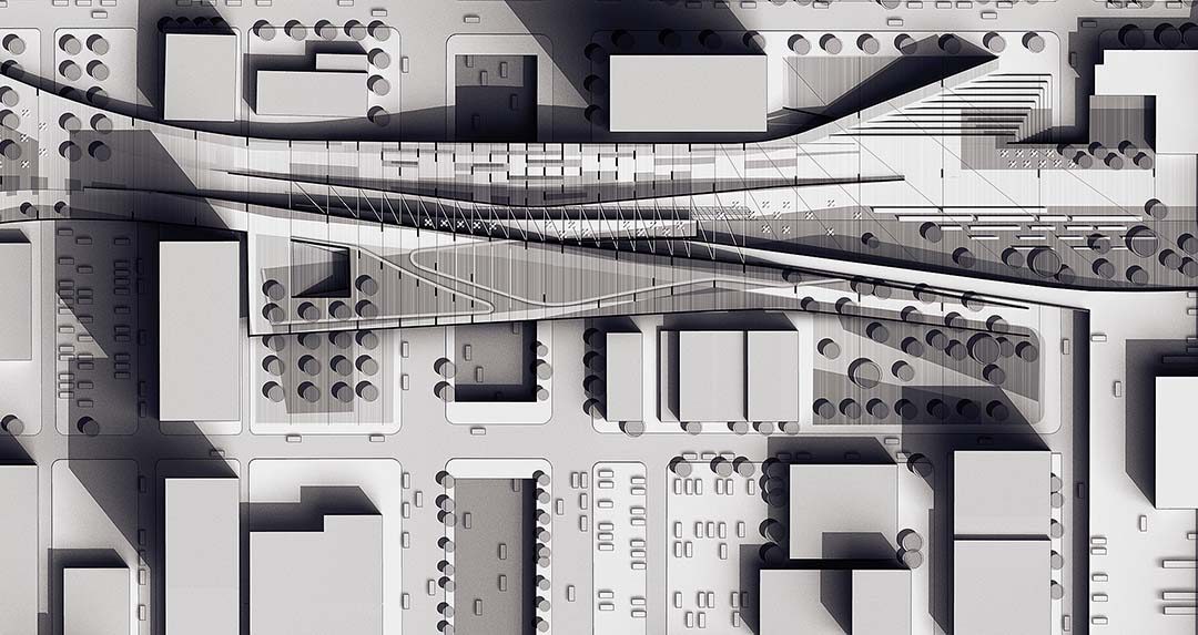
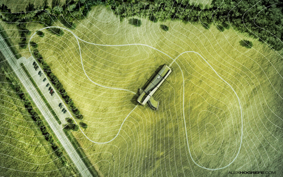
I first generated a black and white study like this for my wharf design back in 2014. I liked how this approach breaks down the complexity of site design into simple elements and creating a space for me to quickly “sketch” out and iterate ideas. For this...

by Alex Hogrefe | May 3, 2015 | Break Down, Portfolio Vol. 4, Project 03 Crossroads Pavilion |
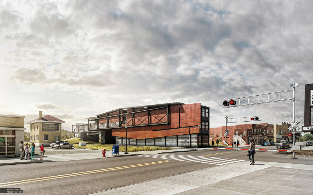
It’s been a while, but I am finally back. I have spent the last several months traveling, giving workshops, settling into a new home, and spending time with family. Needless to say, priorities shifted as they often do and this website unfortunately had to be put...

by Alex Hogrefe | Nov 26, 2014 | Break Down, Portfolio Vol. 4, Project 02 Cultural Center, Styles / Effects |
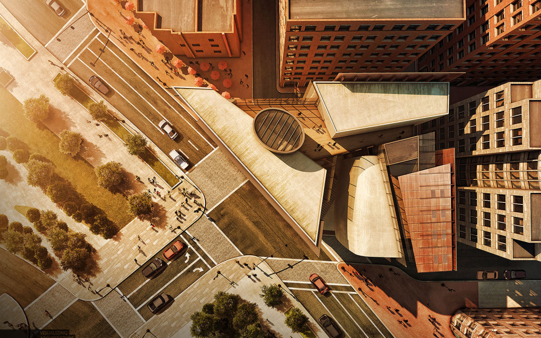
A thought that is often running through my head when working on architectural illustrations is how can I bring more of a human touch to the image. The answer is almost always through texturing in Photoshop. I have spent the last week illustrating an aerial perspective...

by Alex Hogrefe | Jun 22, 2014 | Fundamentals |
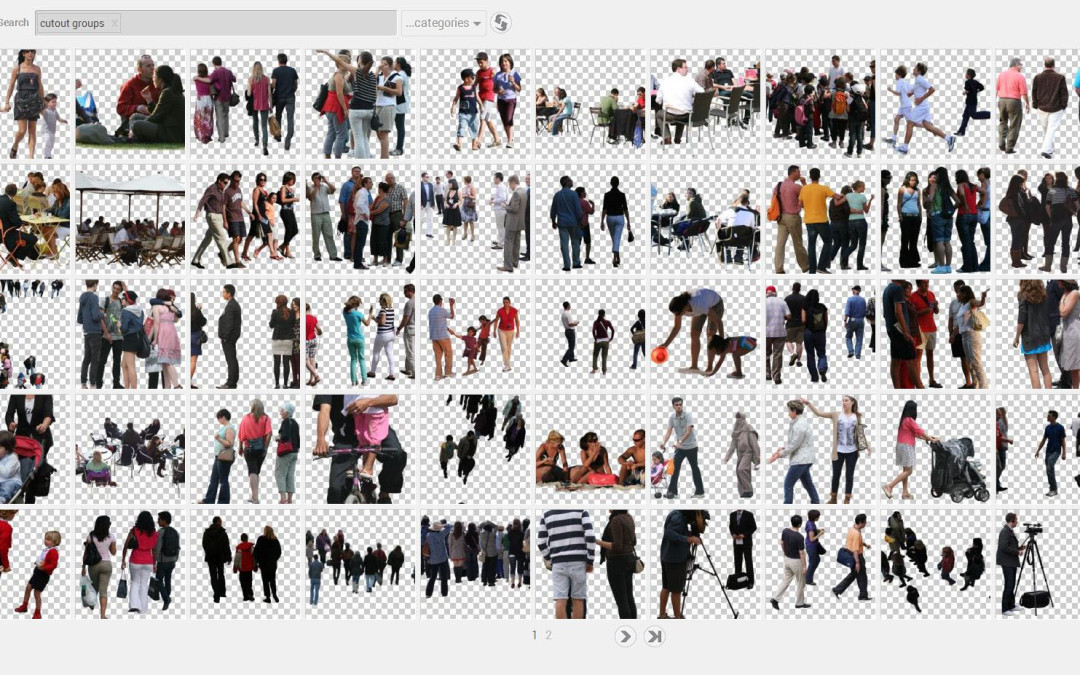
Architecture visualization can consume a lot of resources and time if you’re not careful. With the tediousness of Photoshop and renderings calculating through the night, spending more that 20 minutes searching Google images for a specific texture or image...

by Alex Hogrefe | Apr 3, 2013 | Fundamentals, Portfolio Vol. 3 |
I put some more time into project portfolio upgrade continuing to develop the visitor center pages. The above sheets are a first pass at the layout and will serve as an introduction to the design and concept. Since the relationship to the landscape is...
