by Alex Hogrefe | Oct 7, 2013 | Portfolio Vol. 3, Styles / Effects |
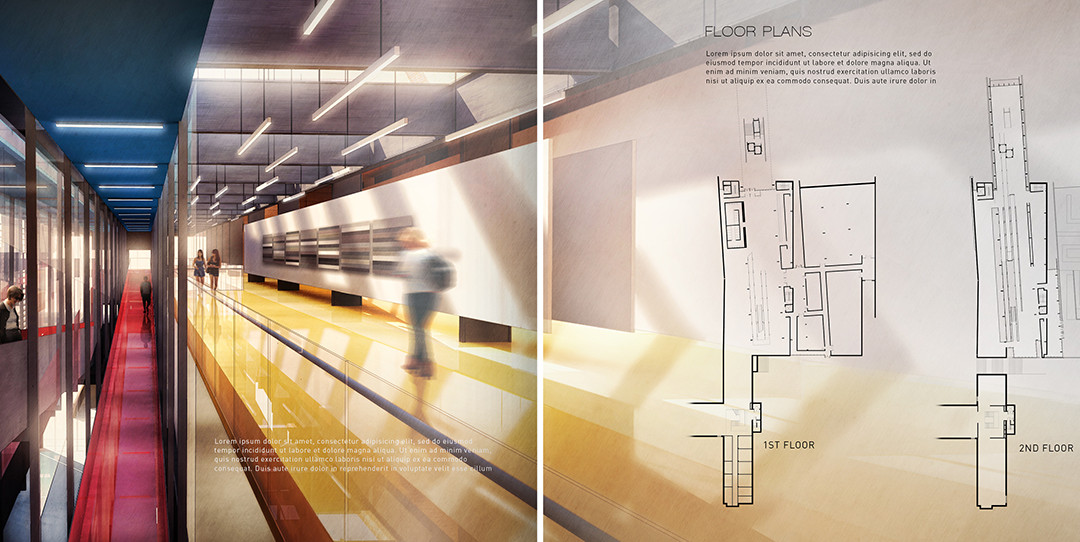
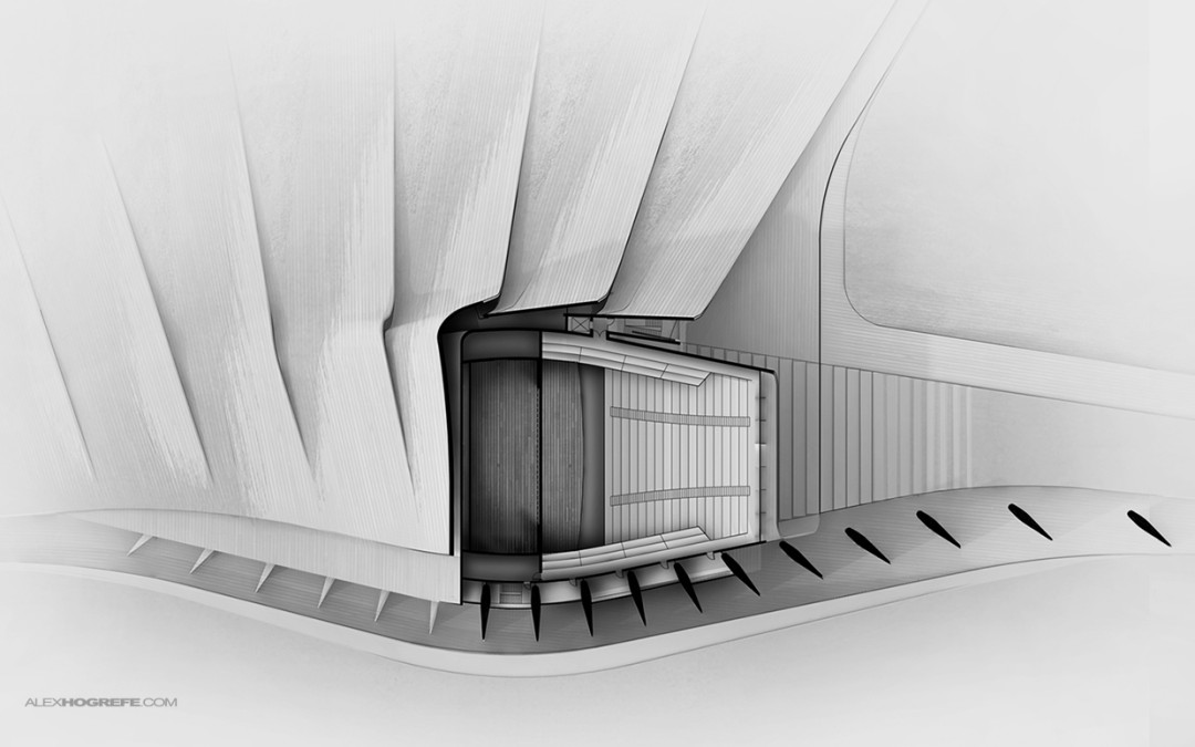
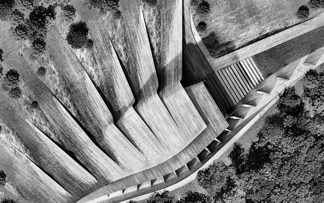
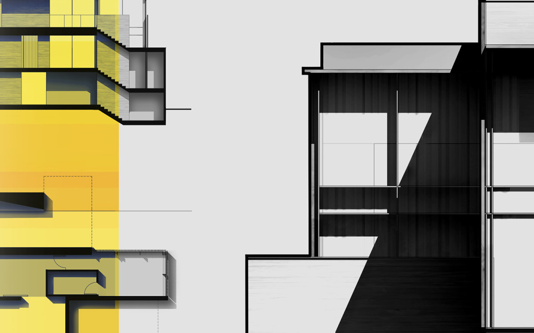
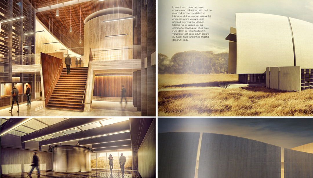
The Cranbrook project spreads are starting to come together. I spent some time composing the section and floor plan spreads which meant moving away from the abstract diagrams and into more traditional architectural drawings. I also developed an interior...

by Alex Hogrefe | Jul 21, 2013 | Portfolio Vol. 3 |
Progress is being made on the theater section of project portfolio upgrade. I put together some floor plans and sections/elevations of the design as well as compiled some of my past process work into another spread. I decided to group the plans,...

by Alex Hogrefe | Jul 7, 2013 | Portfolio Vol. 3 |
The long weekend has given me a chance to catch up on some things, one of them being project portfolio upgrade. I have been spending time developing a new 3D model from scratch and it still is nowhere close to being completed. However, I wanted to get...

by Alex Hogrefe | Jun 2, 2013 | Portfolio Vol. 3 |
A few weeks ago, I created a post on “going minimal” and this week I am adding two more spreads to the project. I mentioned in the first post how difficult it is for me to leave white space on the page and I think the above two spreads show...

by Alex Hogrefe | Apr 28, 2013 | Portfolio Vol. 3 |
Last week I briefly posted some images that I had developed for the “rendering” spread of this particular project. I didn’t post the spread itself which is shown above. I thought I would spend this week breaking down how I got to this...
