by Alex Hogrefe | Jun 8, 2014 | Portfolio Vol. 4, Project 01 Long Wharf, Uncategorized |
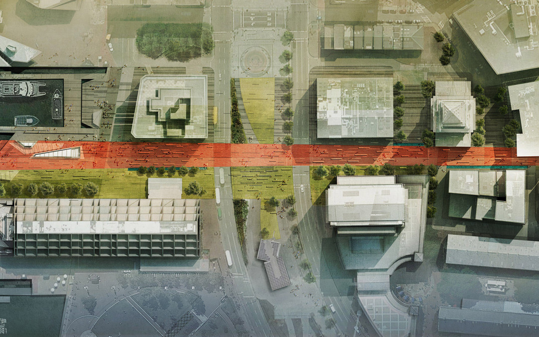
In the previous wharf post, I discussed black and white texture studies that focused on pattern and ground plane elements throughout the wharf. The above image builds off of those studies introducing color and material. Site plans are...

by Alex Hogrefe | Apr 14, 2014 | Over Time, Portfolio Vol. 4, Project 01 Long Wharf |
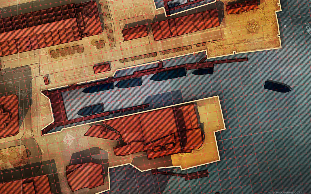
This post is also a follow up from many emails asking me to explain the diagonal line hatching used the site analysis diagrams. There are two methods in Photoshop that I know of that can create the diagonal line hatch seen in the image above. Both options use a...

by Alex Hogrefe | Mar 23, 2014 | Over Time, Portfolio Vol. 4, Project 01 Long Wharf |
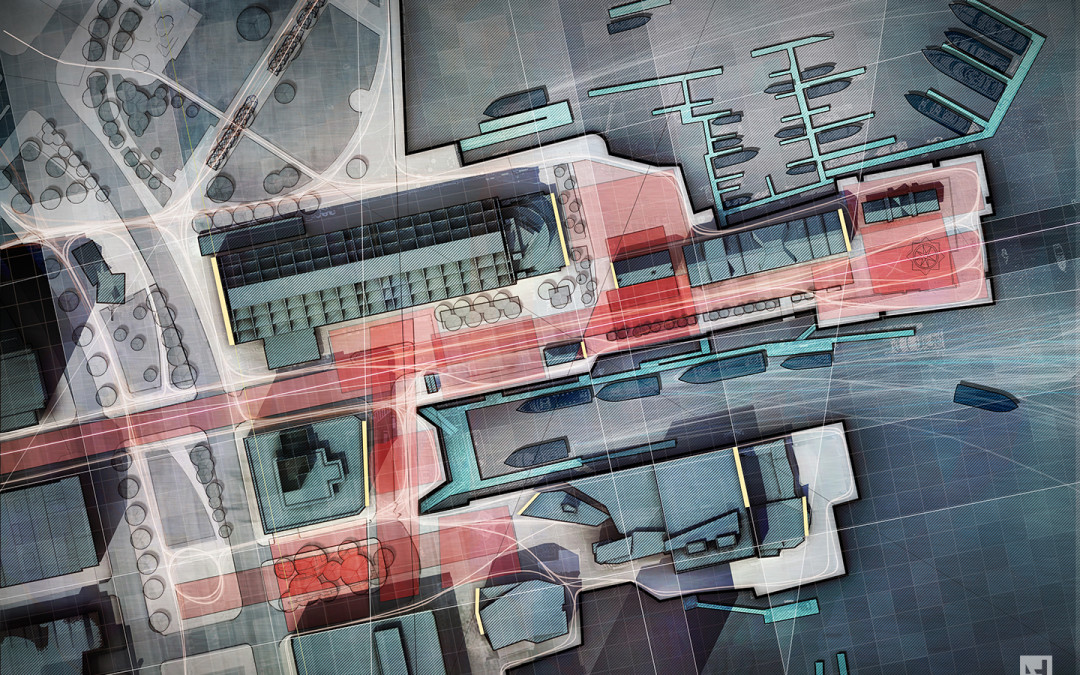
I have been experimenting with some site diagrams of the existing conditions of Long Wharf in Boston. I am mostly interested in introducing texture and depth to diagrams that are typically presented in a more simplified manner using solid colors...

by Alex Hogrefe | Dec 8, 2013 | Break Down, Portfolio Vol. 3, Styles / Effects |
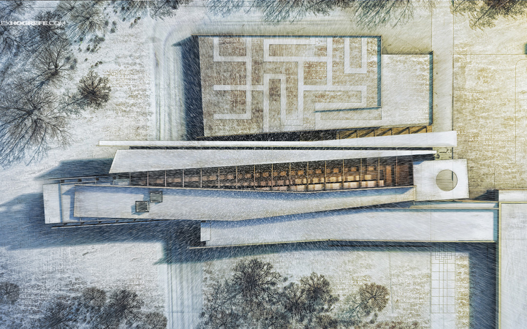
Every year around this time, I have made it a tradition to illustrate a winter scene. With the holidays around the corner, this weekend seemed like a good time to try out some different ideas and techniques related to snow scenes. Sitting down this morning, I...

by Alex Hogrefe | Sep 8, 2013 | Portfolio Vol. 3 |
This week, I put together some diagrams that build off of the language of the first illustration created last week. As mentioned in the last post, the intro page illustration was designed to be a “teaser” for the pages to follow and get the...
