by Alex Hogrefe | Nov 25, 2015 | Break Down, Project 04 Cliff Retreat |
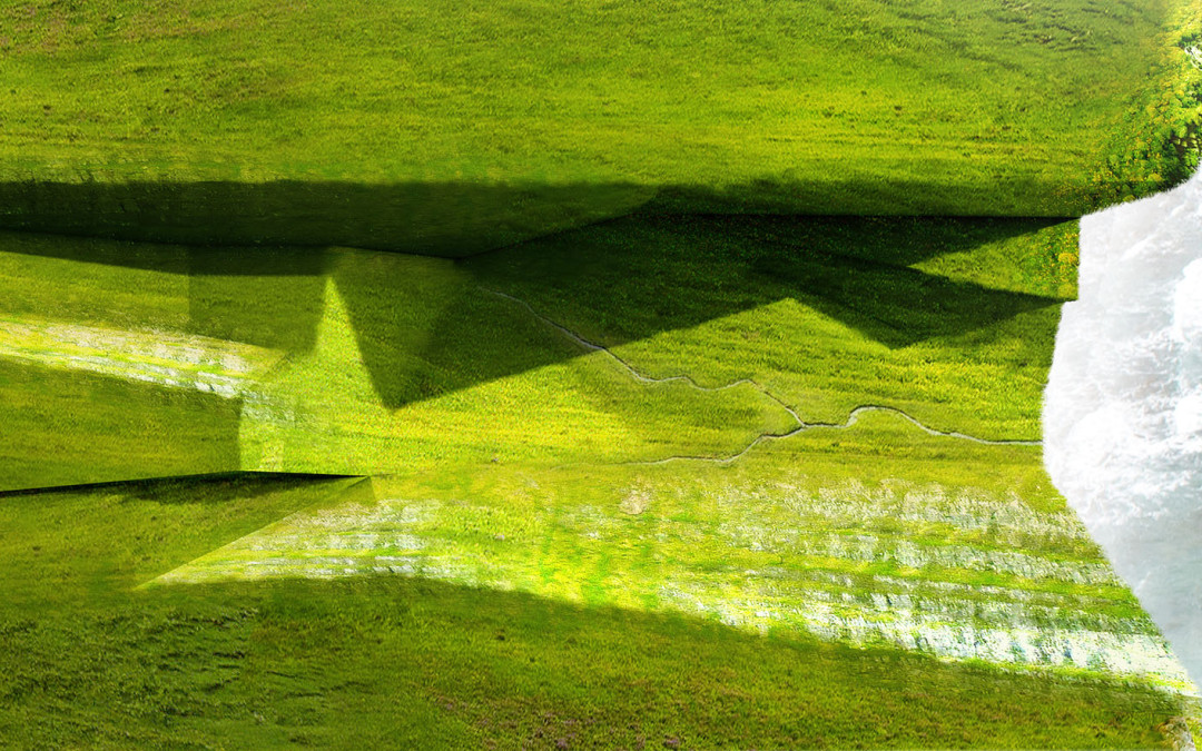
A big part of this design is how the landscape slips under and around the structure. As a way for me to understand the relationship between the landscape and architecture, I put together a few diagrams. The success of this image relies heavily on the textures. The...

by Alex Hogrefe | May 3, 2015 | Break Down, Portfolio Vol. 4, Project 03 Crossroads Pavilion |
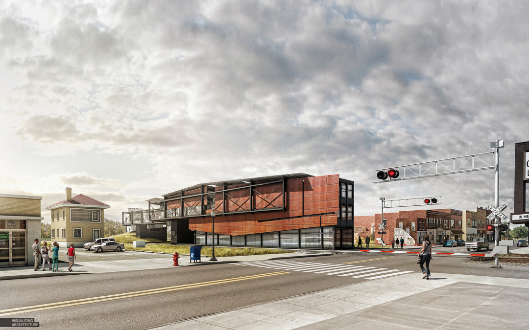
It’s been a while, but I am finally back. I have spent the last several months traveling, giving workshops, settling into a new home, and spending time with family. Needless to say, priorities shifted as they often do and this website unfortunately had to be put...

by Alex Hogrefe | Jul 13, 2014 | Break Down, Portfolio Vol. 4, Project 01 Long Wharf |
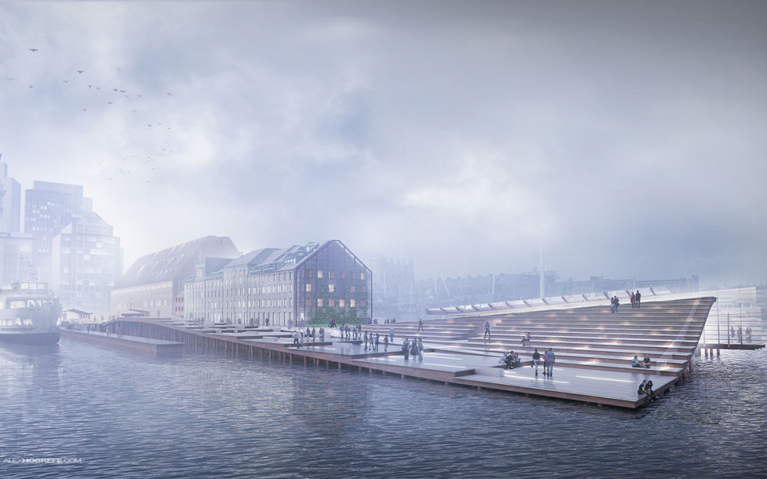
This was a fun image to work on and the breakdown is relatively straight forward. The big poetic moves such as fog and coloring come towards the end which is typically the case with images like this. There was a lot of prep in Photoshop such as refining...

by Alex Hogrefe | Jul 6, 2014 | Break Down, Portfolio Vol. 4, Project 01 Long Wharf |
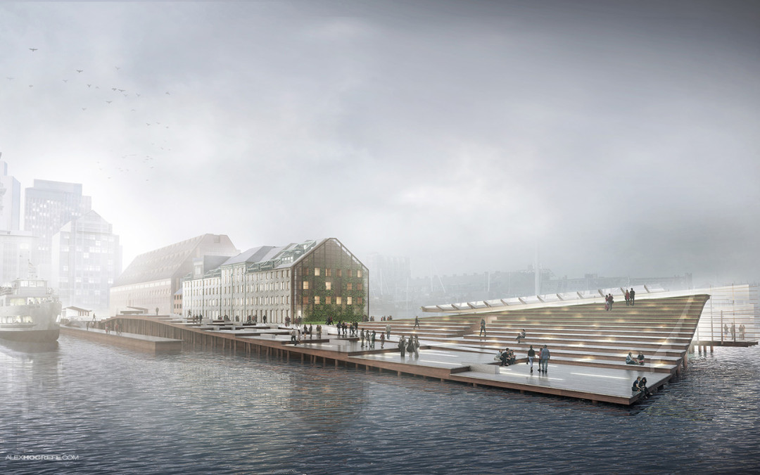
Modeler: Sketchup Renderer: V-Ray Post Processing: Photoshop Final Output Size: 4500 px x 2520 px The Boston Long Wharf perspective illustrations are underway. This first illustration is one of the more important ones because it is describing the entire design...

by Alex Hogrefe | May 25, 2013 | Break Down, Portfolio Vol. 3 |
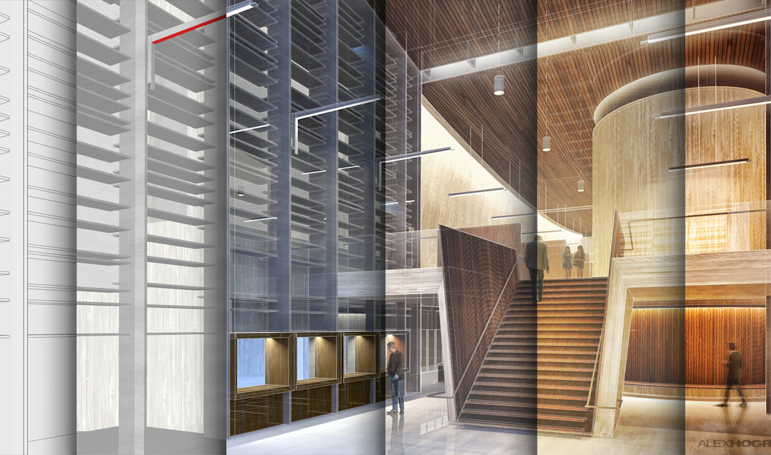
This past post received a lot of feedback from you asking for a more detailed breakdown of the illustrations. The interior illustration in particular got a lot of attention so I am going to start with that one. Since several different parts of the...
