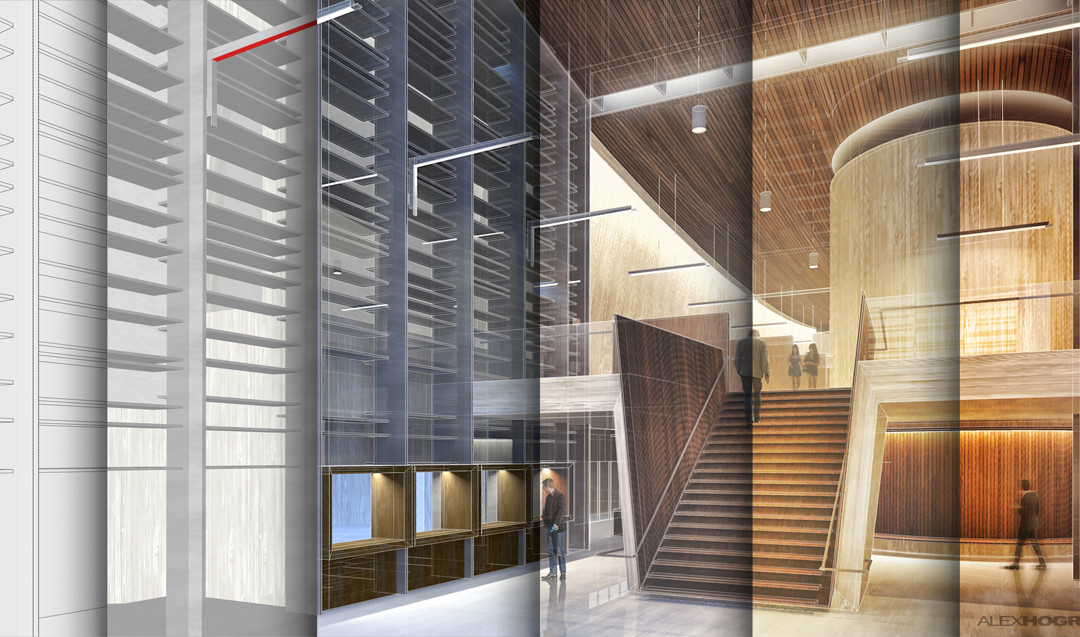
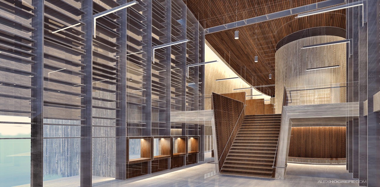
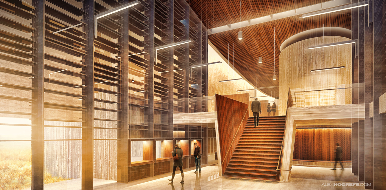
This past post received a lot of feedback from you asking for a more detailed breakdown of the illustrations. The interior illustration in particular got a lot of attention so I am going to start with that one. Since several different parts of the workflow have already been talked about in the past, I will be adding links to the corresponding sections to avoid too much duplicate information on this site.
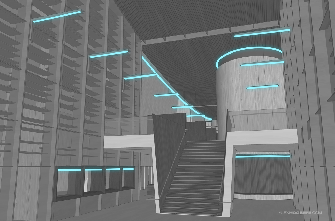
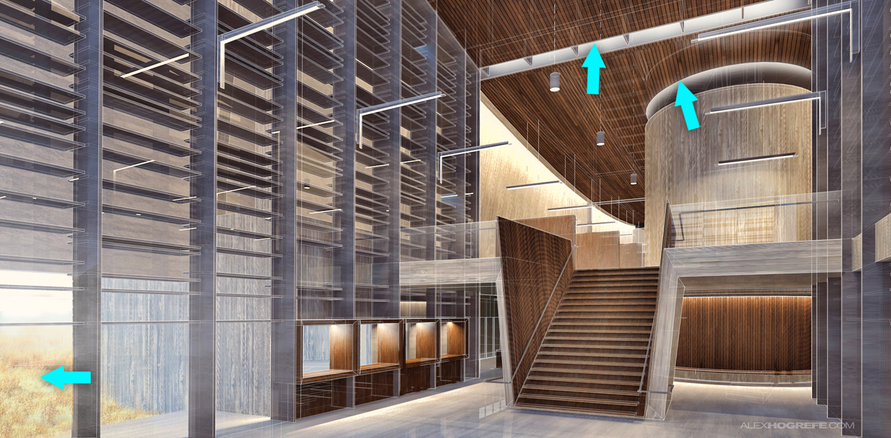
1. For this interior shot, I started the process by identifying where and how I wanted to light the space. I designed some linear pendant fixtures to provide most of the ambient light. Then I looked to some specific areas to use the light to highlight the form such as around the stair enclosure and washing the large side walls.
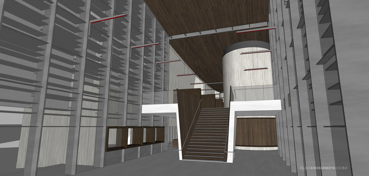
View selected in the Sketchup Model
Blue highlights show proposed locations of artificial light
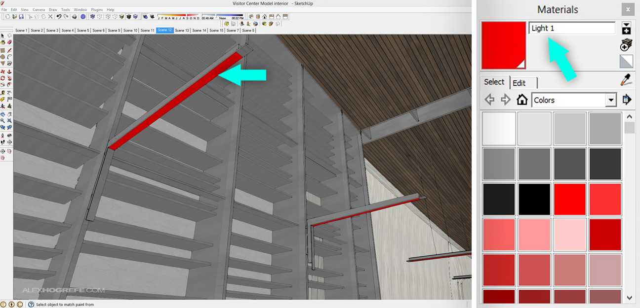
2. Once the locations were determined, I began applying a unique material to these locations so that I can tell this material to emit light later on in Kerkythea. I use a color that I know is not being used anywhere else in the model, in this case red. I also renamed the material such as Light 1, 2, 3, etc. so that it would be easier to identify when imported into Kerkythea.
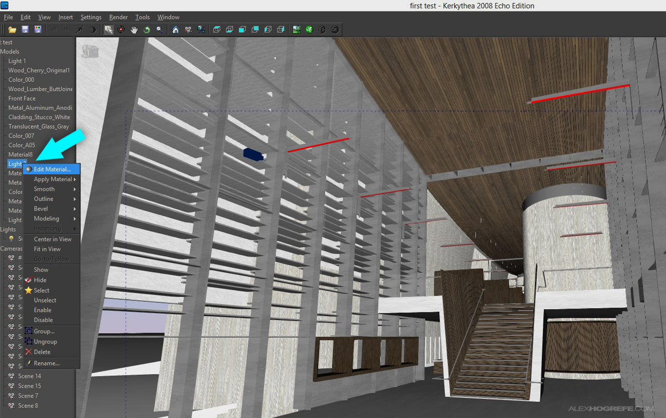
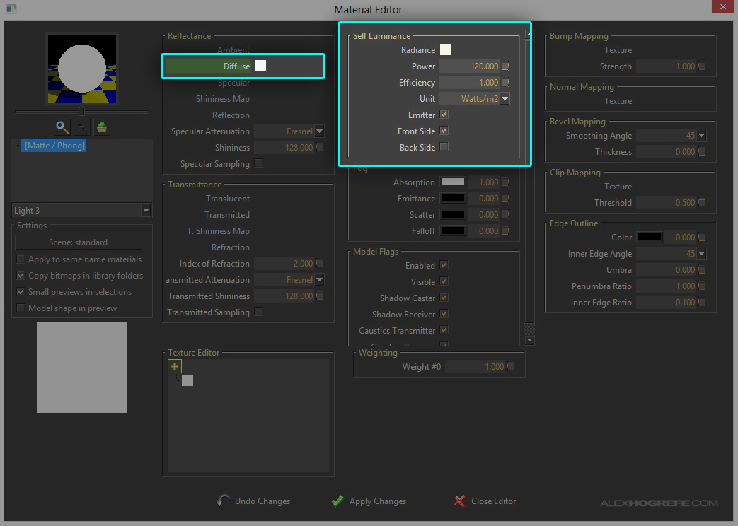
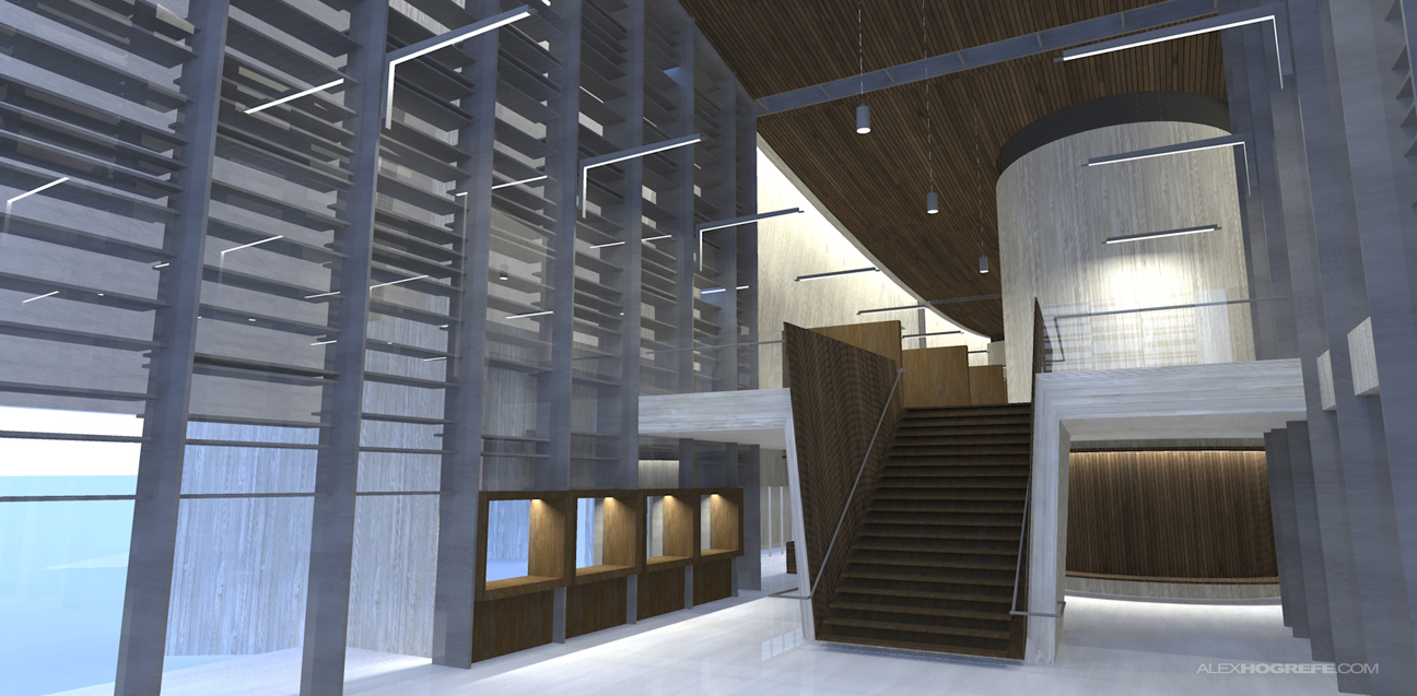
3. The model is then imported into Kerkythea where I can begin telling the material to emit light. This is done by finding the material on the left, right clicking, and choosing “Edit Material”. In the material editor dialogue box, I first change the diffuse color to white. I next tell it to emit light by going to the “Self Luminance” section and giving it a “Radiance” color of white. The “Power, Efficiency, and Unit” settings will change based on how big your light and space are, but you can start with what I am showing and tweak the “Power” setting for more or less light. With the lights in place, I did a quick rendering which will be used as a base image in Photoshop. A more in depth explanation on this process can be found HERE.
Above, a rendering from Kerkythea with artificial lights
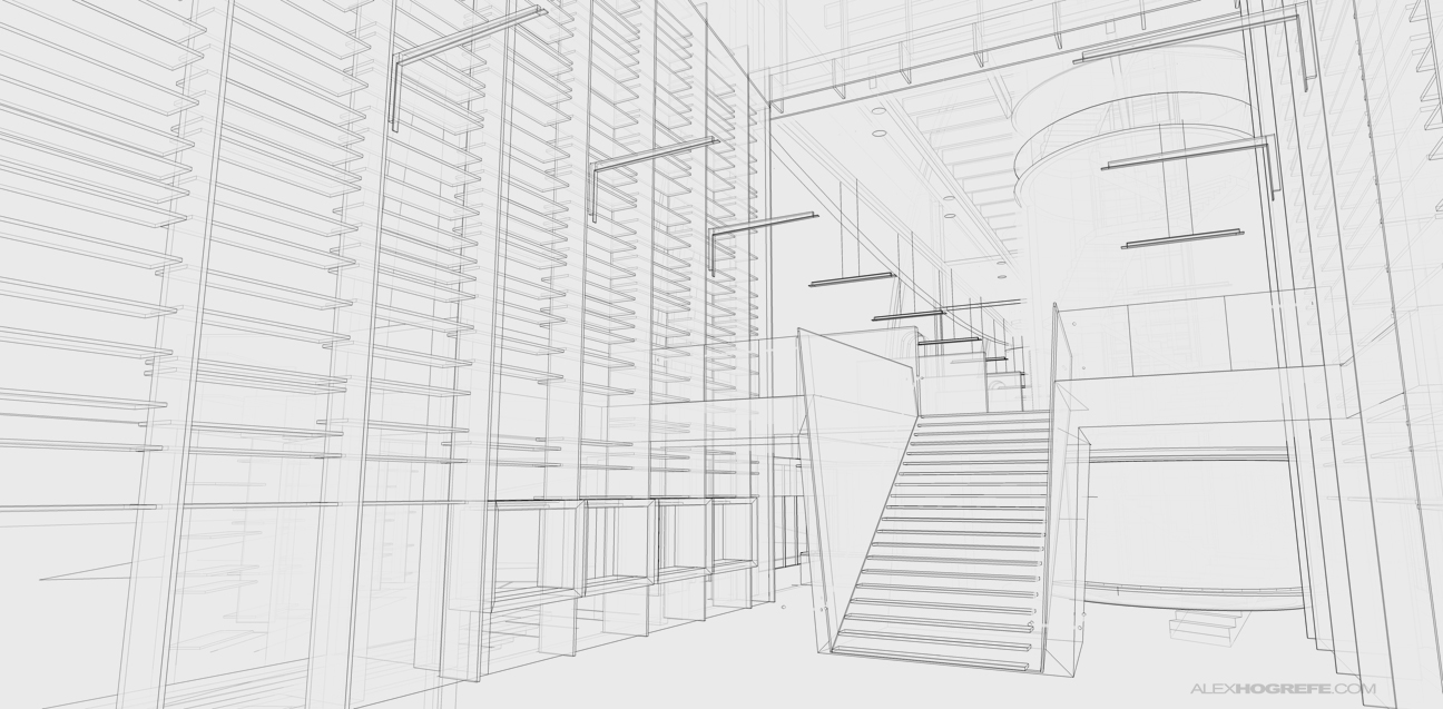
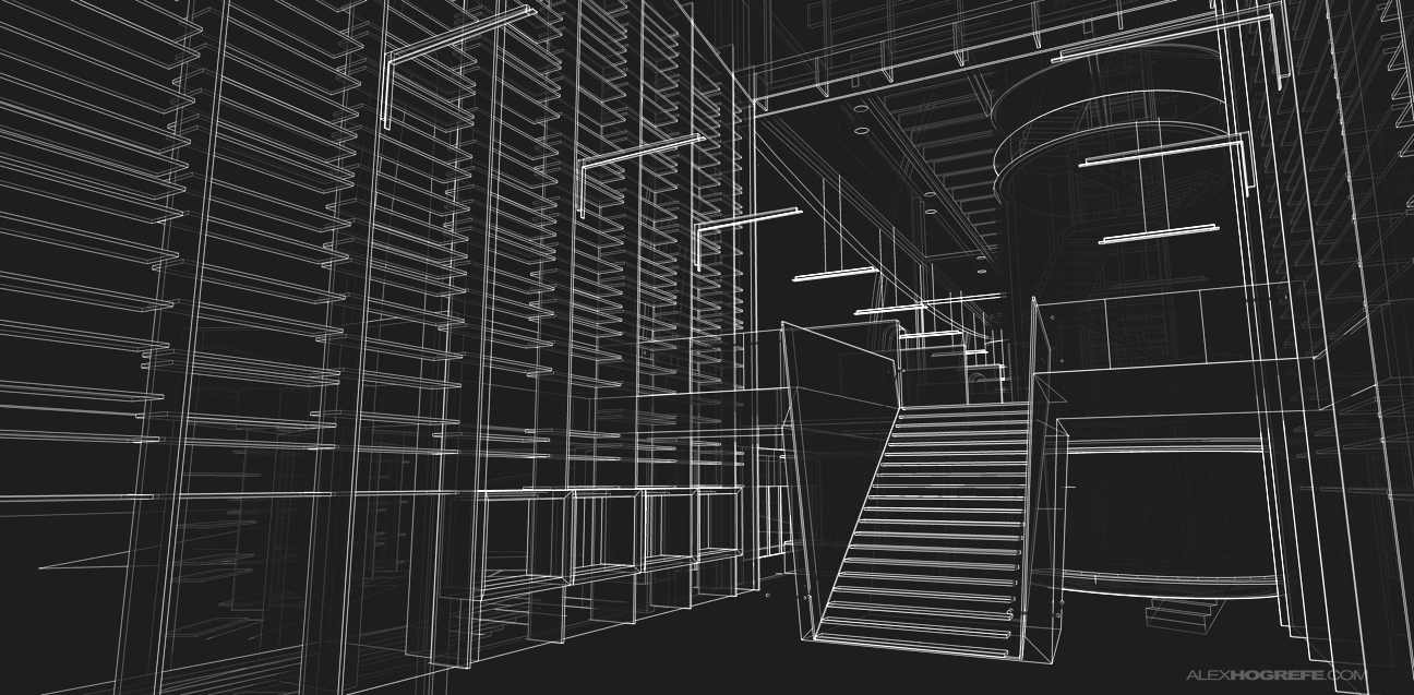
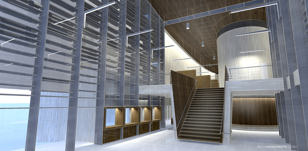
4. Now that I have a base rendering, I am ready to go into Photoshop. I decided to overlay white line work onto the rendering to give the illustration a little more texture. Open the exported line work from Sketchup in Photoshop and move the layer above the base rendering layer. Go to “Image>Adjustments>Invert” to invert the line work colors. Then set the Blend Mode of the layer (found in the layers palette) to “Screen”.
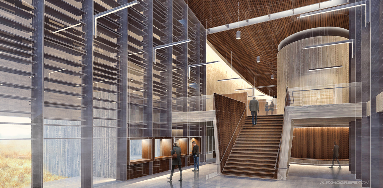
Exported line work from Sketchup
Line work inverted to create white lines.
Rendering with white line work layer set to “Screen”.
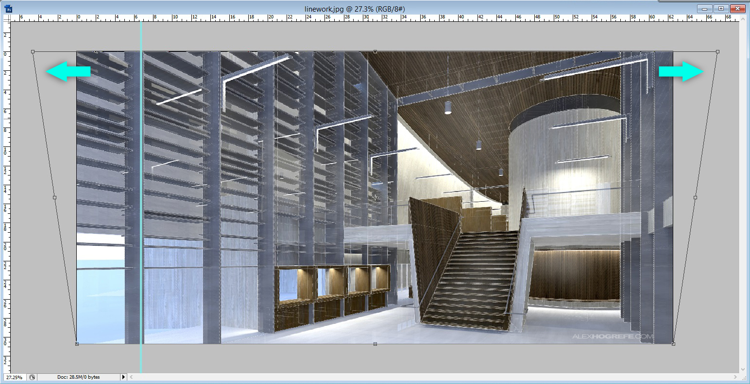
5. Knowing that I won’t be overlaying anymore exported SU images, I want to adjust the perspective so that the verticals are perfectly straight up and down. Select all of the layers, then go to “Edit> Transform> Perspective”. There was a post on this subject a while back going into more depth which can be found HERE.
6. This next step is something new that I have been experimenting with. I want to add some warmth and detail to the illustration in which case I would typically adjust the levels and add a color overlay. However, I have been playing around with a Photoshop plug-in by Topaz Labs. It is primarily a photo editing software but it has been working great for my architectural illustrations. It offers a little more flexibility in terms of pulling out more detail and color in the images. I used the plug-in here to up the detail of the wood and concrete materials.
7. At this point, I am ready to get into the details of the illustration. The first couple of areas that I want to address are adding a background to the outside and fixing some lighting issues in the ceiling.
8. People are always important for scale so I threw a few of them into the illustration. Reflections and shadows are key to getting your people to look like they belong in the illustration. Check out THIS VIDEO TUTORIAL for more on this subject.
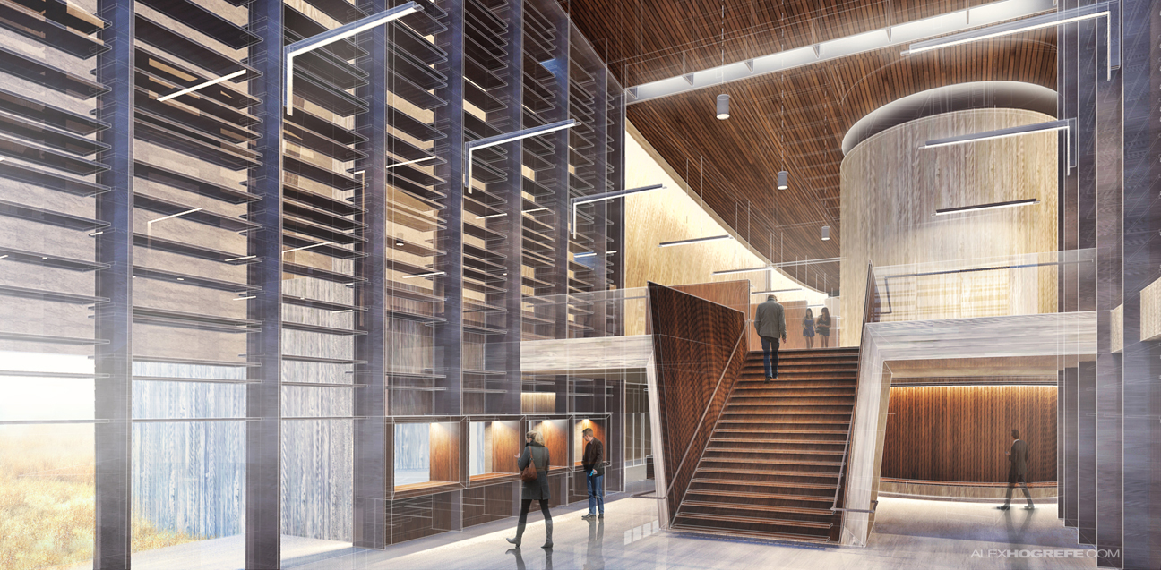
9. I wanted to play up the scale of the space and also the fact that so much light would be washing in from the outside. I can solve both these problems by using glare and fog. Using the brush tool and white paint with a really low opacity, I added a slight haze where I imagined a lot of daylight would be coming into the space. I also used this same method to create depth by painting in “fog” as the space projects further back into the distance. It’s a subtle move but helps to emphasize the areas of the interior that I want emphasized and gets the illustration closer to the atmosphere that I am looking for. THIS POST explains in more detail how to add fog.
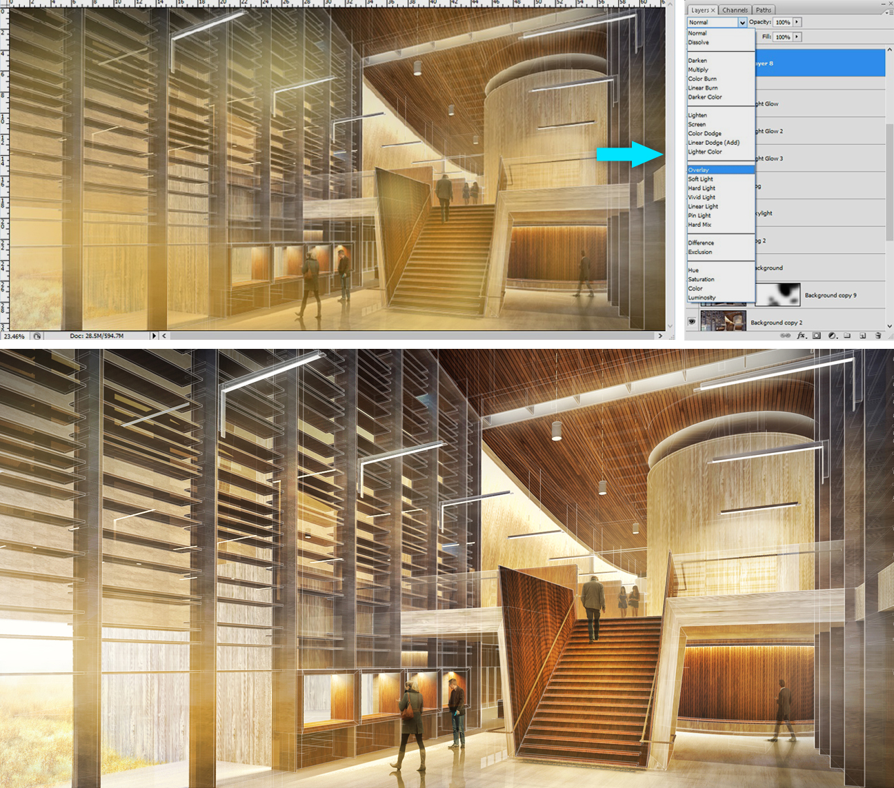
10. More color overlays. There are still many different color tones going on throughout the illustration. One way to unify this is by adding color overlays. I do this on almost every illustration and this one is no exception. All of the illustrations for this project are going to have a slightly warmer palette so I am going to add an orange color overlay. Check out THIS POST for more on color overlays.
11. The image is looking good at this point and this last step probably isn’t always necessary. However, I used the Topaz Plugin “Adjust” one more time to tweak the colors and add detail to the illustration.
Finally, some of you may have noticed that I am trying to raise money for the latest version of Photoshop. Everything on this site has been produced using CS2 and I think it is about time I upgrade to the latest version. If you find this site helpful and would like to see future tutorials with the latest Adobe software, please consider making a contribution. More information can be found on my ABOUT ME PAGE as well as on the side bar. Thank you in advance for all of your support and thank you to those who have already donated. See you next week.



Hi, great post! very useful technique! was wondering how you add the wood texture in sketchup? seems very smooth n detail.
love your work!
Which topaz lab plugin did you use?
dear alex, i don't know how to thank you..
unfortunately i'm living in a country that i can't donate you.. your work is so valuable that i can't put a price on it..
you inspire all of us and i'm extremely greatful
god bless and good luck
Hi Alex,
Do you know you can use "camera > two point persepective" in sketchup to automatically have straight vetical lines in perspective?
Thanks for the tut, very helpful!
Alexis
@Puteri,
I use a combination of SU textures that come preloaded, but adjust the scale to distort them, and also I use textures from CGtextures. SU 8 allows you to rotate and align each texture on the surface if need be.
@Jason,
I have been using Topaz "Adjust" mostly.
@Moj.ta,
Thanks for the kind words.
@Yes, Sketchup can do two point perspective, however Kerkythea has trouble with it so its easier for me to just make this adjustment is PSD.
Hi, Alex
As always, thank you very much for your time, effort and hard work. It certainly is very inspiring to every one.
Now that you mention upgrading software, Trimble just launched the new version of SketchUp, which license cost has gone up a bit and it seems there is no longer available that free version you could keep. I'm I right on the latter? Cuase I know you have been always interested on making tutorials on free software.
Regards from Colombia.
Hello Alex, thanks for this amazing tuts, they're very helpfull, not only for the more technical input, but to gain a more interesting a deep perspective in the art of architectural representation, I'll Donate soon, nevertheless I seriously recommend you to obtain from the ADOBE company the cs6 suite; The CC version seems a bit ripoff, unless you're cool with paying a lot for not keeping anything. Thanks for this amazing job and greetings from Caracas
Alex! u are my hero!
Hi Alex, great post as usual. Used some of these tips on a couple of perspectives I've been stuck on and it has helped a lot. I'm having a problem getting my sketchup and kerkythea exports to match up though, the dashed blue bounding box in kerkythea reduces the view and I can't figure out how to adjust it without the camera zooming in or out. Is there a way of adjusting the bounding box ratio with the view locked? or a way of setting the export ratio in sketchup in advance?
Thanks
Tom
Hey Alex…Wonderful post…Absolutely brilliant ! Your technique is superb…simple, yet the results are amazing…Was wondering about the rendering…are you using the standard sketchup textures (those available in sketchup when painting) when rendering in Kerkythea or do you replace those textures with Kerkythea textures ? Thank you in advance.
These are breathtaking, just found your site and can't leave! So inspiring, definitely gonna help me improve my interior design visuals! Thank you 🙂
@Jauncamiloarq,
Its unfortunate that Trimble has decided to completely uproot the business model that Google had put into place concerning the free versions. Google had made the software accessible to anyone and now the new owners have increased the cost considerably and removed the free version. I understand that Trimble doesn't have as deep of pockets as google, but I at least hope they continue to push the development of it as well as google did.
@Wenceslao
I have reached out to them but with no luck. I am on the fence about the CC option. Your correct that you never own the program however it does make the software much more obtainable. It seems like everything is going to the monthly payment model so you should probably get use to it haha.
@Tom,
As long as you don't move or orbit once in Kerkythea, it should keep the same view size(You will have to scale the kerkythea rendering up to match the SU export, but they should match). If you change the resolution under the rendering settings, it may change the proportion of aspect rations, but the vertical dimensions will always match. This means setting a higher resolution may crop out the left and right of the image, but the x dimension should match the sketchup exports. Also remember that the ration and screen resolution of your sketchup model screen is what is being exported. If you adjust the screen window in sketchup, then export, that same ration will be carried over into Kerkythea. I hope this makes sense. If not, shoot me an email.
@Michael,
Some are the standard sketchup materials, some were downloaded from CGTextures. Well, the wood ceiling was downloaded from cg textures. Everything else was just standard textures, but stretched and scaled.
@Natalia,
Glad to hear it!
Hi, Alex
Regarding my last post, I was completely wrong. Trimble is not ditching the free version of SU, their approach is a bit different, though, but will deeply be the same thing; there are two different products SketchUp Pro, which features everything as we know it does AND SketchUp Make, which is certainly free and intended for carpenters, 3D printing and what not. I did some research on this and they assure that the free version is here to stay.
I was just wondering if you build your models in sketchup or do you import then from another program?
hi alex, great job as usual. But I wonder if you're even intrested in building your own design models in reality or juste interested in making illustrations. Continue doing it, it's helpful so many others!
and also want to know what's the name of the other white material that you used on these images. is it concrete?
@Juancamiloarq,
I completely missed the "Make" version. Thanks for pointing that out. I will have to download the make version to test it out and see what if anything has changed from the old free version
@Aaron,
Everything is built in Sketchup. I have modeled complex curvy geometry in Rhino then imported into sketchup, but this is rare and haven't done it for a while.
@Andrew,
It would be great to build some of these some day, but that is realistic. They were competitions in school and were designed for specific location. I am working in an office now that has a few projects under construction that I have been part of the design from the very beginning. Its exciting to see something go from concept to actually built.
Can you be more specific when you say "other white material"? not sure what material you are referring too.
make a video for noobs please!!
Great job ! good'on mate !
Any tips to get kerkythea software on mac? I am getting crazy trying to download it… i believe kerkythea website isn't fixed yet. I absolutely need the software asap.
Thanks
Now I see. Topaz Adjust can be use to create a HDR image. Just like how Photomatix work from your previous HDR tutorial. So Alex, tell me between Photomatix and Topaz Adjust which one is more user friendly?
Hi Alex,
Thank you so much for all your tutorials. They have helped me a lot in saving time and enjoying the process.
I have started kerkythea recently, and have a few issues i would like to ask you about.
Firstly, whenever i save the scene in sketchup and export to kerkythea, it doesn't open up the same way I have to re-create the scene, i tried many times, but it doesn't seem to work for me… Maybe i'm doing something wrong?
Secondly, adding the lights and changing their radiance and power, the changes don't get applied, when i click "apply changes". Is it because the material is part of a sketchup component? How does it work?
Please let me know…
Thank you.
I am amazed by the way you have explained things in this article. This article is quite interesting and I am looking forward to reading more of your posts.
Thanks for sharing this article with us.