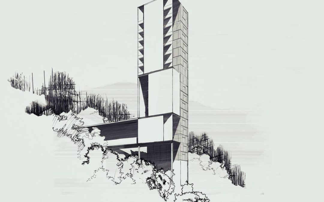
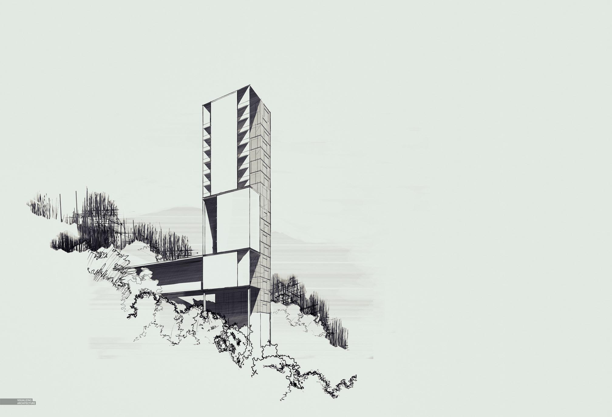
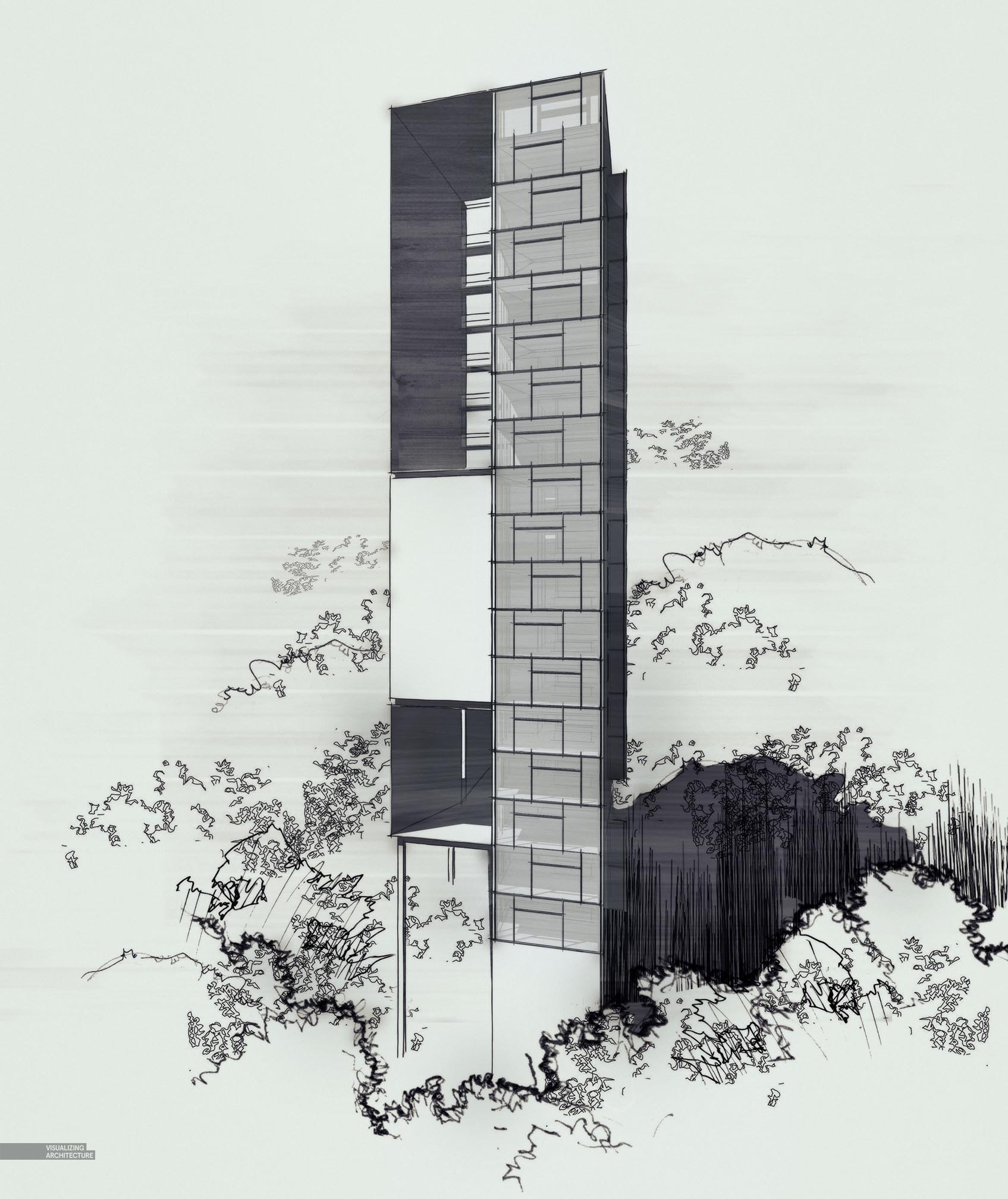
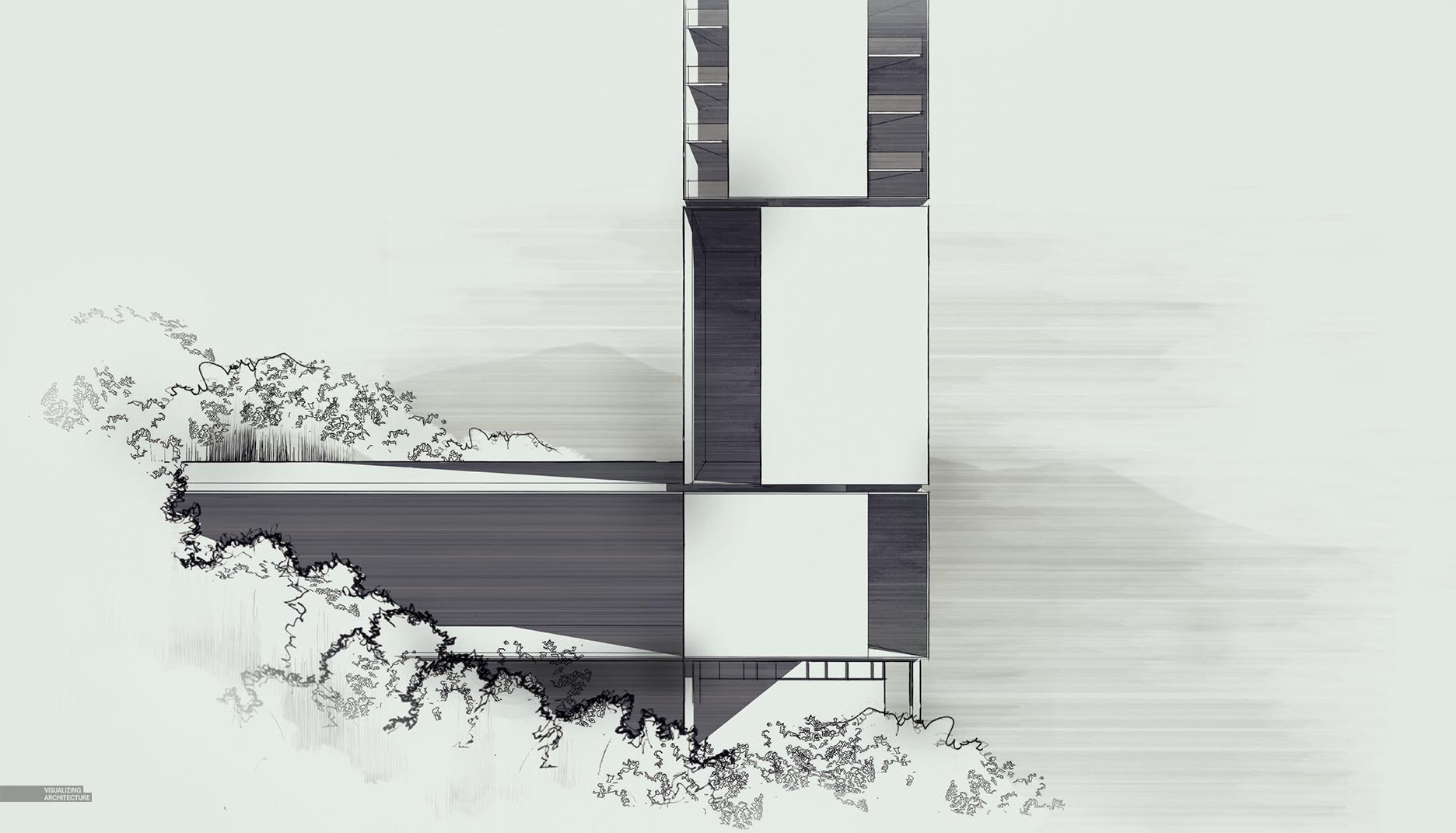
Below is a sneak peak of my next project that I will be illustrating over the next several months. As with all of my projects, I have tried to setup several scenarios that I am interested in visualizing. For this project, specifically, the overarching concept is of a taller structure rising out of the tree canopy. I have created a few tower structures within urban settings, but none in a predominately vegetated environment such as this. Another scenario that I want to explore is working with a heavily sloped ground plane, in this case, a mountain side. This brings with it options for camera angles and image compositions that I haven’t been able to explore with most of my other projects. I think this design will generate some exciting imagery and I can’t wait to dive more into the details. Also, if you have some thoughts on specific images that you want to see such as diagrams, sections, axons, styles, etc., leave me a note in the comments below. I have a couple of ideas that I am planning on pursuing, but I am also open for some new ideas.
The design itself will have a simple program. Half the lodge will be made up of stacked guest rooms, with the other half containing all of the amenities. The footprint on the ground will be minimal, and as with a lot of my projects, the landscape will flow in and out of the design creating living walls and green roofs.
The images above were created using combinations of several Sketchup line work and shadow exports and then some textures overlaid in Photoshop. The process was pretty similar to my sketchy images found in this post.


I’m excited to see this project. It would be interesting to see a detailed site section showing the interaction the lodge has with the steep slope.
Hello Alex,
One of my suggestions would be a front render at dusk where you see the heavy foliage behind the tower with fog in between them (on different levels) . The fog would create like this some nice depth (the further away more there fog will be compact). And off course light coming out from the windows. ( maybe dimed lightening or even candle lights).
One tricky part to represent would be a top view also in rendered style. In that matter I would like to see how you would create the foliage in a matter where you could differentiate that its a steep slope. What I would suggest and could be a nice view is maybe some white topo lines ? But that could destroy the visual balanced aspect if you don’t use lines at all.
For the rest there is no other idea coming to my mind for what (with my actual skillz ) could be a problem for me. Maybe a stylized photomontage like Dogma or Fala Atelier. Only problem is fitting that style in your portfolio ( I am really interested and wondering how they get their vegetation in that style).
Looking forward to see what you came up with in general.
Best regards,
Odair
Interesting…!!
see a detailed site section..great work
not as good as mine
Hi bro, you are one of the best and I really like your styles, and I have learned from you soo much.. Thank you.
but am really having a question.. what happens with your projects, I mean I haven’t seen any of your projects in real life yet.
a .gif showing the layers’ sequence of your process would be great!
Hi Alex,
Love your website but I’ve never posted before. I’ve got to ask, how do you make the foreground foliage look so much like hand-sketching, is it actually hand-sketched or done using SketchUp linework/photoshop? If the latter, then how?
Thanks, for sharing a proper blog with clarity related to the mountain.
The article you have shared here is very awesome. I really like and appreciate your work. The points you have mentioned in this article are useful. I must try to follow these points and also share others.
I love your site but I have never posted before. I have to ask, how do you make the foreground foliage look so much like the sketch in your hand, is it actually sketched by hand or done using SketchUp linework / photoshop? If the latter, then how?
This is really good article, thankyou Alex
Thanks for the sharing with us this is really a nice blog
very impressive…..! thanks for sharing this articles…..https://bit.ly/2sL4gIf
The article you have shared here is very awesome. I really like and appreciate your work. The points you have mentioned in this article are useful. I must try to follow these points and also share others.
Awesome post along with a relevant article. It sounds amazing to read this fact which is fabulous in a modern world. Appreciate it for your knowledge and ideas.
What Is a 404 Error?
Louse mentioned, you get a 404 error once the web page you’re making an attempt to urge doesn’t exist.’’S referred to as a 404 error as a result of that’s the communications’ protocol standing code that the net server uses to explain the somewhat of error.
What a right that is right! Well, you described it, I like it!
Hi Alex. Thank you for your images and your posts. You don’t know how you helped me and inspired me to create my own channel on YouTube for architecture called (surviving architecture). Could you please check it out and give me your feedback. I also did a video about you hehehehe.
Well, basically, it doesn’t show much about details. But I think it’s quite great with the first step.