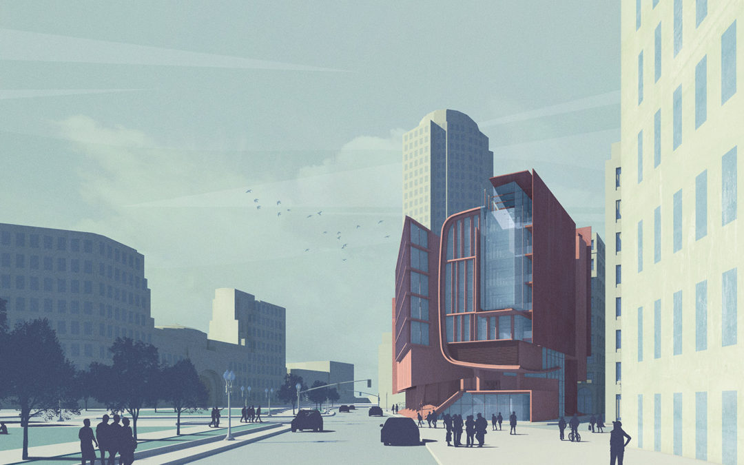
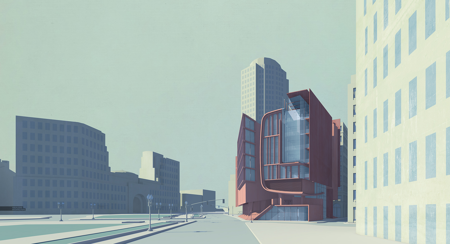
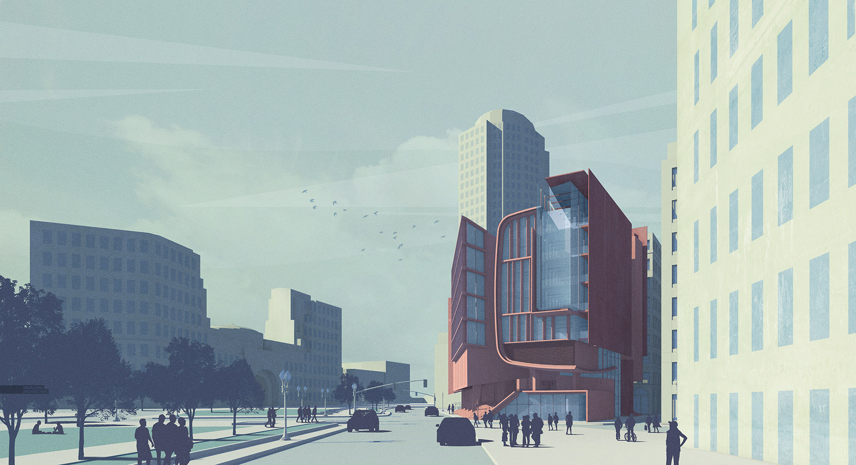
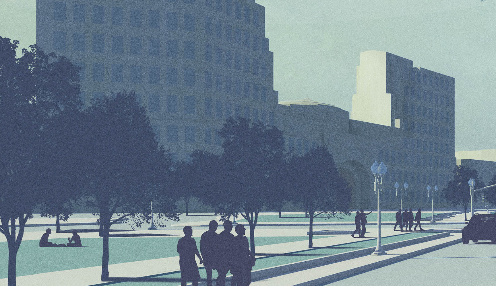
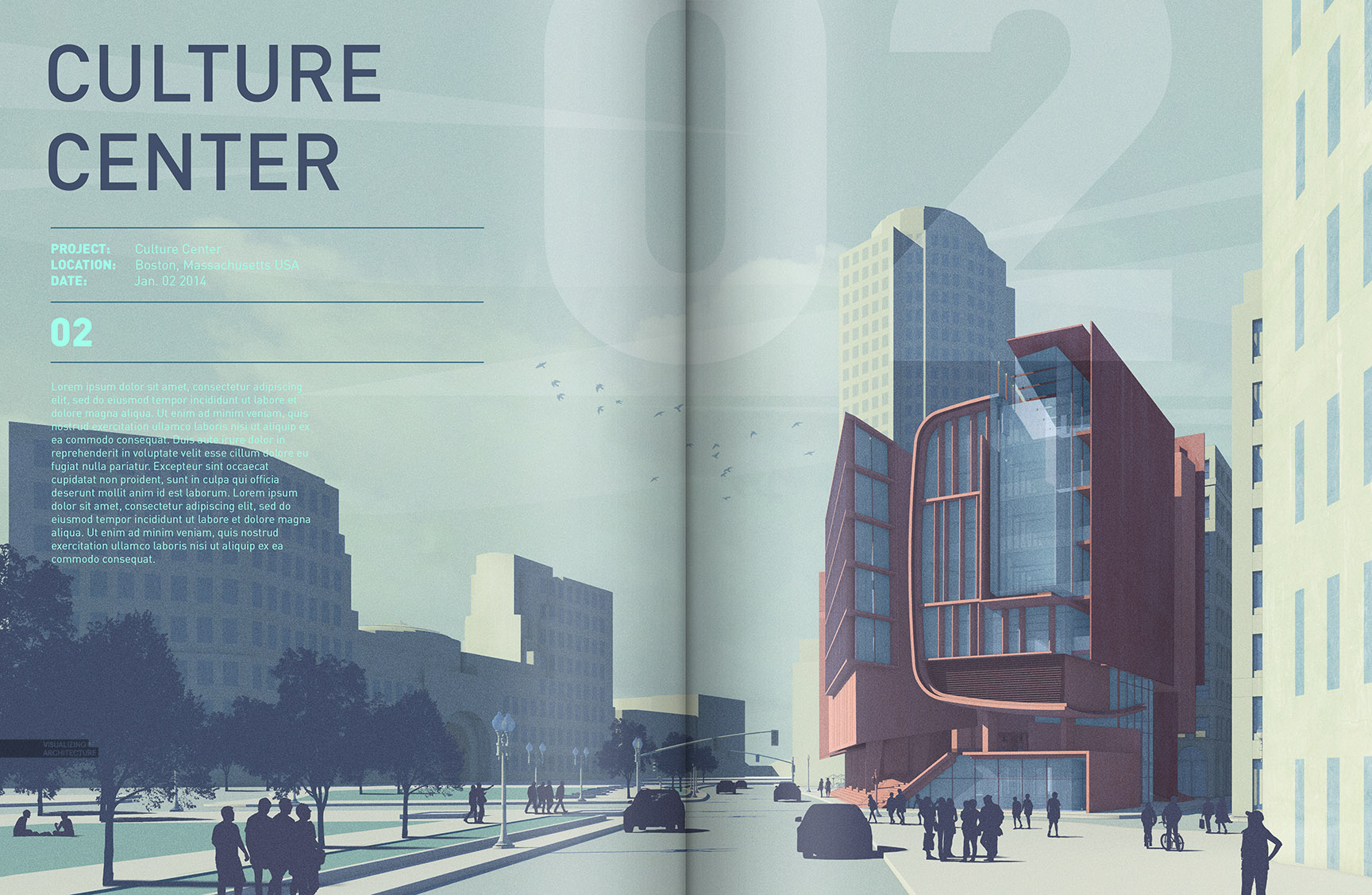
As I rework some of the spreads for my upcoming Portfolio Volume 4, I find myself needing to develop several new illustrations to fill in some missing information or to help better tell the story. However, due to time limitations and the amount of images I need to generate, I am using workflows that are less labor intensive and quicker to produce. This means the style of the images will be more on the minimal side with little time spent in 3D. The image I am breaking down below is for the intro spread of my Boston Culture Center Project.
To start, this image only uses a shadow and line work 2D image export from Sketchup, and a clay rendering from V-Ray.
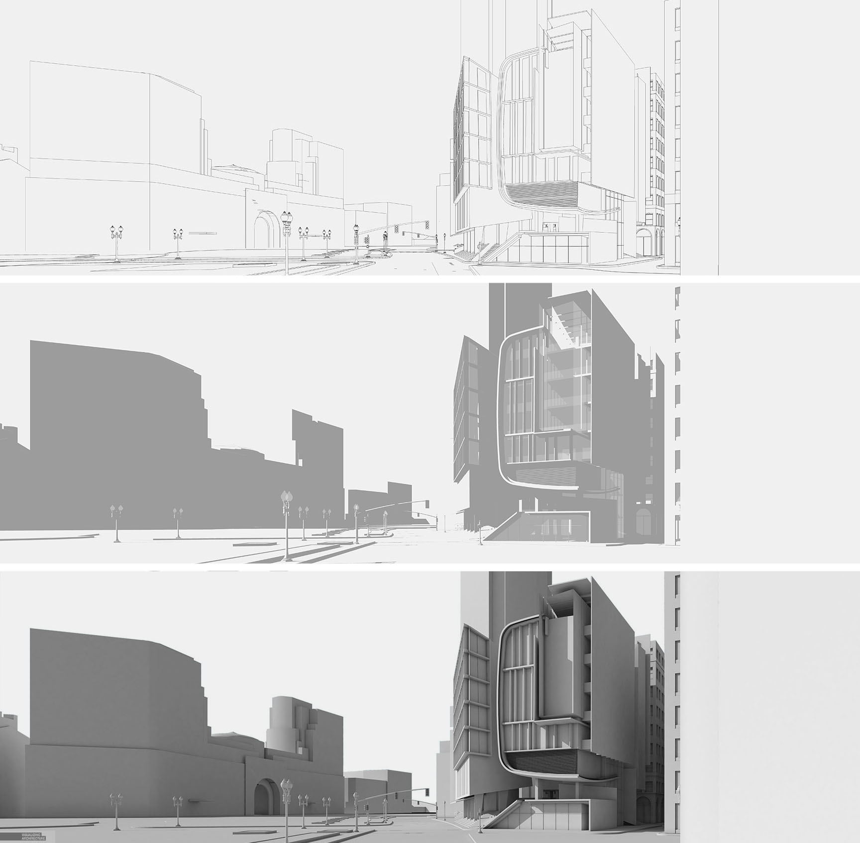
1. Setup the Shadows
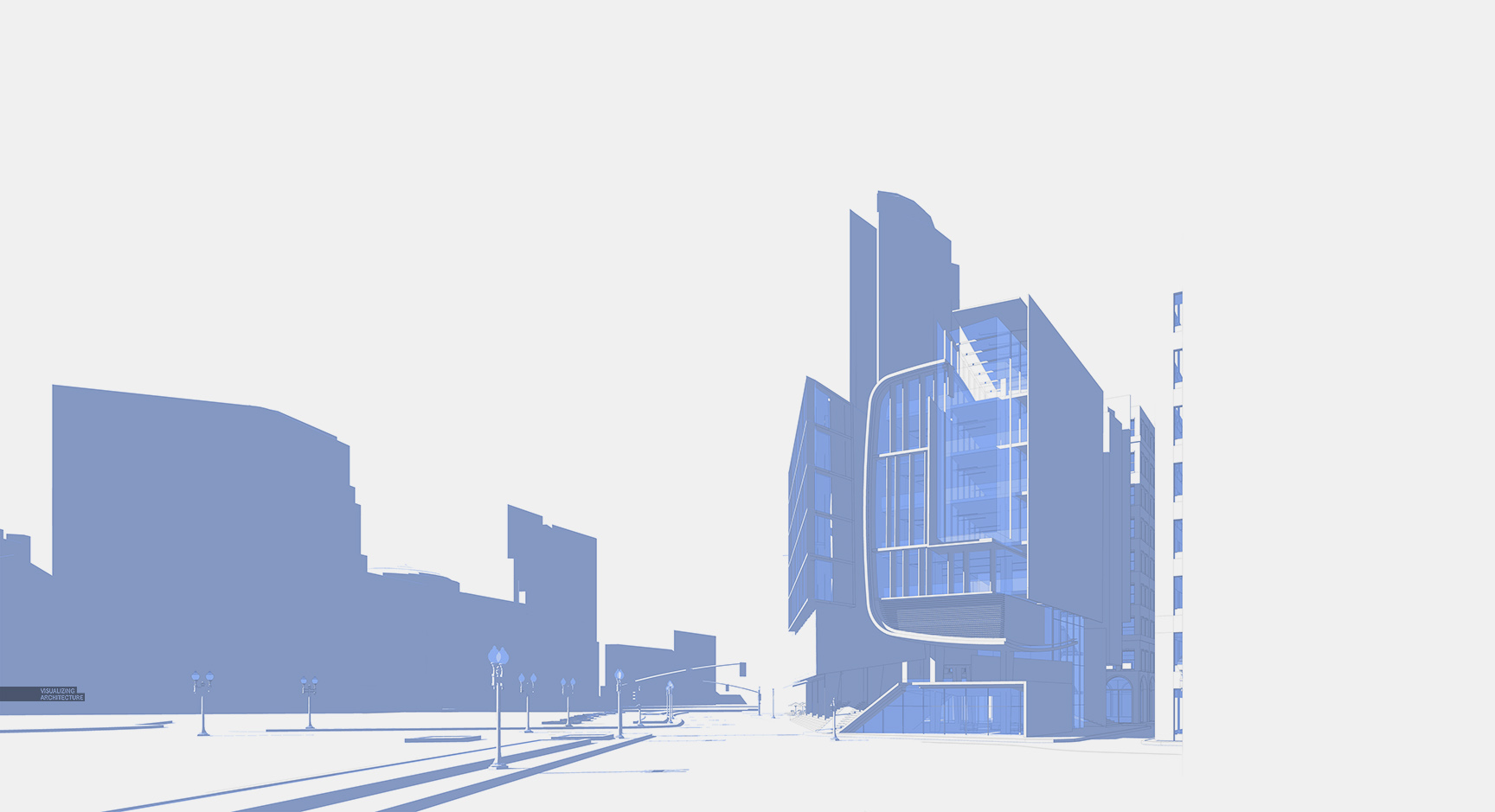
In Photoshop, I brought in my Sketchup shadows and line work layers. I colorized the shadows to give them a blue tint since the overall tones of the illustration will be on the cool side.
2. Overlay the Clay Rendering
I wanted to see a little more detail in the forms, so I brought in the V-Ray clay model rendering and overlaid it on top. I lowered the opacity so that the clay rendering gradients remain subtle.
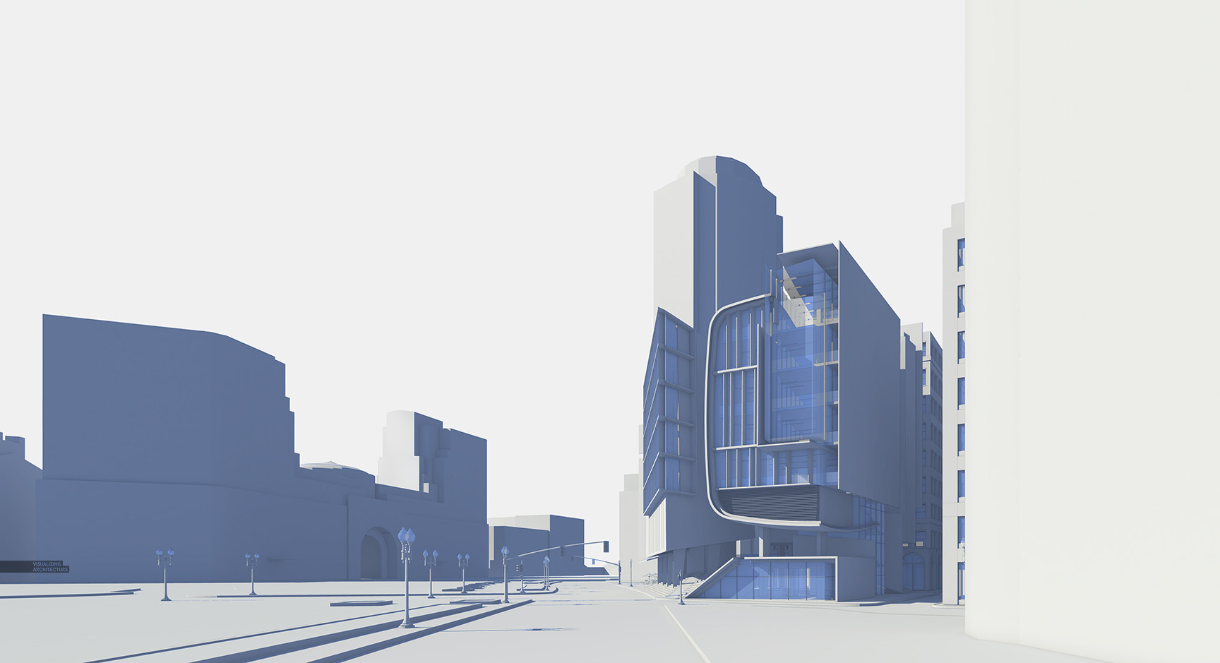
3. Bring in the Color
Once I had the base images setup, I started to lay in some color. I applied the color one zone at a time, starting with the sky, moving to the context, then ground plane, and finally the design. I typically try to get all of the different color zones masked in fast so that I have more time to make adjustments to the colors and experiment with which palettes work best. I almost never get the colors right the first time.
4. Sky Detail
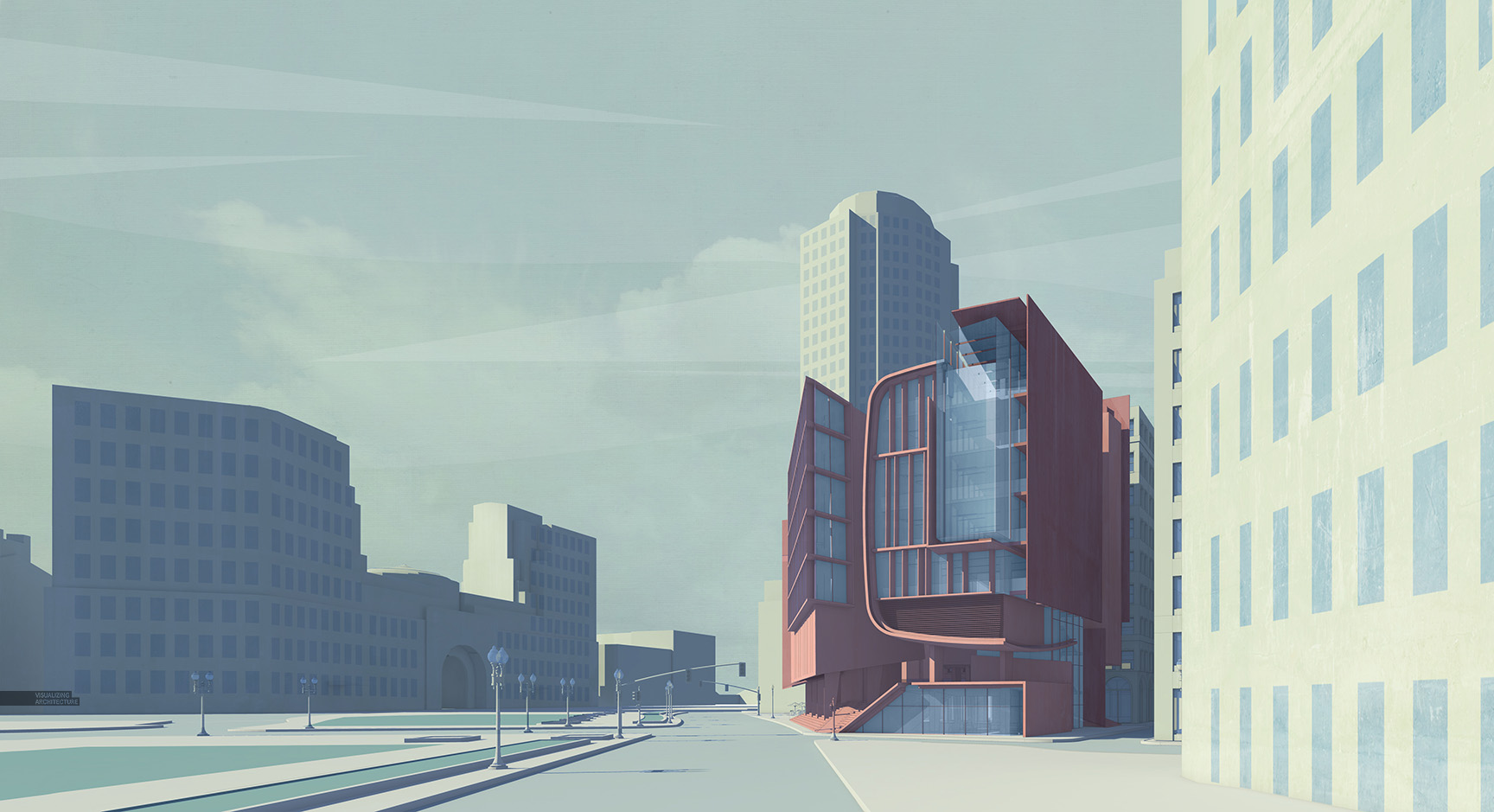
I struggled with the sky but finally arrived at a hybrid style of real and illustrated clouds. I was looking for something that was subtle, added a little texture, but also worked with the minimal style of the image.
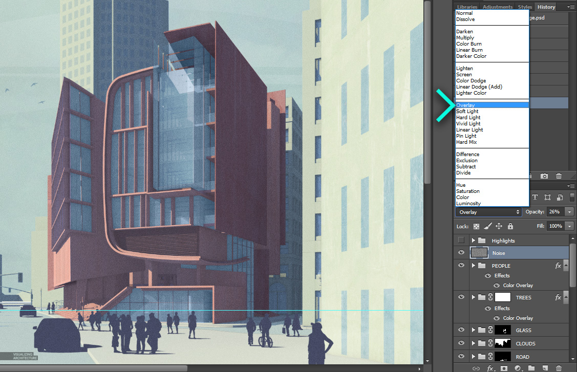
5. Street Life
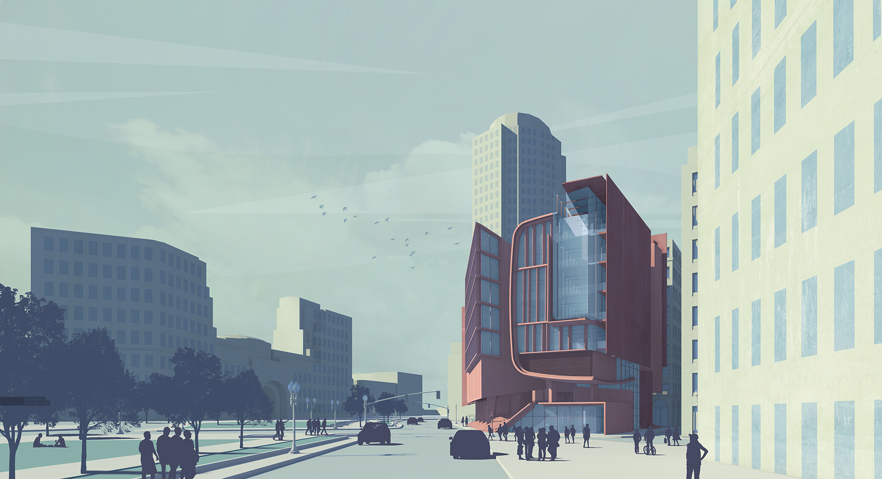
Next was adding life to the public realm. I brought in trees, people, and some cars. All of these elements were placed into groups within Photoshop so that I could colorize everything at once by applying a layer style. I did this by selecting the group, choosing “Layer>Layer Style”. In the dialogue box, I chose “Color Overlay” and selected a color that worked with my composition. Colorizing all of these layers removed the detail giving everything a silhouetted abstract look.
6. Noise Overlay
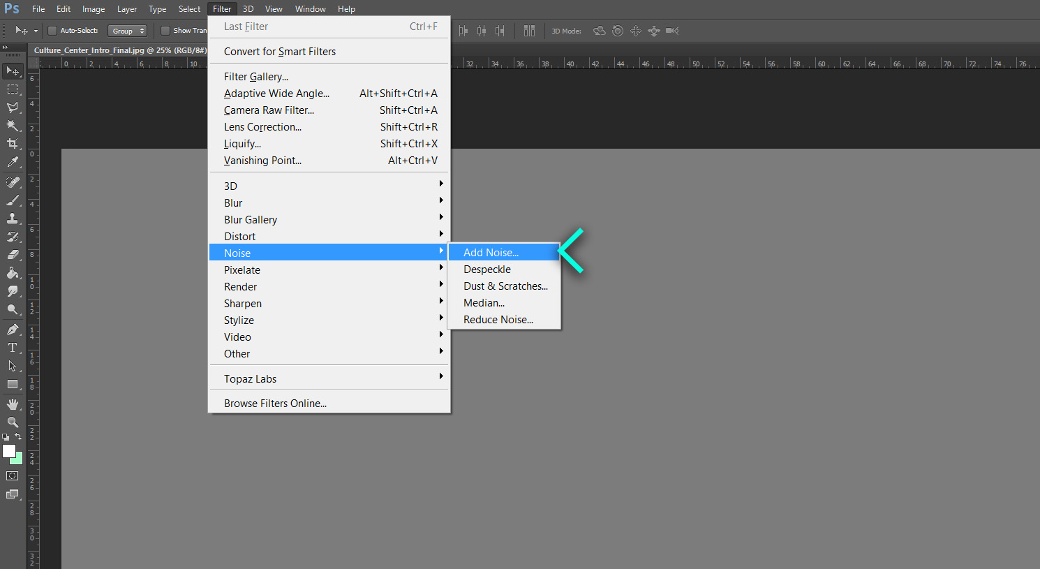
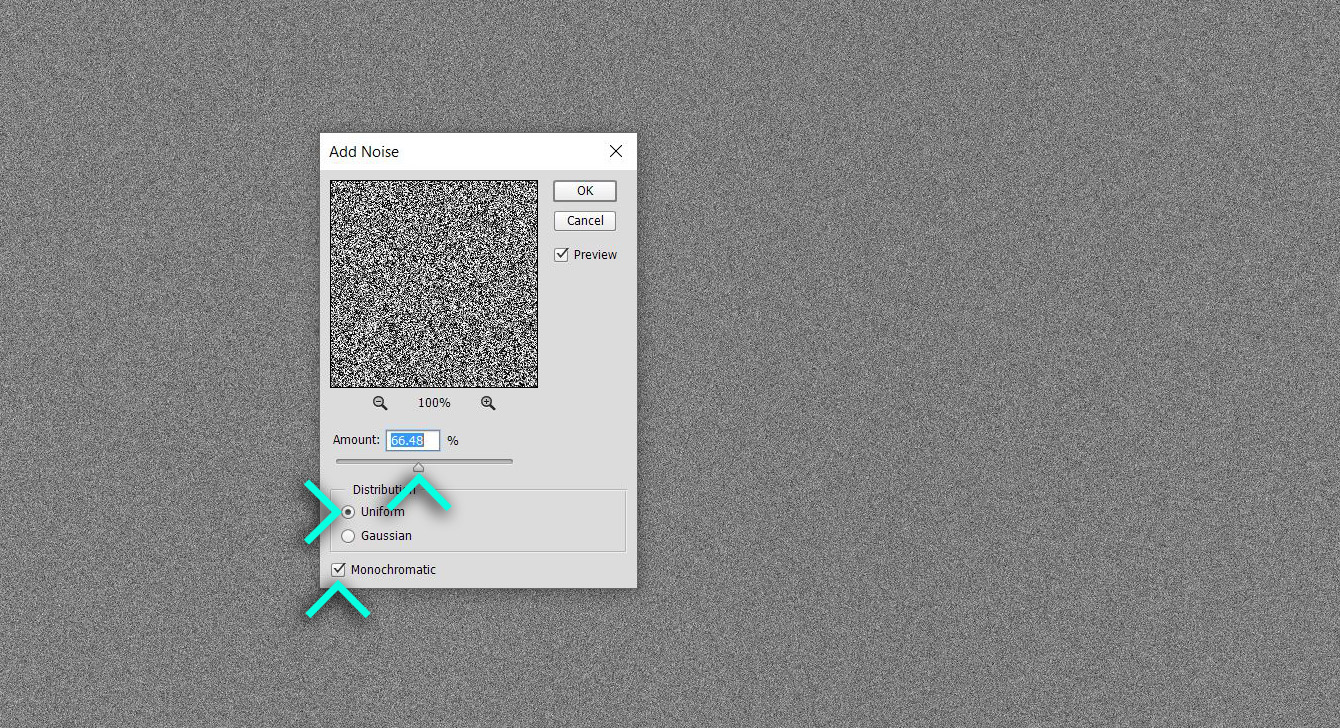

The last thing that I did was add some noise to the image which softens the edges, helps hide little imperfections, and give a retro look to the image. To do this, I created a new layer and filled it with 50% grey. Next, go up to “Filter>Noise>Add Noise”. In the dialogue box, I adjust the “Amount” slider to around 60%, set “Distribution” to “Uniform”, and checked the “Monochromatic” box. Finally, I set the new noise layer to “Overlay” to apply the texture to the image. I also lowered the opacity a little to reduce the strength of the effect.
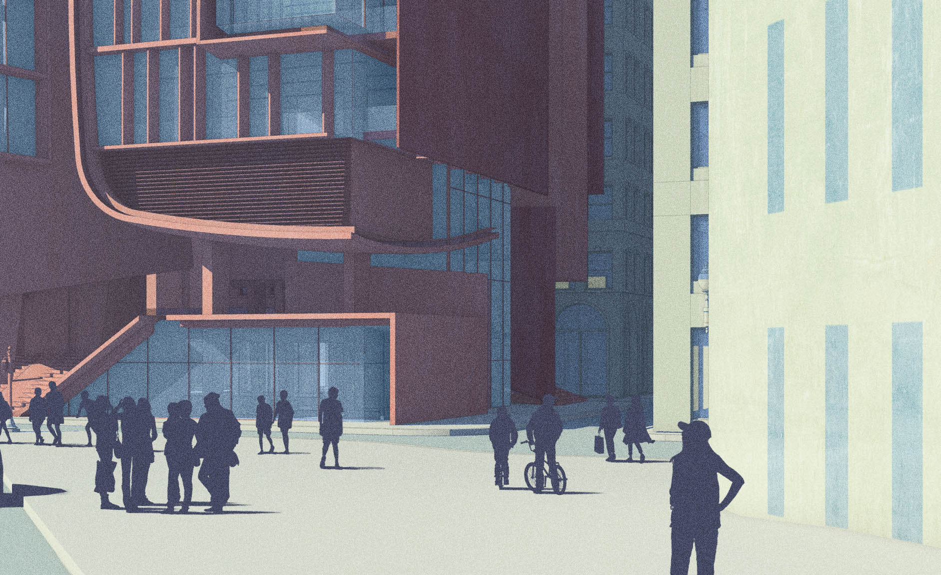
The Final Image


It reminds me of Antonio sant’Elia’s sketches. Beautiful work as always.
Beutiful works n tips. thanks for this beautiful sharing.
make
Even your quick illustrations looks so great! Hope to reach that level some day
even when your try to put minimal work effort\time on a piece you still manage to pull together a well thought final image. I really look up to you as a role model in terms of architectural visualization. I lack the ability of quick decision making when on tight time frame, and when i see your work such as this tutorial i urge my self to work up my skills.
Thanks a lot Alex, even though you say you are kinda squeezed in time but you still offer to share your knowledge. thanks again.
Which render engine for sketchup would you suggest that is 100% free?
Hey, Paul.
I’m not Alex, but I’ve been having a lot of success with Twilight Render.
There’s a free “hobby” version that has almost all of the same features as the $99 “pro” version.
See the website for more. http://twilightrender.com/
I’m actually enjoying playing with Blender and Visualiser, both of which are 100% free and have no limits on the output (that I’ve found)!
Blender looks far more complex compared to Visualiser though – on par with C4D and vRay I’d say.
There are some old posts on this site where Alex is using Kerkythea. As far as I know it is completely free, so maybe it is something for you.
I started out with Kerkythea. Twilight Render uses the KT rendering engine, so the same results can be achieved.
I find Twilight to be much more user friendly, and it operates *within* SketchUp.
The first renderings (i.e. lower on the page) on my behance site were done with KT. The newer ones are Twilight.
Paul, I used Kerkythea for the longest time before switching to V-Ray. It is free and works well with sketchup.
Chapeau! Always have been a big fan of your aproach to architectural visualisations.
Great to see this “vintage”, minimalistic looking
Keep up the good work!
Hi Alex,
I have been wondering for a long time, what is the font you are using on this website (both thin and bold)? I was looking for it but can’t seem to find it.
Thank you!
>Christina,
Search up “DIN” font , they come in both thin & bold.
Thank you very much, FriendlyNeighbor, I checked Din font family, it’s pretty cool, but I still couldn’t find the one Alex uses…
Hi Christina,
I used DIN Pro Font for the image above.
Hi Alex, I’d like to produce similar image but I can’t understand how to export the initial images, especially the shadows and the line work 2D with the same view of my vray physical cam. Can you help me?
Alessio,
I use V-Ray for Sketchup which uses the sketchup scene as its camera. I also use V-Ray tools plugin to ensure exports line up even when in 2 point perspective.
Hi, Alex, can you share this plugin name please.
Regards from Ecuador.
Hey man,
Awesome work, love your website. Quick question that I can’t seem to figure out, but when you render your model to get your vray shadows, how do you set the render output to match the images your exporting directly from sketchup.
Andrew, see my response to Alessio above. V-Ray for Sketchup uses the Sketchup scene as its camera, so renderings and SU exports should match up if using the same scene.
Hi Alex,
Thank you so much for sharing your knowledge. Whatever little knowledge I have abut visualisation is from this blog.
Quick question, Topaz lab plugins work on photoshop when in RGB mode. How do you then calibrate your colours for printing in CMYK mode? This is a problem that has been haunting me for long.
Thank you!
The outcome is so simple but so effective. Even the windows on the surrounding buildings add to much to this image. were they drawn on with the lasso tool? can imagine if i did that they still wouldn’t come out the same
hi,
I am a little confused about what exactly did you do with the 2d line drawing…you mentioned you took both the line drawing and the shadows to photoshop…but did u overlap them and edit transparency?
Fawaz, I really lowered the opacity of the line work and set the blend mode to multiply just to sharpen some edges and add a little detail in some areas. I also like to use the line work to make selections.
Hi Alex, thank you as always. Can you elaborate a little more on how to get the shadow image? Also do you know if obtaining the shadows separately is also possible in VRay Rhino? Thank you 🙂
Dear Alex, This work really looks awesome. The rendering engine, how’s Kerkythea working on this case? Looking forward to getting your response.
where can i get the people and bicycle you used in this amazing work?
Hi Alex, i would to ask you: how you can get the line and the shadow image? I know you use Skp and Vray, but i don’t understand how get the line rendering, or you export for sketchup like a Autocad file and then you import to photoshop?. And the shadow image, its channel form the Vray Rendering setup?
Thanks so much and sorry for my bad english, but i talk spanish.
See ya!
HI Alex, Loving this image. Just wondered if you could celebrate on how you got from point 3 to 4. How did you colour in each surface and how did you add in all the windows when there was no original line work for them? Cheers Alex
Sorry points 2 and 3!
Hi Alex, how to create a good clay render like that.. ? nice work and nice inspiration, love it
It is very beautiful work what you did, but I am not understanding how you did everything. How did you do the shadow drawing? You just took a screenshot? or how did you do it? Second, how did you make all those windows so well? it would be good if you can give more details on the process. Thanks.
Dear Alex,
Great work indeed.
I wonder if your trees and entourage are in “Multiply” mode to remove their white background, then how would you be able to use the Color Overlay? I mean the color overlay will also colorize the white background, I hope you have a tip for that.
Do you use your model cars to find the right view for your perspective or do you modify them in Photoshop? If so, do you have any tutorials on that?
How do you decide on your color themes?
Thanks a lot.
Loaei
Hi Alex.
It is indeed an amazing work.
Compared to those realistic image, this kind of works that bring some comic feeling makes me feel more powerful.
I’ve been followed your works for some time, and this is the first time I want to tell you how much I like them.
Thanks for sharing!!
Hi Alex, your work is very inspirig to me! Whenever i try out your tutorials on my designs i always get compliments at uni lol
I’m a bit confused about how you got the line drawings and the shadows separately though? Did you export the lines to autocad and used it on photoshop? What about the shadows did you just took them out on photoshop?
Thanks and keep up the great work 🙂
Hi Alex, I really like your work! Very curious to find out what font you use throughout the website and on this render.
I’ve just discovered your work and this image has really captured me as I set up my own website – thank you so much for sharing your method in a profession (for me, architecture) that traditionally has kept it’s cards close to it’s chest, donnie
Hi Alex! Simple question, how did you apply the rectangular windows on your walls? I’m trying to quicken workflow and it would probably take too long to model, and too inaccurate to draw by hand.
Thanks!
Very inspiring and helpful too.Hope you continue to share more of your ideas.I will definitely love to read.
Animal Crossing Pocket Camp
your sharing is awesome.
Hi Alex, I have been facing the problem of keeping the portfolio size lower than 10-15 MB as we need to mail them for job application. The high end graphics are just too heavy. And compressing is not a option as the quality deteriorates.!!! Do you have a solution for it??
Hi Alex,
How do you apply colour to your image? Whenever I try to add colour to mine it just ruins the shadows behind?
Alex,
Your’e work is truly inspiring. I am a fourth year, under-grad arch. student, working at a firm in San Diego. Unlike my last firm, this one does not require artistic renderings which leaves me to the redundant drafting tasks. I dream of a day when I can too make a living creating architectural illustrations and design.