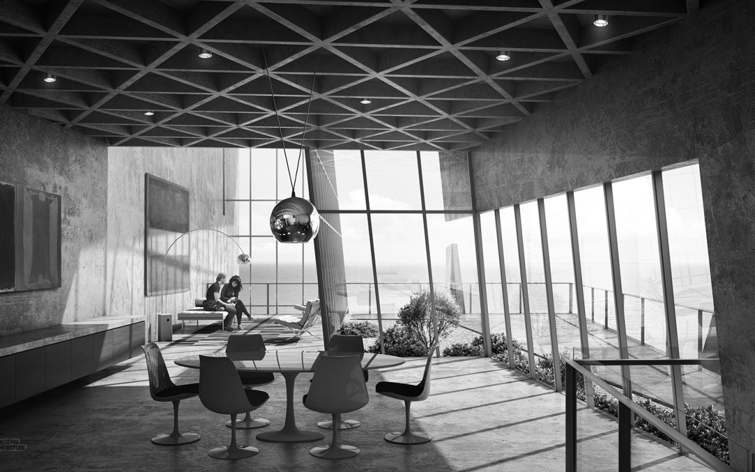
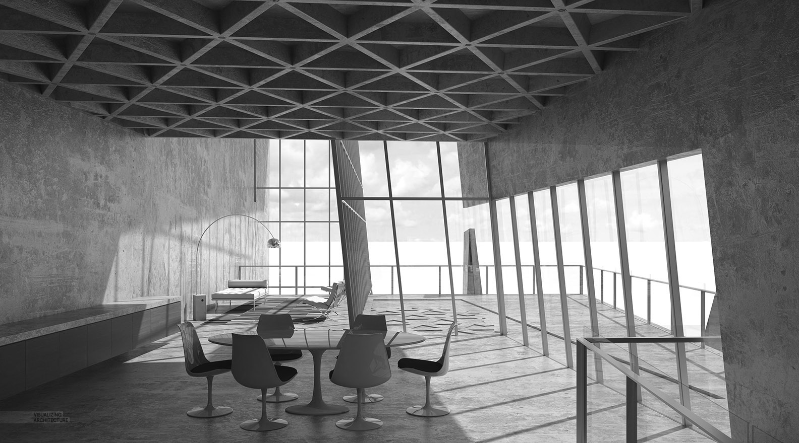
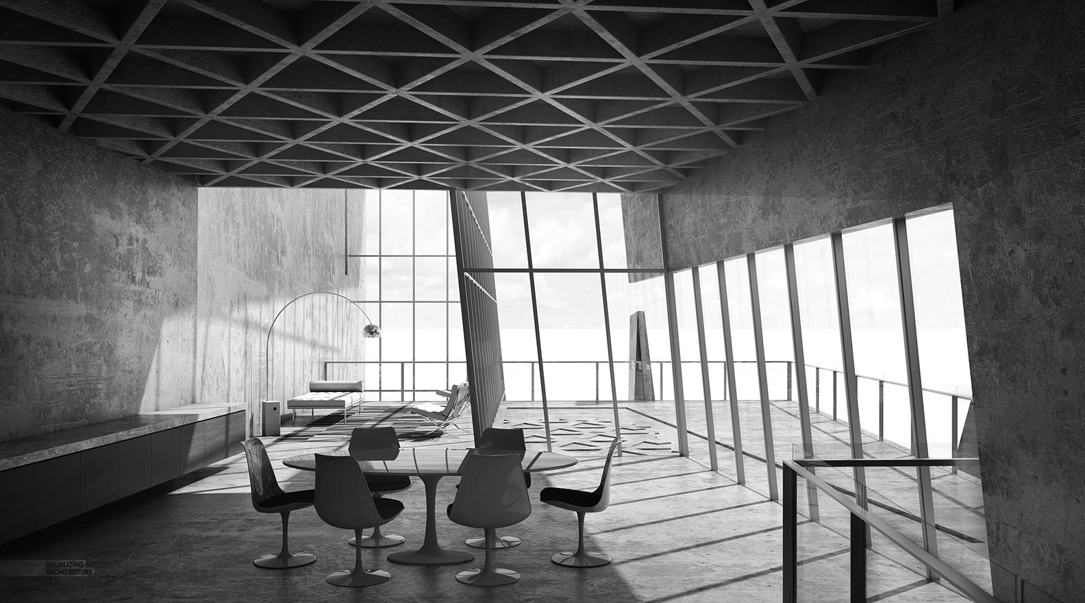
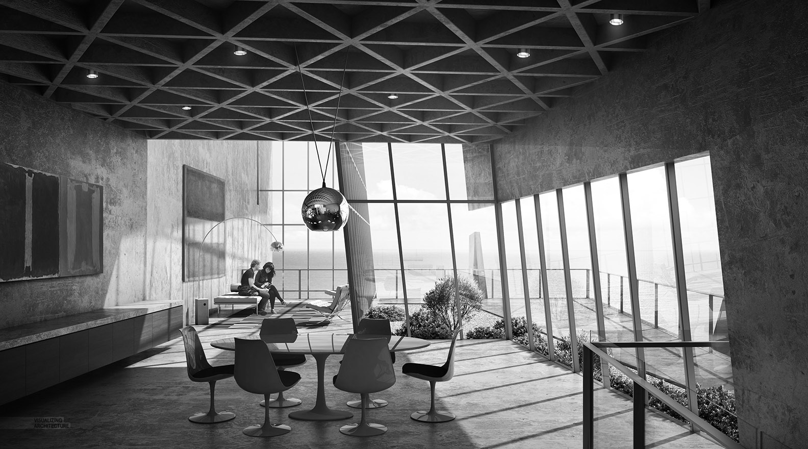
I was finally able to setup some interior scenes for the cliff retreat design. I decided to go black and white with these images to relate back to the black and white exterior images generated a few posts ago. However, the desaturated colors will also help play up the light and shadow of the interior views and highlight the concrete textures that dominate the space.
Below is a quick break down of one of the interior images
1. Sketchup Model
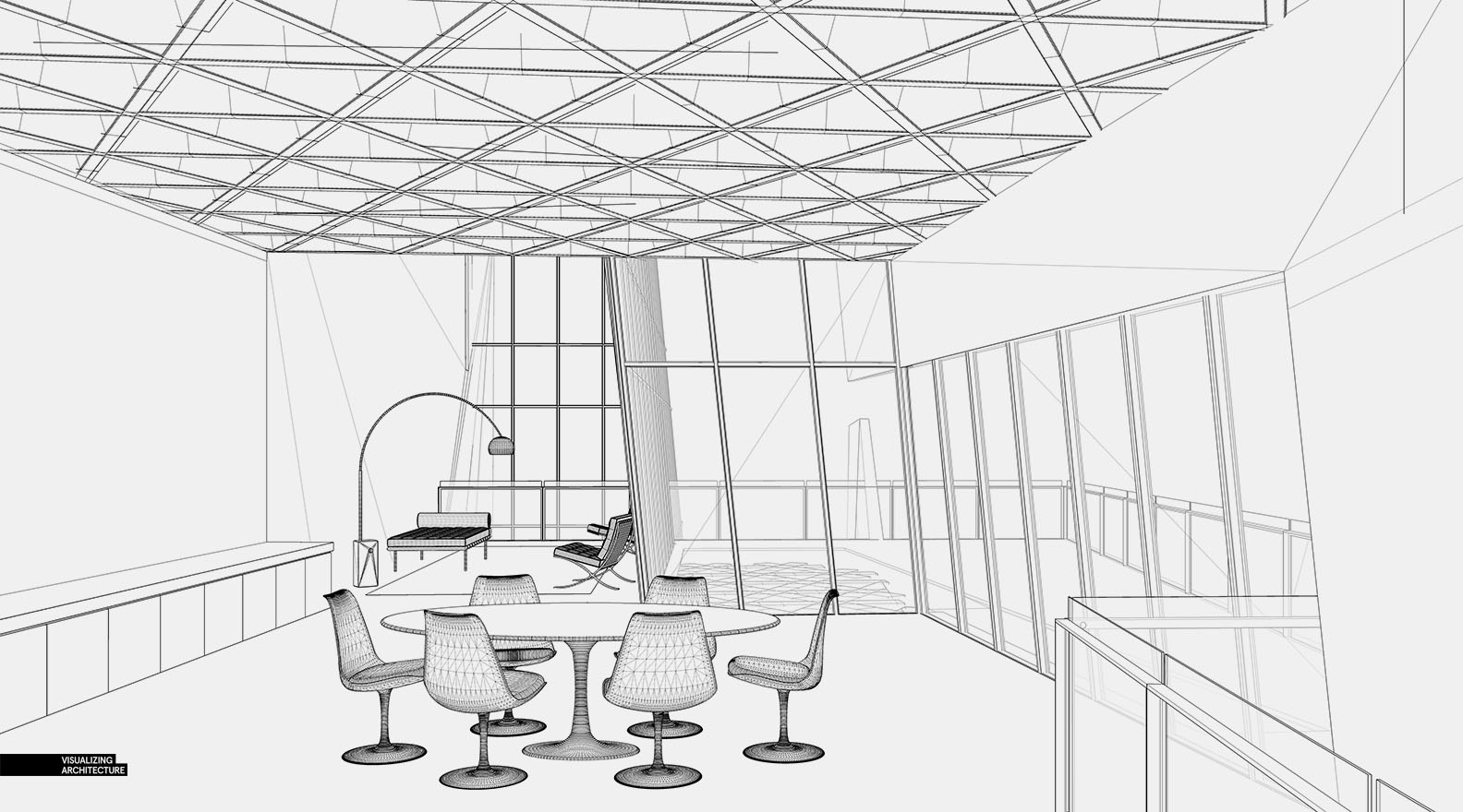
Above is a hidden line view of the Sketchup model. The 3d model remained relatively simple with a Kahn like waffle slab to help break up the large concrete ceiling plane. All furniture was found in Sketchup 3D Warehouse.
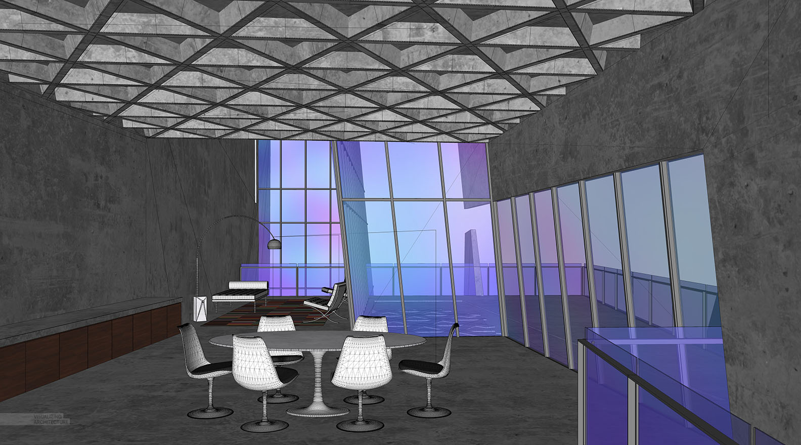
Above is the Sketchup model with materials turned on. A lot of my time was spent experimenting with concrete textures and honing in on the right amount of bump and reflection. While I like to photoshop textures on exterior views like these images, it is too difficult to manually texture in interior scenes. Interior views often have too much geometry and detail to mask around and too many reflective surfaces to deal with.
2. V-Ray Base Rendering
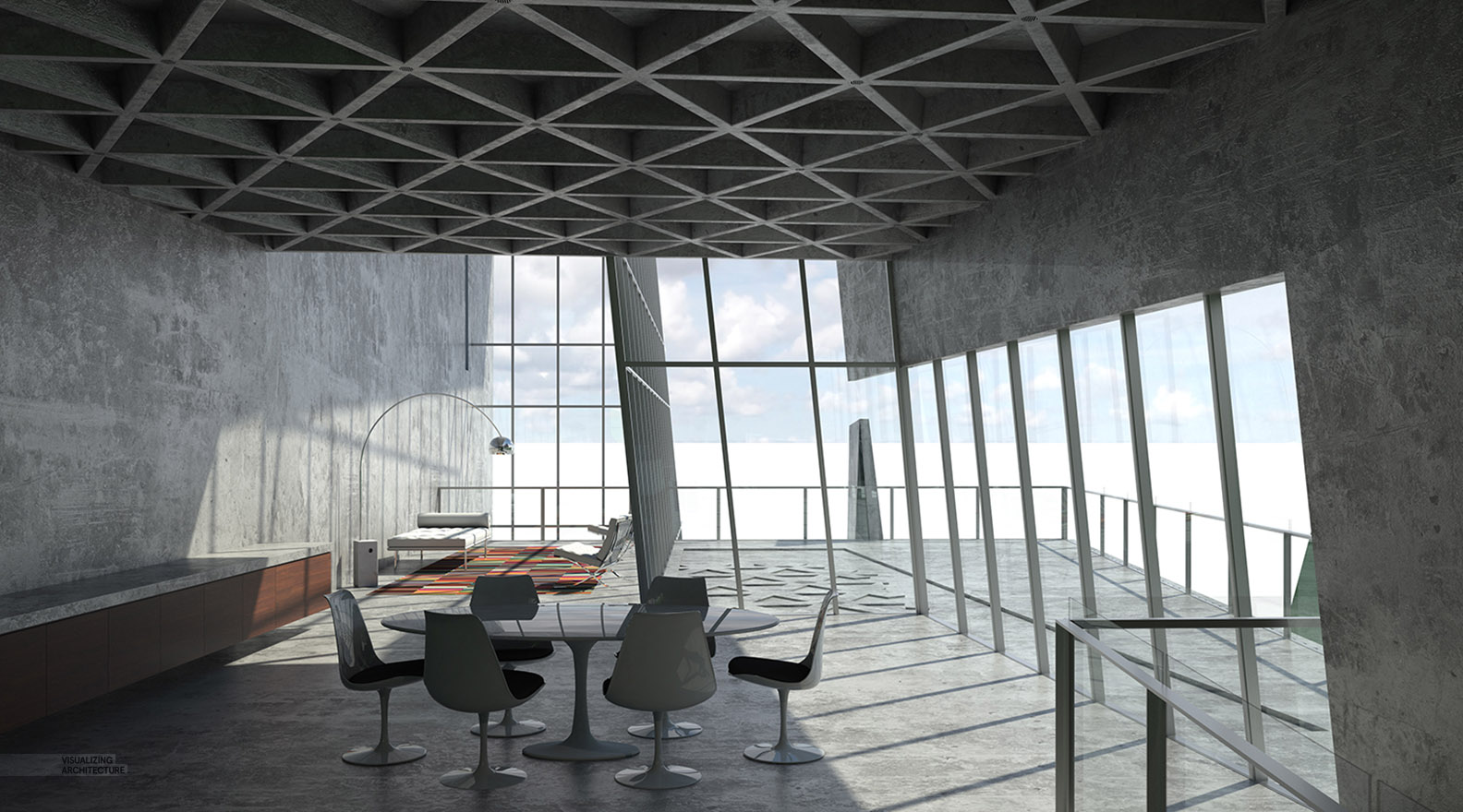
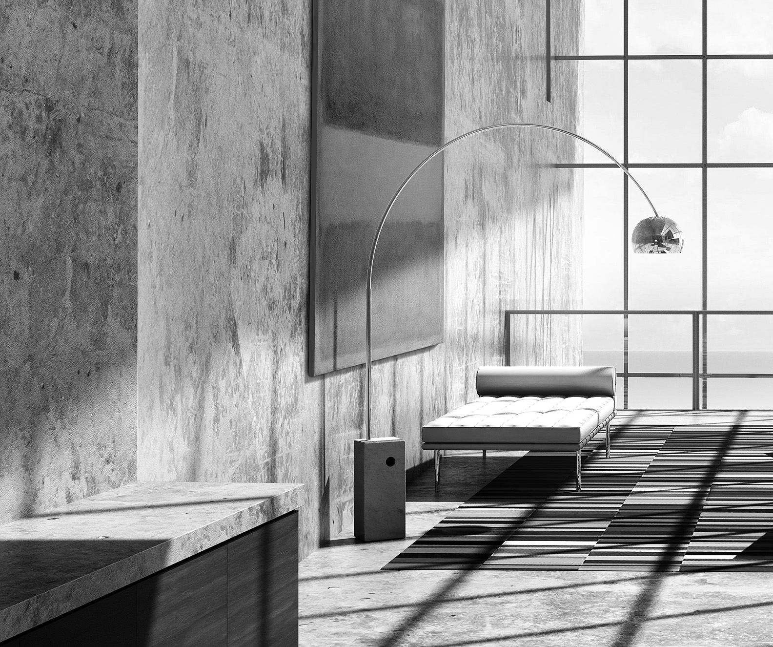
Above shows the V-Ray base rendering. Along with the concrete texture, I also setup a gloss white acrylic for the Saarinen Tulip furniture, chrome materials for the Arco floor lamp and Barcelona chairs, and a simple wood material for the millwork on the left.
3. Photoshop
Once in Photoshop, I started setting up masks and desaturated the color taking everything to a simple black and white image.
4. Adjust the Levels
The image is lacking some contrast so I adjusted the levels to deepen the darks and punch up the highlights. I also added some vignetting (shadow around the edges of the image) to help draw the eye to the center of the composition. Finally, I added a slight haze to give some depth as well as lit up the left wall to help articulate the shift in wall plane from the dining room to seating area in the back.
5. Room Accents
Some vegetation was added to the outdoor terrace to better visually separate interior from exterior. Other elements like the dining room pendant light, ceiling spot lights, and paintings were added in Photoshop instead of modeled in 3d because I find it easier and faster to iterate and test out ideas in this environment rather than waiting for test renderings to kick out. The paintings especially changed quite a bit once desaturated, requiring a lot of experimenting to find the right tones. Finally, some people were placed in the back to avoid drawing too much attention while still adding scale and activity to the space.
Final Images
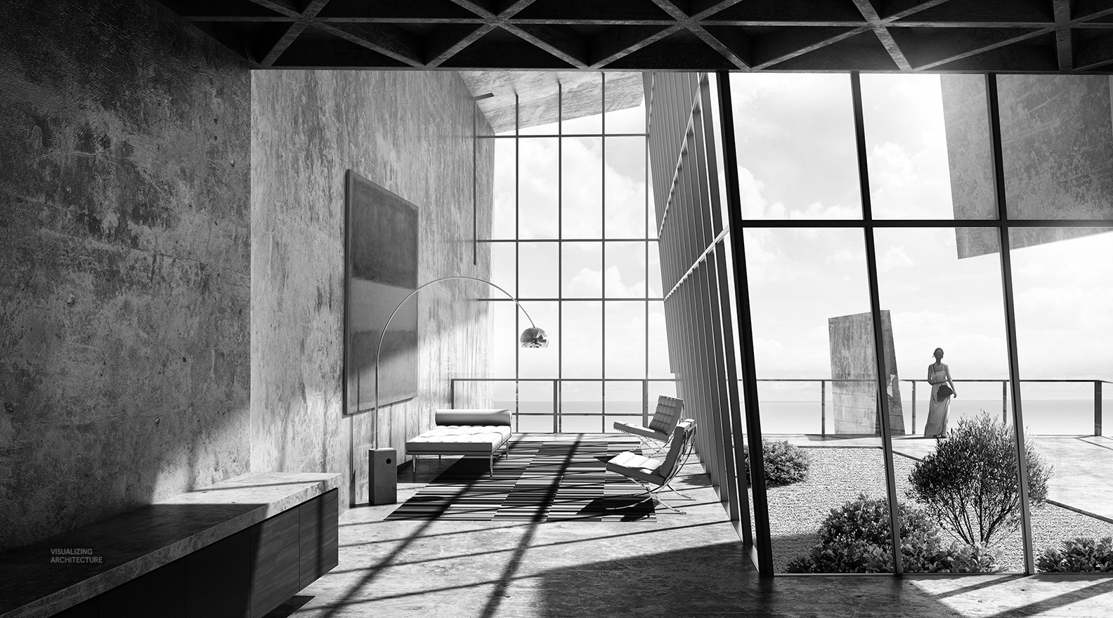
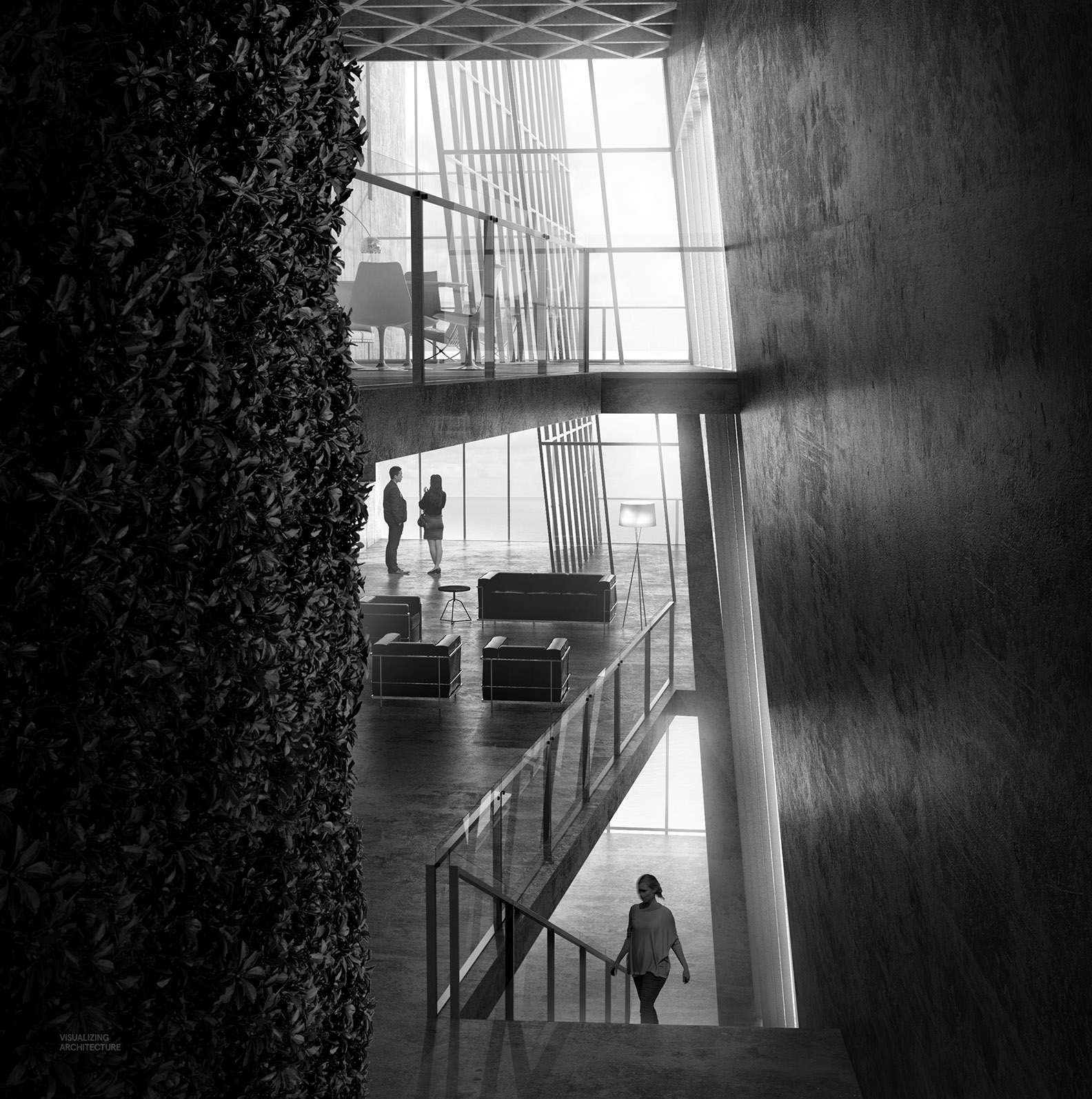


I commend your attention to composition! This series is very compelling.
Yet another successful project. I look forward to purchasing this portfolio!
Wow that looks amazing! love the texture!
By the way Alex, do you happen to have any tutorial for V-Ray? Tutorial and also, where can i download them?
Cheers!
I think it is contracted.Very good!
Inspiring work again, Alex. Keep it up!
Yes, this is definitely inspiring. Thanks for sharing Alex. I’m going to practice. 😉
Amazing.
I hope one day you can find a client with the budget to pull one of these of IRL.
Alex could you possibly do a tutorial on how you create textures and how you apply them through vray?
I’d also be interested in that! Especially since sketchup is quite finicky in regards to UV mapping. I sometimes have problems with materials within components and groups changing their appearance/texture mapping as i enter and exit that group. I’d also be really interested in any tips you have regarding UV mapping materials without a diffuse map – eg. water and other materials that only have a color+bump/reflection maps.
Alex thank you for the awesome post! Your blog has been a constant source of inspiration for me ever since I was an undergrad in college.
I was curious to know what you save your V-Ray renderings as? It seems each file type comes out differently, and I’m not sure which one is the best to use in post production. Would love to hear your input.
Hi your blogs are awesome and very inspirating. I wonder if, for example, this Cliff retreat is a project you do for your client or you do it in your free time just for your portfolio? (same with train staition and couple of other projects) My point is that it should take a lot of time to do such a job and also a blog, and for free?
Hi Alex,
another good work!
I like how you manage a simple render image between 3D software and Photoshop, when this is useful.
Thanks!
A tutorial on how you use vRay, such as lighting and materials would be fantastic. I’d pay for that!
As usual amazing visualisation work. I am you adimirer for last 3years. Thanks to you I have learned a ton. Could u plz elaborate the texturing of the concrete and settings of the base rendering? It would be really helpful. Once again kudos for keeping up the amazing works.
Alex! Great work. I’m wondering how you made the concrete ? I have a hard time finding a good vismat file. Would be great if you could answer me here or through email! Thank you so much!!!
Hello Alex, I was wondering where you get your materials for Sketchup?
Yes Alex, please make a post about Sketchup materials.
hi alex
i learned alot of your blog thanks for the so much informative blog. god bless you. one thing the missing is i think is the technique of setting camera position for interior render. can you plz do it. how to positions camera in interior.
Do you just pull all your planting from google images? Or do you have a specific site that provides good png/cutouts ?
The Interior looks very gorgeous to see .
Alex,
Can you share how you created the room reflections on the chrome finished light fixtures?
Thanks,
Juan
Dear Alex, how do you get textures and models, would you say to ua how are the sites that we can find these things?
Le pire c’est que je vais aussi PARTOUT avec mon téléphone. Sauf cette fois-ci. Une petite plongée au temps de jasrq-duand-on-avait-pas-de-poitable, ça requinque !
Hi Alex, will you please help me to do a realistic render in Vray 2 for the sketch up….
O secretário de Estado da Juventude e do Desporto disse hoje no Parlamento que o ciclista João Cabreira indicou como morada uma casa sem portas e sem janelas, dando este caso como exemplo da necessidade de “apertar” os regulamentos de luta contra a dopagem, sobretudo no que diz respeito aos controlos surpresa fora de competição.
Hi Alex! Wonderful renderings. I admire your attention paid to details, especially with the blown-up image of the floor lamp. I noticed that after you photoshoped in the painting, the shadow of curtain wall mullions disjointed when it meets the edge of the painting. I wonder what was your way of doing that? It seems to me there is no efficient way to make that happen.
Hi, incredible mood in those renders.
I’m wondering how the haze effect was done in photoshop, some kind of brush and soft masking?
Comment: why nobody use thea render? i think this soft is very good.
YomeCorn ethanol is a joke. Increasing the cut of alcohol in fuel actually drops the gas mileage of the vehicle using it since alcohol has a lower unit energy density. Since most of the alcohol comes from corn it is also an oil derivative since substantial amounts of oil based fertilizers must be used to grow the corn that is used to produce ethanol. Its a Rube Goldberg fuel production supply chain.
Hát, megyek is a Szamos egyik egységébe 🙂 Meg egy orient boltba :-)Kérdés: ha ismeritek, akkor melyiket ajánlanátok elsÅ‘nek:Chocolate Desserts by Pierre HermeDesserts by Pierre HermeSecrets GourmandsűKösziÃœdv.
ah, posting ini tidak bisa dibaca sambil curi curi waktu jam kerja seperti sekarang, mending baca lagi entar malam sambil tiduran menjelang tidur, hihi
Miten ihana munakas! Meillä täälläpäin savustetaan norjalaista lohta,mutta se ei ole läheskään niin hyvää kuin Suomessa savustettu.Niinpä ilahduin kun löysin joku aika sitten asuinkaupunkini keskustan eräästä kaupasta eestiläistä savulohta,joka on ihan saman makuista kuin Suomessa.Pitää mennä katsomaan olisko sitä vieläkin siellä kaupassa.
Hi Alex,
this post only tell you I arrived here from link “The Underbelly”.
So you should correct this link.
Thank you Alex to shared you wonderful jobs and Happy New 2018!