by Alex Hogrefe | Jun 26, 2016 | Break Down, Portfolio Vol. 4, Project 03 Crossroads Pavilion |
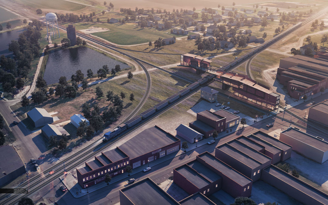
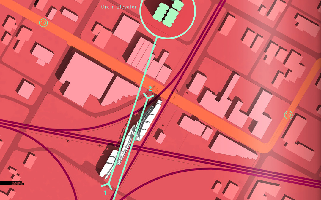
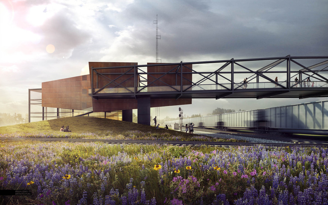
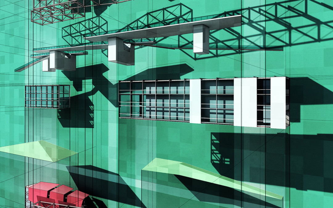
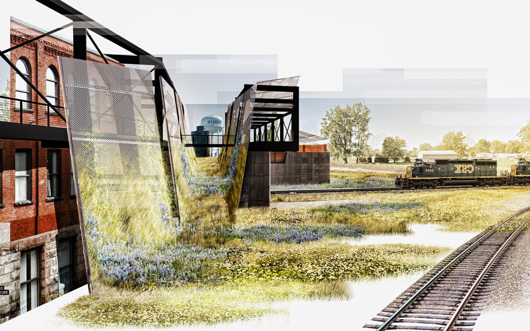
There are still some areas of Portfolio Vol. 4 that are missing information. One image that I just finished creating is an aerial of the train pavilion project that better shows the relationship of the new architecture to the iconic town water tower. I have several...

by Alex Hogrefe | Sep 20, 2015 | Portfolio Vol. 4, Project 03 Crossroads Pavilion, Uncategorized |
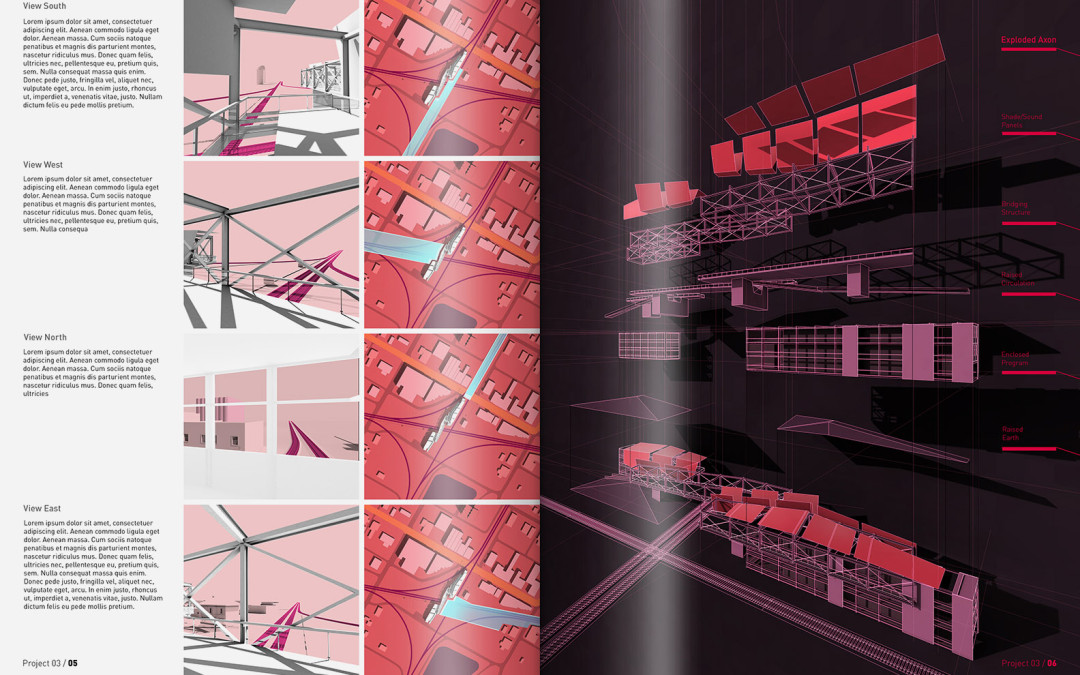
As I near the end of this project, I have started to compile all of the imagery into portfolio spreads. This is the first pass at organizing the illustrations and diagrams to tell the story of the project. As I put this series of spreads together, I am still...

by Alex Hogrefe | Aug 28, 2015 | Break Down, Portfolio Vol. 4, Project 03 Crossroads Pavilion |
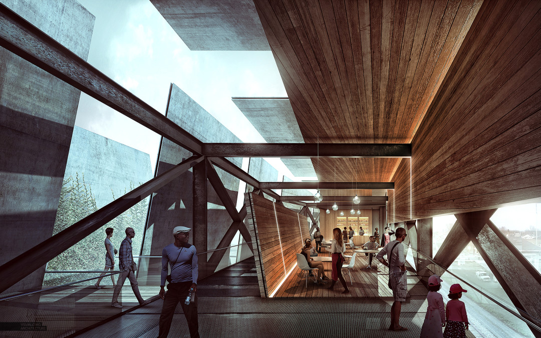
I have been experimenting with some interior illustrations and wanted to post a breakdown of this image. Determining the view for this shot has been difficult because there is so much going on in the design, and I wanted to find a view that properly captured...

by Alex Hogrefe | Jul 19, 2015 | Fundamentals, Portfolio Vol. 4, Project 03 Crossroads Pavilion |
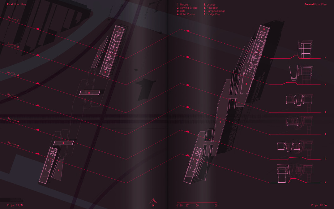
This week, I have begun piecing together the floor plans of the Train Pavilion Project. When it comes to visualizing floor plans, I have always leaned towards a simple representation. Maybe it is because I have spent so many years working in offices where the...

by Alex Hogrefe | Jun 29, 2015 | Over Time, Portfolio Vol. 4, Project 03 Crossroads Pavilion |
I have been playing around with some diagrams for the recent train pavilion design. The architecture diagrams that I create on this site have ranged quite a bit over the years. Lately, I have been gravitating towards a minimal approach for these types of...

by Alex Hogrefe | Jun 7, 2015 | Fundamentals, Project 03 Crossroads Pavilion |
I can’t believe that I have not written a post about skies yet on this blog. In most cases, a sky can make or break an architecture illustration. It’s also something that I see a lot of people overlook or only spend a few minutes on in their renderings....

by Alex Hogrefe | May 17, 2015 | Fundamentals, Project 03 Crossroads Pavilion |
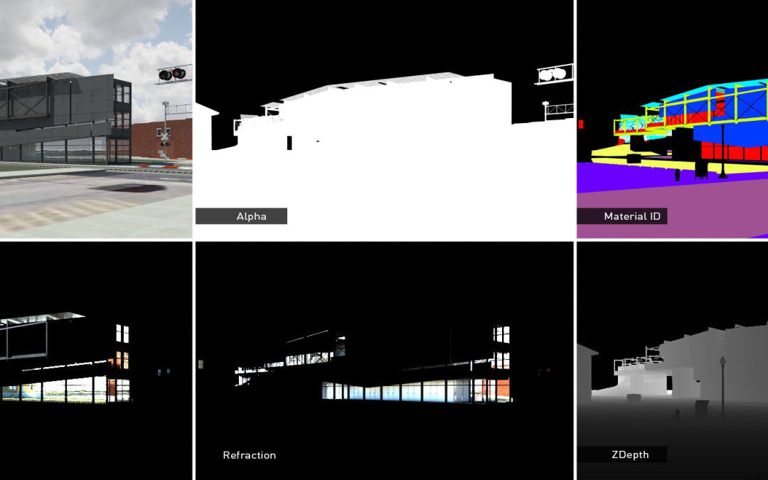
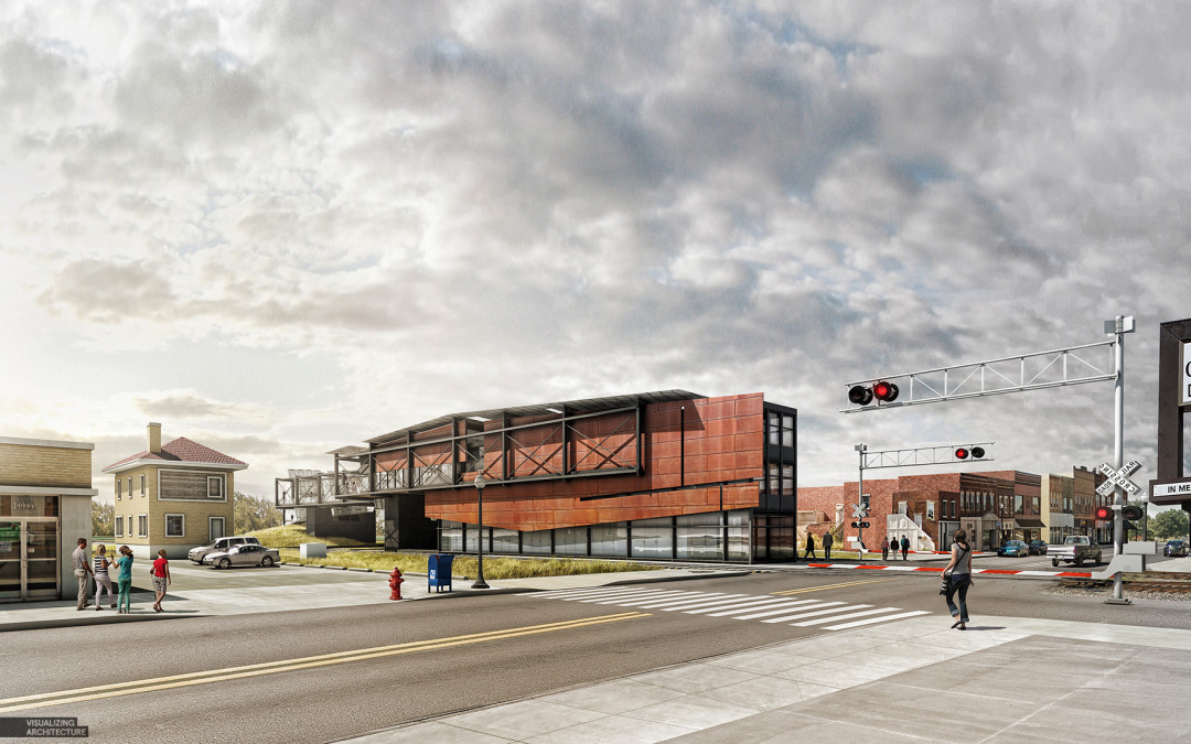
A lot of you have been asking for V-Ray settings and so I am going to spend a little time going over the settings that I used to create the base rendering of the main street perspective in the previous post. I have been using V-Ray for over a year now and I am in...

by Alex Hogrefe | May 3, 2015 | Break Down, Portfolio Vol. 4, Project 03 Crossroads Pavilion |
It’s been a while, but I am finally back. I have spent the last several months traveling, giving workshops, settling into a new home, and spending time with family. Needless to say, priorities shifted as they often do and this website unfortunately had to be put...

by Alex Hogrefe | Mar 2, 2015 | Break Down, Portfolio Vol. 4, Project 03 Crossroads Pavilion, Styles / Effects, Uncategorized |
As you have probably noticed, I have not been posting as often as I normally do. Things have been very busy lately, in a good way. Unfortunately, this means that I have not been able to invest as much time as I would have liked to this website. Instead of not...

by Alex Hogrefe | Feb 7, 2015 | Break Down, Project 03 Crossroads Pavilion, Styles / Effects |
I was in need of some purely right brain thinking so I decided to skip modeling and V-Ray altogether and see what I could turn out with a half baked Sketchup model and some Photoshop. This meant generating a collage style illustration. These types of illustrations are...
