Adding trees to a perspective can be a daunting task, especially if there are a lot of them. Often what happens is the same tree gets copied over and over again. Everyone does it. It saves a ton of time compared to spending time cutting out several trees that are of the same species but all look a little different. The problem is that copying the same tree creates an obvious “computer” generated look. That same branch sticking out the side is in the same place all the way down the line. It’s the first thing I notice when looking at an image and I have trouble getting past it. There are several moves that I use that help remedy this problem quickly and easily.
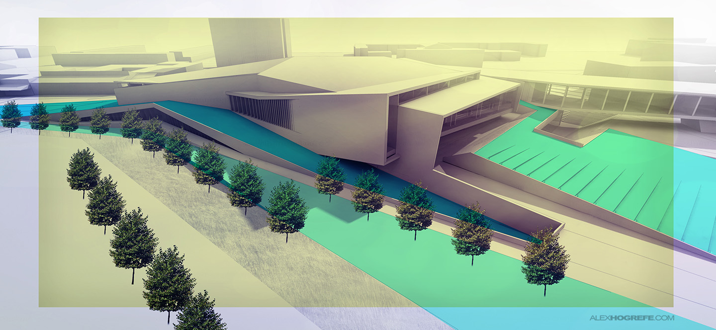
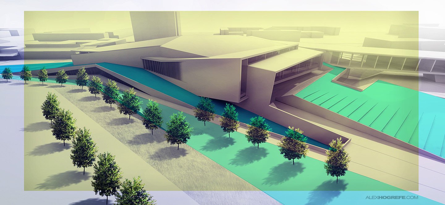
Below is the initial image with the same tree copied 20 times. Since the trees are being Photoshopped in, there are no shadows and the lighting does not match the scene.
SCALE CHANGE
The problem for me is not so much that the texture is the same, but more because the sizes and proportions are all the same. It is rare that trees planted next to each other are the same height and width. When they are proportionally identical, the eye quickly sees the relationships and senses something is not right. Therefore, the first thing I do is go through and stretch the trees to different heights and widths. While I am doing this, I am also occasionally flipping the trees so that the same branches are not sticking out of the same side in every tree.
Between flipping the trees and stretching the trees on the x and y axis, you can quickly generate many “slightly” different looking trees. To transform, go to “Edit>Transform>Scale”. Flipping the tree is just as easy by going to “Edit>Transform>Flip Horizontal”.
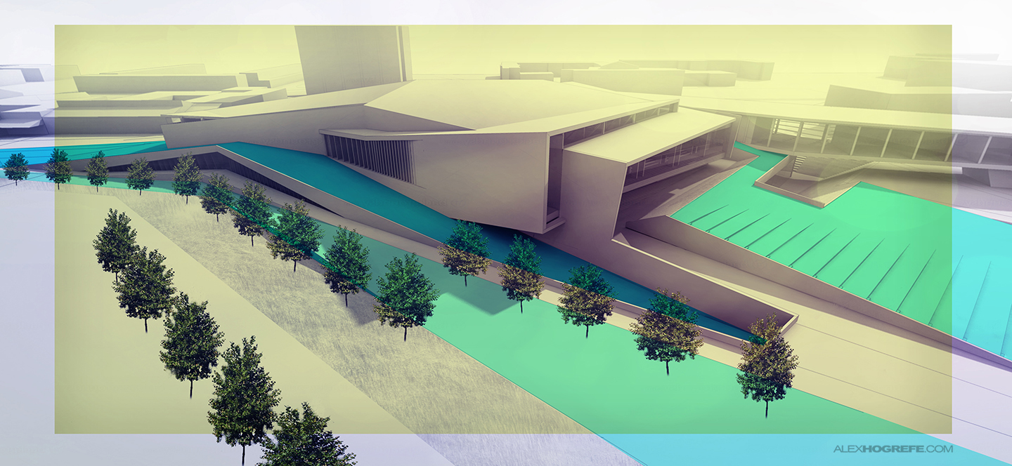
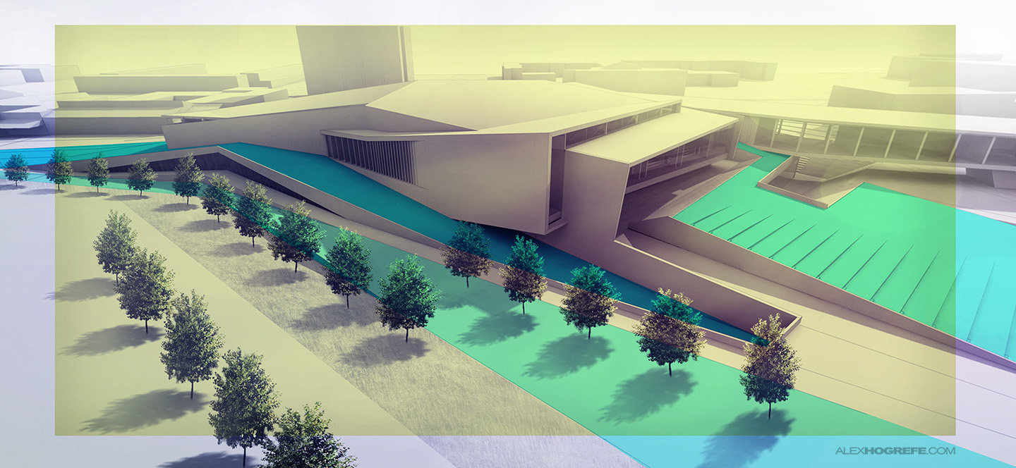
One last thing I do to help differentiate between the trees is occasionally erase specific branches. This again helps to stop the eye from creating relationships from one tree to the next. Below, you can see the repetition is not nearly as obvious after implementing these simple moves.
LIGHTING
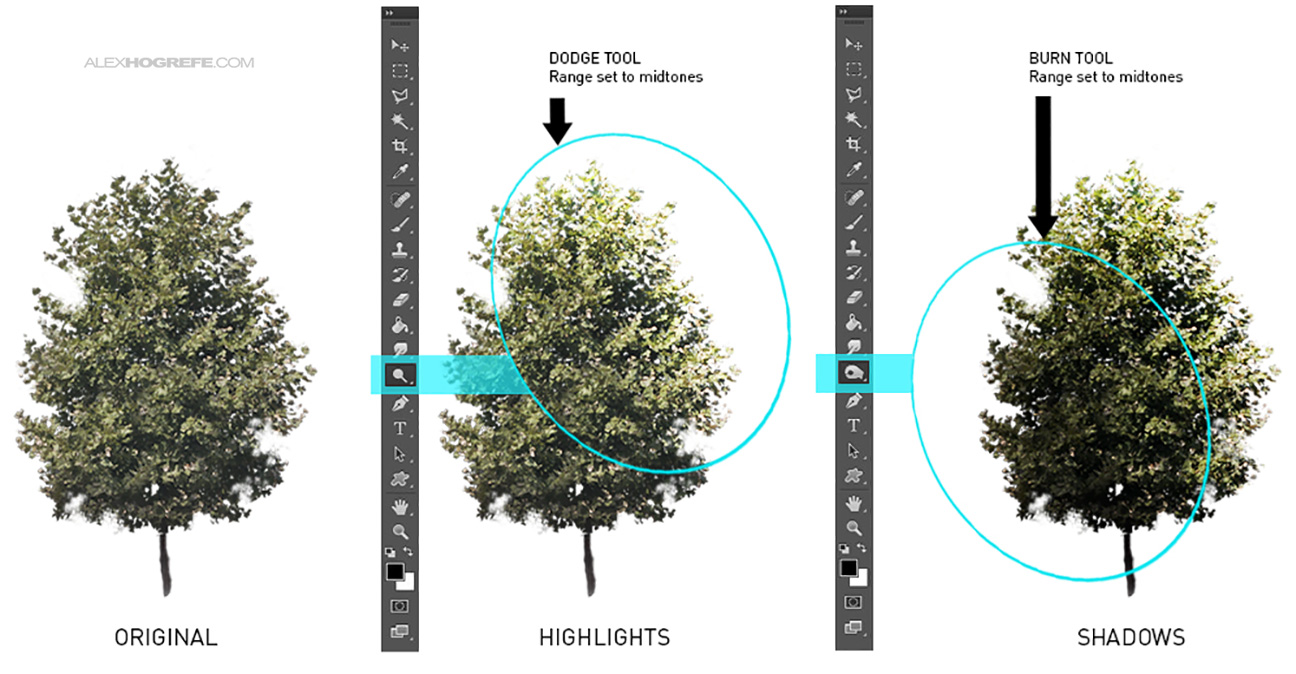
A tree has shadows and highlights just like everything else in the scene. I often see people ignoring this fact which leaves the trees looking flat and out of place in the scene. This is an easy fix by using the Dodge and Burn tools.
The Dodge tool lightens the image. Starting with the Range set to “Midtones”, the strength set around 40%, and a soft brush selected, highlight the edge of the tree that faces the sunlight.
Conversely, the Burn tool darkens the image. Again, set the Range to “Midtones”, the strength to around 40%, and select a soft brush. Darken the parts of the tree that would be in shadow.
The highlights and shadows really help to set the trees into the scene and respond to the environment. It also gives trees a more volumetric feel.
GROUND PLANE SHADOW
A shadow needs to be generated on the ground. The workflow I use is very similar to how I add shadows to people. The process is fast but creates great looking shadows.
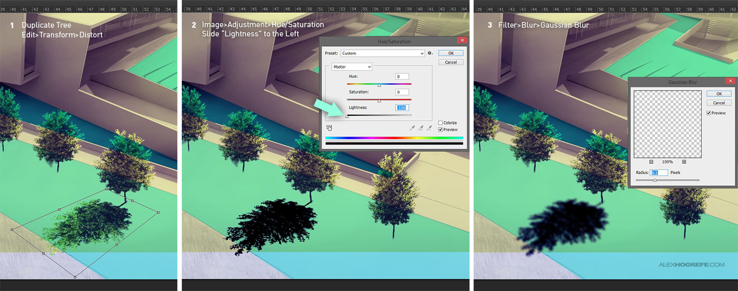
1. The first step is to duplicate the tree onto its on layer. This can be done by selecting the tree layer, right click on that layer, and select “Duplicate”. Next, this new layer needs to be rotated and transformed to match the perspective of the ground. Choose “Edit>Transform>Rotate” to rotate the tree to match the direction of the shadow. Then again go to “Edit>Transform>Distort” to adjust the tree to match the perspective of the ground.
2. Turn the copied tree completely black by choosing “Image>Adjust>Hue / Saturation”. Move the “Lightness” slider to the left to -100.
3. I also like to apply a slight blur by going to “Filter>Blur>Gaussian Blur”. I used a radius of 20 but it really depends on the resolution of your image and personal preference.
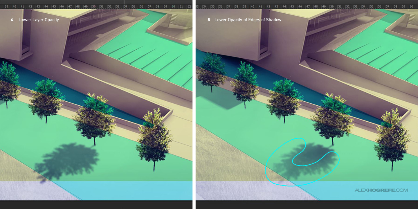
4. With the shadow layer still selected, lower the opacity to match the tone of the rest of the shadows in the image. In this case, I need to lower it to about 50%.
5. The final step is to further lower the opacity of the shadow edges so that there is a subtle gradient. As the shadow gets further from the tree, the lighter it will get. I achieve this by selecting the Eraser tool, choose a soft brush, and set the opacity to 15%. Then erase the edges of the shadow being careful to only erase enough to get a slight gradient in tone.
DESATURATE
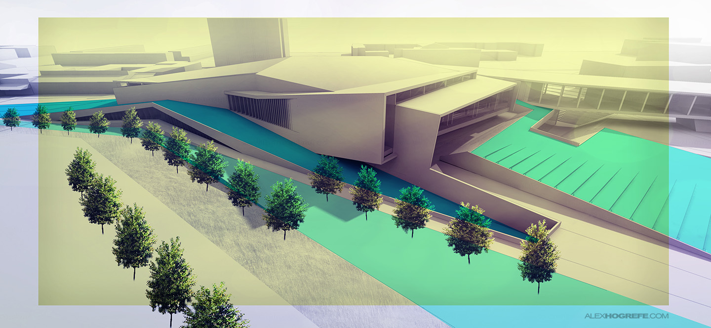
When burning and dodging an image, the colors tend to get very saturated. I don’t want the green color of the trees to draw too much attention, so I need to remove some of the color. I merge the trees into one layer, go to “Image>Adjustments>Hue / Saturation”, and lower the saturation by about 50%. I also lowered the opacity of all of the trees to help blend them into the background.
The main concept to take away from this post is the idea of building imperfection into the image so that the eye doesn’t see repetition from one tree to another. Simple moves like changing the height and proportions go a long way in breaking this repetition.




We always have this joke about "famous birds". So many students choose to use Photoshop brush to recreate birds in their visuals (must admit, I have done it too). But when flicking through the visuals birds become that obvious element which repeats in every visual. Not entirely the same as trees though.
Great article Alex,as I always. I learn new things from your blog. Thanks!
Thank u so much Alex. I hope u 'll continue like before. I always look forward to hear from you.
all the best,
Meruj
thanks again alex, i always follow your tips and tutorial and look forward to hear again from you. 🙂
Love this article
Great post Alex!
We are in the same business and we very much appreciate awesome tips like these ones!
Keep up the good work 🙂
I really like your posts, I was looking for some tips so I can do better with my proyects and it’s really helpfull, so far so good!!!
Thanks for sharing 🙂
Thank you very much!
Thank you!
This helped me out a a lot, thanks for taking the time to post.
thank you dear you are so lovely
You’ve been a life saver when it’s come to my last minute perspectives more than once! Thank you for your generous tutorials
Thank you very much!
Wow… what a great post! Thanks for the sharing, I also found a useful service for docs merging. Just look at the service
https://goo.gl/9UkqRA. Its pretty easy to use.iam really love this country, have alot of great things and i think, only here thats have something amazinng
yeah i think so
just the greatest idea from here .
nice for us
Thanks you
thankyou for share with us, its very helpfull