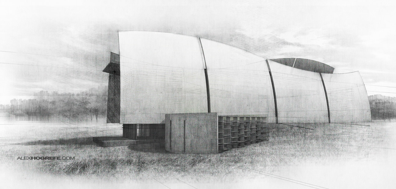
I wanted to go into more depth about how I created the sketch look. Images like these depend almost entirely on the textures you use. I spend a lot of my time scavenging images online as well as creating my own to get the exact style that I am looking for. Along with good textures, another key component to sketch illustrations is the subtle imperfections. Sometimes, the textures that I use have enough blemishes and flaws that nothing extra is needed. In the example below, I did spend some time adding smudges and details that help blur the edge between computer and hand drawn.
I started out creating a video tutorial but soon realized that there was too much custom editing done that was unique to this illustration and probably would make things confusing. By this I mean, there was a lot of erasing and altering of the textures that wouldn’t carry over to other illustrations. Instead, I tried to break the work flow down into basic conceptual steps showing the hierarchy of the layers as well as the types of textures that I used. As a supplement to this post, I would suggest looking at my Blueprint Tutorial and which explains in greater detail a similar workflow.
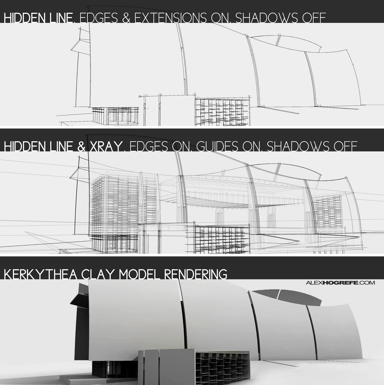
1. As with many of my illustrations, begin with exporting images from Sketchup as well as generate a clay model rendering shown below.
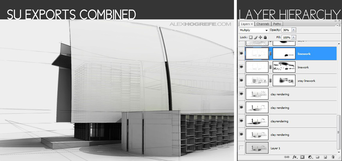
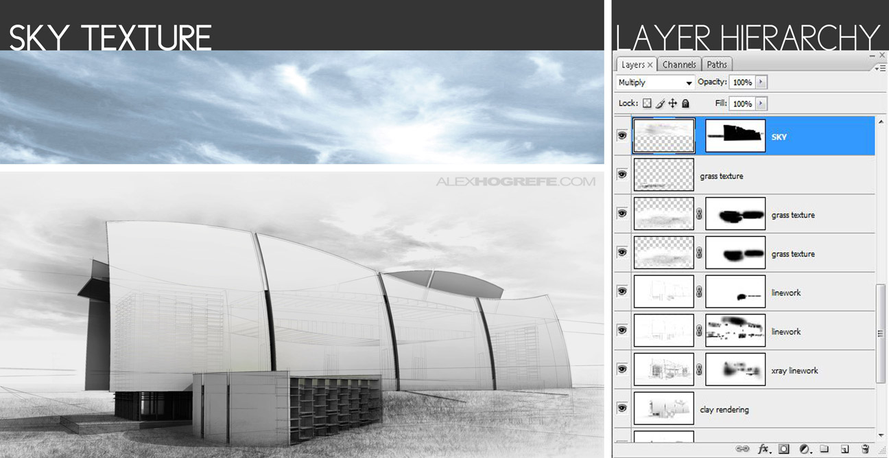
2. In Photoshop, combine the exported layers by setting the clay rendering as the bottom-most layer, and the line work and xray exports above the clay rendering layer set to “Multiply”. You may notice in the image of my layers pallet below that I have layer masks applied to the SU exports. I don’t want the line work to be too clean, so I erased or dulled certain areas to give the effect of an imperfect/ hand-drawn line.
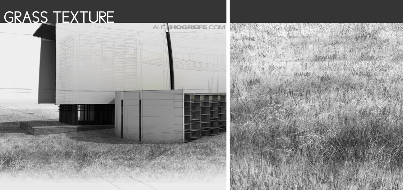
3. The grass is made up of a few textures that I found online. There was a lot of scaling, cloning, and level adjusting that went on here to get the final result. The layer blend mode was set to “Multiply” and I wasn’t real precise with how I erased the grass around the building. Again, the imperfections help to add realism.
4. After the grass, I added the sky. I found a typical sky, then desaturated the color and washed out the image by adjusting the levels. I wanted the sky to be light as to not compete with the design. This is typical for most of my illustrations. I then set the layer blend mode to “Multiply” and used a layer mask to set the sky behind the building.
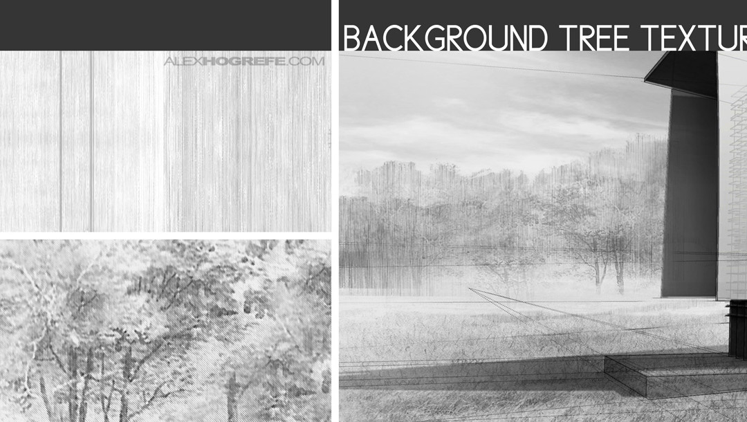
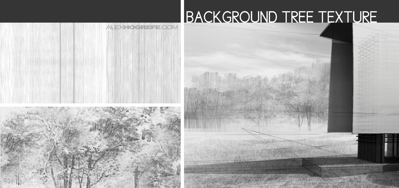
5. The background trees were again made up of multiple textures. When I created hand drawn illustrations in school, I always experimented with different styles and rendering techniques for trees. One of my favorite styles was using a parallel bar to draw many closely spaced vertical lines coming to a rough end at the top. I tried to emulate that style here as well as adding another tree texture on top of that.
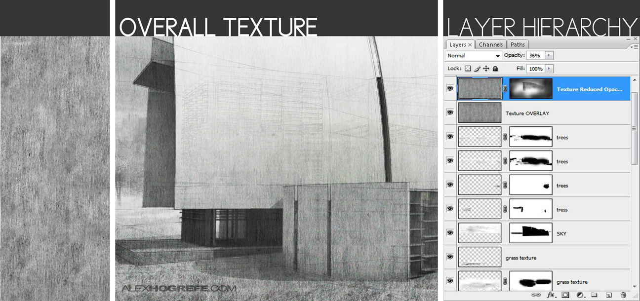
6. At this point, all of the base elements are in and I want to add an overall texture to the image. This is done by finding a large sketch texture like the one below and draping it over the entire image. This is one of the only times where I used the layer blend mode “Overlay” instead of “Multiply”. If you look at the image of my layers pallet, you will see that I used the sketch texture twice. One of the layer blend modes was left at “Normal” but with a low opacity (in this case the opacity was set to 36%). This was done to give the entire image a soft gray tone. The other sketch layer was set to “Overlay” to bring out the texture grain.
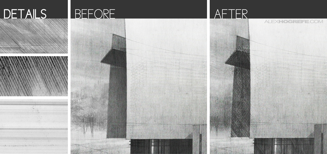
7. The image looks relatively good at this point. But, this is usually the time where I focus on adding details and subtle imperfections. In some of the shadow areas of the illustration, the shading seems a little too “clean”. Here, I added textures with a strong grain to combat the flatness.
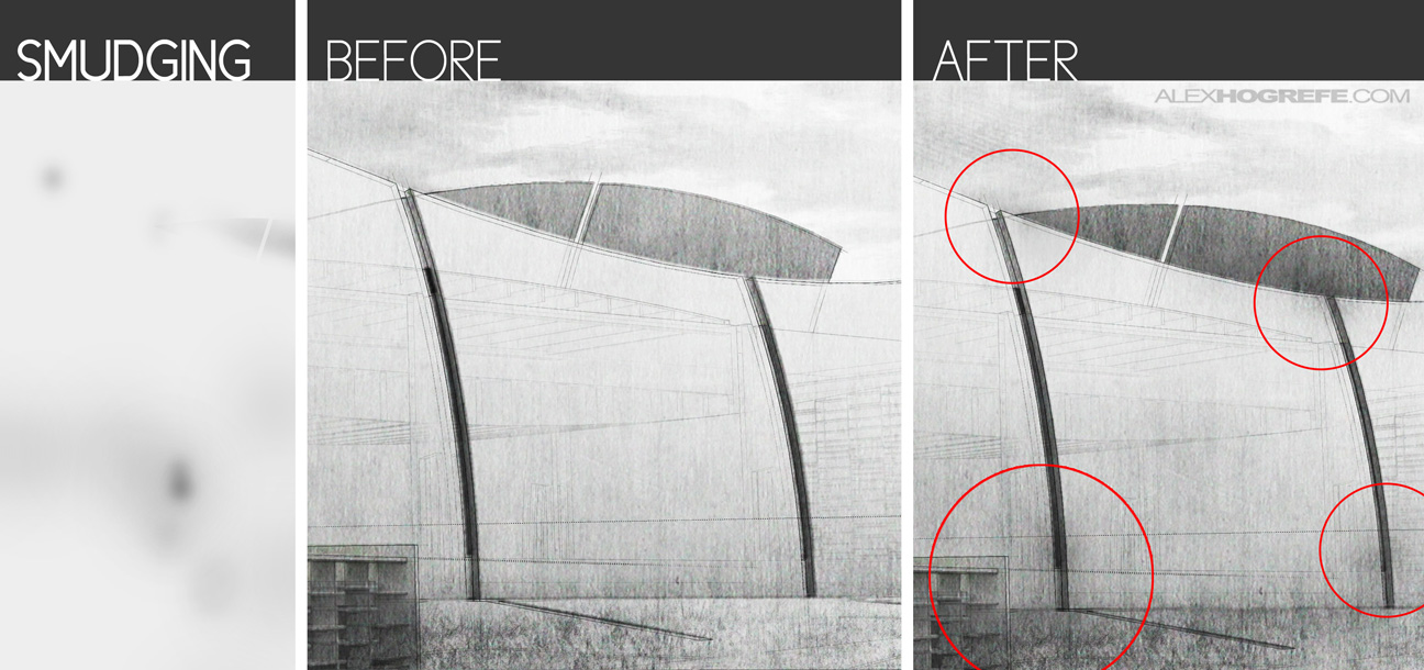
8. Graphite is synonymous for smudging and was something I learned to embrace when learning to draw at a young age. It takes incredible hand-eye coordination to shade a perfect gradient. Even then, it’s not perfect like a computer generated gradient. That’s why I spent some time adding smudges and splotches to give another layer of realism. I simply use the brush tool with a soft tip and low opacity, and paint areas to break up the perfect gradients. Leave the layer blend mode set to “Normal”.
There is obviously a lot of manipulation done to each layer that wasn’t shown here, but that will change from illustration to illustration. On another note, for those who don’t want to spend time generating a clay model rendering, another option could be to follow the steps outlined in my Ambient Occlusion Tutorial which, for this illustration, could have generated a similar result.


Thanks for another great tut… some awesome tips here. Especially the smudging; can't believe the difference this small step makes. Can't wait to try this out for myself.
Cheers again.
jame5j – CCAE.
its amazing how creative you are Alex . Thanks a lot for this one.
Hai om Adi, you are Indonesian? 🙂 This tut is awesome. Hehe Why you not have your blog self. Then I can learn to you. Hehehe
Thank you so much~ from Korea~
It is really amazing~!
And I appreciate your tip~!
Thanks ~ alex
Thanks Jame5j, Adi, and otw.
Hi Alex.
Thanks so much, I have been waiting for that tutorial since you first posted pictures of the technique.
Can't wait to try it on my own.
One thing I'm still wondering about, because I've always been struggling with that when trying to emulate a hand drawing are the trees.
Did you draw them yourself/use a drawing that you then altered or did you start of from a photo.
And what's the filter to get the vertical lines look? Motion blur or is it one of the artistic filters. I can't seem to get the same effect for some reason.
Thanks so much for the great site!
Thank you so much for the great site!
god bless you …
Hi Alex! First of all, my friends and I are huge fans of your work, and your humility and willingness to share your techniques is truly remarkable. I've had Kerkythea for a while but haven't gotten down to using it much yet. I know you already have a tutorial on it, but it would be much appreciated if you did another basic one soon with a different example. I also would like to ask about the people you use for your renderings. Most of them I imagine you've accumulated over the years, but I'm curious as to where do you usually go to find them and how you make the proper cutouts. A tutorial on this would be quite helpful as well, I think. Anyways, thanks for taking the time in making these and keeping up this amazing site!
@Mario,
I used a drawing of trees that I found online and then manipulated the image to work with my illustration. I ultimately used just a small portion of the image, but clone stamped the texture where I needed it. For the vertical lines, I just used a parallel bar to draw them, and then scanned the drawing into Photoshop. I don't think a filter would work only because the are a lot of subtle imperfections in a hand drawing that a filter cannot reproduce.
@Sandra,
Thanks for the comments. Check out http://www.immediateentourage.com/ for a huge library of free cutout people. Also see my post http://www.alexhogrefe.com/cut-out-1/ which also discusses way to cut out objects.
Thank you for an interesting tutorial.
In the image explaining the layer hierarchy next to the step "sketchup exports combined" i noticed you have multiple layers of the clay rendering. I'm hoping you can give some explanation as to what is happening there.
blending modes? levels? exposures?
Thank you,
Adam
Hi Adam, The different clay rendering layers consist of the different shadow types, as well as some experimental layers that I ultimately didn't use. The only ones showing through to the final image are the top two layers which are the different shadow exports (soft vs. hard).
Hi Alex,
Thanks for the great tutorial! I can't wait to try it out. However, I was wondering where you got the textures from? Did you hand draw them yourself or did you get them from the internet? I would be really great if you could let me know. If they were hand drawn, do you think that you could email me your scans? It would be really great if you could because I would love to try this for my final project. My email is crystal@webranet.net.
Thanks heaps and great work!
Crystal
Hi Crystal,
Some I did myself, others were found on the internet. You really only need a small swatch of a sketch from which you can copy multiple times to get a larger texture. I
hi alex,
ever since one of the teacher assistants at my uni showed me your website i have been going through it every day and loving what you do. i was wondering if you could upload some of the textures you have, as a first year uni student i don't have a large collection of textures to use and any additional ones would really help with my work.
thanks, and keep up the amazing work.
AMAZING RESOURCE. Thanks for the hard work and putting it out there for us.
Hey Alex. It´s the first time I post something, but I do follow your blog and I think your work is AMAZING! Both the creative work and the work of updating your page. Congrats from Sweden!
Your stuff is so awesome, that I had to watch it all! It is fantastic and I am so thankful for this remarkable tutorials.
hi. alex, u have done many amazing tutorials. cheers!
I always interest about photoshops and sketch, I found your tut. Thank you so much. I can bookmark your site, master. 🙂
Hi, Alex, amazing job!
Can you recommend some good sites for finding background textures?
Just like the fellas before – just amazing!
And most of all big big compliment for showing openly and giving hints how its made.
That ist really helpful and inspiring.