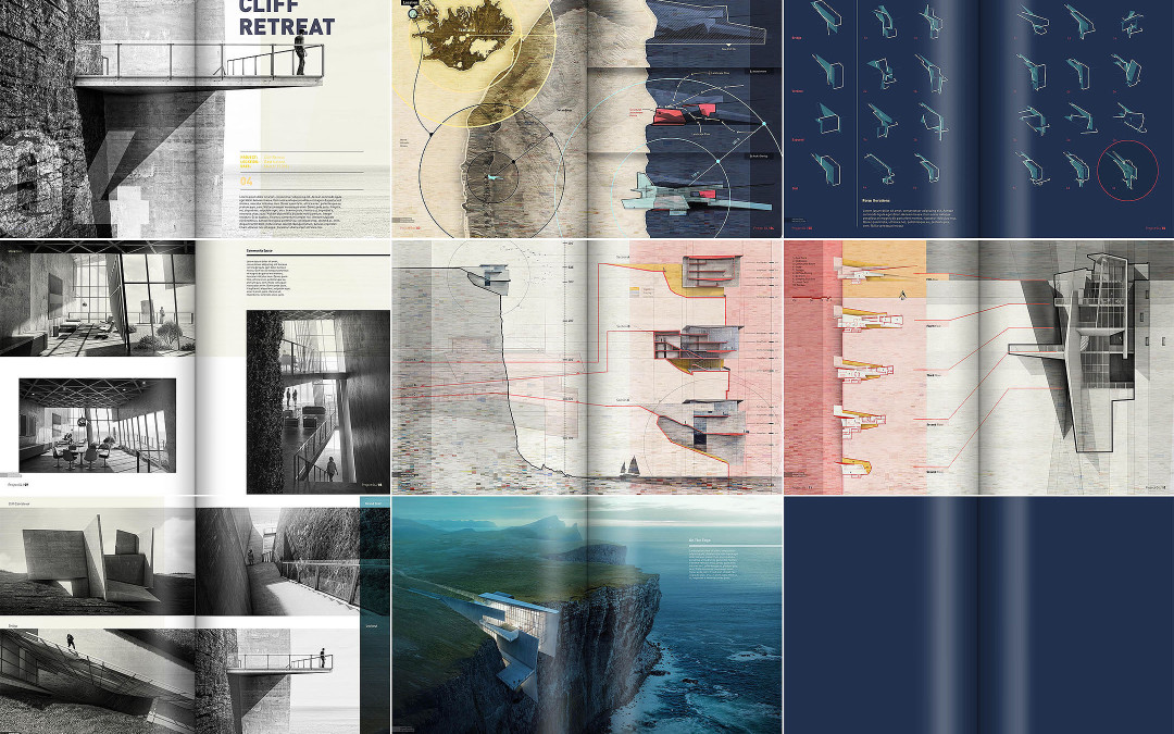
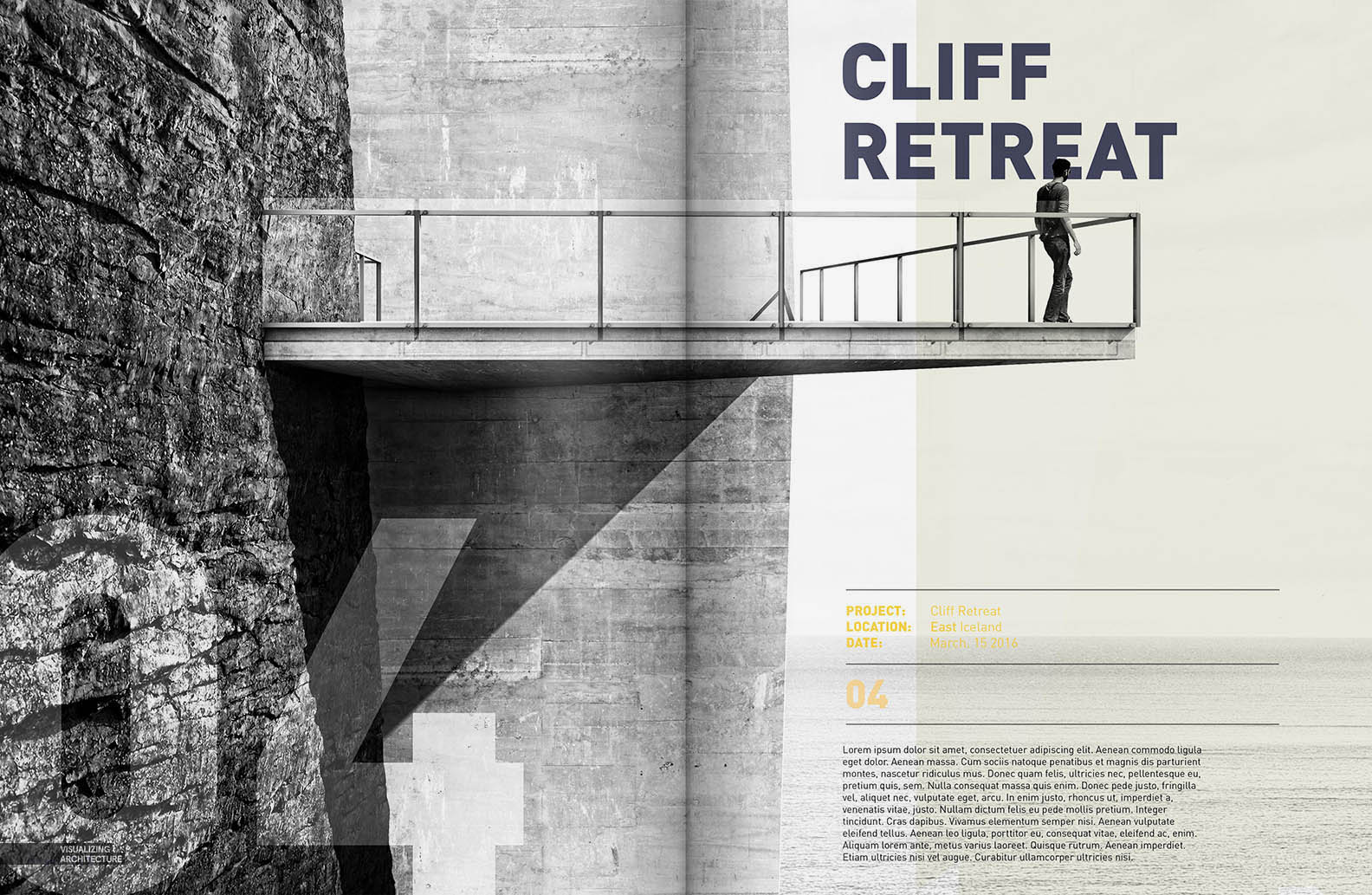
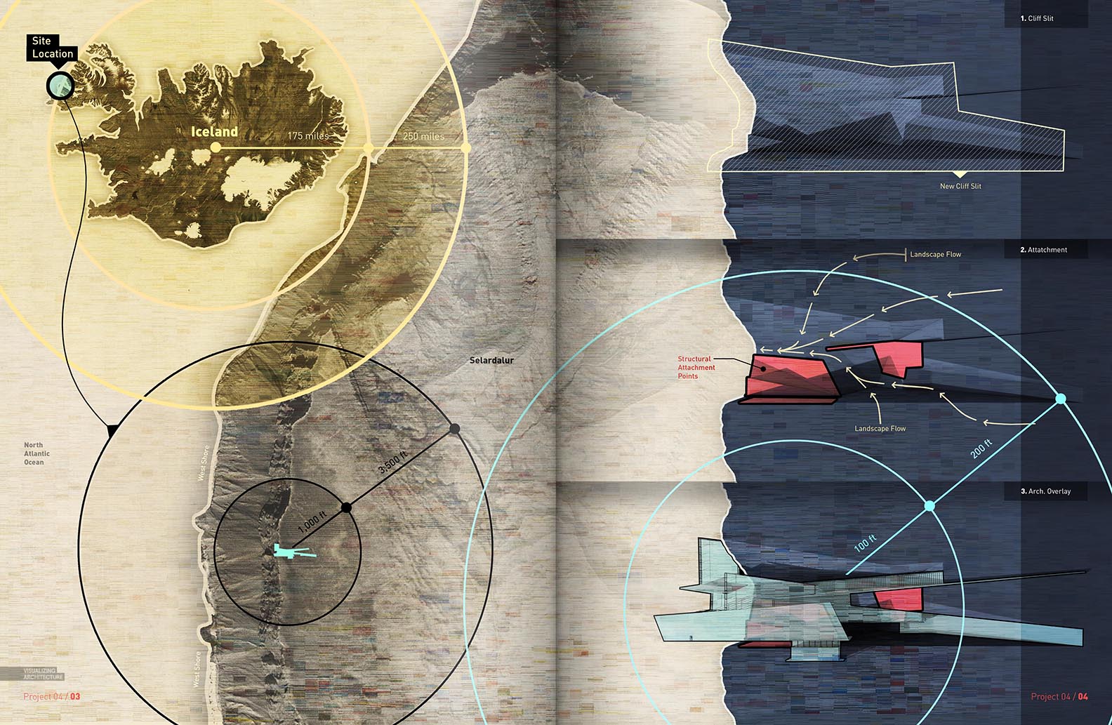
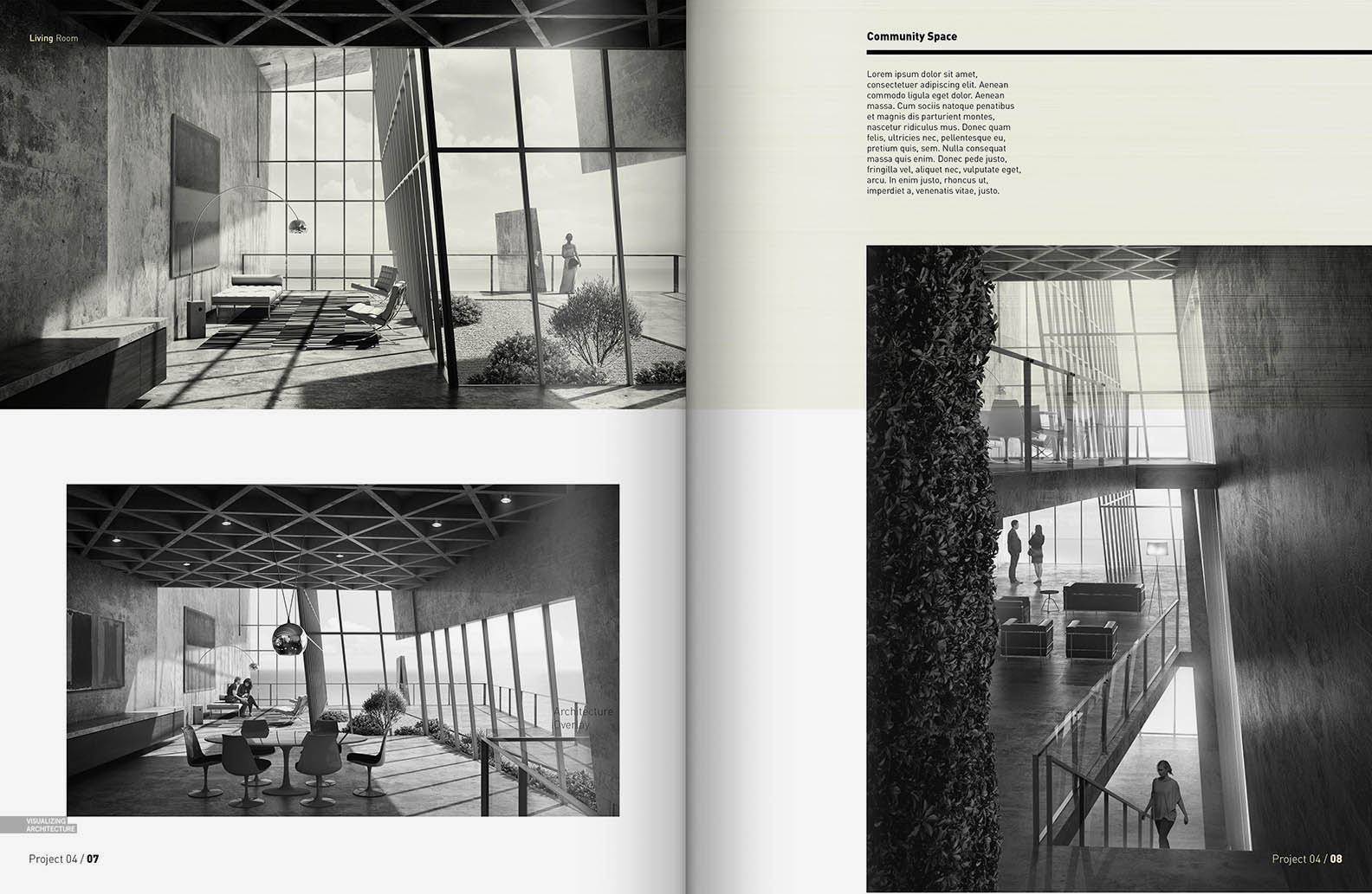
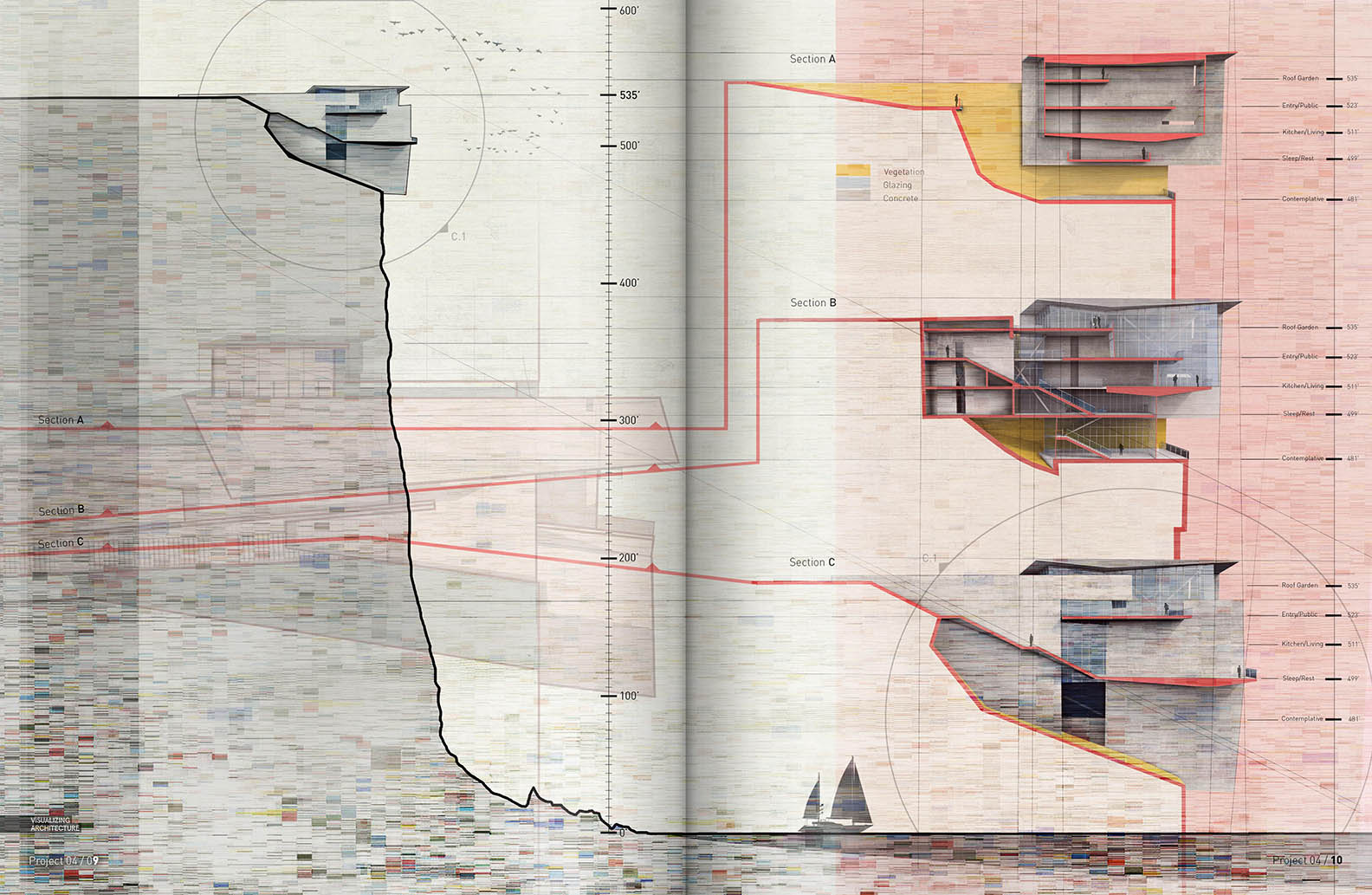
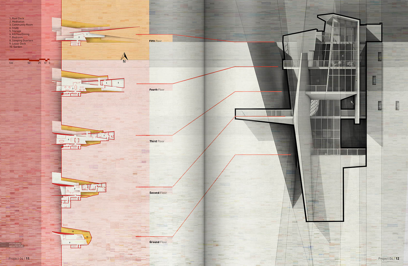
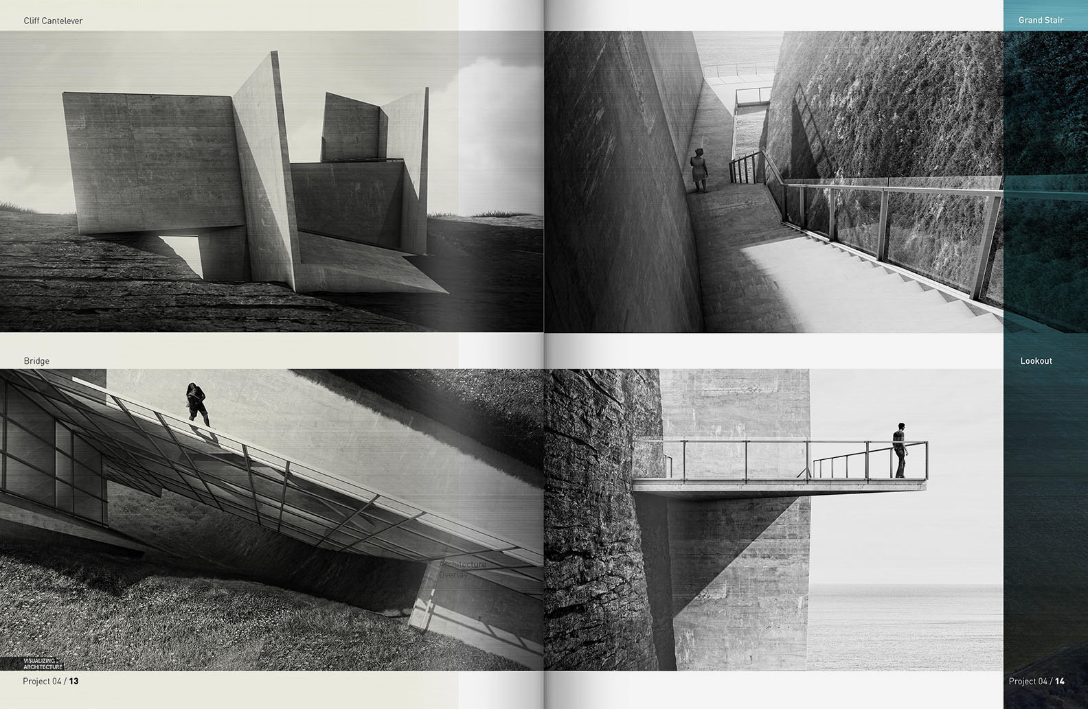
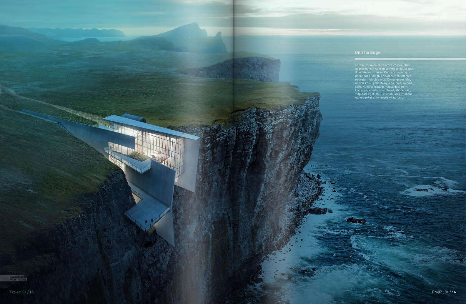
The Cliff retreat spreads are underway. With most of the imagery generated, I had enough content to start thinking about how the pages would be laid out and how the story would be told. As with a lot of my layouts, the styles range quite a bit from spread to spread. For example, my sections spread is filled with texture and sketchy overlays whereas the interior vignettes spread is clean and simple. The way that I negotiated these types of transitions was by carrying over some of the tones and textures of the sections spread into the interiors spread. I didn’t let these textures take over but instead diluted them and set them into the background. One other technique that I have been using is to literally let some of the images wrap around onto an adjacent spread. I folded the large aerial image onto the exterior vignettes spread which gave me a container to hold text but also bring in some color on what would have been a totally desaturated page.
Below are the cliff retreat spreads at their current state:
As I finish up this fourth project, I am preparing portfolio Vol. 4 and hope to write several upcoming posts on the progress. I will be using a similar workflow as PORTFOLIO Vol. 3 described in this PORTFOLIO WORKFLOW POST. However a lot has changed in the last several years with the online printers and I plan to test out a much broader range of options this time around. If you missed it, here is the last post I did in 2014 on COMPARING ONLINE PRINTERS. More on all of this later….


Hi Alex,
Been following you for the past 5 years and learnt everything what i now know about visualization… I’m very grateful to you… THANK YOU!!!!! now it’s time for my thesis and i’m doing a contour site…right time that your cliff house inspires me 🙂 Be there for us always…we want more videos…
Hi Alex,
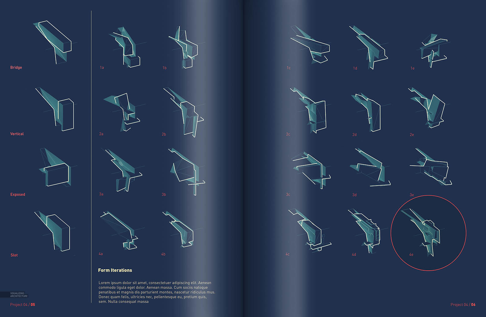
I find the Form Iterations really interesting. Did you use clay renderings from V-Ray or exported linework from Sketch-up to generate that diagram series? I’m just curious what programs you used. Thank you!
I used both sketchup line work and a vray material override rendering. I just inverted the V-Ray rendering to get it to show up better over the dark background.
Ah I see. Thank you!
Hi Alex,
Been an avid follower of your work since i stumbled upon your website a few years ago.
How do you make your bold outlines to have sharp edges instead of curvy, which always seems to happen to me when i choose the stroke option on Ps?
I draw the lines manually and clean up the corners. You are correct though, the stroke option will round the corners and I haven’t found an easy work around. You may notice that I used the stroke in some of these spreads for the really small stuff.
Hi Alex,
I am gobsmacked.
Thanks!
Hey Alex,
great work as always. May i know what font you’re using?
Hi,
nice work as usualy…
What is an idea of “form iteration”:.. it is not fully readable for me.. can you tell more about this part of spread. Is this some kind of project proces thad you have in past presented in 3d viev (not perspective)?
Nice “bird eay” view on the clif house:)
Regards.
Wow good job Alex. I like your work a lot, keep it up.
Hi Alex
Firstly thanks for sharing your knowledge…it has saved me on a number of times doing presentations for studio!
I was just wondering how you did your curved arrows in the 2nd spread above? Photoshop or InDesign?
Regards
The location and the form iteration diagrams are awesome
Very impressive to see those .
Hi Alex,
may I know your spread dimension for this? it is an A4 format?
great post by the way!
Hello Alex Brother,
Following your Tutorials, I have learnt many thing about visualization. I am very much inspired by you & your works 🙂
I’m very grateful to you.
THANK YOU!
very inspiring!
Thanks!