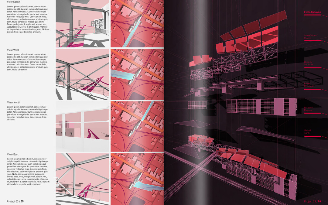
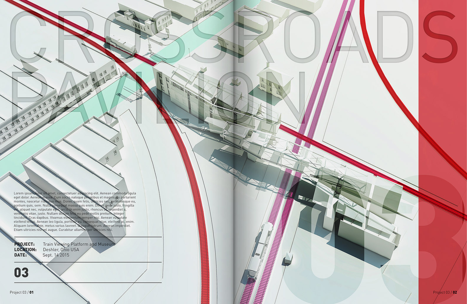
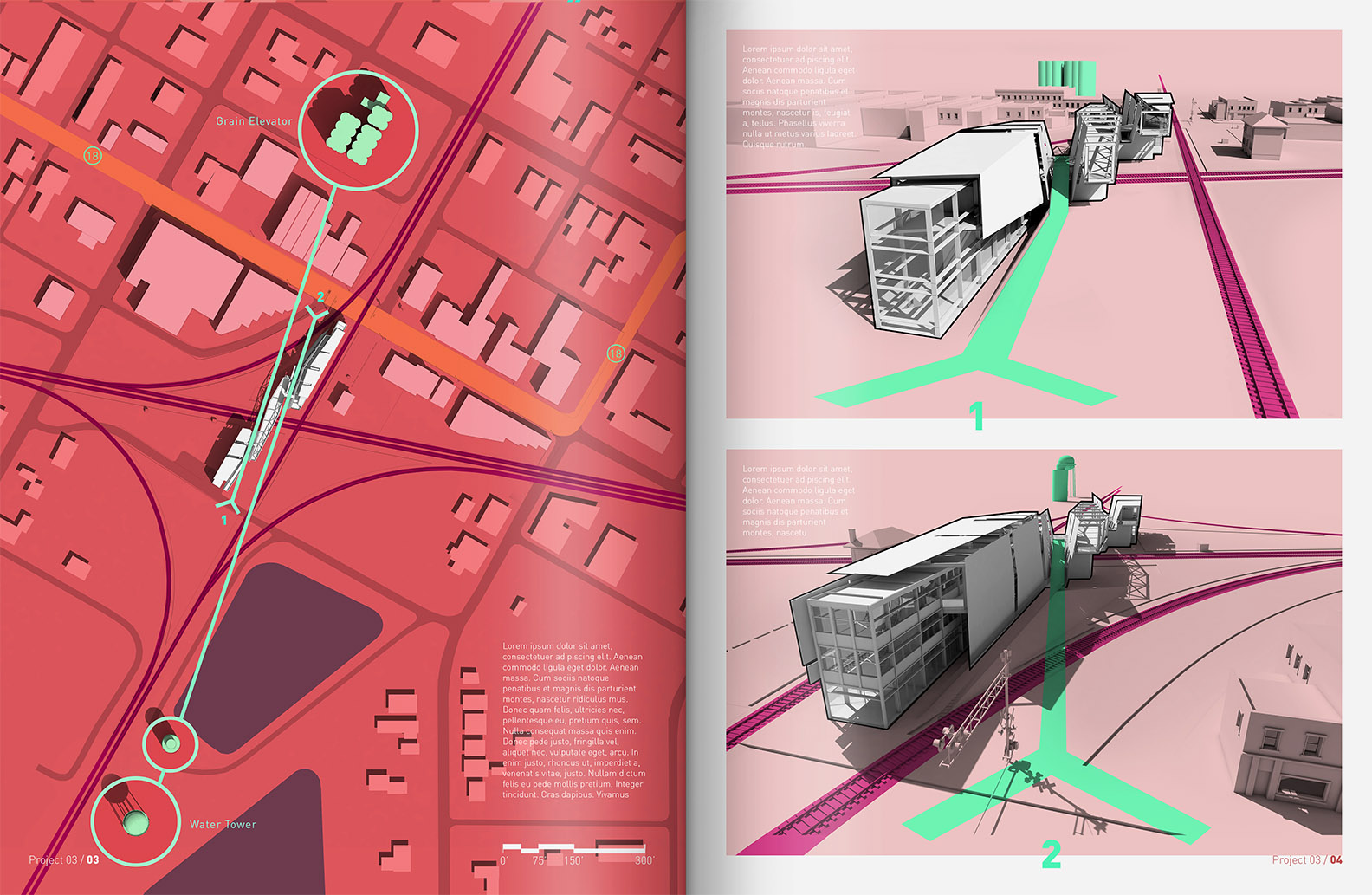
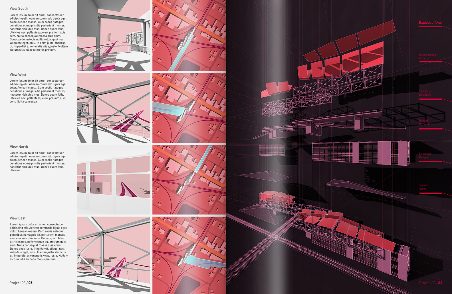
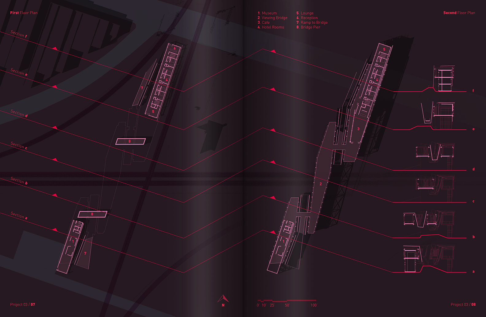
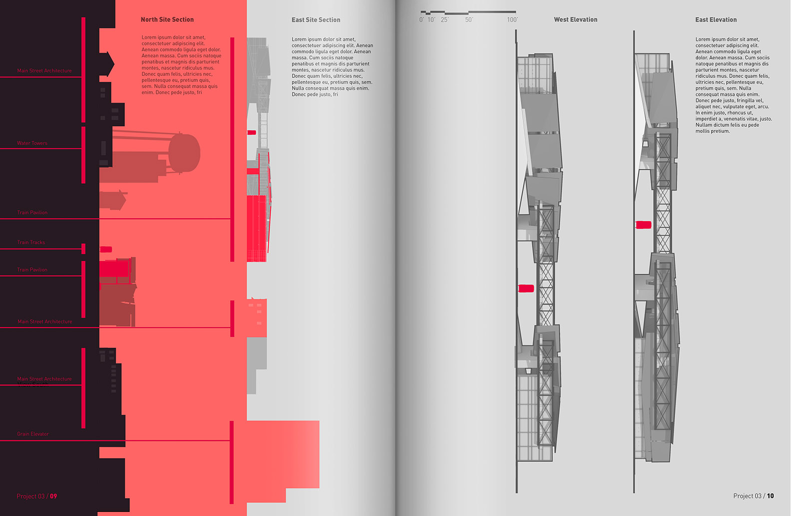
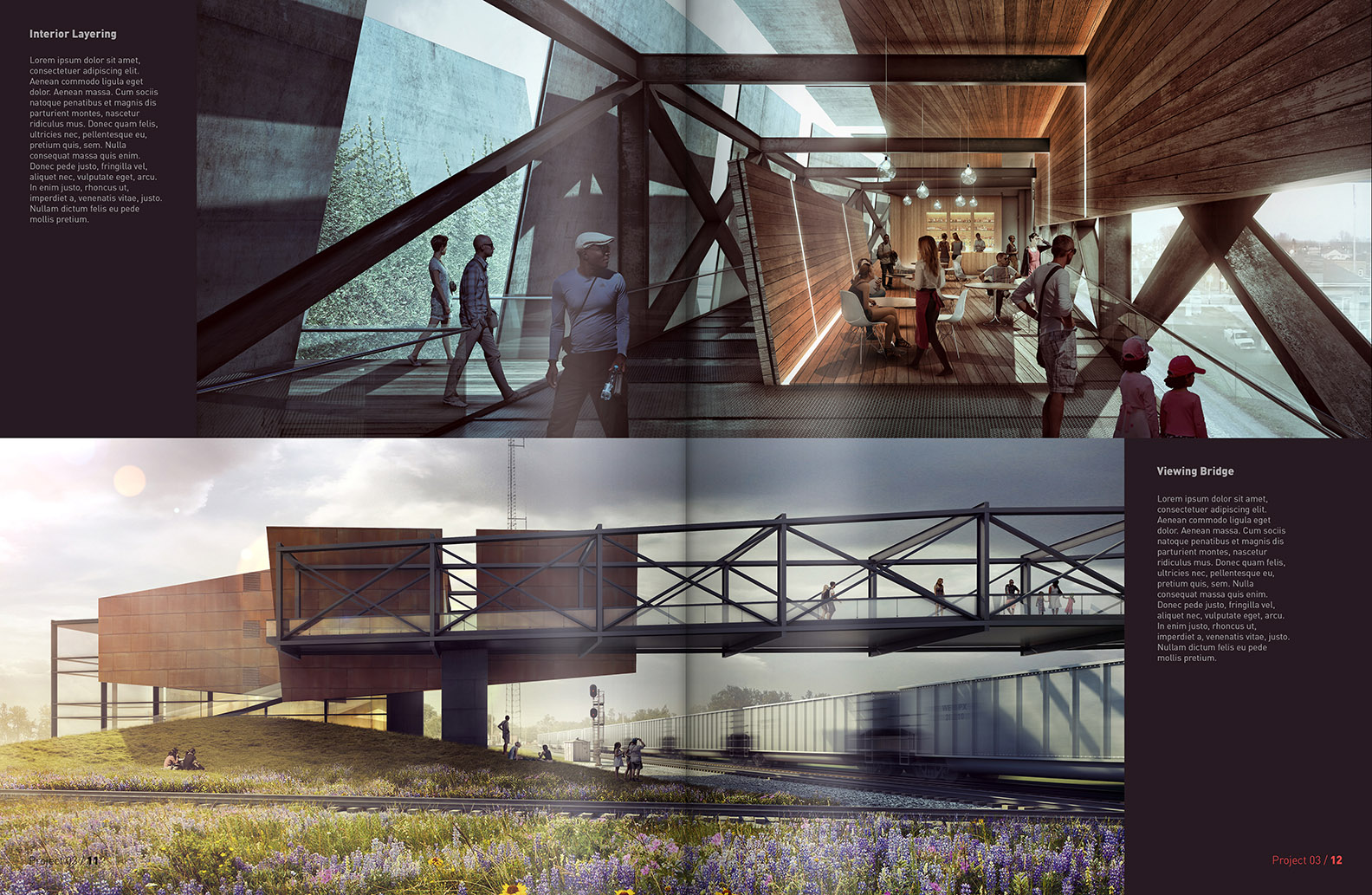
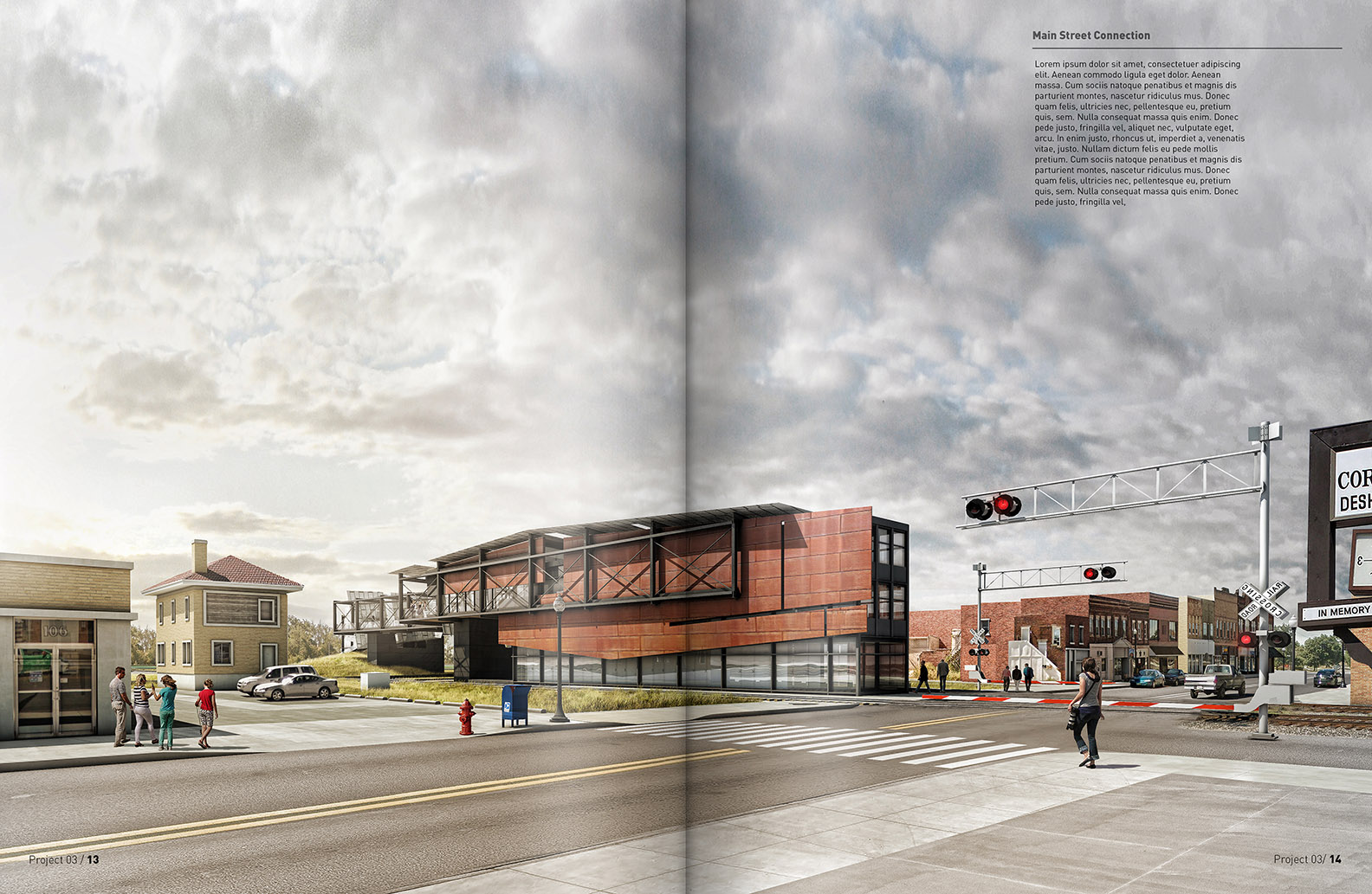
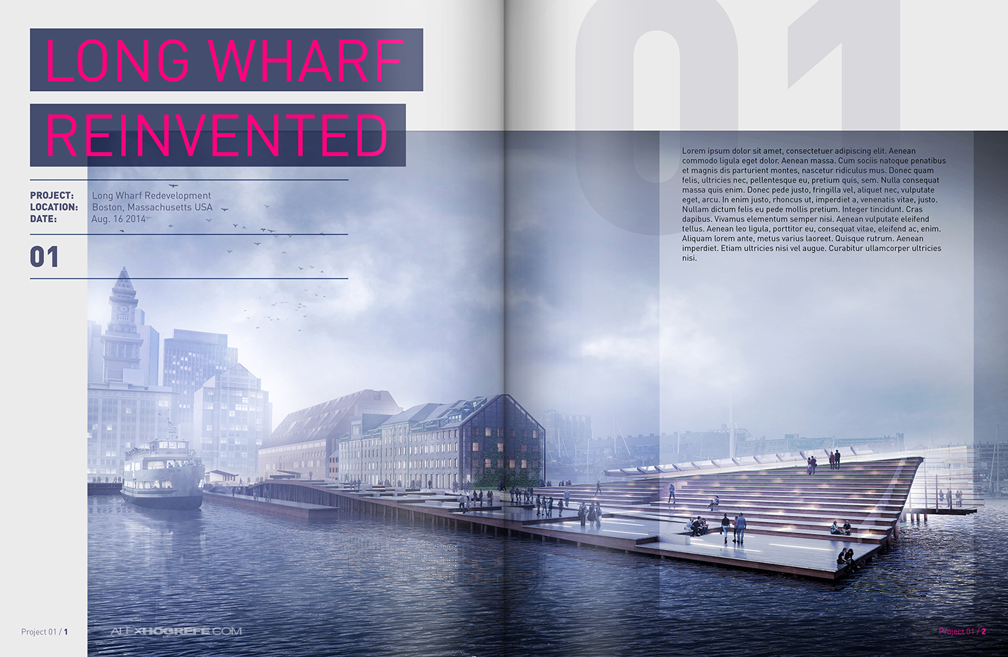
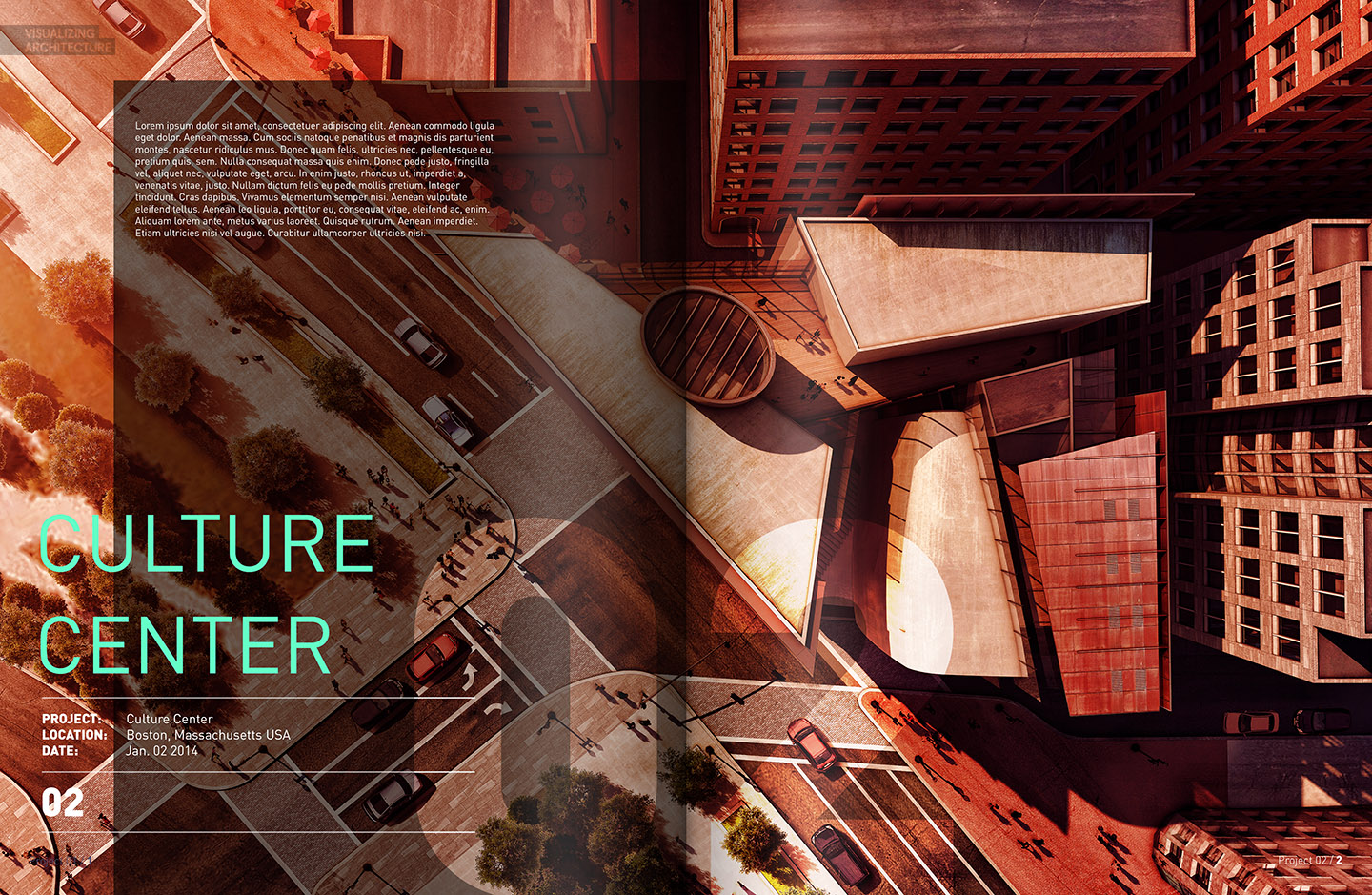
As I near the end of this project, I have started to compile all of the imagery into portfolio spreads. This is the first pass at organizing the illustrations and diagrams to tell the story of the project. As I put this series of spreads together, I am still thinking about the past two project spreads and how these will relate and differ from each other. For example, I plan to stay consistent with page numbers, fonts, and intro page design. The familiarity and consistency of these few elements throughout the document help to orient the viewers as they flip pages and acts as a universal structure that connects the different projects to one another. With that said, elements like color schemes, graphic typology, and page layout are fair game. Changing these up from page to page holds the viewer’s interests and keeps the suspense going.
This is the third project of what will be a four project series that I plan to create and turn into portfolio vol 4. I still haven’t decide what the 4th project will be, so if you have any suggestions, I am listening. I am interested in a location that I have never done before. Most of the projects on this website are of past school projects or places that I grew up around and am familiar with. However, I may explore a project in a mountainous terrain, arctic tundra, or even a desert environment. Each of these locations bring with them a different series of lighting conditions and a unique set of materials/textures.
Below are the posts discussing the first 2 projects spreads in case you missed them.


Hi Alex, I´m an mexican student of architecture and in this time I´m doing my thesis and it´s about a rehabilitation of a storm drain with a footpath in a hill in Tecamachalco, Puebla. If you dare I can send you some pictures
Hey alex! What type of font did you use in your train pavilion spreads?
He uses DIN.
http://www.identifont.com/samples/fontfont/DIN.gif
DIN.
More specifically, DIN Next or FF DIN.
So I’m wondering, are these projects just for academic exercise, or are they really going to be built?
Chalk that derp question up to not reading the whole article. Please forgive me.
Good Designs!!!!!
Hi Alex. I’m a fan of you workflow of presentation, here in Dominican Republic.( very good your website and projects)…i reed that you have interest in diferent location to place a project, you can use this site for the next….The port of San Souci in Santo Domingo
Hi Alex!!
I am a student of architecture from Karachi giving my thesis on sports complex! please guide for some quick section rendering from sketchup
Amazing work,
Like everything how it has been compiled and presented.
It would be helpful for everyone if it’s mentioned which all the software’s are used to make this great thing.
I am also still a beginner 🙂
Hey, what’s the page size you use for vol.4?
You guys that is a great explanation. keep up the good work in your granite blog. Thank you very much!