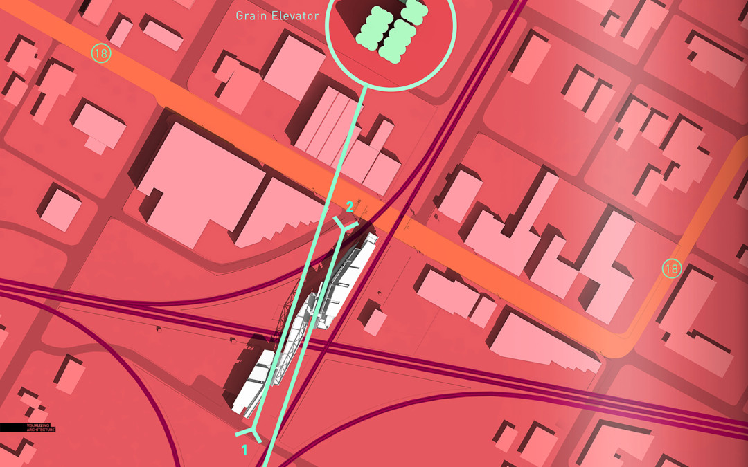
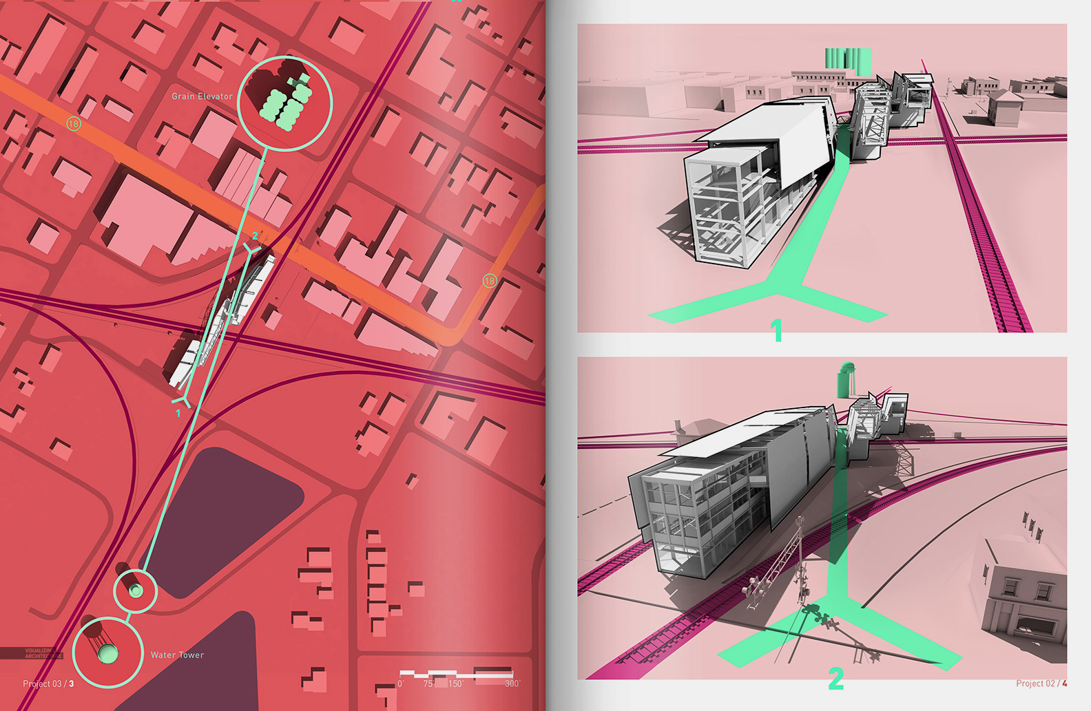
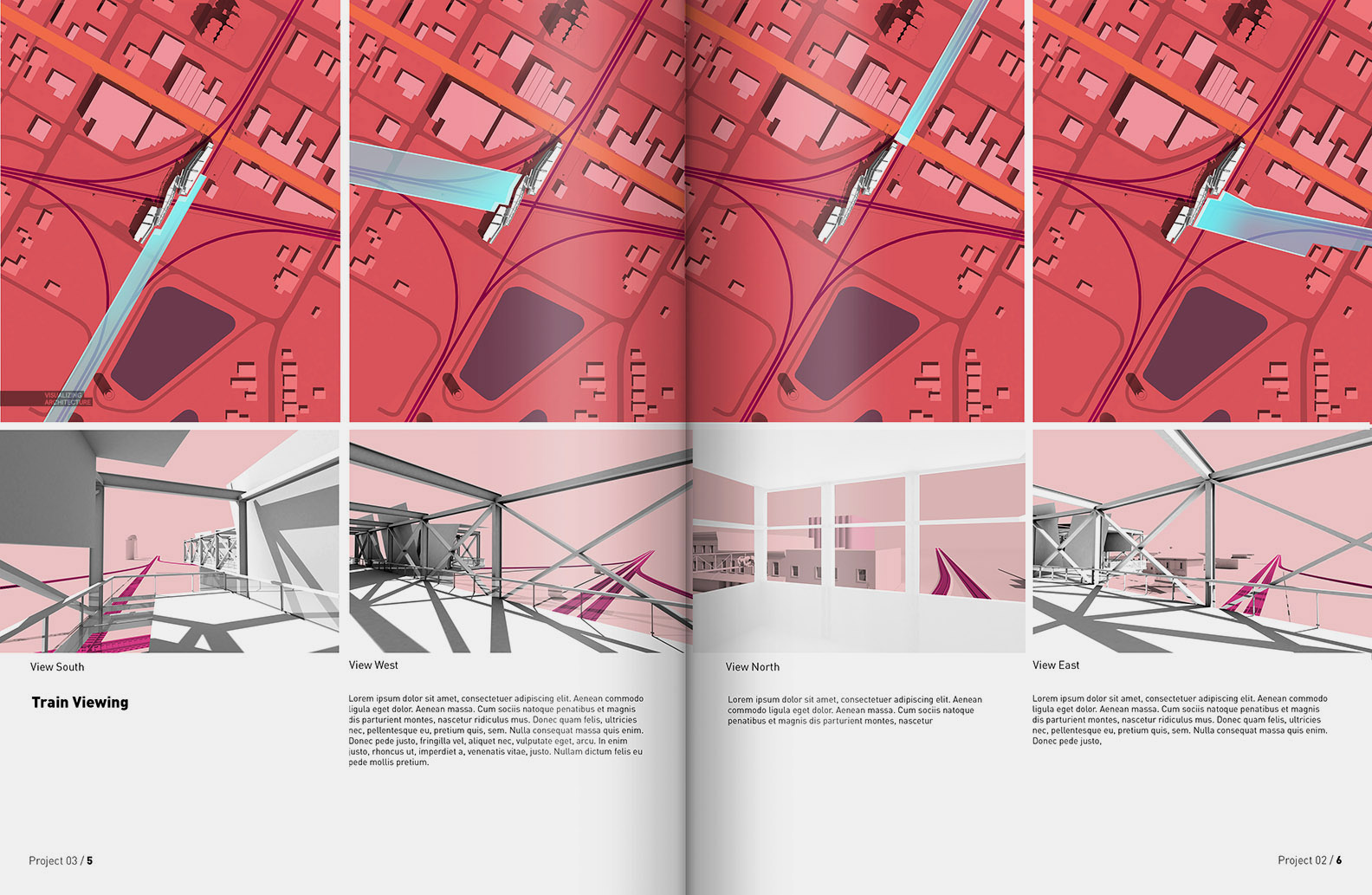
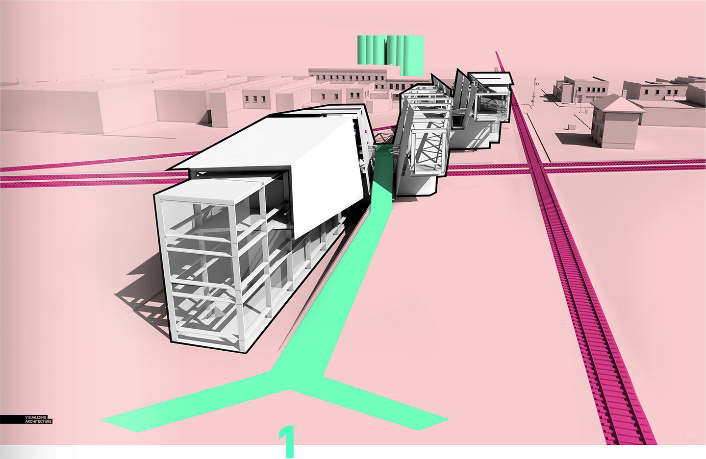
I have been playing around with some diagrams for the recent train pavilion design. The architecture diagrams that I create on this site have ranged quite a bit over the years. Lately, I have been gravitating towards a minimal approach for these types of illustrations. For this series, I experimented with creating a dialect between plan views and corresponding perspectives. I used a simple color palette to help relate and orient the viewer within the diagrams.
All these diagrams were created using a Sketchup model rendered as a clay model in V-Ray. I then used that clay model as a base in Photoshop to apply color. To see some more diagrams that I have done in the past, I have added some links below which go into more depth on the workflow that I use:
3. Cranbrook Site Analysis Diagrams


Great work Alex, could you give us a brief tips of how you came out with illustrations clarity you have in this and every post? Thank you!
All the way with respect from kuala lumpur!
Is there a last applied layer you use to give the illustration a book page feel, (the glow towards the middle between the 2 pages)?
Thanks again
Is it a book page scan or you gave it a layer effect for the glow?
The book look is probably just importing the pages from an Issuu.com document. Free to upload.
I know that issuu.com will give it that effects and other free upload websites too. But if you noticed in the first illustration that the inner of the greenish circles color tone varys from the outer color tone.
Thanks for taking the time to reply!
I generated the look by using a soft paint brush with 10% opacity. For the Highlights, I used white paint. For the shadows in the center, I used black paint. I more or less tried to match the look of Issuu.
I made a .psd file you can use for the book effect.
https://www.dropbox.com/sh/2y5yjy56mfb6pcz/AADyMnuAKOP7c3eBYeGJuqqOa?dl=0
Question on shadows. I am often frustrated by using PS Dropshadow effects because it doesn’t connect the shadow back to the building. I have been using a process of making a selection of the roofs, offsetting the selection, using motion blur and then duplicating the layer many times for a while, but this process is long (now an action) and produces shadows that are not 100% crisp. Obviously the best shadows are 3d generated, but do you have a quick method for making them post render?
To answer your question, I don’t have a quick way of doing this. I only have part of the site modeled, so some of the buildings next to the project have rendered shadows and thus are connected back to the building. The others just use the Photoshop drop shadow and are not connected. Your question is something that I have wondered about too and I am sure there is an easy way out there.
Amazing as always Alex!
Like always amazing quality wok! Thank you for providing awesome content and inspiration!
Hi Alex, love your work. I’ve been following it for a really long time now. Something that always strikes me in your work is your bold use of colours. How do you go about it? Is it something arbitrary or do you have clients who sort of influence your decisions? What would your advice be to students trying to walk the line between a clean, professional presentation and a nice, visually striking one?
Hi Alex, thank you very much for showing us your artwork, it is very inspiring to see such talented designs. This may not be the case, but if anyone is willing to answer the following question, i will be very grateful towards your kindness. My question is: Do you know a way to make a life career from studying Architecture and Graphic Design? Currently i am almost finishing both degrees, and in my future job i wish to join both fields of learning into an integral job path. I know that rendering would took a lot of advantage from graphic design, but i don’t see myself modelling and editing renders as a life career. Don’t get me wrong, i admire the art of making it from scratch, but i don’t see myself doing it since i lack the interest. So, for me, this path gets discarded. Any comment would be very appreciated, thanks in advance.
A career path that combines Graphic Design and Architecture (that isn’t arch viz) might be working for a firm that creates branded spaces. Branded spaces are exactly that: physical spaces that carry the ethos of a brand. The architecture and graphic design blend together and reinforce each other.
Some firms that immediately come to mind are FRCH and Advent.
FRCH.com
adventresults.com
May your efforts be blessed.
are the outlines of your building rendered or are they added in psd? thanks