It has now been several months of working on this latest project from which lots of imagery has been created. I’m ready to start compiling all of this information into portfolio spreads similar to what I did for the wharf project. Anyone that reads this blog knows that I love designing portfolio spreads and presentation boards. I like seeing all of the parts of an architectural project come together and the complexity information get organized into a single story. For this latest set of spreads, I followed suit with the wharf project and combined several styles of visualization in a single project. I prefer this approach of using different styles because it keeps things interesting and better engages the viewer. I also like to switch up the layout typology from spread to spread such as going from a full bleed illustration into a vertically based layout that then transitions into a horizontally based layout, etc. It can get difficult creating good flow from one spread to another with so much change in style so I use subtle moves to “connect” the pages. In this case, the same teal color was used in varying amounts to relate the pages as well as the same font style and size. It’s this dance between keeping the viewer engaged while not confusing them that generates a good portfolio design in my opinion.
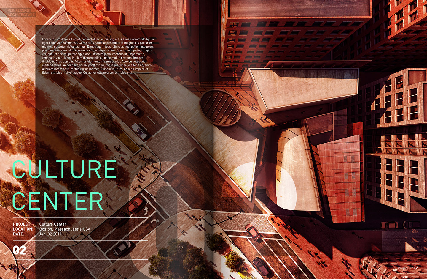
I typically like to start a project off with a brutally simple layout and large text signifying the start of a new project within the portfolio. One of my biggest pet peeves is looking through someone’s portfolio and not knowing where a project ends and another one begins.
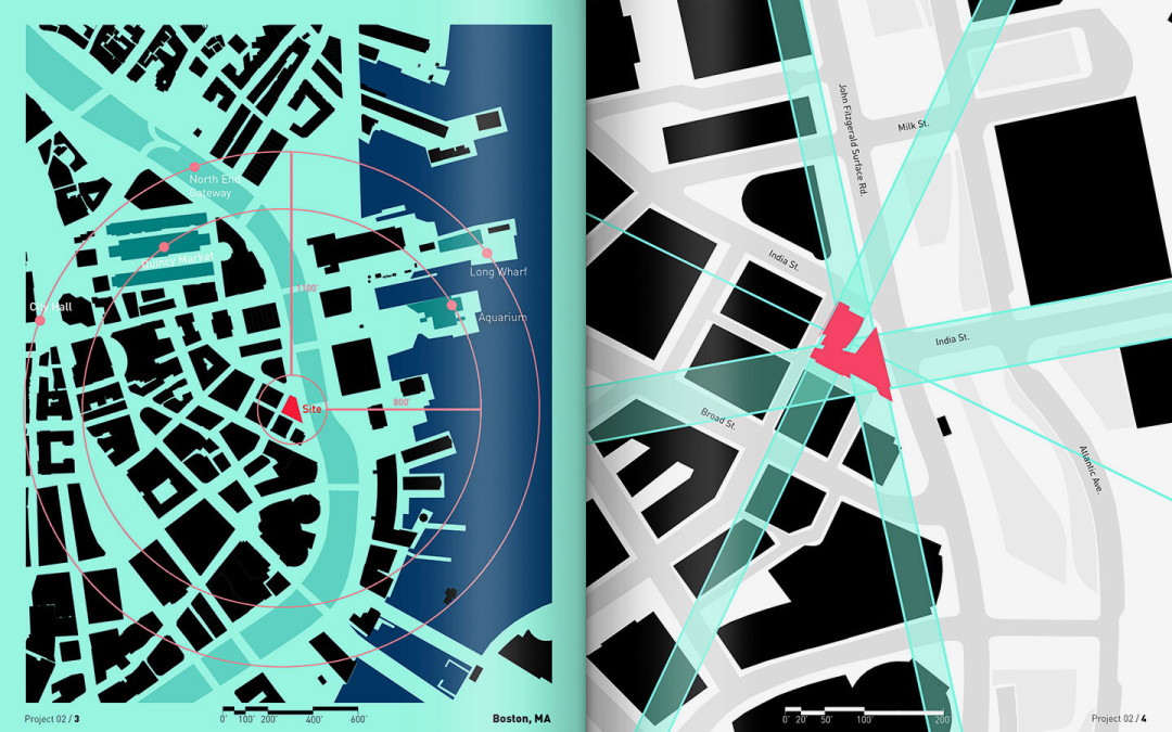
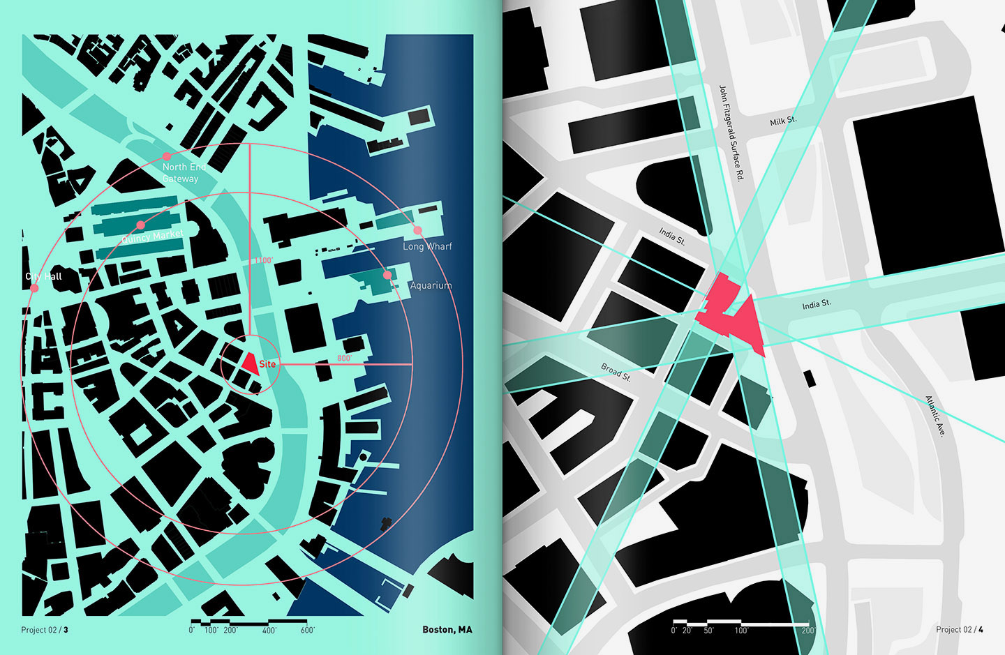
I also think it is important to have a spread early on in the project describing the location and orienting the viewer.
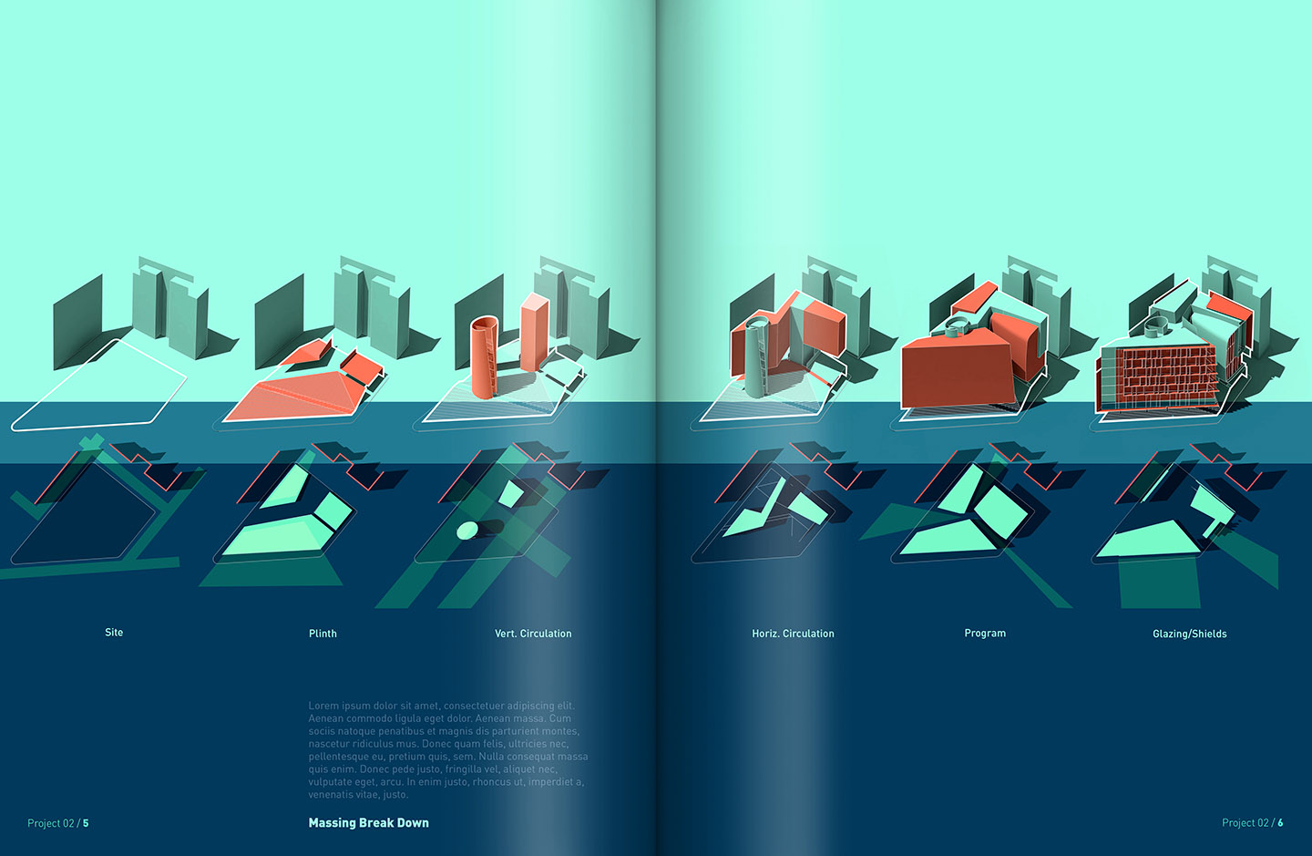
From there, I introduced the form and a break down of how and why it was designed the way it was.
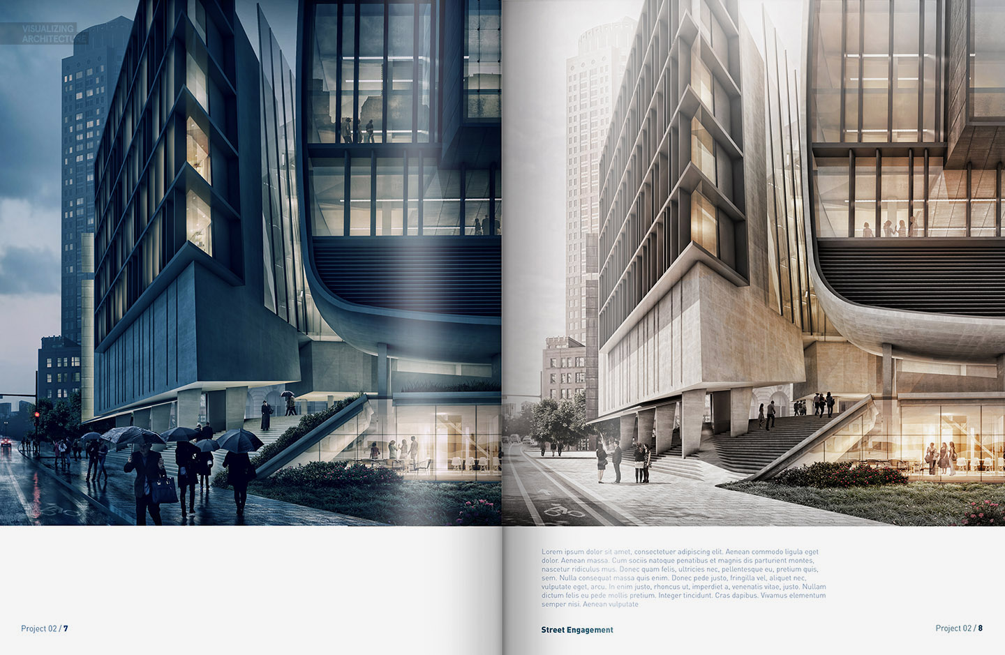
At this point, I though it would be interesting to jump out of diagram mode and into some vignettes at street level. The previous spread talks about the street engagement diagrammatically so these spreads will go into more depth on the subject.
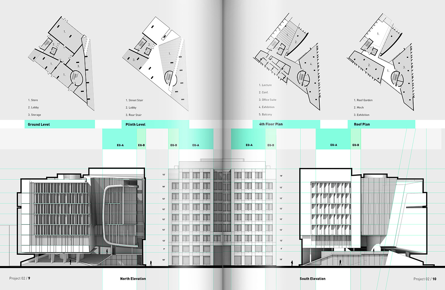
I’m not into rendering out floor plans but instead prefer to keep them extremely diagrammatic and easy to read. I also like to combine floor plans with elevations and sections so that the viewer can better see the relationship between them. One thing that I need to fix with this spread is to size down the elevations to be the same scale as the floor plans and add graphic scales. This will help avoid any confusion and aid in the reading of the page.
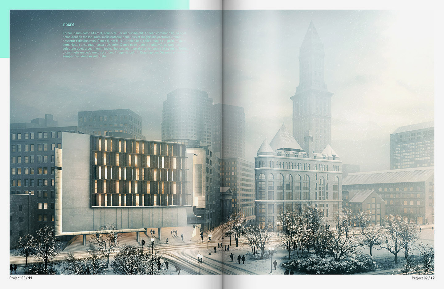
The snow scene seemed like a good image to end the project on because it is memorable but also because it is a view of the entire design and shows its relationship to the surrounding context.
Time to move on to the next design. If you have any suggestions for what the next project should be, leave me a comment or send an email.


Great job! I always learn a lot from your posts. 🙂
Awesooooooooooooome! The only thing I noticed was that the first diagrams that “break down of how and why it was designed the way it was” is not entirely true. I mean you only showed the different layers of elements within the architecture object but not the process behind those layers. I know, I know, maybe that explanation would be centered in the lowered paragraph but it would be nicer if that explanation becames graphic, sort of the BIG methodology diagrams.
I can see your point. The diagrams are more of a breakdown of the form and programmatic elements where as the explanation of the design and concept will probably come on the first intro spread. I think the diagrams could also use some more labeling and refinement.
Do you remodel shapes after completing the project or just hide layers and leave the form you want for the diagram ?
WOW……..it all came out together beautifully…..!! really nice work….!
However this tym around i was expecting some interior views and detailed breakdown on them.
Before u switch to another project it would be awesome if u could show us some new sectional representations of varying scales….maybe like from a building to a site section…..how to make them more lively…!!
Thanks.
I was planning on some interior shots for this project but more or less was ready to move on to another project. All these projects are created from scratch and I ran out of time to develop the interiors for this design. I think the next project will be more interior focused because it is something not talked about a lot on this site and is also something I have a lot of fun working on.
alex,
great work again. Regarding suggestions on next project – would love your advise on vray settings, workflow, etc.
yes, v-ray settings will be coming soon!
Yay! excellent!
perfect job!
This is brilliant! Congratulations! I have been wondering a few times how you would visualize a master plan for urban planning competition? For example part of the city centre (market place and few blocks) or an area for single family houses, attached houses and parks? Is there a chance to do it with sketch up and photoshop and with reasonable amout of work?
I had the cad footprints which I imported into Photoshop via pdf, and then filled in to get a basic figure ground. Then I used an aerial map as a underlay and painted in the roads. I probably put both of those maps together in a few hours. I like to work in Photoshop but some people find it more advantageous to do this kind of stuff in Illustrator for sharper line work. You could probably use the sketchup line work similar to how I used the cad foot prints assuming you have the whole site modeled.
Hi Alex, I’m wondering how did you created these neat site plan schematics? I can’t find any meaningful tutorial on this topic to explain how to do it effectively and without much effort. Thx for sharing your tips
See my response to Leena above. Like I said above, most people prefer to do these kinds of maps in illustrator but I have some techniques that I use to get sharp line work in Photoshop. The advantage of doing maps in Illustrator is that everything is more editable.
You’ve changed the way of drawing architecture!
great project alex. love the visuals. Wanted to know how you get the surrounding buildings. Do you create them in sketchup or download them. Or do you just add them in in photoshop. Thanks and again, love the visuals.
I was able to download simple massing online. I was also able to find some buildings in sketchup warehouse. The buildings next to my design where modeled from scratch with more detail. So to answer your question, a little bit of everything. I did Photoshop in some textures as well.
Love the Work! Regardless of scale on your next project I would love a break down of Topaz Adjust on some of your next images. Thanks!
You are an inspiration
Alex! Thank you so much for sharing your knowledge. Greetings from a landscape architect
from Norway.
Hi Alex.
Tell me please in what program do you place your visualization or how you compose them so they look like a in magazine
hi
alex, im jonathan an architecture student from indonesia. i really
admire your works. may i ask some questions? when u’re designing a
model, what kind of apps do u use? sketchup then kerkythea then
photoshop? or something other than that? what apps do i need to install on my pc? can u teach me please haha. i
really wanna create something like u. thanks before.
if u dont mind u can reply at @jonndavy@gmail.com
Hey Alex! Do you export elevations from sketchup model? There is a Make2D feature in Rhino which exports model in 2d linework, but it takes a huge amount of time with really big models.
Hi alex,
Woow I do alway loves all ur works and it techniques. U are the excellent change of architectural drawing. I love u man. Keep going.
Hi Alex,
Just wondering what page dimensions you’re using for this portfolio?
Great Work, just found your site and love it. 2 quick questions,
1… is there any way of me receiving one of your models to look over, I’m trying to figure a few elements out that you do well, and
2… In your spreads is the shadow and highlight marks in the center of the spread photoshoped in?
I have been wondering how you do the scales on your spreads. When you import the spreads do you use a a certain scale? Also how do you place the scaling the rulers based in proportion to that.
I understand your busy schedule and understand if this does not work, but I was wondering if you would have to time to do a skype screenshare or something of the sort some time. Either way thank you for your continued support and tedious upkeep of the site.
Josh