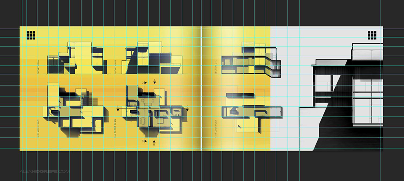
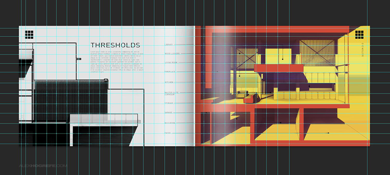
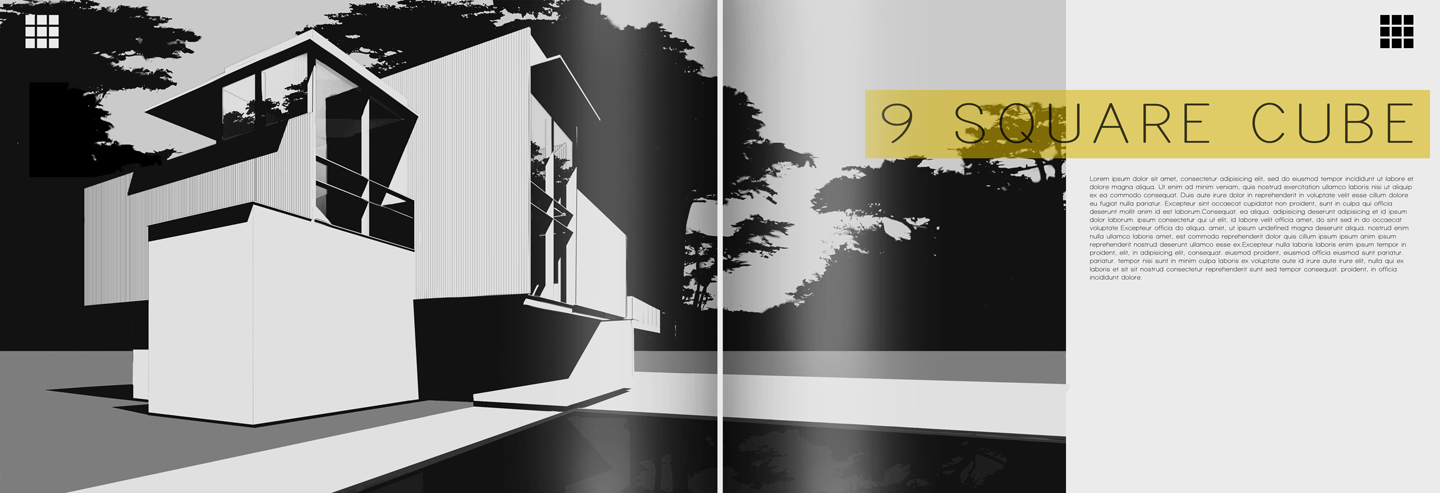
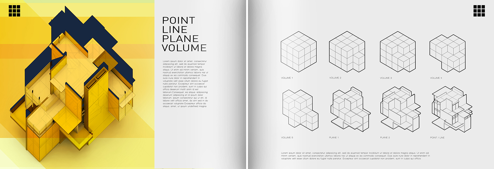
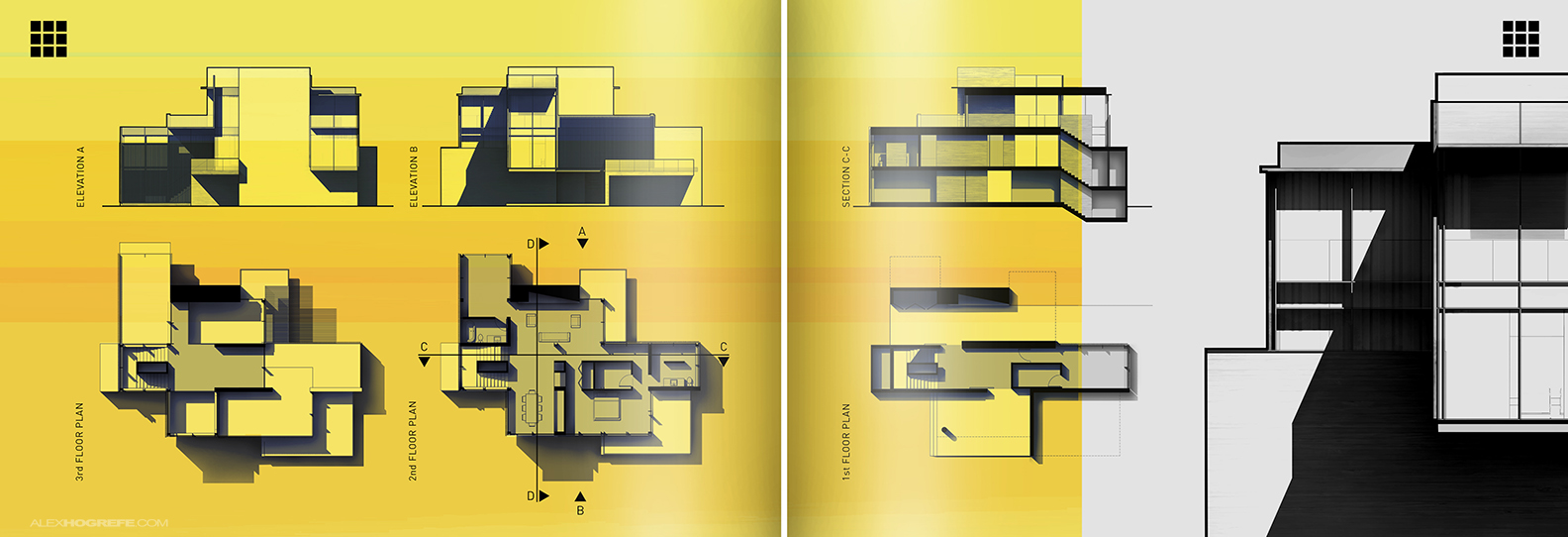
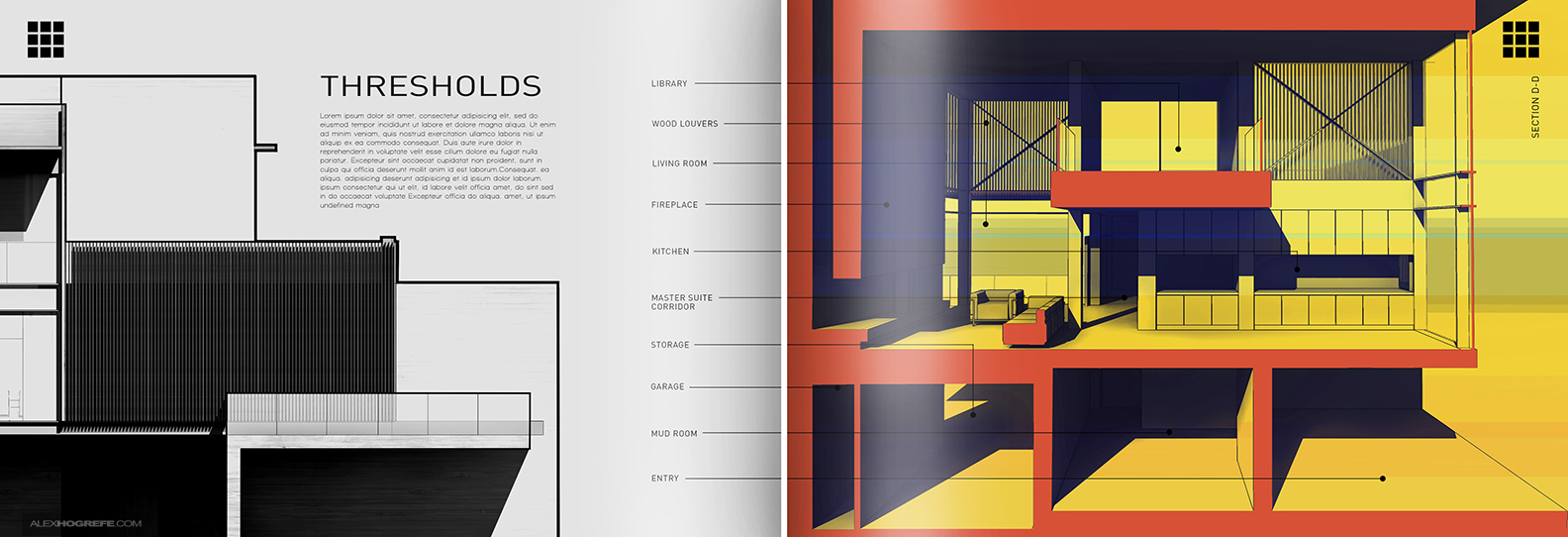
A few weeks ago, I created a post on “going minimal” and this week I am adding two more spreads to the project. I mentioned in the first post how difficult it is for me to leave white space on the page and I think the above two spreads show this discomfort through a denser layout than the first two. While I don’t exactly have the white space concept figured out, it is forcing me to think differently about page layout. For example, I am giving the content more breathing room than I typically do. More space around the images means smaller images to account for this extra space. However, I think the clarity and readability of the pages make up for slightly smaller images.
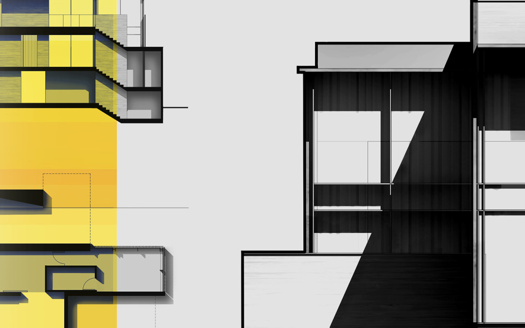
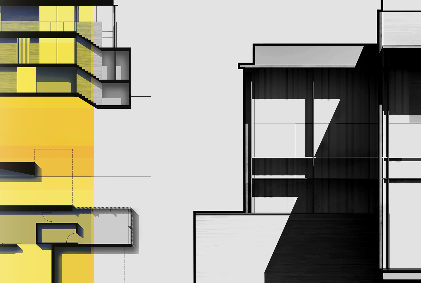
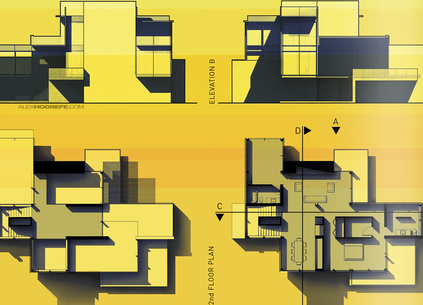
It’s rare to find an illustration on this site without some sort of grunge or sketch texture overlayed on top. However, with these latest spreads, less energy was put into textures and more into line weights and contrast. Since I am working to avoid using rendering engines for these spreads, getting floor plans, sections, and elevations to read clearly with depth means using line weights and SU shadows to my advantage. I like the look of thick profile lines that define the boundary of the imagery as well as the contrast created from sharp / dark shadows simply exported from Sketchup. These moves help to hide the “Sketchup look”.
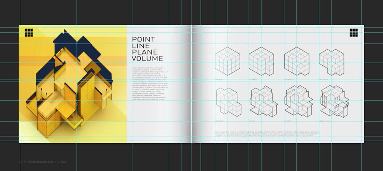
Finally, I took some screen shots of the grids I set up in each of the files. Simple, clean layouts will reveal the smallest misalignments. Setting up grid systems allowed me to place each object and text in a location that had a relationship to something else. While not everything landed perfectly on the grid, the grid did help me to give proper and equal spacing to the imagery, align column grids, and find patterns in the geometry that aren’t instantly noticeable without the grid. The grid spacing was based on a few variables such as the number of images displayed on the pages, the “9 square cube” concept, and/or the rule of thirds.
I’m up to four spreads with this project. I still might put together a spread comprised of perspective vignettes similar to what is on the first page. It’s going to take some experimenting to get the interior shots to display like I am imagining in my head. More on this later.


Hello Alex ,
Thank you for the great post , I always recommend going minimal when presenting grid based work , great job!
you mentioned the "Rule of thirds" can you please comprehend ?
Pages 1, 2, 4 and 8 are dead sexy.
A quick critique from someone who's just now looking at this work…
I love the diagrams on sheet four, and I totally follow the volume, plane, and line parts of the narrative, but I don't really get "point" at all.
The yellowish graphics compete with your plans, to the point that the graphic dominates. I found myself drawn to the intricacies of the grain of the graphic more than to the architecture. Then again, a big portion of the function of a portfolio is to show off your graphic skills, so maybe that's not a problem.
The "Thresholds" title is kind of ambiguous. I'm not sure if it's referring to the elevation detail or to that lovely section on the right. If it's referring to the section…well, the section seems to be more about the public spaces of the residence than about thresholds. I supposed the compressed space formed by the library is a threshold between the kitchen and living room, but then it's the only un-labeled space on the sheet.
Hope that's of some use to you.
By the way, thanks for your blog. It's an invaluable resource!
Hi Alex,
I would just like to say thank-you, I have just finished a 14 hour 1.50 section session and all guided by your on line tutorials and I am stoked with the result, while still clearly room to improve! Thank-you, keep up the great work.
P.
Hi.
Thanks for this post. It would be interesting to do a quick tutorial about line and shadow work on your plans, sections..
Thanks for all your knowledge
Hey Alex. Wonderful post. What is the name of the font used here ?
@Tim,
Thanks for the critique. I get the color comment and went back and forth with the yellow color for a long time. ultimately, I went with the graphic that would grab attention vs becoming a page that viewers might flip past.
Also, "Thresholds" was more or less filler text. I haven't taken the time to write out the text yet which would explain the "threshold" title. The writing obviously will play a big part in the success of the portfolio and its something that will come later.
thanks infonya
Hi Alex
Sorry for reigniting an old discussion, just wondering if you had any more posts/tips to add to this tutorial? Can you offer any advice on the types of textures you used to achieve this look? How did you get the silhouette gloss look of the yellow block behind the ‘9 square cube’ text etc.
Love your work!
Hi, love your worrk, i have been follwing it for a couple years now. I just wanted to know how did you do the cubic ilustrations on page 4?
Cheers, thanks
Can u please add a tutorial video on going minimal