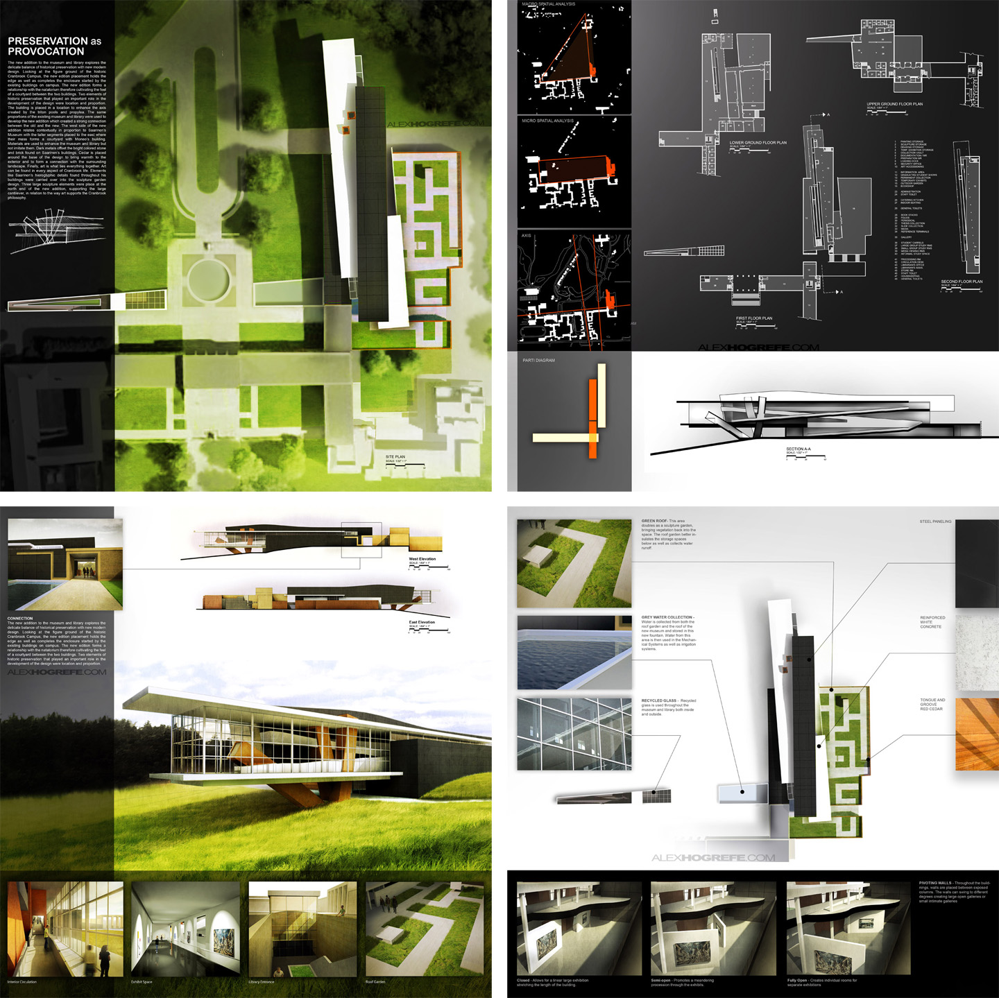
This post is continuing off of the 4 boards discussed last week. To get up to speed on what I have already done so far, read this first. For the most part, I kept the overall layout of the original presentation, however, I have been tweaking certain elements and making adjustments in attempt to get the compositions to read clearer.
ARCHITECTURE PRESENTATION BOARD 3- RENDERINGS
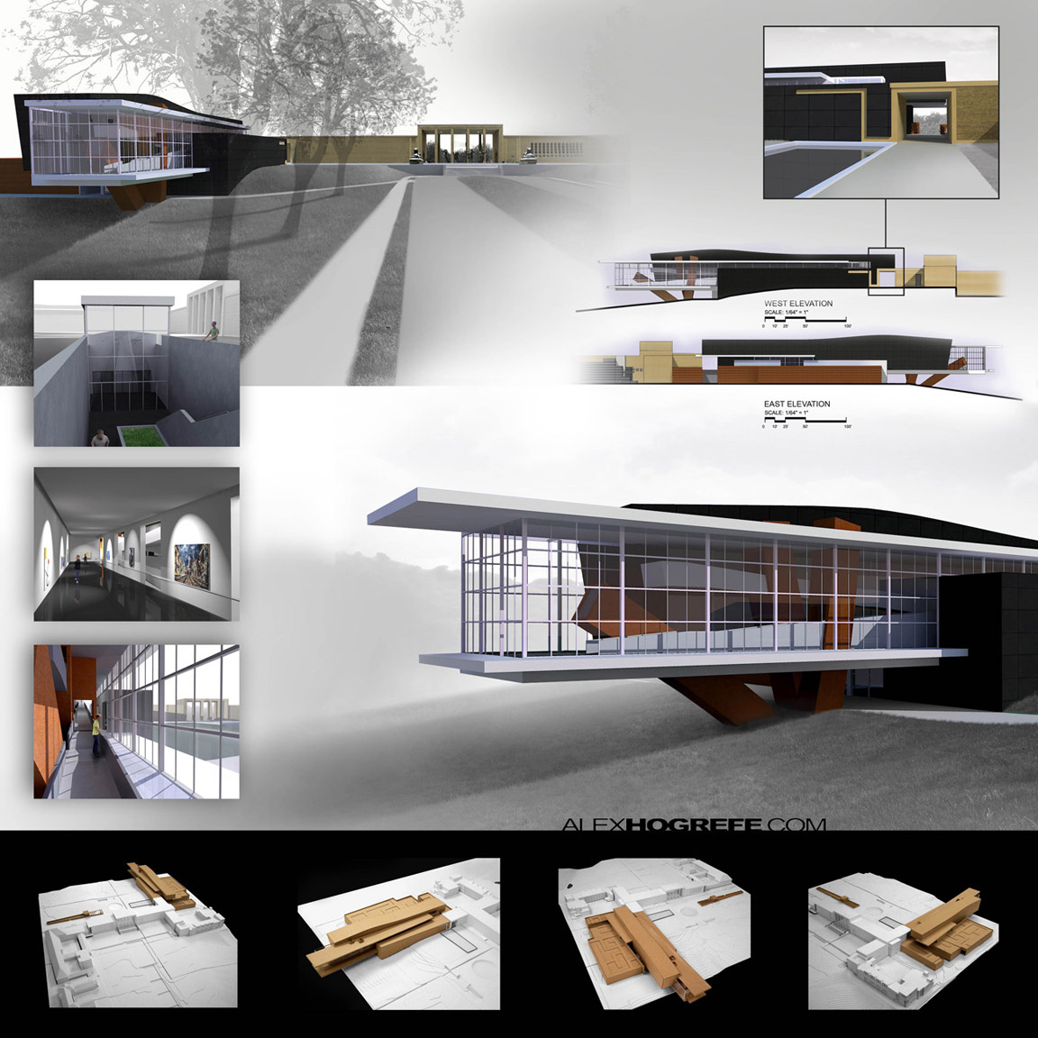
The original rendering board had way too much information. I felt the layout worked, but there was some useless information that could be removed.
1. Imagery: Similar to board 1, the imagery on board 3 is too desaturated. At the time, I thought I was making the building stand out by desaturating the landscape. Over the years, however, I have spent less time trying to get my designs to stand out and more time playing up the site around the buildings in an effort to create a better relationship between the two.
2. Physical Model: There really isn’t any reason to have images of the physical model that I built for the project on the presentation boards. I thought that including these images would give me brownie points for the competition. In reality, they are not adding any value to the story that I want these boards to tell.
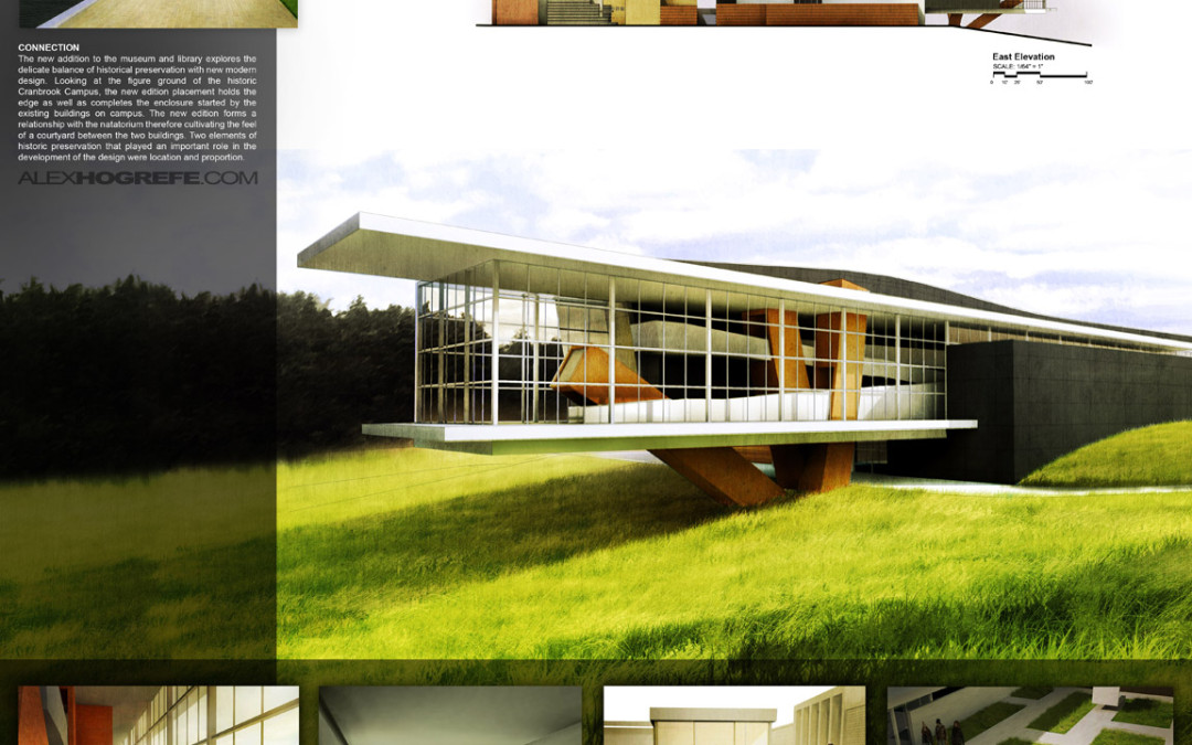
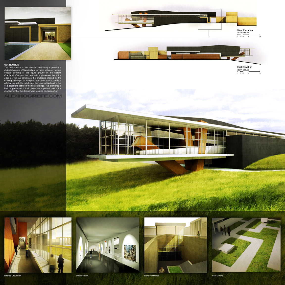
With the new rendering board, the first thing that I focused on was adding color and life back into the illustrations. A lot of time was spent just adding color overlays and textures to the existing illustrations. I also focused on simplifying the boards. The main image now has lots of room to breath, while the four vignettes at the bottom are larger and have more of a presence in the board instead of just floating in space. There is an important detail of how the new museum design connects to the original Saarinen building, and I wanted to play this up. I therefore separated it from the other vignettes and again related its location to the elevations.
ARCHITECTURE PRESENTATION BOARD 4- DIAGRAMS
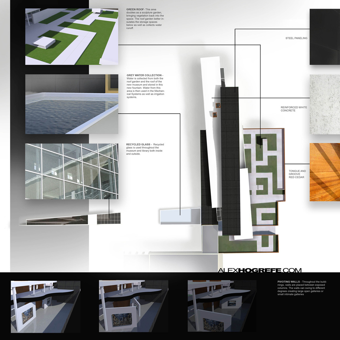
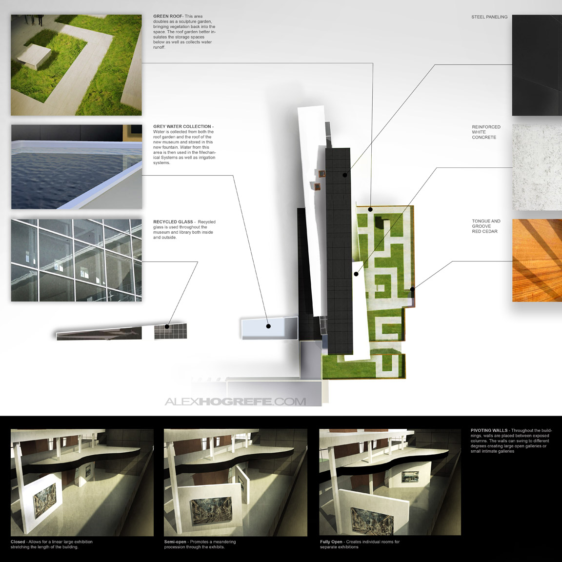
Not much changed with this board. I felt the layout worked well. The only thing that I thought needed adjusting was the size of the building roof plan illustration. I felt it competed too much with the board 1 site plan. As with the other boards, the illustrations at the bottom are too desaturated and for some reason I faded them out haha.
As you can see, the two are relatively similar. I shifted some things around so that the grid of the new board would relate to the grids of the other new boards. I also added some tone and textures to some of the illustrations.
THE FINAL COMPOSITION
With just some simple color corrections and minor composition moves, I was able to make some dramatic changes to the feel of the competition boards. The original structure of the boards is still there, but this time I erred on the side of simplicity and clarity vs. quantity of information.


I was actually fortunate enough to go on a school field trip back in mid March, what a beautiful campus, and I truly think your design woulda made a great addition, have you ever been fortunate enough to visit the campus?
The shadows on the trees in the site plan help give a sense of the building's height. I may have missed it but I don't see a north sign.
P.S you're becoming quite famous with architecture students. I'm seeing a lot of hogrefe inspired presentations.
Hi Alex, Thanks for showing your new boards. Now i see the difference i'm agree that this new boards are better than the first boards. But I have to say that your first boards are also impressive. I like your presentations style a lot. It's very clarifying showing a fue small renders and a big one. The most important change in the first and the second edition of your boards is color. I like the 'hard color' of green grass a lot, and adding a 'yellow' shine on your little renders makes it more warm. nice work! … be curios for your next post.
Best regards Jurgen
@Dillon
I grew up in Northwest Ohio, so I lived somewhat close to Cranbrook, and visited the campus a couple of times for this studio project. I agree, it is a beautiful school.
@Andrew,
Your correct, I left out the North Arrow, lazy mistake on my part. Thanks for pointing that out.
@Jurgen,
Thanks for the kind words.
do you have tutorials for the board presentation??
i like ur post very much. ..u re trully a 2d and 3d artist. ..ur post is superr and i hope u'll make another tips and tutorial for us
Thanks Alex, such a helpful post, it's really great to see your suggestions in action and see what a difference it makes.
You are really awesome. I really look up to you. Thanks for the post!
You are awesome, Thanks for sharing your knowledge, that's wonderful, thanks
Great work!! What rendering programs did you use and how did u apple the textured grass effect?
Hi David, you can find more information about this in Alex his other tutorials:
1/ adding grass in top view : http://www.alexhogrefe.com/blog/2012/6/10/just-playing-around-continued.html
2/ adding grass in perspective view : http://alexhogrefe.squarespace.com/photoshop-landscape-tutorial/
In the description of the tutorials you can mostly read with program is used!
Greets Jurgen
msg me plz
Thanks for the post. they are wonderful illustrations.
Thanks for you give me a best insight to make presentation panels simple.
Your article is very interesting. I think this article has a lot of information needed, looking forward to your new posts. Get permission to share:
Great post, thanks for sharing!