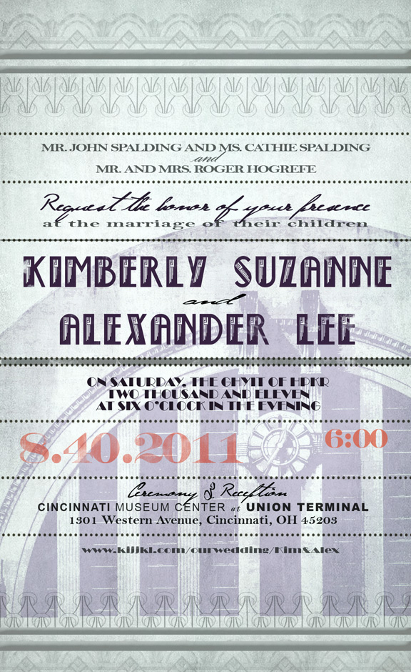
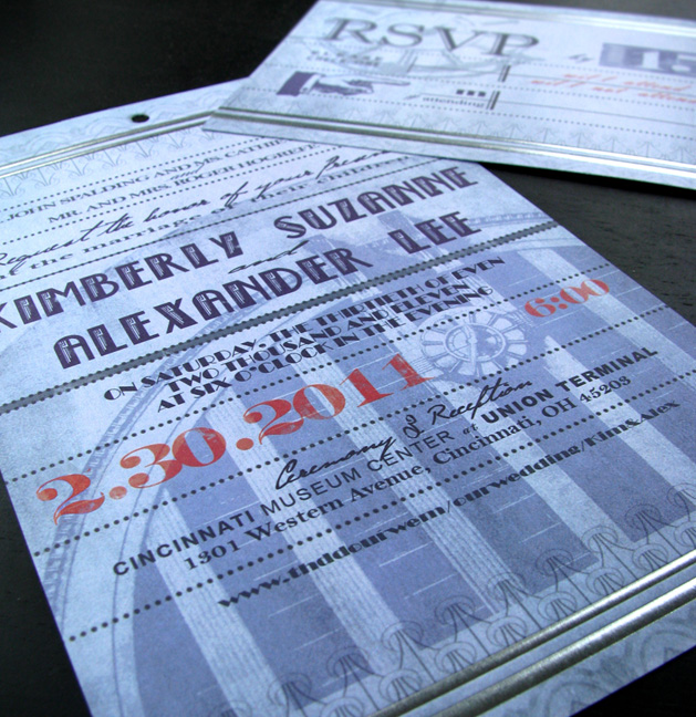
I’ve been designing my wedding invitations this weekend and figured I could kill two birds with one stone and try to get a post out of it as well. After all, I have been attacking these things like an architectural design project so it seemed to make sense. First off, I wasn’t into the traditional wedding invitations with all their calligraphy and ribbon. Kim and I wanted something more personalized and unique.
As an architect, I’m pretty excited about the building we are getting married in. It’s a 1930’s art deco styled train terminal in Cincinnati, Ohio and was named one of the top 50 architecturally significant buildings in America by the American Institute of Architects. The reception will be in the main rotunda underneath a 180’x 106’ dome. It only made sense that we go with a retro art deco styled invitation to pay homage to the place.
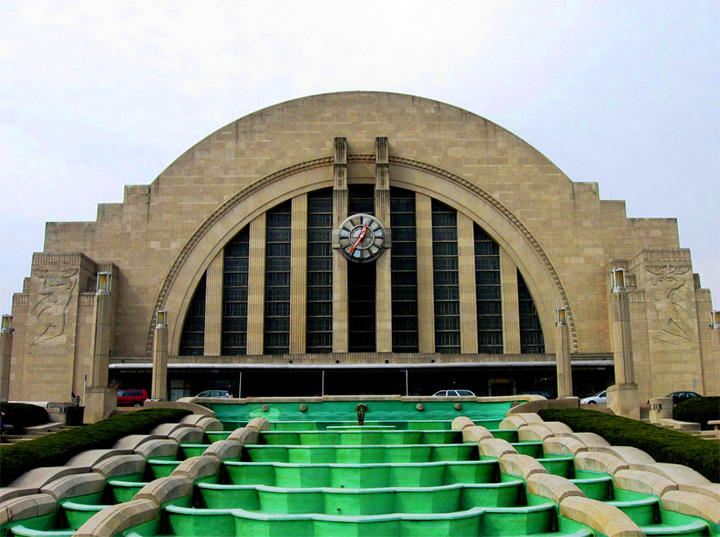
Union Terminal in Cincinnati, Ohio
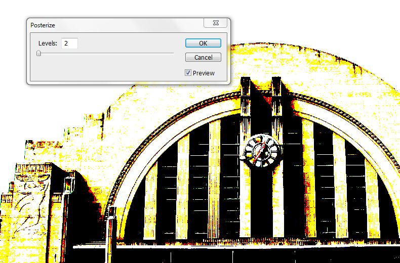
Unlike a portfolio, the invitations are more about the written information and less about the imagery. However, as an architect, I had to add some visual graphics to the invitation. I was afraid of overpowering the text so I solved this problem by posterizing an image of the terminal in Photoshop to remove some of the detail and gradient.
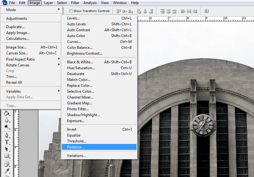
The posterize option can be found under Image>Adjustments>Posterize. I kept it to 2 or 3 levels so that most of the detail and gradation is lost.
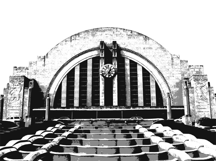
I actually really liked the results after this step but obviously the colors were too distracting for the invite, so I desaturated the whole thing and lowered the opacity to set it into the background more.
To continue the art deco concept, I needed some good fonts. I made a quick stop at dafont.com and found some great styles that worked well for what I needed. I bet 50% of my time designing the invitations was spent finding and testing out different combinations of fonts.
In the last few steps, I added some grunge textures and some wear & tear on the text to age the prints. Lots of other subtle other effects were used to get the final outcome.


alex these look awesome… my fiance always wants a one of a kind type of thing and these are a perfect way to customize our invitations and practice techniques.. keep up the great work and tutorials… your caliber of work is something for every arch student to strive for… thanks for all the info.
I like how it says you're getting married on the 40th! Quite an important date. Very nice design too!
Congrats Alex! Brilliant work with the invites too, i also want to take this time to thank you for all your tutorials, you saved my ass for my final year synoptics, keep up the great work.
I always appreciate the compliments. Thanks guys
Congratulations!
congratulations and as always thanks for your blog
Alex, my best wishes to you and Kimberly!
why not invited me?!!!…congratulations alex!……bye bye partys and hot girls
Haha, So you would fly to Cincinnati from Argentina for our wedding if your invited ?
.
yes of course! and for bachelor parties too! saludos y gracias por todos los tips que nos enseñas incondicionalemente