Modeler: Sketchup
Renderer: V-Ray
Post Processing: Photoshop
Final Output Size: 4500 px x 2520 px
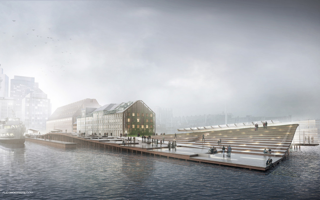
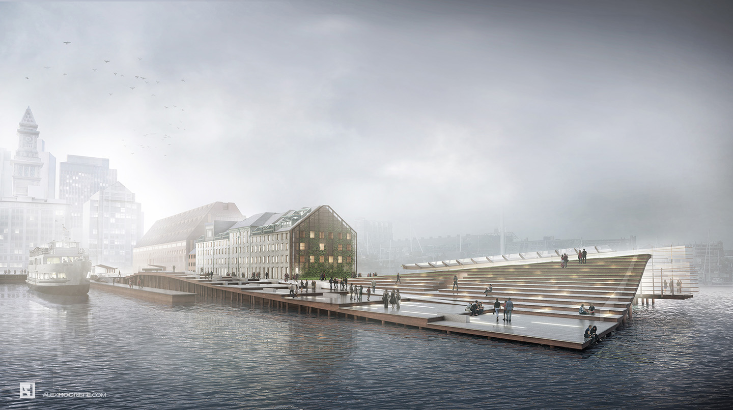
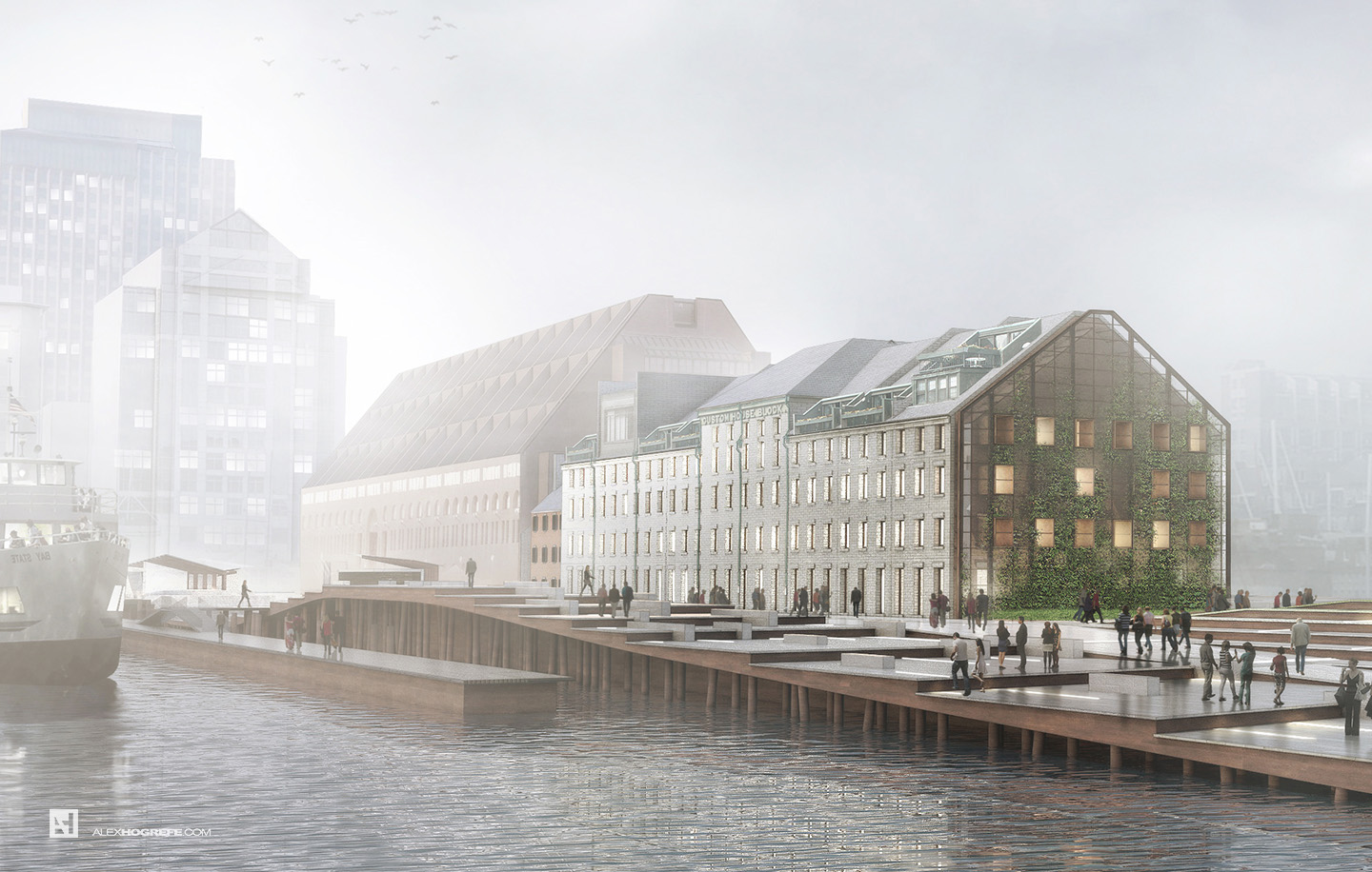
The Boston Long Wharf perspective illustrations are underway. This first illustration is one of the more important ones because it is describing the entire design and its relationship to the water and the city. An early morning fog scene has been on my to-do-list for a while and this view/project seemed like a perfect opportunity to give it a try. One of the toughest things I found working on an illustration like this was keeping the overall color saturation to a minimum. I have a tendency to amp up the color in past illustrations through lots of color overlays. With this image, I constantly was going back and desaturating layers to maintain that early morning mood.
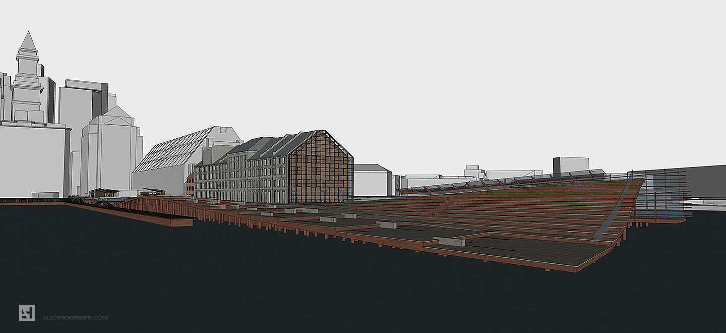
This illustration took me a little longer than the others for a few reasons. I have been designing and building the 3D model as I go. Typically, I spend a few hours when I can after work during the week on the modeling. It got to the point on Friday where I had to buckle down and make some design decisions and stick with them for the final illustrations. The good thing was once these decisions were made, I was able to quickly brute force model and get things where I needed them to start setting up the rendering.
I have attached some of the screen shots of the Sketchup model below.
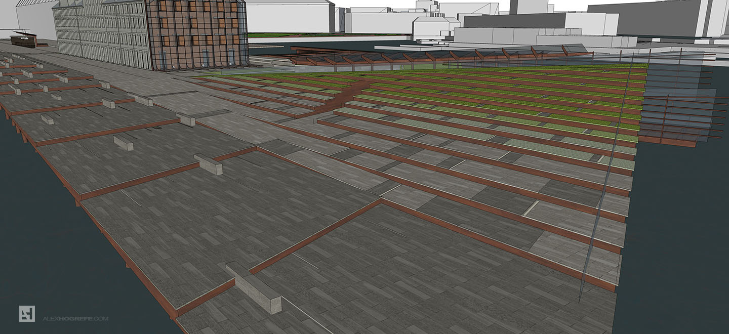
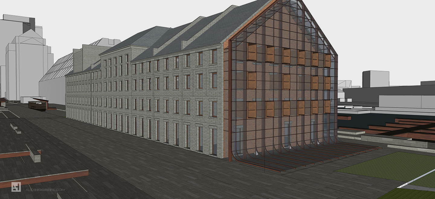
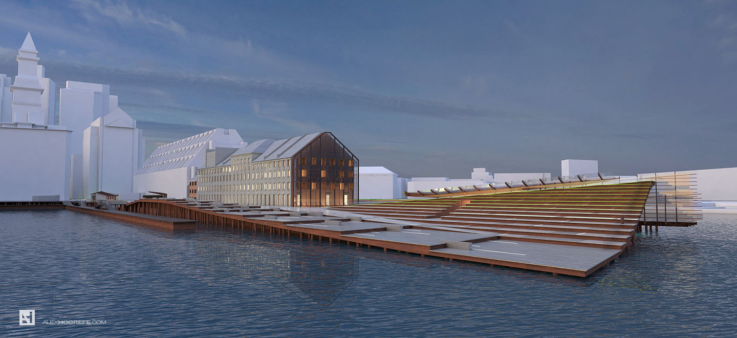
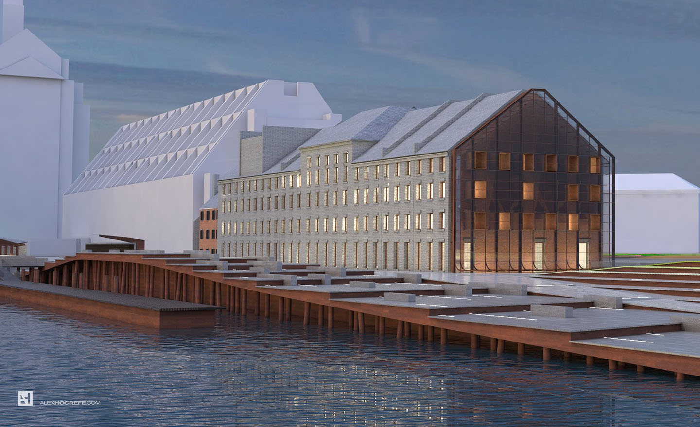
The other thing that absorbed some of my time was setting up the file to render. Anyone that follows this site knows I prefer to spend most of my time in Photoshop. However, with this shot, I decided to invest a little more time preparing the textures and lighting. V-Ray was used for this image instead of Kerkythea, a rare occurrence on this blog. Below are some screen shots of the raw rendering output from V-Ray.
I kept most of the surrounding context largely untextured. This area of Boston is highly photographed online and I knew I would be overlaying images of the background buildings on top of the base rendering. For that reason, I rendered the context gray allowing me to overlay the photography but still maintain the light and shadow of the base rendering.
You may have noticed the title says, “Part 1”. I plan to salvage what I can of this 4th of July weekend and pick back up in the next post with an in-depth break down of the post processing in Photoshop. These types of illustrations are fun to work on and I think the workflow would be interesting to see.


Nice image!
looking forward for the postprocess 🙂
seems interesting so far, it is amazing to see how you can be this good with all different archi software and design. I always struggle with the design process of ANY project that am working on, eventually, I sacrifice all of what I thought of and just do a "typical" design. so for the archi software, I am trying to learn but it doesn't seem like am achieving anything here or there. can you please advice me of something out of your experience as how to stop being lost with this?
Interesting to see the switch to VRay and the results were very impressive! I've been rendering with VRAy for Rhino a while, and I was just wondering if you used HDRI mapping for the sky/reflections? Also are you making your own materials or finding them online? The glass and water look great!
Looks great! Interesting to see your switch to v-ray I guess now you spend more time on making the materials and lighting due to the more options offered by vray 2.0 for su. Looking very much forward to hear about this workflow, domeligh+hdri used, which kind of rendering settings colour mapping etc. – I'll always had problem achieving this overcast skye look, but it is great! I have been working with vray for su for some while now as an architect in some smaller companies and sometimes I just have problems with the program crashing easily due to su's 32 bit limitation, making the model easily unstable – so it would be fun to see if you also encounter such problems and how you deal with it when making these 4000px+ illustrations. Thanks 🙂
great work! Please ulpload the video tutorial!
thank you!
Would love to see how you finally present this type of image for client and council
Thanks again
@Angel,
My advice to you is to focus on becoming good with only 1 or 2 pieces of software instead of trying to learn many at once. For example, I put a lot of energy into learning Photoshop and didn't start using rendering programs like Kerkythea until much later. I also focused a lot on Sketchup and didn't learn Rhino or Revit until much later. Breaking down your goals into much more simplified chunks helps me focus in and learn them faster. Also, architecture software requires many, many hours of practice. Its not something that will be fully understood in just a few tutorials. It takes years to get to the point were it becomes second nature. Im still learning and experimenting with the software I use every day.
@Funklyton,
I did use an HDRI image for the sky and sun. Also, I prefer to make my own materials only because there is unlimited flexibility going this route. However, there are some good ones I found online that I use occasionally.
@Therkel,
Sketchup has crashed on me a few times, but for the most part, I haven't had problems rendering. It seems to crash most often when I have a lot of VFB channels selected. Also, I haven't been pushing the materials too hard such as using displacement maps everywhere which probably helps.
Average at best.
Thanks for your reply Alex, I've been waiting. You are the best.
Nice work! Did you use V-Ray's Z-Depth pass for the fog, in the post production. Or, maybe a V-Ray environmental element?
I'm really looking forward to this post process.
Always thanks for your devotion.
@Korea
And is the texturing done in sketchup or are they vray material?
Beautiful layout, and great inspiration for some site diagrams. I have a separate question though. Roughly how long would you say a illustration takes you? I know it must vary but for example the wharf design foggy perspective?
Printeroffline-fix is For Technical Help. The best place to fix any Hp printer issues online without compromising any work. No more waiting or staying in questions for Printer Support. Our customer support number +1 8544-00-5545 is here to give any technical support you want. You can connect to us any time you want because our technical experts are available 24/7 for your service.
https://printeroffline-fix.com/