If you read my first post, you understand that Alex and I chose to start his Portfolio design process by selecting fonts. Anytime I begin any kind of design project I always start with type. Others may tell you they start with a grid, color palette, forms, and shapes, but for me, it all begins with type. Whether I’m starting a large scale environmental design project or visual identity and logo, I always start with type. That’s because type allows me to determine what kind of visual voice to give a project. For me finding that voice is the foundation for any visual design endeavor.
01. Precedents
The first step in determining what kind of font to use is to look at your project and see what other projects are out there that have the same qualities as yours. See what they’re doing and make a determination whether or not you want that same look or feel, or whether you want to be completely different. A great resource I use is Fonts In Use. This resource allows you to see real-world applications of who’s using what fonts and how they’re being applied.
Fonts In Use is also a great resource to discover new typefaces to add to your now ever-expanding library.
Another great resource for conducting precedent research is Typewolf. Just like with Fonts in Use, Typewolf posts contemporary projects from around the web and highlights the typeface’s featured in each project. The feature that I enjoy the most from Typewolf is their guides and resources section. Although you have to pay for some of them, they are some of the most help type guides on the internet.
Finally, the most helpful resource for me, believe it or not, is Pinterest. It’s honestly a great resource for zeroing in on specific project typologies that might be harder to find on a google image search. It, of course, makes it easier to develop a mood board to really determine how you see your project shaping up.
02. Terminology
Let’s talk about some basic terminology.
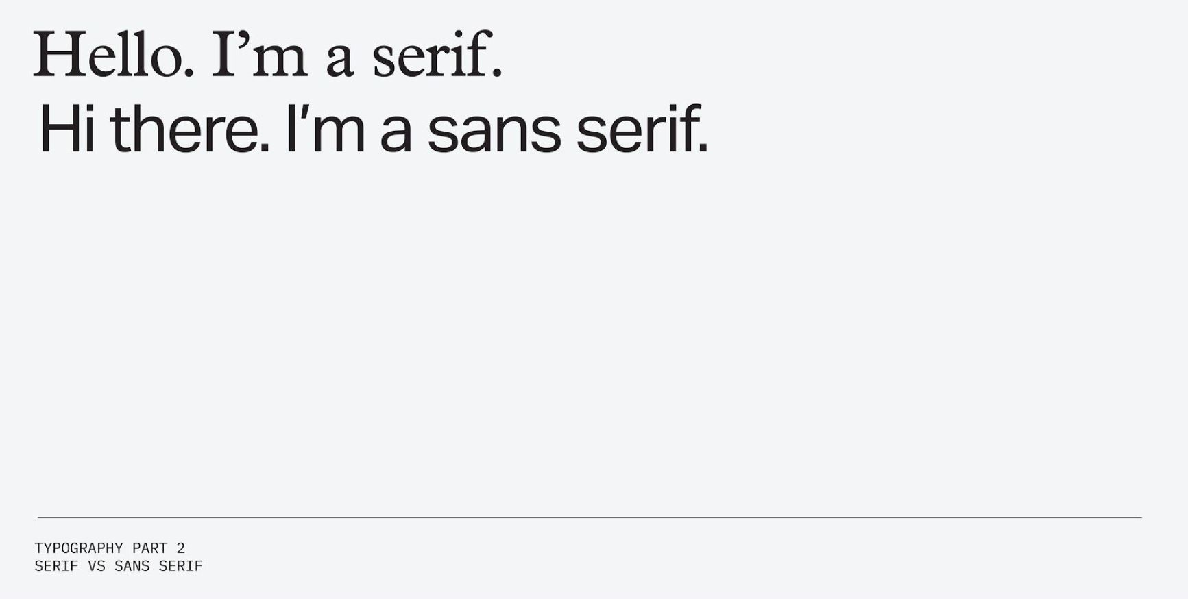
Serif vs San Serif
Simply put, a serif is a font that has a small line/stroke that finishes off a larger stroke. A sans serif is a font that doesn’t have any of those small strokes or serifs.
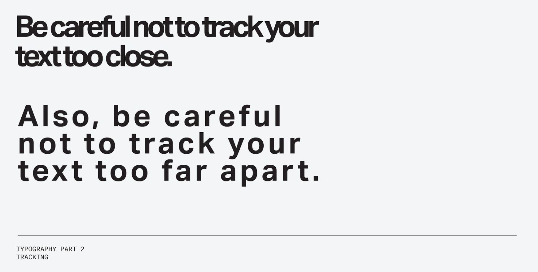
Tracking
Tracking or letter-spacing is the uniform spacing between all the letters and characters in a given word or sentence. Tracking often gets confused with kerning, which is the individual spacing between two letters or characters. Be careful when designing to not track your letters too closely or too far apart. This can lead to major legibility issues.
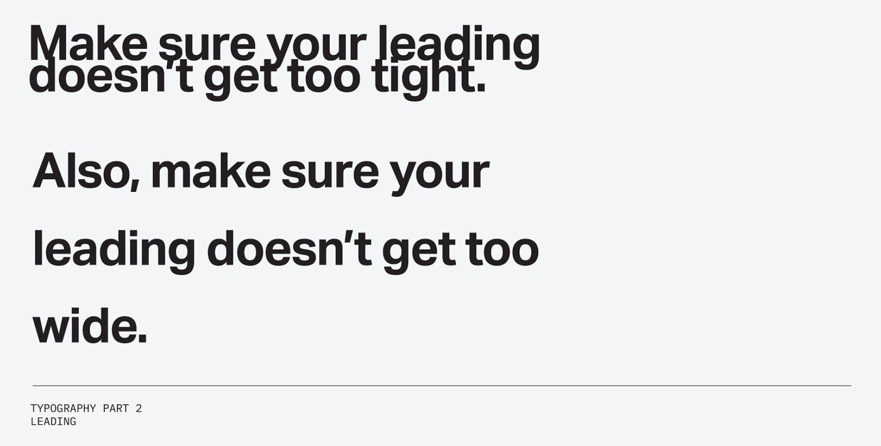
Leading
Leading or line spacing is the distance between two lines of type. It’s very important to pay attention to the leading when you start to deal with type in uppercase vs sentence case. When your type is in uppercase you can start to adjust your leading to be a lot tighter because your not dealing with varying heights within the typeface. However, when dealing with sentence case be careful that your type doesn’t get too close or too far apart. When lines of type start to collide it can make it very tough for your eye to follow along.
03. Do’s and Don’ts
Let me just mention these are just suggestions, there’s no wrong or right answer here. These are just some simple do’s and don’ts that can help guide you when you’re putting together your own spreads and portfolios.
Do Keep It Simple
The best piece of advice I can offer is to keep it simple. When putting together a spread try to keep your use of different typefaces to a minimum. I would suggest using 1-3 typefaces max on a spread. If you can, just use one typeface that has a number of different weights. This way your spread will feel more cohesive. Using too many typefaces can become chaotic quickly, especially when you start to factor in your imagery and color usage.
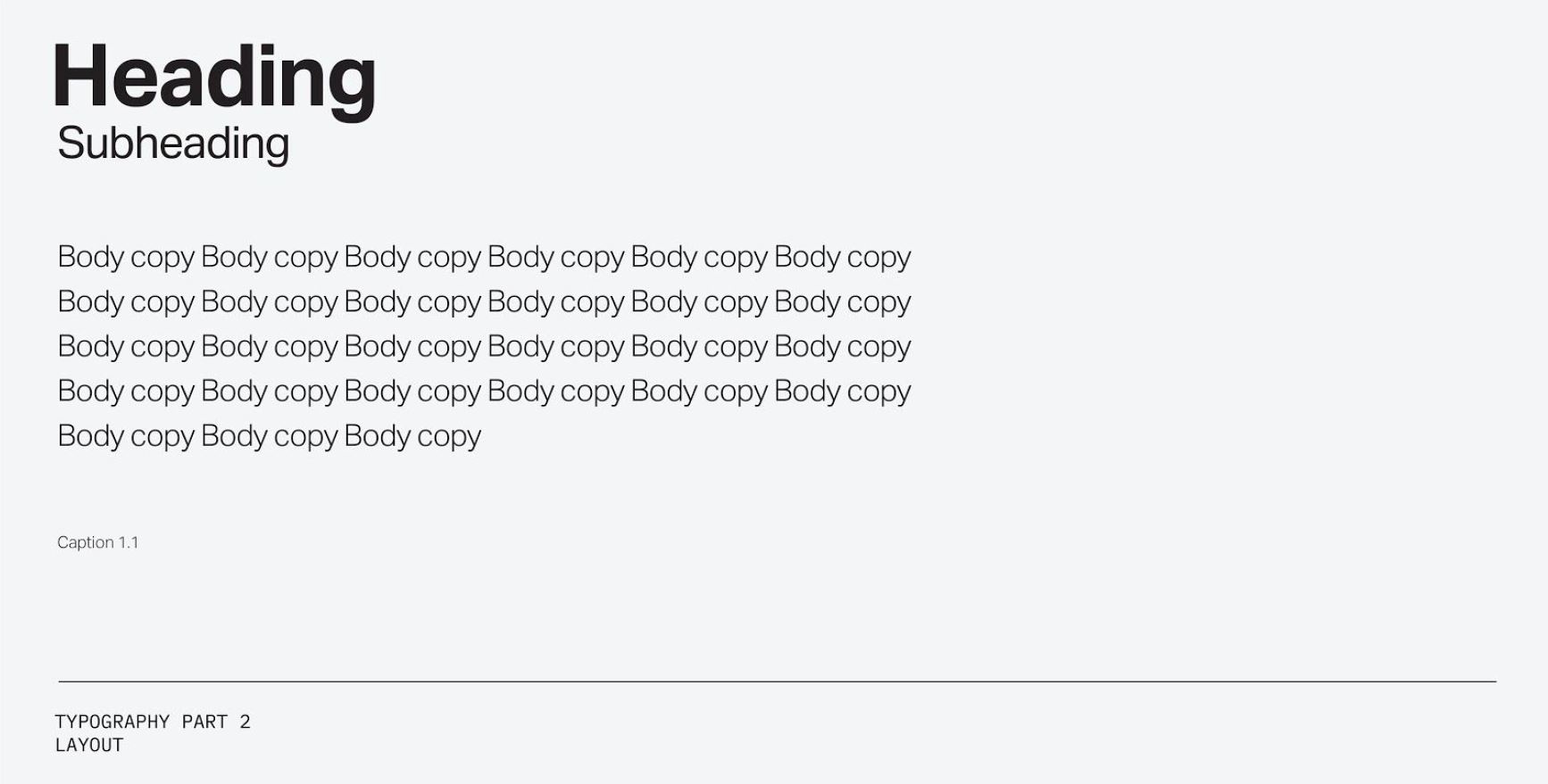
Do Stay Consistent Throughout The Document
Another tip is to determine different weights and sizes early in your design and then replicate that throughout your other spreads. Start with one spread. Figure out what the most important information is. Maybe it’s a heading or some kind of call out making reference to an image. Give it the biggest presence on the page whether that’s size or weight. Secondly, determine your secondary information. Is it a subheading or is it body copy? Give that a substantial size difference from your primary information. Lastly, if you have captions or any type of tertiary text make sure to make it the smallest size on the page so that it doesn’t start to compete with the rest of the spread.
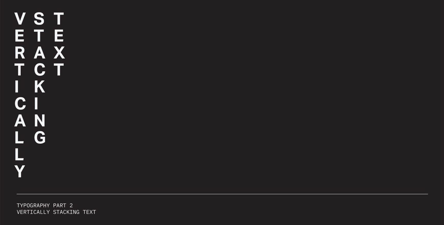
Do Not Stack Vertically
In general here are some things I would stay away from when you start putting a project together. Stacking text vertically. Seriously, don’t do it. It’s always tough to read especially in a book format. You’re asking the reader to put in more work to understand what it is your trying to convey.
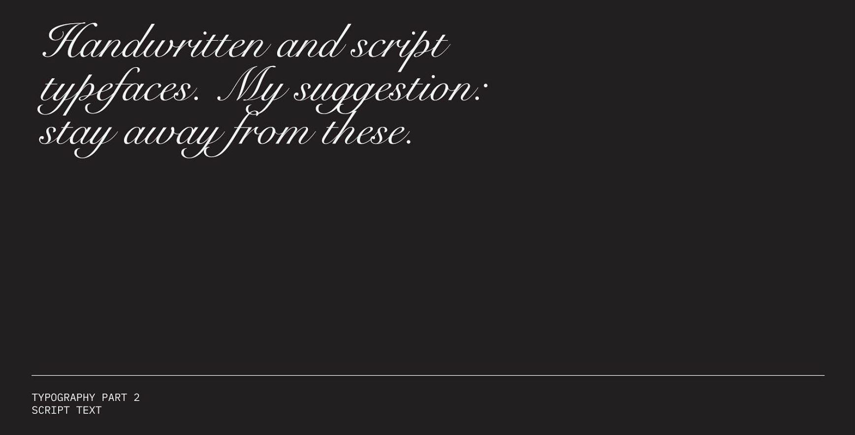
Do Not Use Script Typefaces
Definitely stay away from script and handwritten typefaces unless a project really calls for them. If the project does call for it write it out yourself and scan it in. Typically these kinds of typefaces come across as forced and inauthentic. When in many cases your use of script text is meant to come across with a high sense of authenticity.
04. Other Resources
Type Foundries
In our previous post, we spent a lot of time talking about free font resources like Google Fonts and Adobe Fonts. This time around I wanted to highlight some of my favorite type foundries that produce really great typefaces. I would suggest checking out the following; Grilli Type, Commercial Type, Klim Type Foundry, Colophon Foundry, Dalton Maag and Village. These are the type foundries I go back to time and time again.
Print Publications
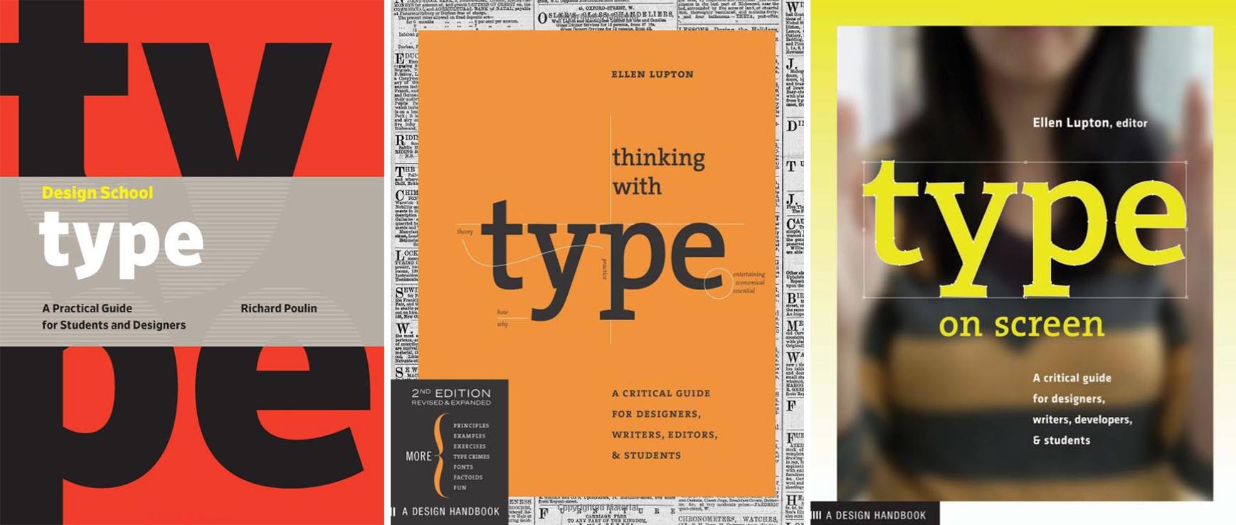
There are of course really good print publications on typography as well. I would recommend Design School: Type: A Practical Guide for Students and Designers, Thinking with Type and Type on Screen. Lastly, if you’re really looking to nerd out on typefaces I would suggest taking a look at The Visual History of Type, and Basic Typography: Design With Letters.


Very helpful advice in this particular post! It�s the little changes that make the largest changes.