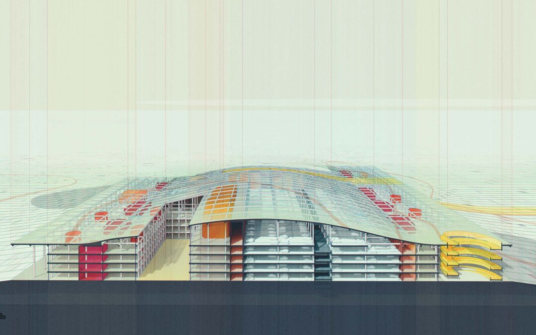
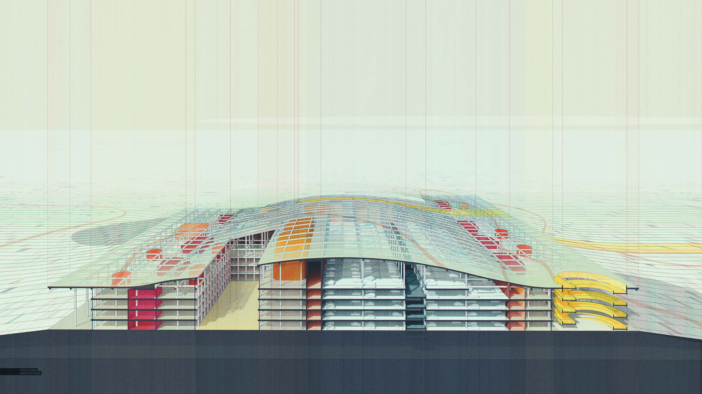
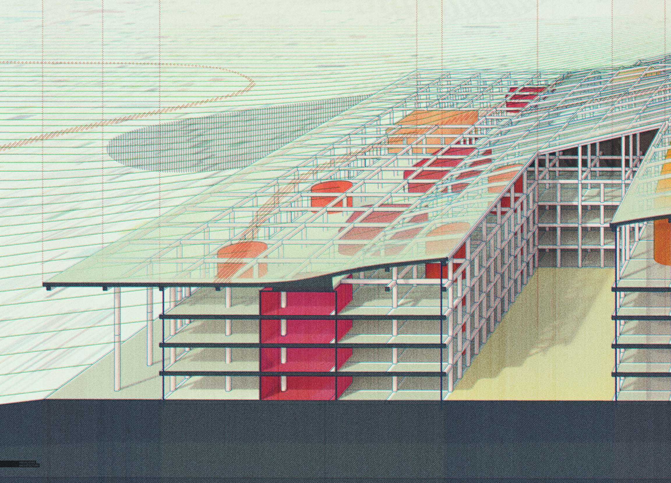
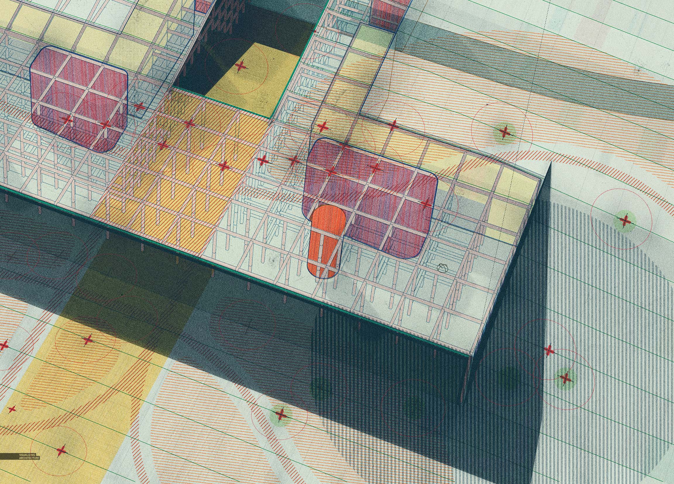
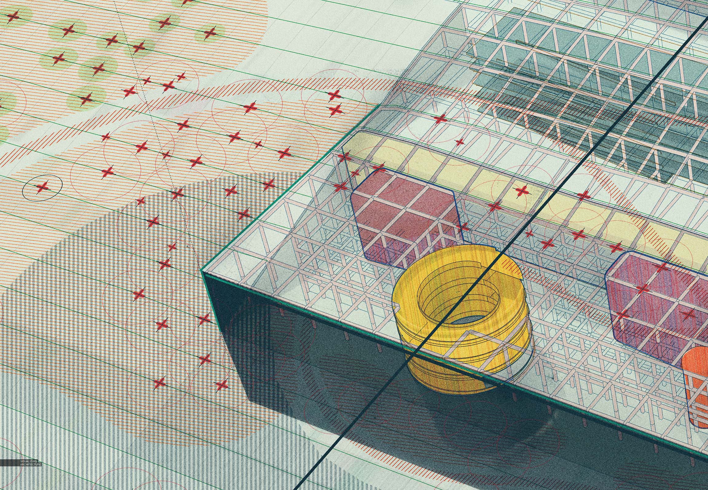
Every now and then, I need to switch things up. Sometimes this means not thinking too much about what the end result will be and just seeing where things go. I needed a break from “realism” and the focus on high res textures, accurate lighting, etc. Instead, I wanted to put together a series of images that were a little more loose and playful. The intention was to be diagrammatic, vaguely showing how the interior volumes and spaces worked in relation to the relentless gridded structure that runs throughout the building. At some point later on down the road, a layer of annotation will be added over these illustrations. Below is a quick break down showing the components that makeup these images.
1. Base Renderings
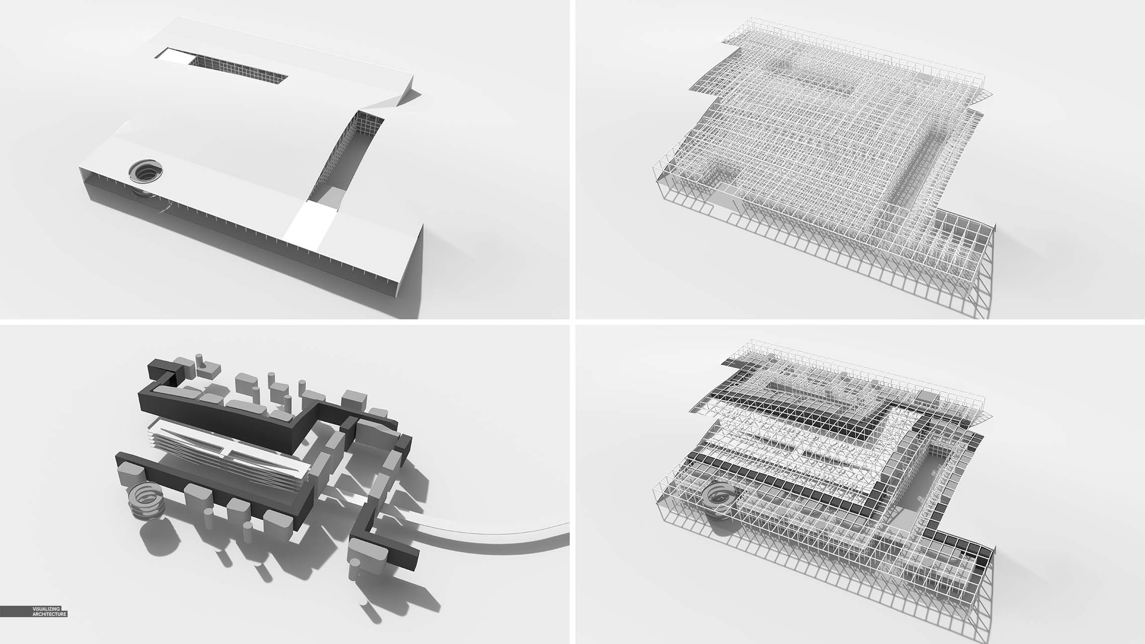
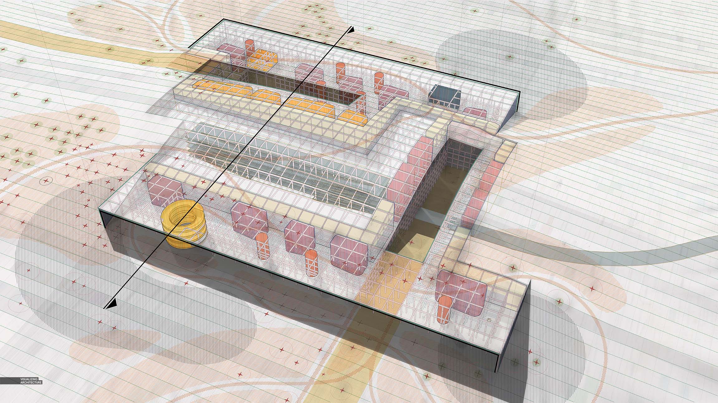
To get started, I rendered out several different versions of my model in V-Ray with different layers turned off and on. I had no idea where I wanted to take this so I wanted to make sure I had lots of different options ready so that I could iterate quickly. In the end, I only used two of the versions of the base files layered on top of each other in Photoshop. I am also showing the Material ID elements that V-Ray kicked out. These are extremely important for an image like this because of all of the selections that I will be making in Photoshop.
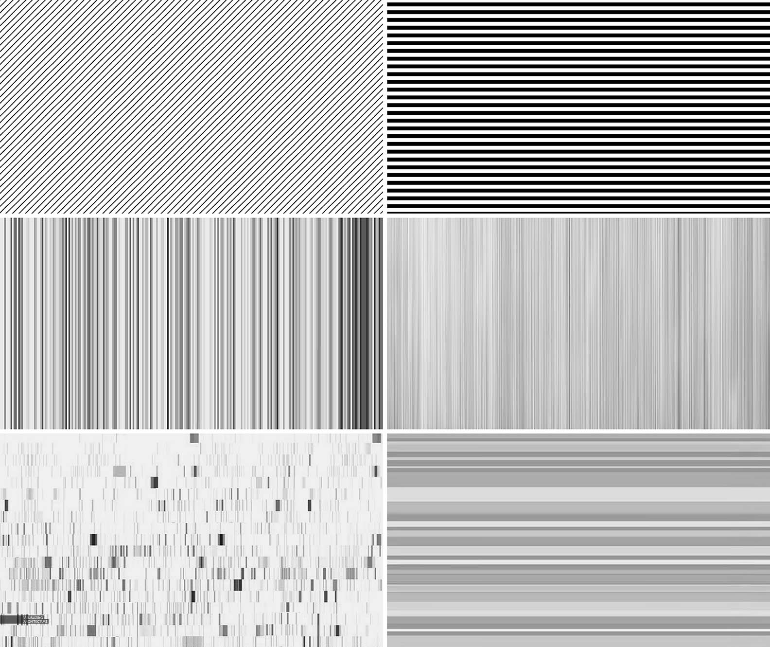
2. Line Work
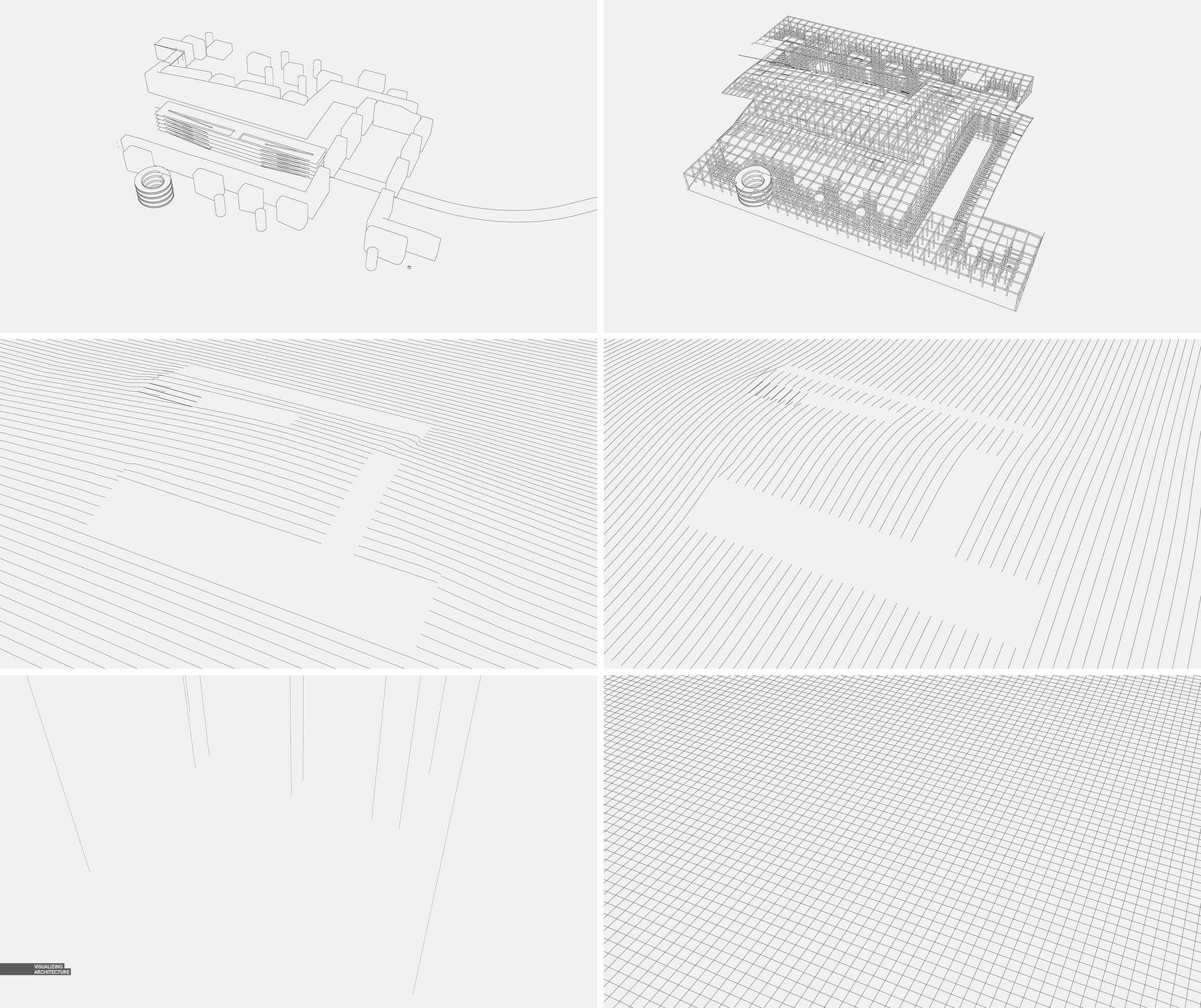
Next, I did the same thing with line work as I did with the V-Ray base files. I exported several different versions out of Sketchup by turning off and on groups in the model. In this case, I wanted the line work separated out from each other so I could explore color and opacity on an individual basis.
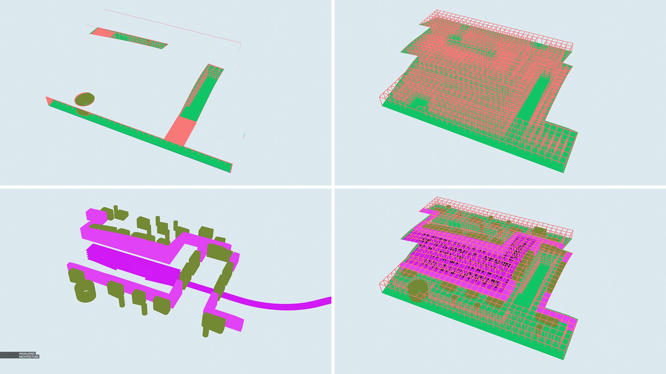
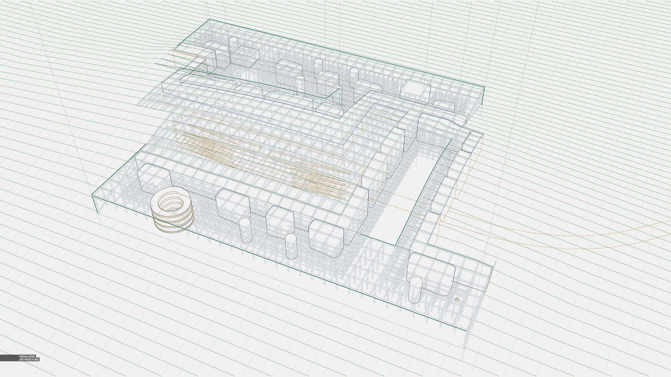
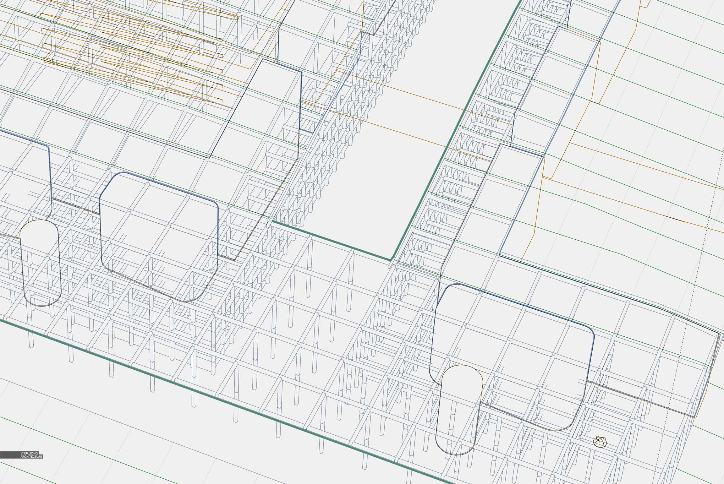
3. Color and Texture
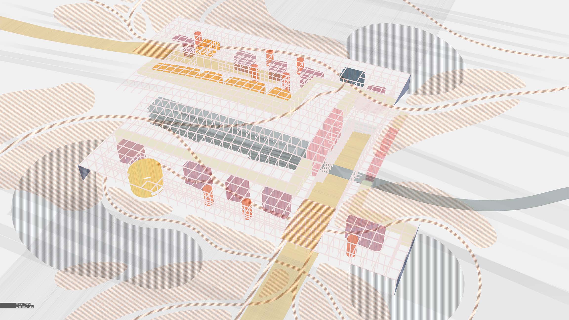
Once the base files and line work were setup in Photoshop, I began layering in color and texture. This was done by setting up a group in Photoshop for each color and then applying a layer mask to each group for each zone the color was for. While this took some time up front, it really allowed me to iterate quickly and test out lots of color combinations and textures for each zone. By setting up a group for each zone with its own unique mask, any color or texture placed in a group would take on that masked shape. This avoided lots of duplicate masks and kept things organized and highly editable.
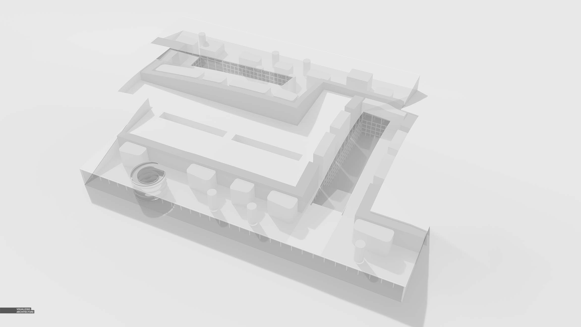
4. Additional Detail

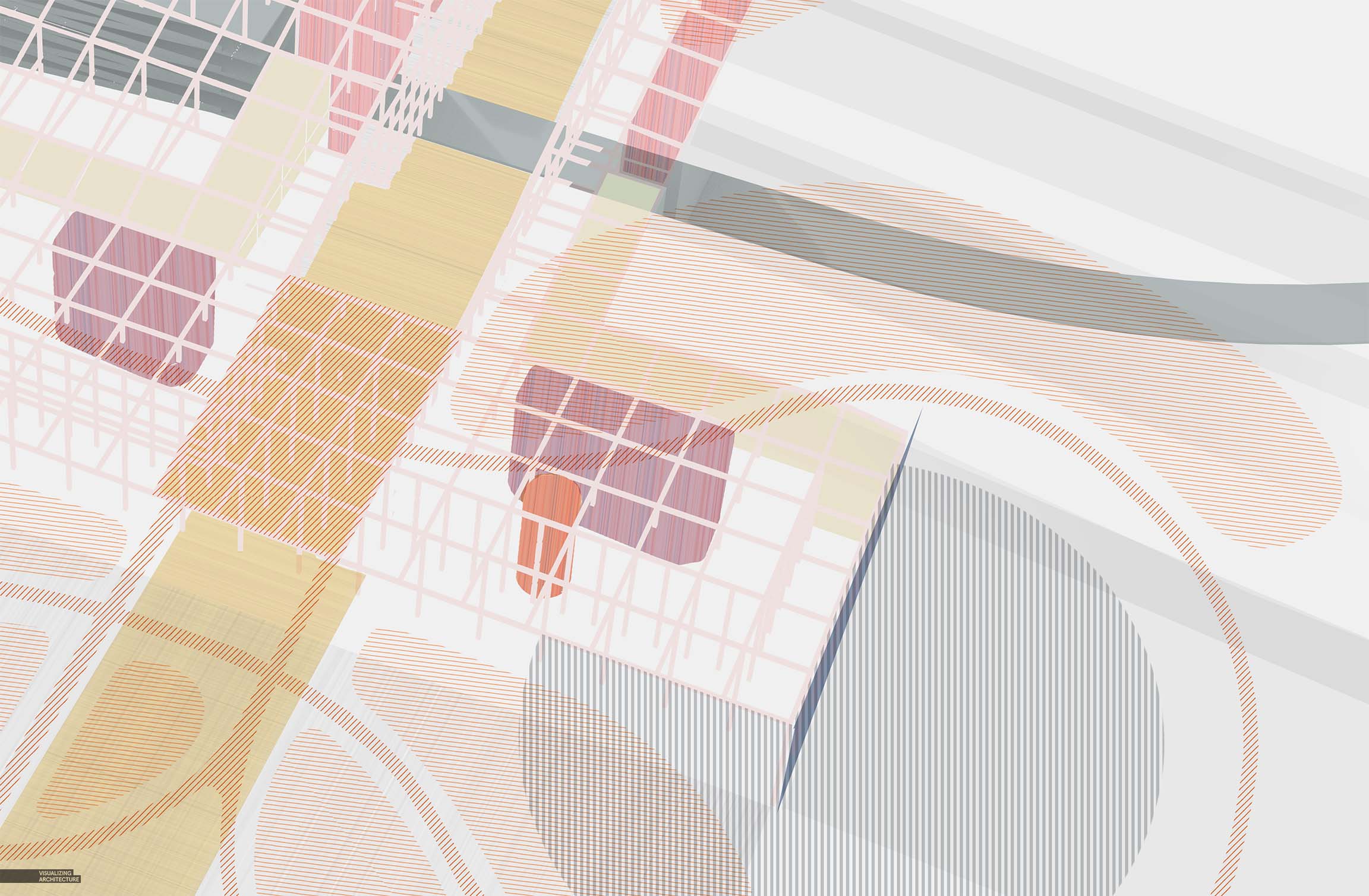
Finally, I added in some final details that brought in some extra texture and complexity. You will notice lots of little smudges which helped to rough up the line work and break up the smoothness of the background.
5. Color Grading
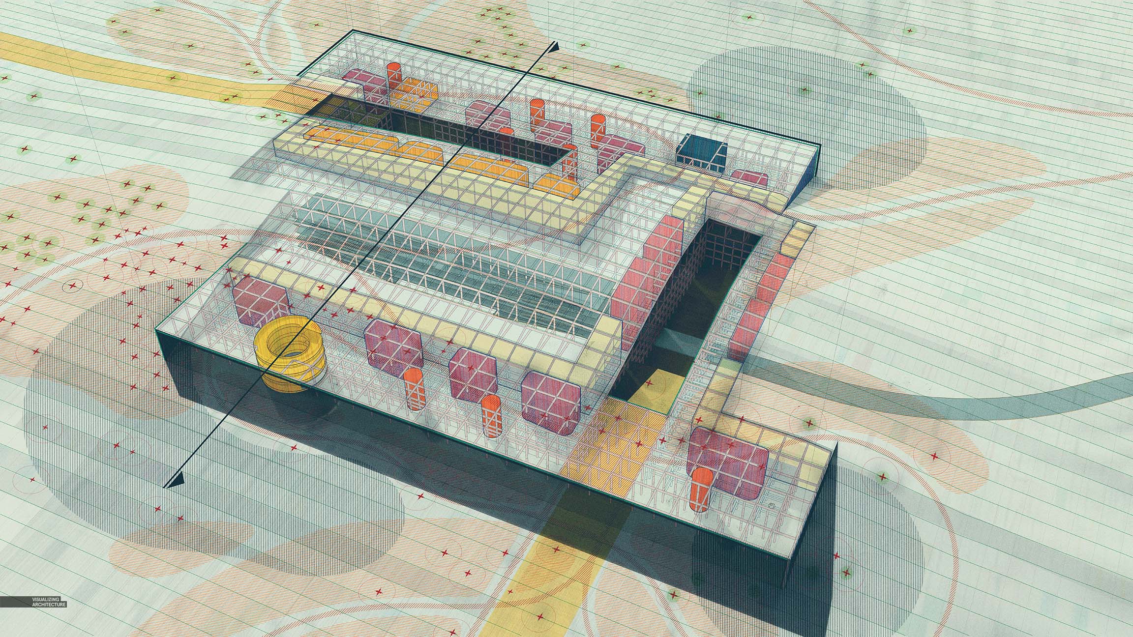
I shifted the background colors away from neutral grays to a cooler temperature. I also punched up the contrast and darkened the shadows just a hint. Below is the corresponding section I put together alongside the perspective.


Hi Alex, I am impressed with the V-Ray Renderings. May I know the software for color grading ? Thanks.